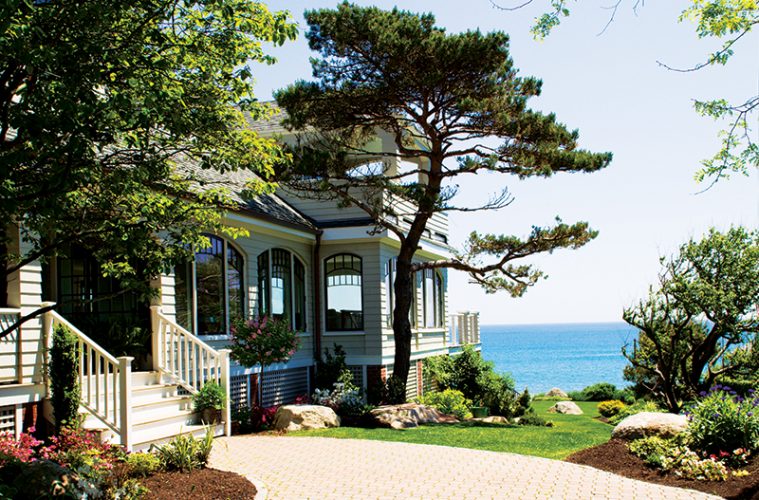
The setting is, in a word, spectacular. Situated on the Neck, an island-like spot of land connected to Marblehead proper by a causeway, the home faces open ocean—an expanse of blue that shifts from white-capped to gloomy grey depending on the day. The backyard boasts a rocky meet-and-greet of land with sea.
The Shingle-style home was originally built at the turn of the last century as a summer retreat. The linear structure runs perpendicular to the ocean and street, an orientation that makes maximizing views from street-side locations a challenge. Although generous in size, the mostly original interior (some updates were made along the way) was a warren of small rooms. The interior layouts were convoluted, and storage was lacking.
Initially, the current owners approached the Beverly-based architecture firm Siemasko + Verbridge about more mundane improvements, such as a new roof and heat and electrical updates. The kitchen was outdated, and the bathrooms were antiquated as well. But once design discussions began, the project’s scope increased organically.
“As part of our initial study, we couldn’t stop ourselves from seeing better layout solutions,” says principal Jean Verbridge. “Our design iterations promised better transmission of natural light and better views throughout.” Seeing their home’s potential, the owners warmed to the idea of a more comprehensive renovation and decided to invest in its future possibilities.
Although their three children are grown, the couple defies the “empty-nest” concept and considers their property an evolving family estate. The needs of their kids and their kids’ emerging families were always prioritized as the renovation took shape. “Our challenge was to make the home accommodate a weekend overflow of people yet feel warm and intimate for just one or two occupants during the week,” explains Verbridge. “We also need- ed to create better privacy for a house full of people,” she adds.
The first-floor layout did not change drastically but benefited from better flow between living spaces generated by a series of openings and French doors. Also,when possible, rooms were enlarged by eliminating unnecessary nooks. The most difficult decision was where to site the kitchen. On the ocean side, banks of win- dows promised impactful views; however, maintaining the kitchen’s street-facing location had the potential for a more cozy setting, particularly during winter.
|
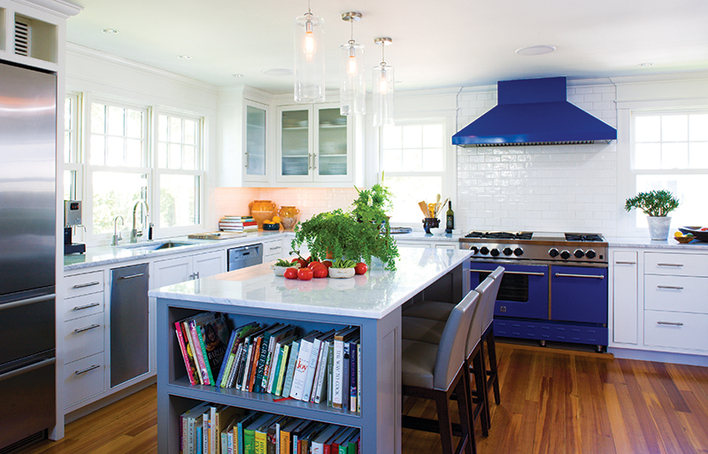
The main floor living spaces flow in succession: Beyond the kitchen and pantry lies the library, which features built-in shelves and comfortable reading chairs. Beyond that is the living room, at the center of which stands an original wood- burning fireplace. The series culminates in an informal dining area overlooking the ocean.Once the latter option was chosen, Siemasko + Verbridge expanded the space to include a modern firebox by Italian furniture maker Giorgetti. “It creates a hearth while taking up minimal space,” notes Verbridge. Additional features include a six-person dining table, leather banquette, and adjacent bar/pantry. While the refinished southern yellow pine flooring, subway tile, and neutral cabinetry are all timeless design choices, the BlueStar range and hood in matching blue add an unexpected yet welcome pop of color.
The architecture firm rearranged the second floor’s amalgam of bedrooms, bathrooms, and closets. Instead of a run of three bedrooms on the water-facing side, the designers opted for side-by-side master and guest suites. The master suite is generously sized and outfitted with his and hers walk-in closets and enjoys access to a covered balcony. Two additional bedrooms as well as dual daybeds in the office round out the second floor’s guest accommodations.
Satisfying their clients’ desire for casual, informal “hangout” spaces, Sie- masko + Verbridge brought new life to the walk-out basement. The finished space now boasts a family room with pool table, wine cellar, and exercise room, complete with sauna. Glass doors open out onto a patio and hot tub.
The owners’ design tastes tended toward clean and modern; however, with resident golden retrievers as well as potential wear and tear from frequent guests, they knew interior austerity was not an option. Siemasko + Verbridge collaborated with New York City–based decorator Billy Cotton of Custom Resources on the de?cor, which exudes warmth with comfortable sofas and armchairs, Oriental rugs, and colorful throws and accent pillows. Collected artwork, including framed illustrations from well- known children’s books, personalizes the revamped spaces.
“Renovating a home where their chil- dren grew up created conflicts at times due to emotional ties,” says Verbridge of the process. “Many items were put into storage, and by the time the house was complete, most of these ‘things’ were no longer necessary. The real attachment was to the memories, which will always remain.” svdesign.com


 Designers introduced a pop of blue in the kitchen