She did not know exactly what she wanted, but she knew the kitchen she had was not it. The layout was not optimal, with too much space in some areas and not enough in others. And even if the flow had been better, the brown tones of the cabinetry, floors, and countertops made for a kitchen that felt dark and somber.
“When we first began to talk about a renovation,” says interior designer Dennis Duffy, “I began to think that there was a deep disparity between what she said she liked and what I saw. She talked about light and contemporary design, and I kept thinking, ‘It’s so dark in here.’”
Duffy—whose eponymous Boston–based company has created sleek and stylish interiors for residences, commercial establishments, and multifamily developments in New England and beyond—first connected with this homeowner when she saw a living room he had designed for a friend.
“I had always liked it, so when we finally got around to making some changes, I called Dennis. When he came here, looked around, and told me what he thought, I got really, really excited.”
The homeowner and her husband have lived in the Swampscott house for several decades, raising their children and developing their careers here. Built in the 1940s out of white-painted cinderblock made to resemble a California ranch, their home grew into a Tudor-style house with half timbering and a brick stair tower.
“When we came here in 1993, those renovations were 90 percent complete,” the homeowner recalls. “We loved so many things about this house, including that it’s just steps away from the ocean and the fact that the backyard is flat, making it easier to install a swimming pool. But we never loved the ambience,” she continues. “We wanted to lighten it up in the entry hall, to redo the two downstairs powder rooms, and to redesign the kitchen. When it came time to begin, we decided to do it all together, and make a mess just once.”
“Her kitchen is literally located at the center of the house, and it is the signature of the house,” Duffy explains. “What we did in the kitchen drove the design of what is around it.”
Completed in October 2014, the redesign features, in addition to a stylish and superbly functional new kitchen, lightened woodwork, darkened flooring, beautiful new half baths, and a lighter, less ponderous sensibility. Four entry columns, purely decorative and non-load-bearing, were removed, along with a checkerboard-patterned floor medallion. Removing black and gold stair balustrades and substituting clear acrylic rods proved an especially witty and effective change that represents Duffy’s and the homeowner’s preference for clean design and modern materials.
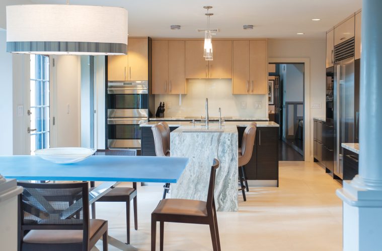
The kitchen is, however, the physical and aesthetic centerpiece of the project. Gutted and totally rebuilt, it features practical porcelain tile flooring that resembles limestone, an array of appliances for the home chef, a water-like patterned granite, a white glass backsplash, and upper cabinets fashioned from pale bird’s-eye maple, while the lower ones are made from intensely dark zebra wood. “Harmonious contrast is the theme that runs throughout,” Duffy says.
The two contrasting but subtly related wood tones determined the kitchen’s stylistic vocabulary and drove the selection of granite—a richly figured granite called Fantasy Brown tops the lower cabinets as well as the central island. Originally wider and rectilinear, the island is now closer to the stove and ovens, making for easier access while cooking. Duffy reconfigured the island into a T shape by adding a peninsula; it now acts as an informal kitchen table, which allows for better flow around the room. The wide leg of the peninsula is also covered with patterned granite, creating a focal point in an otherwise neutral-toned kitchen.
“We spent the most time picking out the granite,” the homeowner recalls. “It was really important that it coordinate with the wood colors as well as the floor. I knew I wanted a light-colored stone, but I also wanted a beautiful pattern. Dennis and I chose the slab, then we decided how it should be cut for optimal placement. To me, the leg of the peninsula looks like a waterfall.”
Duffy’s design relocated the dishwasher next to the dish cabinet, multiplied storage with drawers within drawers, and created an easy working triangle between the sink, stovetop, and refrigerator. The homeowner, who wanted more oven space, now has two Wolf wall ovens that function either as electric or induction ovens. The sleek new induction cooktop is also by Wolf. The homeowners are especially fond of their new Miele coffee center, which is plumbed to allow for near-instantaneous coffee and tea service.
At the end of the kitchen closest to the living room, Duffy created a separate dining area and a built-in bar. The striking kitchen table, which he designed, features a pearlescent, pale blue resin top with a mirrored back. It is set on a geometric stainless steel base.
“The base is sculptural, while the mirrored back gives the top great depth,” Duffy points out. The chairs surrounding the table have cane backs and seats upholstered with ostrich-patterned fabric, another example of the contrasting materials he promoted in this kitchen.
The bar includes a wine refrigerator with separate temperature zones for red and white wines, as well as a deep cabinet for spirits. Barware lives in bird’s-eye maple cabinetry designed for that purpose and in-stalled at an easy reach above the wine refrigerator.
“Dennis got rid of the wasted space,” smiles the lady of the house. “We have a much better layout now.” Duffy says that this kitchen represents his design aesthetic.
“All our work tends to have a similar cleanliness.” duffydesigngroup.com

