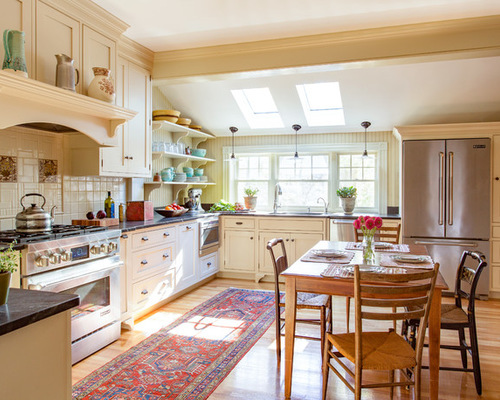
It’s easy to see why Marylou and Bob Graham love to eat at their kitchen table. Before they hired Heartwood Kitchens to gut the room, it had a dated 1980s look that was at odds with the rest of their 1890s Dutch Colonial home. Thanks to the renovation, their kitchen now is light-filled and full of Victorian-era charms, including antique English transferware tiles, vintage-style drawer pulls, and beadboard.
Kitchen 1: Eric Roth Photography, original photo on Houzz?
Related: An Open and Airy Kitchen With Lots of Function
Kitchen at a Glance
Who lives here: Marylou and Bob Graham
Location: Melrose, Massachusetts
Size: 255 square feet (23.7 square meters)
Designer: Nancy Hanson of Heartwood Kitchens
When it came to a table or island, this family was kitchen table all the way. “They love to have impromptu casual dinners with friends about three times a week and eat at the kitchen table,” says designer Nancy Hanson. They do have a portable stainless steel island they pull out when in full-fledged chef mode.
Originally, the ceiling beam was raw, but Hanson had the contractor trim it to match the millwork in the rest of the room. One design challenge was dealing with the sloped roof: In a room where the molding atop the cabinets meets the ceiling, it makes for an awkward moment above the upper cabinets.
Kitchen 2: Before Photo, original photo on Houzz
?
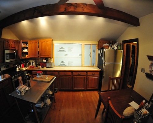
BEFORE: The kitchen was dark and dated, and there was little workspace between the range and the sink. The couple had remodeled the rest of their home but had been putting off the kitchen renovation. Now, with their youngest daughter set to graduate from high school, they were ready for the change. This phase of the renovation also included a small addition off the back of the house to give the homeowners a butler’s pantry, a new laundry room and an accessible full bathroom on the first floor.
Kitchen 3: Eric Roth Photography, original photo on Houzz?
Find the Perfect Dishwasher for Your Kitchen Remodel
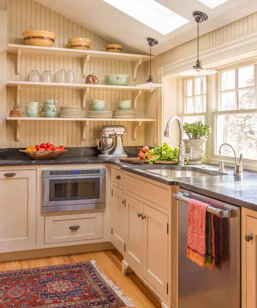
AFTER: Hanson deftly met the sloped ceiling challenge by adding open shelves backed with era-appropriate beadboard. “They have great glassware and china and other things to show off,” she says. Using open shelving also makes the most of the natural light streaming in from the windows.
New skylights flood the room with light. Hanson replaced the existing windows with double-hung windows, which are more in keeping with the period, then boxed them out at a height that meets the counter. This added precious inches of counter space behind the sink.
Wall paint: Northampton Putty, Benjamin Moore; beadboard paint: Crown Point Sand, Benjamin Moore; custom cabinetry: Mouser; appliances: Jenn-Air; pendant lights: Rejuvenation; faucet: Elkay via Peabody Supply
.jpg)
Kitchen 4: Before Photo, original photo on Houzz
BEFORE: The sink was located on the side of the house. The window looked out at a neighbor’s home.
Kitchen 5: Eric Roth Photography, original photo on Houzz?
Make a Statement With a New Dining Table
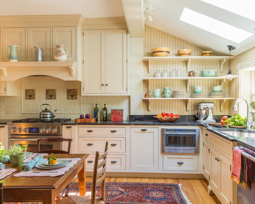
AFTER: The couple sacrificed that window for a wooden hearth-style range surround that’s now a focal point. The new skylights and lighter paint colors make up for the lost window. Abundant cabinets include long, narrow pullouts on either side of the range to keep herbs, spices and cooking oils handy.
“Marylou has a friend, Posy Bass, who has a great eye. She helped her with some of the details,” Hanson says. Bass helped track down these era-appropriate brown English transferware tiles, the new field tile, the lighting, and the finish and door style on the cabinets. They found thetransferware tiles on eBay.
The Shaker cabinets have a beaded inset detail that is appropriate for the period. “Bracketed feet also give it a vintage look,” Hanson says. Although Marylou was hoping to find antique hardware, she wasn’t able to locate enough for the whole kitchen. These pulls are from House of Antique Hardware.
Antique Oriental rugs passed down from Marylou’s mother decorate the house, and this runner turned out to be a great fit for the kitchen, adding color and softness to the floor.
In this photo, you get a good look at the floors, which are new quartersawn oak that matches the flooring in the rest of the house. “Quartersawn oak has beautiful fine, tight grain,” Hanson says. “It’s more expensive, but it’s worth it.”
Soapstone counters were an apt choice for the style and age of the house. They are one of the couple’s favorite things about the new kitchen.
Kitchen 6: Eric Roth Photography, original photo on Houzz
?
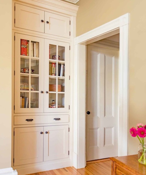
While the house was under construction, the designers realized that they had enough space by the kitchen entry for a built-in china cabinet. The piece, similar to the kind that would’ve originally existed in a house like this, serves as a landing strip for keys, and provides storage and display space for cookbooks and other objects. The door on the right leads to the basement. The hallway leads to the front door.
Kitchen 7: Eric Roth Photography, original photo on Houzz
?
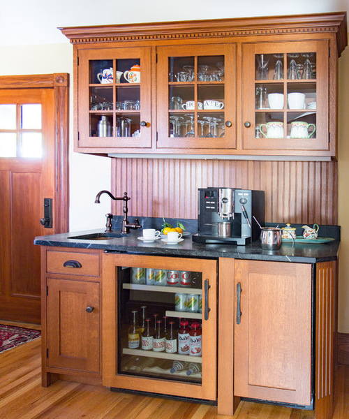
Between the kitchen and the dining room is this butler’s pantry. Hanson designed the coffee and beverage station, which combines the same soapstone used on the kitchen counters, beadboard and more quartersawn oak. (There’s beautiful quartersawn oak paneling in the adjacent dining room too.) The unit to the left of the refrigerator conceals an ice maker.
In addition to the casual dinners around the kitchen table, the Grahams love to throw big parties. This handy station can serve as a bar, with guests spotting their own glassware through the glass cabinet doors.
Coffee and beverage station: Quality Custom Cabinetry

