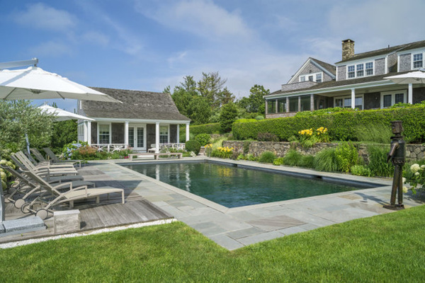
Though this shingle-style home on the island of Nantucket, Massachusetts, was full of charm, the layout didn’t match the way the family who bought it wanted to live. “These homeowners are happiest when the house is full of family and friends,” says Stedila Design partner Tim Button. “They wanted it to feel easy and comfortable.” Button redesigned some of the interior architecture and completed all of the interior design; the changes and new decor opened up the house to make the most of sunlight and water views, and to give the family plenty of comfy spots where they could gather and relax together. Unique furniture, artwork and accessories add island personality without getting bogged down in the “ye olde Nantucket” look.
Houzz Tour: Cheery Massachusetts Beach Getaway
Richard Mandelkorn, original photo on Houzz
Houzz at a Glance
Who lives here: This is a vacation home for a family of 5.
Location: Nantucket, Massachusetts
Design: Tim Button, Stedila Design
Size: About 7,500 square feet (697 square meters); 7 bedrooms, 7 bathrooms, plus pool house
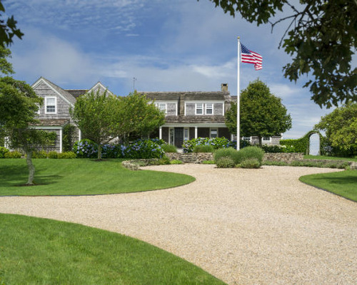
The home was built on spec and lived in year-round by the developer for several years. While Button lauds the architecture, the layout inside did not work for the family as a vacation gathering spot. They wanted it to be comfortable, light and casual and set up to hold a lot of people. “We stripped down a lot of things and made big statements,” he says.
The entry makes a strong impression, thanks to two 100-year-old industrial foundry molds that serve as a sculpture. “The hardest thing about using these was figuring out how to hang them,” Button says. The oval-like shape they form is something we’ll see again in the house.
On the ceiling you’ll see a trick Button used throughout the first floor. Because the ceilings are only about 8 to 8½ feet high, he chose a pale blue paint in a high-gloss finish, which helps them visually recede. “They seem about a foot higher because of the paint,” he says.
Across from the molds are some patinated pieces found on the island. The ship is a painted weather vane. The mirror was custom made to fit the space.
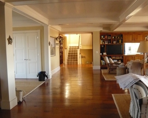
Just off the hallway is a great room, which incorporates the dining room and living room. A major change to the layout was turning the large living room into a living room–dining room. “There were two large seating areas, and it felt like you were walking into the lobby of a hotel,” Button says. Because the family loves to gather around the table, he placed a dining area in the large space. The big opening to the kitchen used to be a wall with a fish tank and a TV on it.
Before Photo, original photo on Houzz
BEFORE: The great room was originally divided into two large seating areas. Button created a large opening in the wall with the TV and fish tank. The staircase previously was tucked away and closed off from the rest of the house.
Richard Mandelkorn, original photo on Houzz
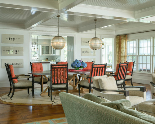
AFTER: The pendant lights were the first thing found for this space, and they drove the entire design. The ribbed and scored glass fixtures used to top streetlights on a bridge across the Seine in Paris. They inspired the large scale of the oval zinc-topped table, which can seat up to 18 people. Next came comfortable upholstered spool chairs.
“I’ve spent some time here with these clients, who have become dear friends at this point, and we sit here for the entire evening, so the chairs had to be really comfortable,” Button says. “They are practically like lounge chairs.”
The artwork is a series of negative-like photographs of surfers. They’re a creative way to reference the coastal location.
Button custom designed this canvas rug after the homeowners were afraid the wheels on the chairs would scratch up the floors too much. It has the same proportions as the table and extends out 3½ feet all the way around. He had already chosen a rectangular rug for the living area and wanted to delineate the dining room space in a different way. The compass points on it are true.
The dining area is open to a comfortable living area, full of cushy spots to settle into and visit or watch a game. One major change was the fireplace, which had a chunky mantel carved with fish and was covered in a stone veneer. (The mantel was reused on a bar in the finished lower level.)
The clients wanted a TV here; Button first tried locating it on a swing arm to the left side of the fireplace but hated the result. So he had Brass Works come in and change the top of the stone fireplace surround. It is covered in oxidized steel, with the TV covered by folding mirrored panels. One detail that Button loves is that the mirrors don’t fold out flat — each one reflects at a different angle.
The floor lamp bases are old surveyor tripods. A geometric pattern gives the traditional hooked rug a modern twist.
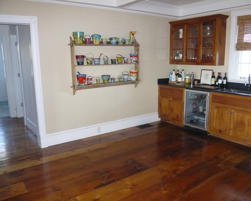
Before Photo, original photo on Houzz
BEFORE: You can see how the color choices and cabinetry in this wet bar area made the ceilings feel lower.
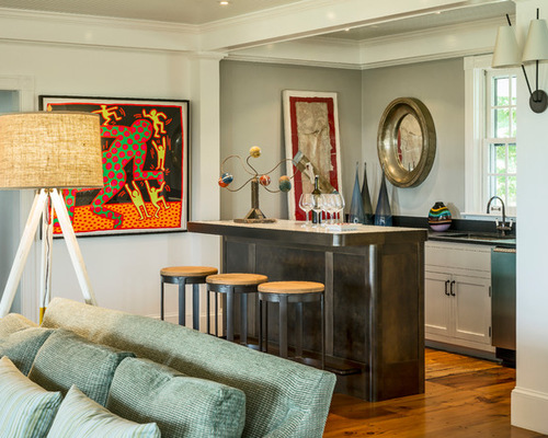
Richard Mandelkorn, original photo on Houzz
AFTER: The homeowners loved the convenience of having the bar right off the living area and wanted to keep it. Button painted the walls a slightly darker gray and added a counter bar to create an alcove feeling. The oxidized steel bar adds a retro Prohibition-style touch. The top is marble from the original kitchen island cut to fit the new bar. “It was already wonderfully worn and stained,” Button says.
The homeowners already had the Keith Haring piece. “We didn’t want to turn this place into ‘ye olde,’ slavishly cute coastal,” Button says. Antique and retro-style pieces, island finds and modern art are all at home here.
“A lot of what happens in this house is about food. Nantucket has some amazing restaurants, but for them, being here is all about eating at home together,” Button says. The once-dark, closed-off kitchen needed to be opened up to the rest of the house and brightened up with sunlight. The former fish tank wall was opened up to the dining room, and the wall through to the staircase was opened up as well. “Now the house enjoys wonderful sight lines throughout the house,” Button says.
There was existing beadboard above the cabinets, which Button extended around the kitchen to differentiate it from the other rooms. He painted it pale blue-green to make it stand out from the white cabinets. “It is high gloss, and it gives it almost a wallpaper look,” he says.
A stunning 7-foot by 7-foot painting creates a colorful focal point along the back hallway, giving the stairwell area more of a presence. Previously, the staircase was blocked off and hard to find.
One of the big statements in the house is the 6- by 10-foot island topped with rich mahogany wood. The custom light fixture overhead incorporates marine lights and barn lights in an interesting industrial assemblage. Another bar is a popular gathering space. The depth of the opening between the dining area and the kitchen was determined by two 36-inch Sub-Zero refrigerators that mirror each other on either side of it.
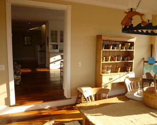
Before Photo, original photo on Houzz
BEFORE: This is the former dining room, now the breakfast room, with a view through to the kitchen. You can see how dark and closed off the kitchen was before.
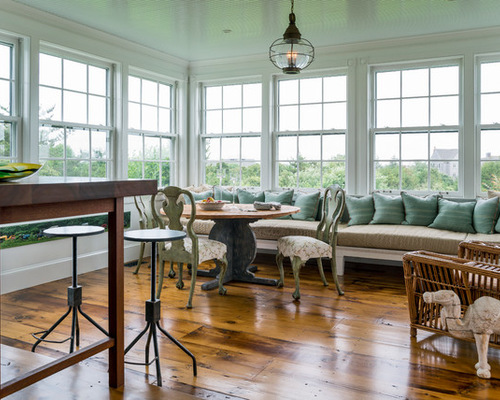
Richard Mandelkorn, original photo on Houzz
?
AFTER: The former dining room now serves as a breakfast room off the kitchen. “This is the sunniest spot in the house, with ocean views, and they mostly spend time in the dining room at night when it’s dark, so it was going to waste,” Button says. He made it a space they would enjoy in the mornings and afternoons, complete with a long sofa-deep banquette and table.
The dining chairs were passed down from the mother of one of the homeowners; the rattan chair was bought from the previous owners. The camel has traveled with them to different homes they have owned. The onion lamp is a tip of the hat to “ye olde Nantucket” style.
Richard Mandelkorn, original photo on Houzz
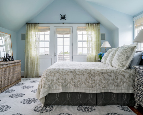
In the master bedroom, Button removed a wall and relocated a dressing room to the right of where this photo was taken to open up the room. The room has coastal colors but global flair. A Madeline Weinrib rug grounds the room in an exotic pattern, while a bone-inlay dresser has Moroccan style. The custom bedding is quilted gauze with appliqués. A large milk carton rattan trunk adds a beachy texture.
The piece on the dresser is a vintage metal fan light cover from over a door.
Button made only minor cosmetic changes in the master bathroom, adding furniture, shelves, medicine cabinets, shutters and new lighting. A reproduction of a vintage travel vanity folds up, locks down and rolls.
He also added an industrial-style cabinet to house towels and other toiletries. It allowed for less clunky pieces elsewhere, like pedestal sinks in lieu of large vanities.
Painted butt boards on the walls add more texture to the room. Button designed the built-in window seat–trundle bed–storage combo. “This house is about sleeping as many people as possible,” he says. The teenager can fit several friends in here.
The window treatments add a sharp graphic touch. They are original canvas rolls from English bus routes, cut and customized into roller shades.
.jpg)
Richard Mandelkorn, original photo on Houzz
The pool and pool house were existing; Button added the deck lounge area to the left at grade. The statue was the homeowners’ and is made of industrial pieces that guests love to play around with, like bicycle chain for the hair on its head. He’s anything but “ye olde” and adds personality to the idyllic landscape.
Team:
Contractor: Cottage & Castle
Metalwork: Brass Works

