The perfect reading spot is different for everyone. Take a look at these six libraries to learn more about how the people in these homes crafted their reading retreats.
15 Book Nooks and the Stories They Want You to Read
Ramsay Gourd Home, original photo on Houzz
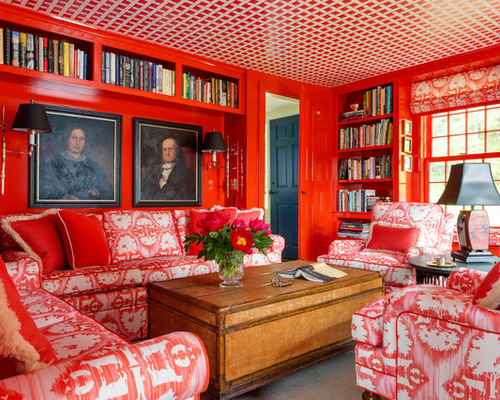
1. Personalized fabric in a red reading room. A couple fell in love with a fabric pattern. The only problem: It had a safari theme, which didn’t fit in their Vermont farmhouse. The couple asked Ramsay Gourd if he could make it more Vermont-y, and he did. He swapped out African animals and foliage for maple trees and farm animals. He then used the fabric to cover the sofa, two chairs, window seat cushions and window treatments.
To make this space into a library, Gourd added built-in shelves to display the couple’s books, family portraits and artwork. The couple then filled the shelves themselves, ensuring each book had personal meaning.
Don Welch Architecture, original photo on Houzz
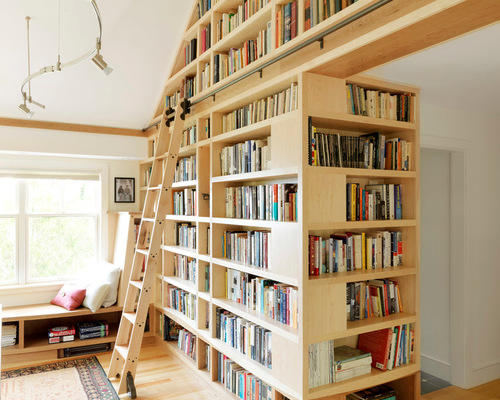
2. A reading room with lake views. The homeowners turned to the original architect, Don Welch, when they sought to remodel and add on to their lakeside home. As part of the home transformation, they realized they could turn one of the original bedrooms into a library-office.
Welch used cherry and maple wood for the bookcases and incorporated a ladder made by the homeowner into the space. While housing the extensive book collection took a lot of space, Welch also wanted to create places for the homeowners to read, relax and take in their views.
Laura U, Inc., original photo on Houzz
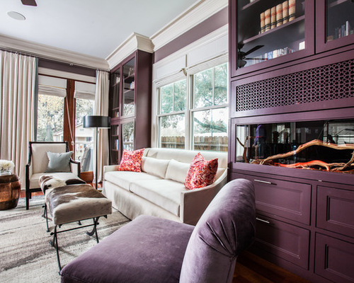
3. A library fit for a snake. The designers at Laura U tackled five challenges during the creation of this luxurious library. The first was building a proper snake habitat for the homeowners’ pet snake, Princess. The designers worked with Aquarium Design Group to install the proper snake equipment, such as heating lamps, ventilation and locks. Next, they worked on the other four challenges: creating privacy, integrating functional cabinets, making an elegant space and balancing colors.
The final design resulted in a library where the homeowners can curl up in their aubergine space with the latest issue of <em>Snake Fancy</em> magazine and rest easy knowing their snake has a comfortable, safe home.
Dona Rosene Interiors, original photo on Houzz
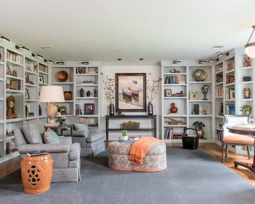
4. A display of favorite objects. Interior designer Dona Rosene transformed an unused, catchall room into a peaceful library. She designed floor-to-ceiling bookshelves, which now house the homeowner’s collections. On some shelves you’ll find stacks of favorite books, and on others you’ll find family heirlooms and collections, such as one of the homeowner’s antique baskets.
In addition to the shelves, Rosene added two seating areas: one for lounging and the other for enjoying the views. The homeowners spend many mornings at the second spot, chatting and eating breakfast.
Hamilburg Interiors, original photo on Houzz
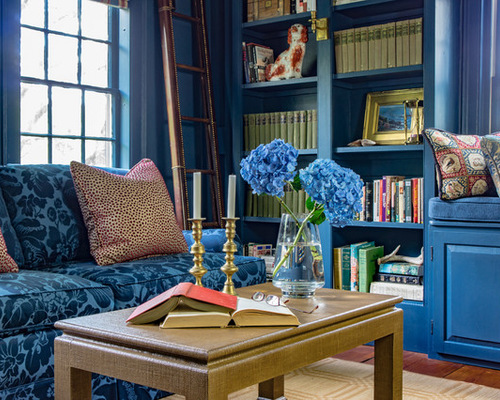
5. Blue hues in a multiuse parlor. Homeowner and designer Amy Mitchell of Home Glow Design teamed up with Dena Hamilburg of Hamilburg Interiors to turn her narrow parlor into a library and music room. They demolished the former built-in bookcase and installed new floor-to-ceiling bookshelves, complete with a window seat. This gave Mitchell the perfect place to display her antique books and heirlooms.
For the music room, they moved Mitchell’s grand piano to the other end of the parlor to create a piano practice space. They painted all the woodwork and walls the same color to help unite the two separate spaces.
Small Space? Opt for a Love Seat
Crowell + Co. Interiors, original photo on Houzz
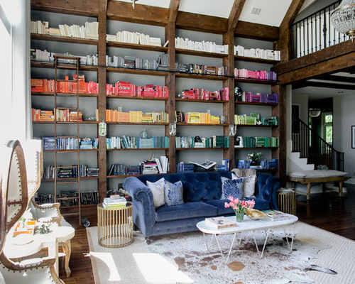
6. A colorful book collection. High ceilings and a massive bookshelf required a creative solution from Hannah Crowell of Crowell + Co. Interiors. She had started to buy nice art books but quickly realized that it would cost too much to fill all the shelves using that method. So she turned to Strand and purchased 500 feet of books. She bought an array of colors and then organized them all in an ombré pattern, which took about 14 hours.
The rest of the room has a Hollywood glamorous style, from the blue velvet chesterfield sofa to the noir dome chairs. The backdrop to the scene is Cornforth White paint from Farrow & Ball, which Crowell calls the “perfect light gray.”

