Interior architect Alissa Minehart’s client was unsure what her personal design style was, but she was quite sure that the dated and poorly laid out bathroom in her new condo was not it. The homeowner was happy to follow Minehart’s lead as they reworked the space. The result is a classic, spacious bathroom with elegant contemporary touches — a style that the homeowner now happily embraces as her own.
See This Small Charlestown Master Bath Make an Elegant First Impression
Photos by Sarah Jayne Photography
Bathroom at a Glance
Location: Waltham, Massachusetts
Size: 100 square feet (9.3 square meters)
Designer: Alissa Minehart of Lenore Design
It was obvious to Minehart that the bathroom, which hadn’t been touched for at least three decades, needed to be overhauled. “It was a complete gut job,” she says.
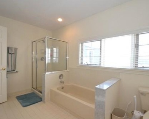
Elegant Bath 1: Before Photo, original photo on Houzz
BEFORE: She describes the room as having a lot of space with an ineffective design. It didn’t help that the door opened onto the shower, tub and toilet — what Minehart refers to as the private part of the bath — with the vanity hidden away.
Minehart reworked the space, including moving all the plumbing, to create a more functional layout. The room now opens onto the vanity, and the private areas sit out of direct view.
Elegant Bath 2: Sarah Jayne Photography, original photo on Houzz
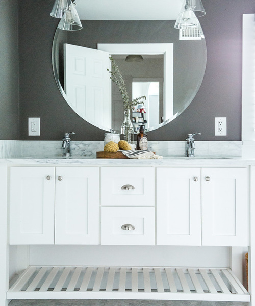
Minehart sized the vanity’s ready-made cabinets to fit between the wall and window. She then called on contractor LJ Gauvin & Sons to fit the pieces together and add the open storage below. The look is bright and airy while still providing hidden storage for items that, in Minehart’s words, “don’t need to be seen,” such as blow dryers and cleaning supplies.
Dual sinks are set into a custom Carrara marble countertop with matching backsplash. Minehart selected the marble to bring out the gray in the floor tile and walls. Chrome fixtures provide a contemporary touch that mixes seamlessly with the classic style of the room.
Countertop: Colonial Marble; sinks and fixtures: Kohler; pulls: Home Depot; sconces, Pottery Barn
Because the vanity is flanked by a wall on one side and a window on the other, Minehart felt that adding separate mirrors over each sink would end up feeling too crowded. Instead, she opted for one large mirror that’s centered over the vanity. It also serves as a focal point that imparts a modern vibe when viewed from the bedroom.
Elegant Bath 3: Sarah Jayne Photography, original photo on Houzz
?
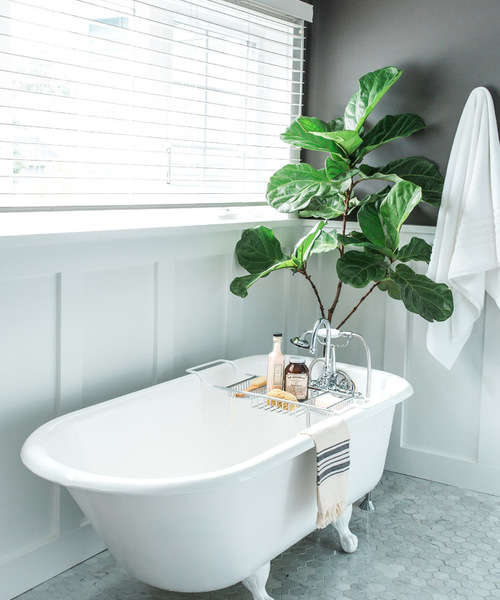
Minehart refinished a cast-iron claw-foot tub in bright white and sealed it. She then tucked the tub under a window that’s opposite the new shower. Its classic lines add elegance and a traditional feel to the space.
Keep Shower Supplies Handy With a Bath Caddy
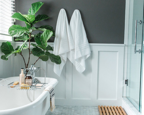
In keeping with the classic feel, Minehart also added Shaker-inspired wainscoting to the lower half of the exposed walls, then painted the upper walls a dark charcoal gray for a dramatic contrast.
Elegant Bath 4: Sarah Jayne Photography, original photo on Houzz
A contemporary walk-in glass shower now occupies the area where the vanity used to be.
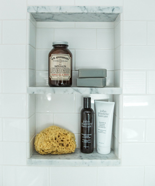
Elegant Bath 5: Sarah Jayne Photography, original photo on Houzz
Traditional subway tiles line the shower, while Carrara marble pieces that match the vanity countertop provide subtle contrast.
Subway tile: Roma Tile; marble insets: Colonial Marble
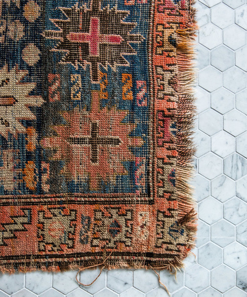
Elegant Bath 6: Sarah Jayne Photography, original photo on Houzz
Traditional hexagonal marble floor tiles blend with the grays and whites of the room and add more visual interest thanks to their pattern and color variations. An antique rug found at the Brimfield Antique Show tops the flooring. The rug adds a touch of warmth while bringing out the grays of the floor, countertop and walls.
Flooring: Roma Tile

