It’s truly amazing how much stuff we’re able to carry across the thresholds of our homes. Shoes, keys, bags, coats, hats, phone, mail, kids’ bike helmets, sports equipment — it all comes and goes in the vast bear hug of our arms. And if you don’t have a plan to store, organize or otherwise contain life’s daily accoutrements, then the space inside your front door is bound to look more like a disorganized yard sale than a welcoming, calming entrance to your home.
The following photos — uploaded recently to Houzz by their respective designers — showcase a range of solutions for entryway storage, from clever cubbies to floating benches and more. Here the designers share the details on each of their projects, one of which includes a fire pole for good measure. Because who’s better organized when on the go than firefighters?
Smart Storage 1: PROjECT interiors + Aimee Wertepny, original photo on Houzz
Designer: Aimee Wertepny of Project Interiors
Architect: Kevin Toukoumidis of dSpace Studio
Location: De Pere, Wisconsin
Size: About 100 square feet (9.2 square meters)
Homeowners’ request: “The homeowners’ vision and style is unlike any other home you might see in De Pere, Wisconsin,” says designer Aimee Wertepny. “When you take a walk down the edge of Fox River, where this home is built, this will be the only modern box of glass, steel and stone you will see, so we needed to make sure that this contrast was elegant and not overly jarring.
“The homeowners also wanted a place to nurture creativity, with an openness that keeps the family connected to each other and with nature while still providing little pockets for each family member to get away and embrace personal growth. And above else, they wanted the home to induce smiles and laughter through fun, unexpected elements.”
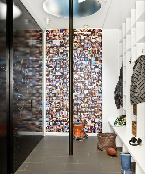
Plan of attack: “We love designing mudrooms, because it is an area that is used every morning and evening, and is a space that needs to be vibrant and fun. It’s the checkpoint for each member to come and go. It is the jumping-off point for the day, where you tell your safe haven, ‘Peace out, home; time to carpe diem.’ So it had to be reflective of this family’s optimistic, grab-life-by-the-reins approach. And what better way to enter this space than through a fire pole?
“Each surface in the mudroom is a chance to reflect and inspire. The doors that conceal coats, book bags and boots are finished with high-gloss IdeaPaint in black, encouraging the family to share messages, like, ‘Be awesome today.’
Write Greetings on the Wall With Chalkboard Paint
“This was also our first time doing a custom Instagram wall covering for a client, and we knew this was the perfect opportunity to test it out. This is a family of adventurous creatives and smarties. This wall gives a glimpse into their exciting life. Each photo is a daily reminder of their love, history, strength and spirit that makes them truly unique.”
Why it works: “The main focus of the space is to send Mom, Dad and the kids off to take on the day feeling excited and inspired. Entering such a space by way of a fire pole is the perfect metaphor for jumping right into the day and leading an inspired life.”
Designer secret: “If you have a fun idea, go for it. Always go for the option that makes you smile. Your home should be a reflection of your happiest state.”
“Uh-oh” moment: “When our mural arrived, it was about an inch off in measurement and had to be reprinted. We had accounted for a bleed, but somewhere along the lines it got lost in the shuffle. So always double check your measurements and remember when you’re designing something graphically to account for a bleed. It’s always good to have a little too much than a little too little.”
Take-away: “When we were formatting the Instagram wall covering, our client pointed out the design team wasn’t included and insisted that the architects and interior designers were added into the collage. This was one of the most touching moments during the process, and was a reminder that we were all a part of this very special home. So now when they are putting on their rain boots, they can look at our laughing faces and remember the crazy, awesome journey we all took together.”
The nitty-gritty: Instagram wall: custom layout, fabrication by Murals Your Way; surface-mount light fixtures: Teti in white, Vico Magistretti; fire pole: designed by architects Tom Hagerty and Kevin Toukoumidis of dSpace Architects
Team involved: Aimee Wertepny and Lauren Warnock of Project Interiors (interior designers); Tom Hagerty and Kevin Toukoumidis of dSpace architects (architects); C and C Custom Builders (construction)
Smart Storage 2: Ben Herzog, original photo on Houzz
Designer: Kevin Dumais
Architect: Ben Herzog
Location: Tribeca neighborhood of Manhattan
Size: About 7 by 24 feet (2.1 by 7.3 meters)
Homeowners’ request: “The homeowners needed a space to remove shoes, city grime, and to drop mail, keys and coats before entering into the clean and calm of the apartment.”
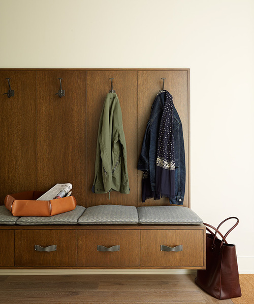
Plan of attack: “The bench was the main element in the space,” says architect Ben Herzog. “It provides a key- and mail-dropping area, hooks for coats and a place to sit down and take off, or put on, boots and shoes. It was designed by Kevin Dumais, the very talented interior designer on this project, with [me] providing assistance. We all felt that the bench should ‘float’ above the floor to make the small area feel a bit more spacious. Val Canuci, the cabinetmaker on the project, provided steel support brackets hidden under the bench to enable it to withstand a lot of weight. The rest of the space evolved from there.”
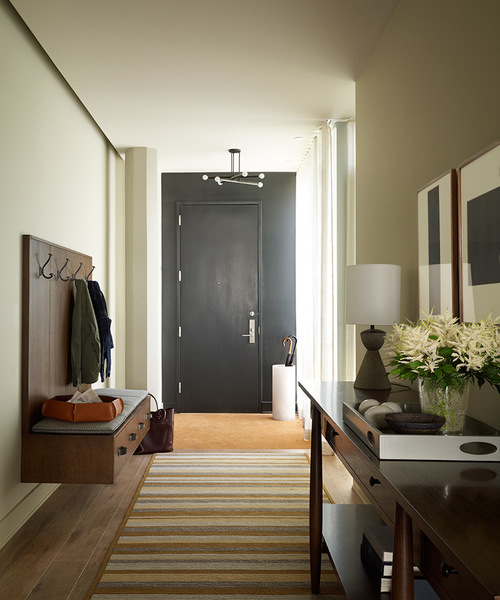
What wasn’t working: “This apartment does not have a mudroom or separate entry. The entry door opens into a very small space that is directly on the kitchen and the hallway seen in the picture.”
What goes on here: “Getting their three young kids geared up and ready to go out.”
Who uses it: “The space is for a young, hardworking, financial-industry couple and their three young children.”
Designer secret: “The hallway extends longer than is shown in the photo, and the clients have very nice wall art. We designed a light cove, seen on the left side of the hallway [below], that creates a diffuse glow and wall wash for the art that is quite effective.”
Smart Storage 3: Ben Herzog, original photo on Houzz
“Uh-oh” moment: “Right by the front door, we had a coco mat installed flush to the new wood flooring. The light tan color showed dirt and boot prints pretty quickly. Fortunately, it isn’t fastened down to the floor, just cut to shape, so it can be lifted out and shaken and cleaned. The discussion with the clients and designer ended with the option to swap out for a darker black coco mat to match the front door and front wall if this one proves to be too much of a pain.”
Install New Flooring With Help From a Local Professional
Splurges and savings: “We didn’t open up the wall between the hallway and the kitchen, seen to the right in the hallway photo. This would have involved a fairly complete redesign of the kitchen. The savings helped enable more custom millwork throughout the apartment, a Bulthaup kitchen and more artwork and furniture.
Take-away: “I learned, from Kevin Dumais’ choice here, that I love leather drawer pulls. I am planning on incorporating similar hardware in many non-kitchen millwork applications.”
The nitty-gritty: Flooring: Siberian Floors; hardware, rug and light fixtures: provided by Kevin Dumais
Team involved: Ben Herzog (architect); Ori Guy (project manager); Kevin Dumais (interior designer); Robert Sercaru, iCon Design Build (contractor); Val Canuci, Interdimensional Interiors (cabinetmaker)
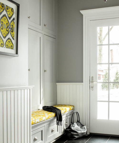
Smart Storage 4: ML Interior Designs, original photo on Houzz
Designer: Marisa Lafiosca of ML Interior Designs
Location: Summit, New Jersey
Size: About 6 by 9 feet (1.8 by 2.7 square meters)
Homeowners’ request: “The entryway was part of a recent update of the kitchen, family room, powder room and mudroom–rear entry,” says designer Marisa Lafiosca. “The client wanted to brighten the dated fabrics and furnishings to create a light and airy space.”
Who uses it: “A family of five, three of them teenagers, all active in sports, and a family dog.”
Plan of attack: “The mudroom–rear entryway posed a problem because all the sports equipment and clutter took up too much space in the small entryway. It also served as the entry to the patio-grill, so we had to declutter. Adding cabinet doors to existing cubbies and cleaning out a large closet on the opposite side allowed us to store lacrosse sticks, tennis rackets, balls etc. We also used porcelain large brick tile with dark grout for wear and tear — easy maintenance and savings.
“The bench seat is the family dog’s favorite spot in the house for sitting in the sun. I had the fabric laminated before having the upholsterer make the bench seat cushion — now it’s care free. With the first teenager heading to college and the others shortly behind, the need for the large chalkboard with schedules was no longer necessary. We replaced that with the framed ikat prints to pull it altogether.”
Find Fabric in Every Color and Pattern
Designer’s secret: “To give the space the appearance of a higher ceiling, we painted all the trim above the cubbies the same color.”
The nitty-gritty: Tile: porcelain; bench fabric: Holland & Sherry Belfour ikat in Lemon; paint: Manor House Gray 265, Farrow & Ball; art: ikat prints
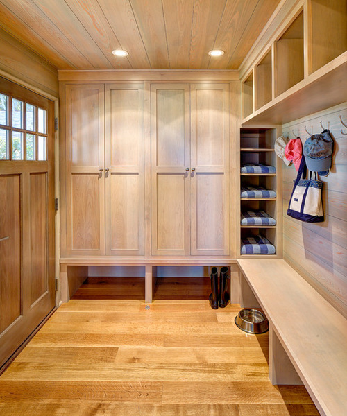
Smart Storage 5: sullivan + associates architects, original photo on Houzz
Architect: Chuck Sullivan of sullivan + associates architects
Location: Oak Bluffs, Martha’s Vineyard, Massachusetts
Size: About 7 by 12 feet (2.1 by 3.6 meters)
Homeowners’ request: “The clients wanted an entryway that provided both a sense of arrival and efficient storage for their active young family and guests,” says architect Chuck Sullivan.
Plan of attack: “We approached the entryway asking, ‘How could we design the ideal entryway that related to both the exterior and the interior spaces?’ First step was to design and install a front door with windows, as well as a window adjacent to the door, to capture the abundant natural light and allow for water views.
“Because we live on an island, there’s always a design consideration for the elements: rain, snow, sand, wind etc. To address this, we covered the porch and built it at the same level as the entry for a smooth transition under any weather condition. On the same level, to the south side and out of sight lines, is an outdoor shower for rinsing off after a day on the beach. Inside, from the entryway, there is easy access to the first-floor bath with indoor shower and laundry facilities. Perfect for those adventurous days when the kids’ dirty clothes can go straight into the washing machine.
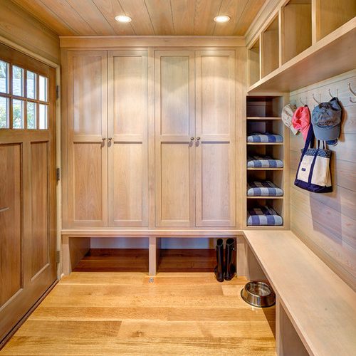
Why it works: “Small spaces present their own challenges, and we designed it almost like a boat, where the goal is to maximize utility and function without compromising design, which was important to our clients. The custom built-in cabinetry provides storage for hanging coats, and sports and beach gear behind closed doors, while the open shelving next to the enclosed storage and above the coat hooks provides cubby space for items needed at hand: beach towels, hats, flashlights, bike helmets, dog leashes and toys.
“The built-in bench is a must. Perfect for helping kids on and off with boots, which are then stored neatly under the bench, which also serves as a loading dock for incoming groceries, beach bags, the stuff we all need for a day at the beach.”
Who uses it: “This house is owned and enjoyed by a young family of four who entertain family and friends on a regular basis, with guests coming and going during the summer season. Lots of flip-flops, galoshes, hats, beach gear etc.”
Team involved: Chuck Sullivan of sullivan + associates architects (architect); Flanders and Crew Construction; Vermont Custom Cabinetry; Vani Sayeed (interior designer); Specialty Builders’ Supply (windows, doors, interior and exterior trim package)

