In my mind, there are two kinds of backsplashes, and each can be deduced from the word itself. Some backsplashes are meant to recede, or stay in the background, while others are meant to make a splash. The following three kitchens embrace the latter. See how bold tile choices put these backsplashes front and center.
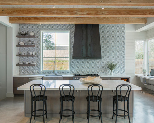
Backsplash 1: Fine Focus Photography, original photo on Houzz
1. All the Way Up
Designer: Page Gandy of 3 Fold Design Studio
Location: Austin, Texas
Size: 250 square feet (23.2 square meters)
Homeowners’ request: An overall soft, monochromatic feel with texture and interest to enliven the space.
Backsplash: Hand-painted terra-cotta tile (Fatima decorative field tile in Mezzanotte color, 4? by 4? inches, by Walker Zanger). “Because there were no upper cabinets in the kitchen, we knew the back wall had to really pop without being overwhelming,” designer Page Gandy says.
Other special features: Black steel vent hood. White Caesarstone countertops. Cabinets hand-finished in a washed gray. “Because of the amazing backsplash tile, we toned down the other finishes in the space,” Gandy says. There’s also a study nook to the right.
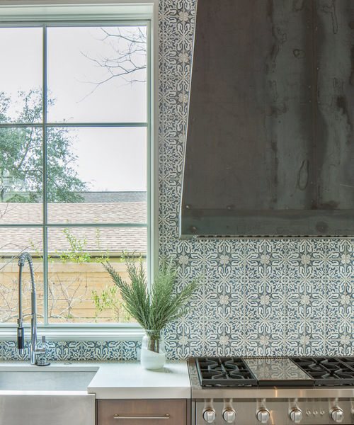
Backsplash 2: Fine Focus Photography, original photo on Houzz
Why the design works: “I tend toward keeping things simple so that the pieces and materials that are special really shine,” Gandy says. “This kitchen embodies that idea in keeping counters and flooring simple and letting the backsplash make a statement.”
Designer secret: “In every kitchen I design, I try to find a way to incorporate counter seating,” Gandy says. “From quick meals to homework, to large spaces in which to lay out the seemingly never-ending school projects, I find having one uninterrupted counter top invaluable.”
Also on the team: Joe Fowler Custom Homes (construction); Hugh Jefferson Randolph Architects; Tre Dunham of Fine Focus Photography; Ferguson (plumber); Alexander Marchant (hardware)
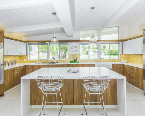
Backsplash 3: KBC of Palm Springs, original photo on Houzz
2. Mellow Yellow
Designers: Howard Hawkes and Kevin Kemper of H3K Design
Location: Vistas las Palmas, Palm Springs, California
Size: 360 square feet (33.4 square meters); 20 by 18 feet (6 by 5.4 meters)
Homeowners’ request: Replace a closed-room kitchen with a more open concept that would maintain the original vintage charm.
Backsplash: Semicustom handmade tile by Ann Sacks. “It was the most important decision for the client,” designer Howard Hawkes says. “It had to be just right. It took him months to pick it out. He wanted it to be bright and cheery and vintage, but it also had to go with the new sleeker version of the house.”
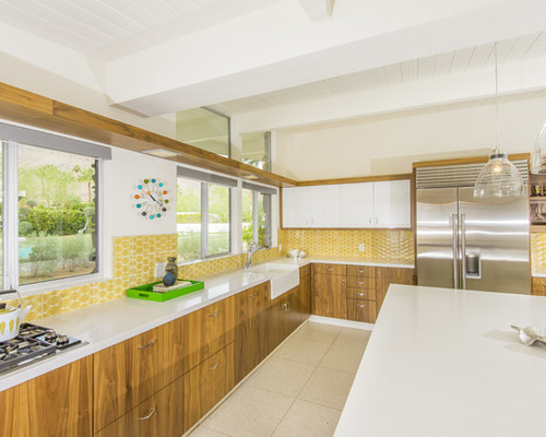
Backsplash 4: KBC of Palm Springs, original photo on Houzz
Other special features: Custom walnut-veneer cabinets. Quartz countertops. Walnut-wrapped soffit over sink with three inset old-fashioned square downlights in chrome finish. Cooktop and sink beneath windows.
Designer secret: Hawkes and designer Kevin Kemper stopped the backsplash a third of the way up the wall for more of a vintage feel. “If this was a contemporary space, we would have tiled it all the way up,” Hawkes says.
Also on the team: KBC of Palm Springs (cabinets); Hoyt Construction (general contractor); Palm Springs Plating (light fixtures over sink); Baci Tile and Stone (tilework)
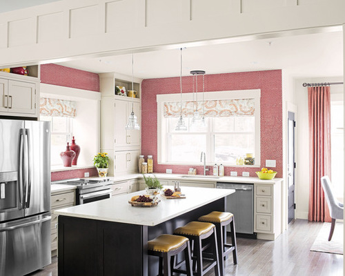
Backsplash 5: William Geddes Photographer, original photo on Houzz
3. Red Alert
Designers: Donald Powers and Christina Carlson of Union Studio; Denise Enright (interior design); and AJ Johnson of CliqStudios.com (kitchen design)
Location: Devens, Massachusetts
Size: 208 square feet (19.3 square meters); 16 by 13 feet (4.8 by 3.9 meters)
Homeowners’ request: This design was in collaboration with This Old House magazine for its 2016 show house. The editors were looking for a modern farmhouse vibe and to showcase color throughout the home.
Backsplash: Hudson penny round tile in vermilion by Merola Tile. The team selected a neutral cabinet for long-lasting appeal, but gave the kitchen a bright accent with the counter-to-ceiling backsplash in a colorful tile.
Other special features: “We wanted to fill both exterior walls with windows to create a light-filled kitchen that links the open living and dining spaces,” architect Donald Powers says.
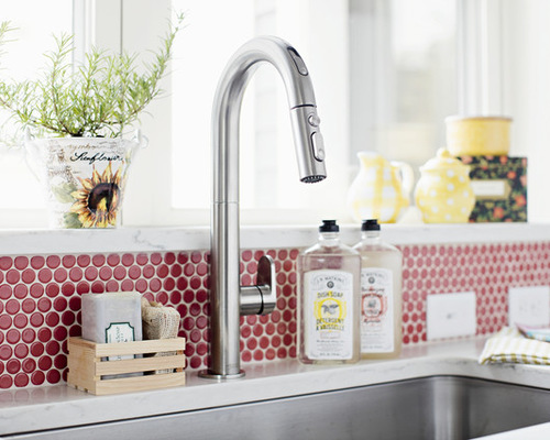
Backsplash 6: William Geddes Photographer, original photo on Houzz
Why the design works: “This kitchen is the heart of a very compact home in New England, where energy efficiency is enhanced by reducing the home’s footprint,” Powers says. “The openness and light are essential to make the house live large in fewer square feet.”
Designer secret: “We built a custom kitchen using cabinets in stock sizes,” Powers says. The open shelves near the ceiling are typical base and wall cabinets turned on their side. The island is a modern version of the farmhouse table, the focal point and gathering space of the home. We kept the top clear of a sink or appliances, though a microwave drawer is tucked underneath to reduce visual clutter.”
Also on the team: Dan Gainsboro and Sean Ford of Now Communities (developer and builder); Claudia Jepsen of <em>This Old House</em> magazine; William Geddes (photographer)

