Beth Birke Calitri felt the weight of generations on her shoulders when she tackled the design of her Newburyport home. After all, the 1857 Victorian had housed city mayors and the founders of the Newburyport Horticultural Society in the past.
“I didn’t want to abandon all this history,” Birke Calitri says. “I wanted to give it a nod, but I didn’t want to be beholden to the past.”
Previous owners had kept the dark wood, and used a more traditional Victorian color scheme—pretty much the opposite of what Birke Calitri, her husband, Chris Calitri, and their two children, Zoey and Max, were first looking for when they decided to put down roots in Newburyport after moving more than a dozen times as expats, bouncing around places like Switzerland and England.
“We were originally looking for something more modern and fresh,” Birke Calitri says. “[But] I think that being expats gave us a renewed appreciation for the traditional.”
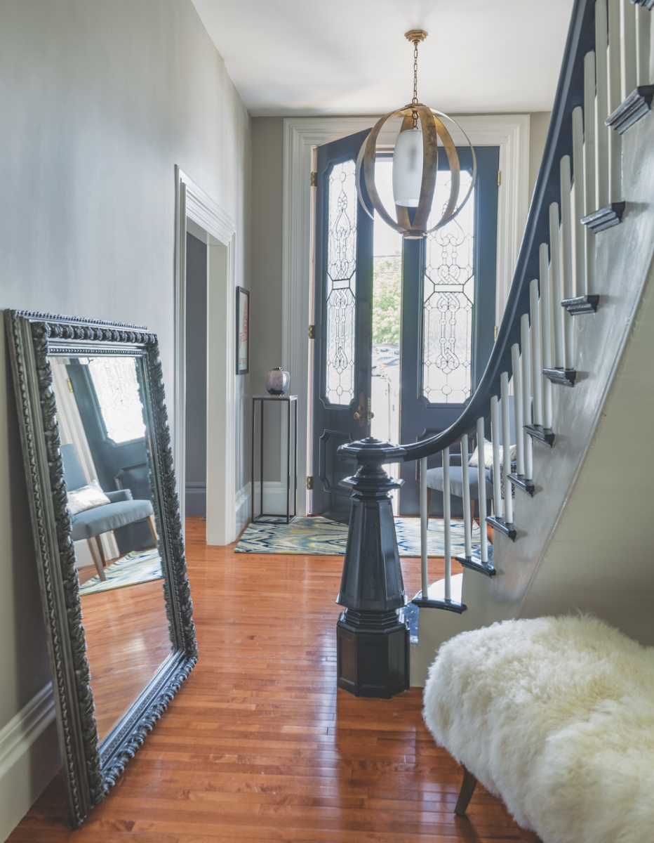
Balancing her modern aesthetic with the home’s bones has been an exciting challenge, Birke Calitri says. “It’s been a tricky balance, because I wanted to remain sympathetic to the Victorian style, knowing that we were carrying on decades of tradition, without creating a look that was moody and stifling. I needed something that was fresh, layered, and more modern.”
After four years, the home is still a work in progress. Birke Calitri says her favorite room in the house is always the one she is currently working on—these days it is the parlor. But the priorities were clear when they first tackled the house.
“Because we’ve moved so many times, I wanted to take care of the kids’ rooms first,” Birke Calitri says. “I wanted them to have a sense of permanence.”
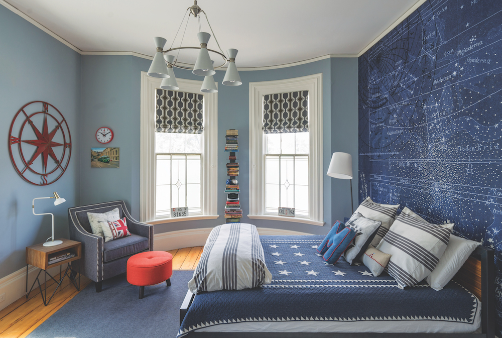
Max, age 13, has always been fascinated with aeronautics—he currently takes flying lessons at Plum Island Airfield. So, naturally, his room reflects the sky and stars, with the focal point being European constellation wallpaper that Birke Calitri found online after extensive research.
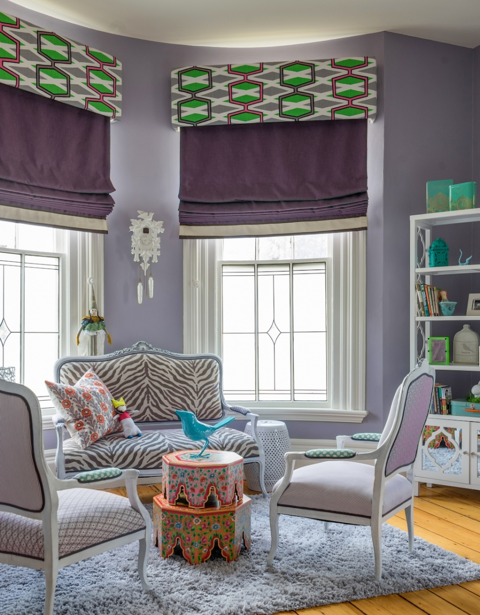
“Zoey’s room is bubbly, like her personality,” Birke Calitri says, with bright colors and a sitting area marked with an antique French settee and chairs from Birke Calitri’s grandmother, updated with fun, funky fabric.
The one thing the kids’ rooms share with each other and with the aesthetic throughout the house is shades of gray paint—Zoey’s a gray-purple, Max’s a gray-blue.
“Even though the color palette is more complex than creams or whites, and is difficult to get right, using a gray color scheme provided a soothing backdrop to pop our accent colors, conveyed sophistication, versatility, and calmness, and added that contemporary feel we were after,” Birke Calitri says.
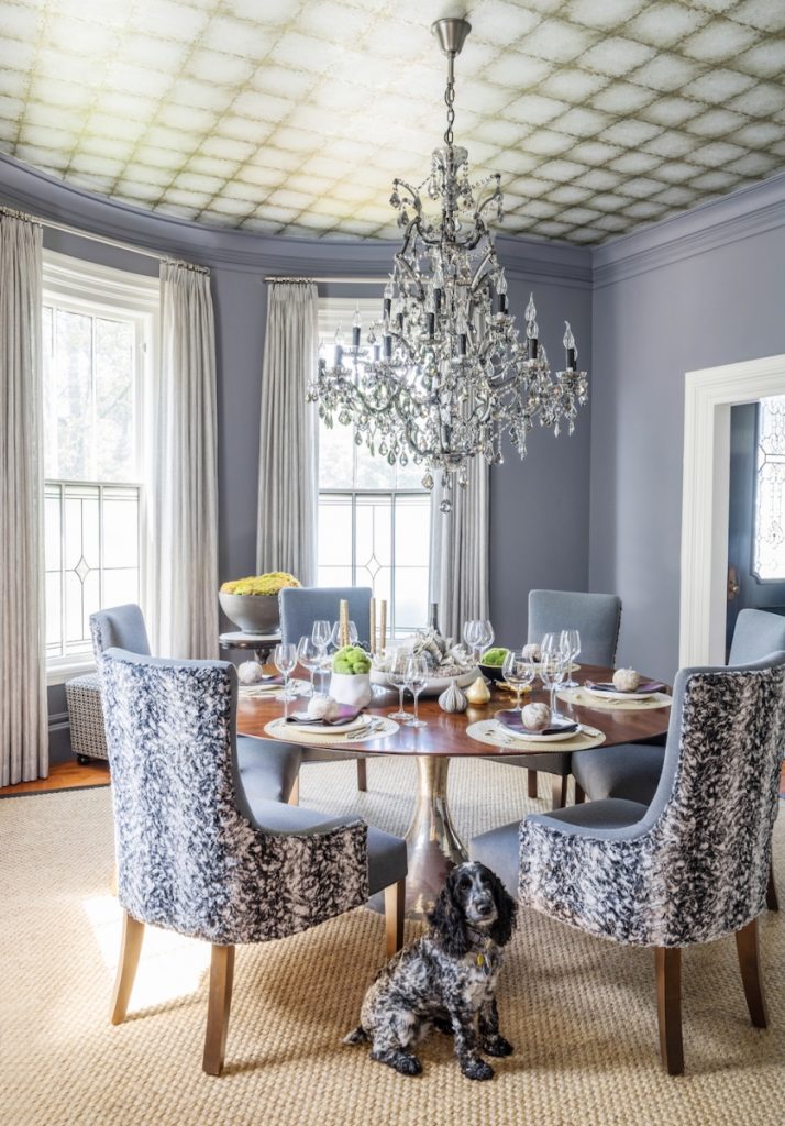
Gray is clearly the star attraction in the formal dining room—the wall color is influenced by “London Skies” by Jamie Cullum, a song that was popular in England when the family lived there. “I wanted that smoky-gray moody look,” Birke Calitri says, adding that the family’s travels are reflected in almost every room of the house, from the painted cuckoo clock from Switzerland in Zoey’s room to the formal dining table imported from England.
Designer Robin Pelissier, whom Birke Calitri brought in to consult on the project, is known for working on those kinds of personal touches in a space—and for suggesting some bold choices. In the formal dining room, Pelissier suggested using Lustre Tile wallpaper from Zoffany on the ceiling. “By wallpapering the ceiling, it shortened the room visually, giving it a more intimate feel,” Birke Calitri says.
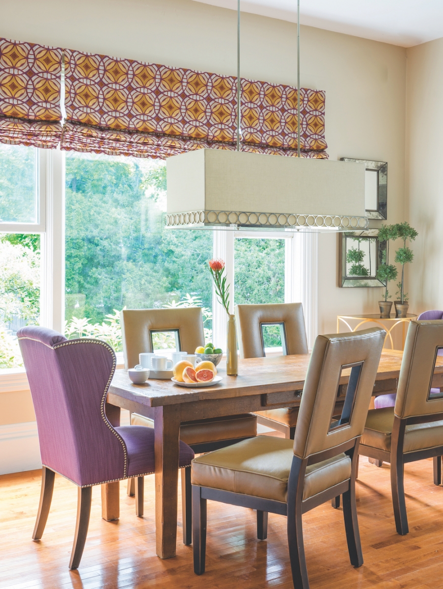
In fact, dealing with the sheer height of the ceilings has been a challenge throughout the home. “The walls are huge in this house—so much that they seem to swallow wall décor—paintings and such,” Birke Calitri says. “Robin told me to think big and bold.”
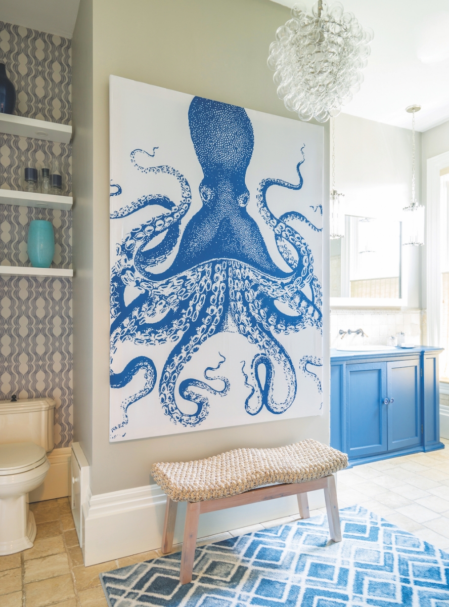
Going big and bold meant some unique wall coverings. For the kids’ bathroom, which they decided for now to update rather than gut, Birke Calitri bought a shower curtain featuring an illustration of an octopus and had it framed at a local shop, creating a striking work of art. Wallpaper behind the floating shelves over the toilet further adds a modern touch to that tricky space.
Shelving is also a highlight of the living room—crafted in a material not often seen on the North Shore. “When I was in England, I fell in love with limed oak,” Birke Calitri says. Also known as cerused oak, it gives wood a whitewashed look and is surprisingly rare around here.
“We had to find a contractor in the area who is knowledgeable about [limed oak], and it’s not easy to do,” Birke Calitri recalls. “But we did, and he did the whole thing by hand.”
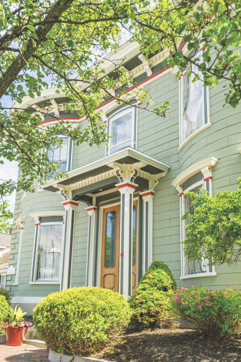
Overall, the elegant home feels open, airy, and modern—all hidden behind a classic Victorian exterior. “I love the juxtaposition of the old on the exterior and the new on the interior,” Birke Calitri says. “It’s a nice surprise.”
Robin Pelissier Design
28 North St., Hingham, 781-740-4843
robinpelissier.com
