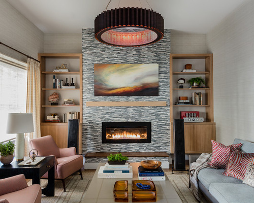
“I love modern design, but it’s important to make it approachable,” interior designer Tiffany LeBlanc says. She aims to design “rooms where you want to sink in and spend a lot of time.” Because her client was moving into a dense urban neighborhood that kisses the city limits of Boston, they decided on a sophisticated modern look to suit his city lifestyle, with layers of texture bringing in the homeyness. The designer dubs the result “homey modern.”

Townhouse 1: Michael J. Lee Photography, original photo on Houzz
Houzz at a Glance
Who lives here: A man who loves music and the city lifestyle
Location: Brookline, Massachusetts
Size: 2,800 square feet (260 square meters); three bedrooms; 2½ bathrooms
Designer: Tiffany LeBlanc
The living room’s purpose is for getting comfortable and listening to music. “This was new construction, but we wanted to get rid of everything that looked too ‘new construction,’ ” LeBlanc says. This meant wiping out the cookie-cutter stuff and tailoring the design to her client. Though she didn’t remove walls, she changed the floors, the built-ins and the fireplace surround, then layered multiple textures atop that base. Bye-bye, drywall: She covered the walls throughout the first floor in a vinyl wallpaper that looks like grasscloth. “Vinyl wallpaper is just more durable and forgiving, and this one is really beautiful,” LeBlanc says.
For the built-ins, she thought carefully about proportions and materials, floating them off the floor to make them feel more airy and stopping them short of the ceiling. “Extending them all the way up would have made them feel like they were going to topple over,” she says. The wood is a bleached walnut, and the units have integrated lighting for ambiance. The large ring chandelier adds copper overhead and helps to bring the ceiling down to a cozier human scale.
“The furniture has a Mad Men-inspired look to it,” LeBlanc says. It also adds more colors and textures, including woven wools and linens, leather and even velvet on the Turkish throw pillows. The coffee table has a wood base and a top wrapped in linen (with a finish on it for durability). The windows have two layers of textures: woven shades and sheer wool drapes. The floor is covered in a large sisal rug with an overlay.
Sofa and chairs: A. Rudin; drapery fabric: Holland & Sherry; pendant light: McEwen Lighting Studio; vinyl wallpaper: Donghia
The photo was taken from the homeowner’s favorite seat in the house: a chair placed for maximum listening enjoyment. “The most important thing in here was listening to music,” LeBlanc says. The built-ins house his sound system while speakers proudly flank the fireplace.
On the fireplace surround, LeBlanc chose a sophisticated wallpaper that gives the illusion of stacked stone without all the heaviness. “This is just the most amazing wallpaper — it’s Asian-inspired and it has little pieces of bamboo flowing through it, like little twigs,” she says.
The painting over the fireplace conceals a TV, which her client swore he’d use in here only about three times a year. (The room truly is all about the music.) “We looked into those lift systems that hide the TV behind a painting but they cost something like $10,000,” LeBlanc says. “Instead we used simple cleats to hang the painting; he’ll only have to remove it three times a year, so it just made more sense to do it this way.”
Wallpaper on fireplace surround: Romo
Townhouse 2: Michael J. Lee Photography, original photo on Houzz
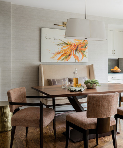
Just off the kitchen is this dining space, with a walnut-topped custom table, elegant chairs and a cozy wingback settee that serves as a banquette. “The fabric on the chairs is really textural and has a heavy weave,” LeBlanc says. “We wanted the house to be city-slick, so we went more modern with the lighting throughout the townhouse.”
Related: See more contemporary dining room sets here
Painting: Alicia Tormey via Chase Young Gallery; table: custom; banquette and chairs: Powell & Bonnell; chair fabric: Rogers & Goffigon
Townhouse 3: Michael J. Lee Photography, original photo on Houzz
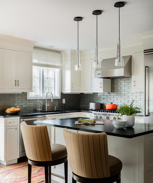
“We really wanted to set up an entertainment space in here that would also serve as a daytime living space,” LeBlanc says. The kitchen layout remained roughly the same but the look was completely redone with new cabinets, counters, backsplash and lighting. “This place is nice and bright during the day, but we had to think about how it would be at night,” LeBlanc says. Dimmers on all the lights allow the owner to switch up the mood. “I love dimmers,” LeBlanc says. “I live my life on dimmers, and so all my clients do too.”
The backsplash is glass but has a metallic look depending on the light. The new countertops are soapstone.
Pendant lights: Jonathan Browning
Townhouse 4: Michael J. Lee Photography, original photo on Houzz
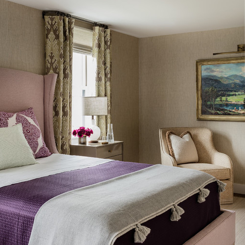
The second floor also has a welcoming guest room that features cozy textures such as a wool bed and rug and ikat window treatments in heavy linen. Pink and plum accents make the space even more inviting.
The lacquered nightstand and milk glass lamp bring in modern touches. The chair and its bouclé pillow are a comfortable spot for reading. The wallpaper is a seamless grasscloth.
Chair fabric: Peter Fasano; lamp: Schoolhouse Electric; bed: Lee Industries, upholstered in a wool by Rogers & Goffigon; wallpaper: Phillip Jeffries
Townhouse 5: Michael J. Lee Photography, original photo on Houzz
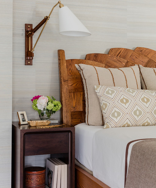
The master suite occupies the third floor, which gives the homeowner his own private space. “Everything up here is even another step more soft and plush,” LeBlanc says. The rug has a silky texture and the pillows have chenille embellishments.
“He had this bed, so the room already had its belle of the ball,” LeBlanc says. “It has so much texture and presence that we went more subtle with everything else.” The modern nightstand is walnut with routed detail, and the reading lamp combines wood, brass and glass. It can lend a soft glow over the nightstand, then be brightened and swung overhead for reading.
Light: Palmer Hargrave
Townhouse 6: Michael J. Lee Photography, original photo on Houzz
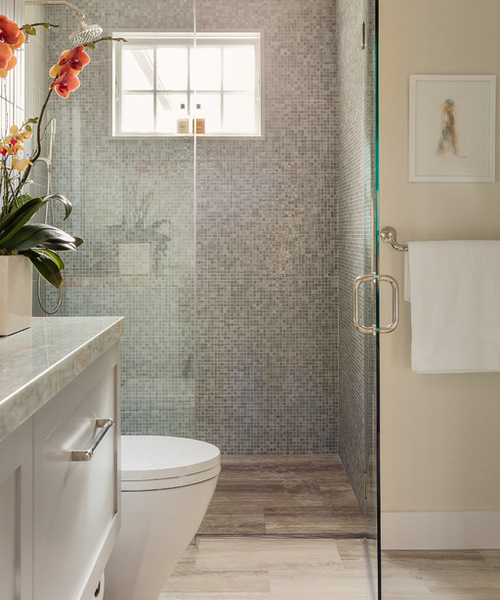
The master bathroom was a complete gut job, and the renovations make it seem much larger. The floating vanity and flush shower floor let the vein-cut travertine extend across the room in one expanse. The large-scale (12-by-24-inch) tile makes the floor space feel bigger. A small-scale mosaic in the shower adds a more lively pattern but with soothing colors. The countertop is a luxe onyx.
Related: Explore more bathroom mosaics on Houzz

