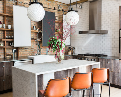
The truth is, many kitchens are created equal. But if you want your cooking space to stand out from the rest, consider one of the following small features to bring fun and function.

Kitchen 1: Aimée Mazzenga, original photo on Houzz
1. Sliding Chalkboard Panels
Designer: Anthony Michael and Emily Roberson of Anthony Michael Interior Design
Location: Wicker Park neighborhood of Chicago
Homeowners’ request: An industrial-chic aesthetic with a midcentury vibe. “The loft is housed in a former paint factory, and the kitchen needed to be just as unique as the space itself,” designer Anthony Michael says. “Our creative solution was to use reclaimed [and] repurposed industrial items while being budget-conscious.”
Special feature: Sliding chalkboard panels create a cool feature for hiding cabinet items and offering a place for jotting down grocery items or to-do lists.
Appliances: Dacor and BlueStar; ceiling pendants: Rejuvenation
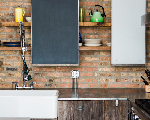
Kitchen 2: Aimée Mazzenga, original photo on Houzz
Other special features: Exposed copper pipes. Brick wall. Reclaimed-wood lower-cabinet faces. Custom island with beige Carrara marble. Commercial-grade appliances.
Designer secret: “We used industrial-grade metal ‘blanks’ for the lighting around the perimeter walls with exposed bulbs,” Michael says. “Our big splurge at $9 each was to buy silver-tipped bulbs to throw the light back and not create glare.”
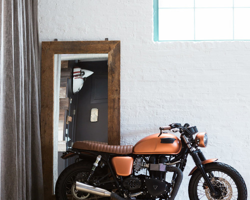
Kitchen 3: Aimée Mazzenga, original photo on Houzz
“Uh-oh” moment: “Just around the corner from the kitchen sits a custom Triumph motorcycle in the living area,” Michael says. “We hired four men to hand-carry this up several flights of stairs — not at all practical, but totally cool.”
Also on the team: Aimée Mazzenga (photographer)
2. Fold-Down Table
Designers: Husband and wife Mary Rentschler (interior designer) and John Fuller (architect) of Lake Street Studio (formerly Rentschler & Co. Interiors and Mitchell Fuller)
Location: Vineyard Haven, Massachusetts
Size: 384 square feet (35.6 square meters); 16 by 24 feet (4.8 by 7.3 meters)
Homeowners’ request: Rebuild a guesthouse in a vineyard-cottage style, says architect John Fuller, with exposed studs and sheathing boards. The space is being used as an office for Lake Street Studio.
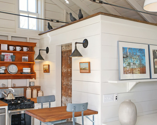
Kitchen 4: Rentschler & Company Interiors, original photo on Houzz
Special feature: A table on hinges allows the space to be used for multiple purposes with more open space. Heavy-duty industrial brackets allow the table to support heavy loads, and fit in with raw steel found elsewhere in the cottage design. The stools do double duty as seating for the central office collaboration space.
Other special features: Exposed framing. Raw steel tie rods on the ceiling. Custom cabinets. Small appliances, such as an 18-inch dishwasher and a 24-inch stove. Countertops fabricated from salvaged, vintage pine boards. Handmade sconces.
Designer secret: “Dogmatically keeping the design consistent with the vineyard-cottage style was the greatest reason for success,” Fuller says.
Also on the team: Dan Parker (carpenter); Dana Thornton Electric; Brennan Mechanical; Israel’s Plumbing; LP Simmons Concrete; Keane Excavation; Fenner Construction (site utilities); P&P Masonry (site work); Fab’s Painting; Johnny Roriz Gutters; Crane Appliance; Hearth & Patio (provided Heat & Glo gas fireplace)
Paint: China White, Benjamin Moore; stools and Scovil Brown sconces: Schoolhouse Electric & Supply Co.; range: 24 inches, Premier; doors and windows: Integrity, Marvin
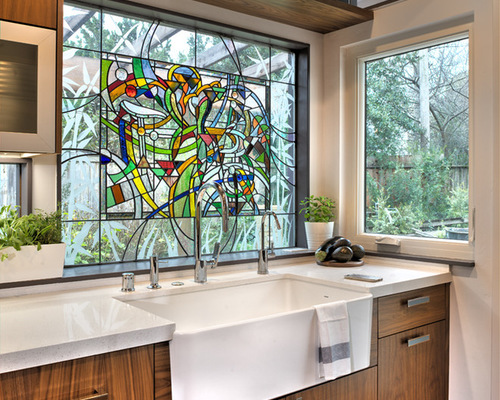
Kitchen 5: MAK Design + Build Inc, original photo on Houzz
3. Stained Glass Window
Designer: Anthony Anderson of MAK Design+Build
Location: Davis, California
Size: 200 square feet (18.5 square meters)
Homeowners’ request: “The existing kitchen was too small for their needs and too isolated from other common area rooms,” designer Anthony Anderson says. “The project was designed to allow the home to host large groups of traveling cyclists who come to the area for training and events. By relocating the kitchen in a new addition, we were able accommodate larger appliances, improve communication with other areas and create sightlines to the expansive yard.”
Special feature: Art-glass window over sink, created by glass artist Tom Medlicott, a cyclist friend of the homeowners’. The insulated, tempered glass panel incorporates etched glass, stained glass, large glass jewels and various other materials. The central portion of the panel was intended to be reminiscent of a bicycle, which you can see on close inspection, but the colors, shapes and arrangement were designed to be at home in a midcentury setting while evoking the work of Alexander Calder, among others, Anderson says.
See More Midcentury Modern Design Ideas Here
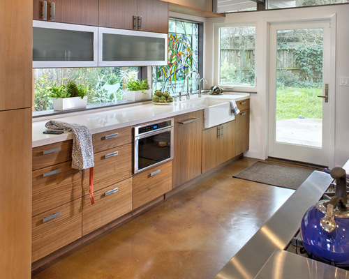
Kitchen 6: MAK Design + Build Inc, original photo on Houzz
Other special features: Large BlueStar range. Custom hood. Hidden-door pantry. Custom egg indentations routed into the stone countertops to allow eggs to be placed near the stove and sink without rolling away when the owners are cooking for a crowd.
Why the design works: “While it was important to improve connections to adjacent rooms, we did not want the massive appliances, which included 72 inches of refrigeration and a 48-inch gas range, to dominate the space,” Anderson says.
“Additionally, in ranch houses of this era and style in our market, kitchens were often partially cloistered from the expansive open plans that surrounded them. In order to preserve this feeling of connection without flooding sightlines from connected spaces with stainless steel, we created a fairly straightforward galley kitchen with the refrigeration and range facing inward. The refrigeration house was designed to stop short of the ceiling, which provided a sense of connection and allowed us to share light by not interrupting the expansive architectural clerestory glass above.”
Designer secret: “When finding or creating moments, restraint is important,” Anderson says. “Not every surface or feature has to sing or rise to the foreground, especially when you are incorporating something as dramatic as this stained glass window.
“Uh-oh” moment: “The real ‘uh-oh’ occurred when the glaziers who were creating the insulated glass assemblies from the art glass — necessary for our climate and energy code — accidentally destroyed one large panel of etched glass,” Anderson says. “Thankfully, the artist was able to re-create the work on thicker glass, which was eventually insulated and transported without incident.”
Also on the team: Kristen Gong of MAK Design+Build (interior specialist); Ken Kirsch, Matt Karnatz and Chris Kiesz of MAK Design+Build (project management); Mark Pemberton of Pemberton Engineering (structural engineer); Keith Kesser of Summit Woodworks (custom woodworker); Tom Medlicott (glass artist); Roger Kilby of CA Energy Services (HVAC); Dave Adams Photography
Cerana apron-front sink: Blanco; faucet: DXV Isle, American Standard; gas range with griddle in Brilliant Blue: Platinum series, BlueStar
?

