Today, interior designer Rachel Reider takes us on a tour of something a little different than our usual house tours. Rachel redecorated The Veranda House Inn on Nantucket, and her designs have a lot to teach us about improving our own homes. Though the historic building (which dates back to the whaling days of 1684) had its charms, the conditions when Rachel hit the scene were less than ideal for an inviting inn. Today Rachel gives advice on how to take an expected style and twist it into a unique vision, create spaces that inspire gathering and conversation, honor the past in modern ways, make small rooms feel larger, and make your bedroom a truly relaxing retreat.
Nantucket Inn 1: Rachel Reider Interiors, original photo on Houzz
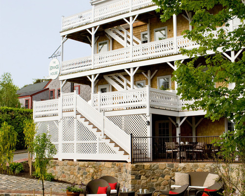
The challenge: This is the “after” photo, but upon arrival, Rachel describes “years of mismatched renovations and redesigns had left the hotel disjointed and badly in need of a cohesive design direction. Without any significant common spaces, the 19-room hotel lacked a center — a place from which a clear aesthetic direction could emanate throughout the rest of the public and common spaces.”

Nantucket Inn 2: Rachel Reider Interiors, original photo on Houzz
The plan of attack:
1. Create common spaces that would serve as an anchor for a cohesive design throughout the hotel.
2. Preserve as many of the hotel’s charming 17th and 18th century historical details as possible while updating the interior to meet the needs and tastes of the modern day traveler.
3. Build upon the existing retro chic branding in a unified and fluid way.
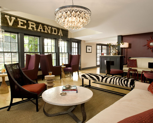
The result is a sophisticated yet inviting boutique hotel that pays homage to the property’s history. Case in Point: The vintage sign dates back to 1882 and serves as the anchor for the lounge space. “It was very important to respect the rich history of the inn throughout the design,” Rachel says. “Many of the original 17th and 18th century details such as the wide plank floors and iconic wraparound porches were restored, and the details matched throughout the inn for a consistent look and feel.”
Related: Love the Vintage Vibe? Try Shabby Chic Decor
How to build upon an existing color scheme: “We wanted to build on the retro chic branding that was the heart of the hotel’s identity. We incorporated the existing signature red and black color scheme (which they were already using in their branding materials) throughout the common spaces and added plum and neutral shades to the scheme to soften and add sophistication.”
The coffee table from Oly Studio has a metal base and a shell top. While there are different finishes available, Rachel says, “I loved how the shell top tied back in with Nantucket and in such a sophisticated way. The variation in the shell pieces is really beautiful.”
How to avoid the ubiquitous coastal theme but still pay homage to the surroundings: “We wanted to incorporate the natural beauty of Nantucket into the design plan but without being overly coastal. With textural touches harkening to the ocean and beach — sea grass rugs, a glass droplet chandelier, and rustic wood tables — we were able to tie back to the surroundings in elegant and unexpected ways,” Rachel says. “The artwork is by an artist named Molly Dee and was the original inspiration for the retro chic branding. We had these paintings in mind when developing the overall design concept.
“The coral mirror is from Dransfield and Ross and was really a jumping off point for the overall look and feel of the hotel — modern, fun, and eclectic while also integrally connected to the Nantucket surroundings.”
Nantucket Inn 3: Rachel Reider Interiors, original photo on Houzz
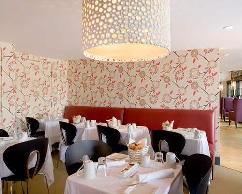
How to make a dining room modern and comfortable: “Color and texture play an important role in creating a comfortable and cozy feel in this room. I often use warm tones such as these reds and plums in dining spaces as they create a warm, inviting atmosphere ideal for entertaining. Additionally, the upholstered seating and fabric table clothes create a layer of softness which is important in a dining space comprised of mostly hard surfaces. Our goal was for guests to be comfortable so they would linger and strike up conversation with other guests. Dining is not only about food; the overall experience and environment play a key role.”
What inspired the overall design of the room? The wallpaper! “I found the wallpaper and knew instantly it was perfect for the space. You can’t help but feel happy and uplifted when you see it; it creates the ideal ambiance in a breakfast room.”
Nantucket Inn 4: Rachel Reider Interiors, original photo on Houzz
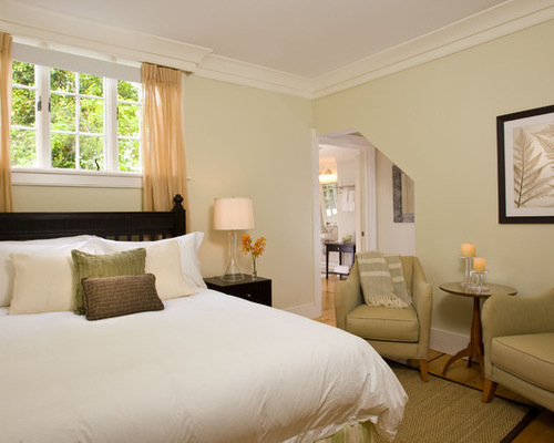
How to achieve serenity and freshen up a bedroom: “There are a few easy updates that will instantly freshen up a space. The first is paint color. It plays such a crucial role in setting the tone of a space. Here, the light green is soft and soothing creating the perfect background for a fresh and serene environment. And even better, it is a fairly inexpensive update that will make a huge impact. White linens also go a long way to brighten up a space, creating a crisp, fresh feel.”
Nantucket Inn 5: Rachel Reider Interiors, original photo on Houzz
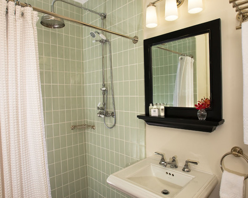
How to make a tight bathroom feel larger: “There’s a ceramic glazed tile from Waterworks available in a variety of colors and sizes. For a small space such as this I recommend a smaller scale tile which makes the space feel larger.”
Related: How to Choose the Best Bathroom Tile
How to make a bedroom look stylish with ease: “In the bedroom, function and mood are paramount to developing a design plan. Think about the mood you want to set and tie that into your color palette and overall design direction. Is this a relaxing and serene space or is it bold and glamorous? Determining this is a great starting point.
“Function should also be an important consideration. I always ask clients to think about how they want and need to use the space and then design around that.”
Why you should try to incorporate a seating area in your bedroom: “Not all bedrooms are large enough for a seating area, but if possible it is a great addition. A seating area creates another space aside from the bed to read a book, watch TV, converse. This is especially important in a hotel where your guest room has to function as your living room, office, and bedroom. The hotel owners drilled it into my head that every room had to have at least two seats which was not an easy feat to accomplish!”
Nantucket Inn 6: Rachel Reider Interiors, original photo on Houzz
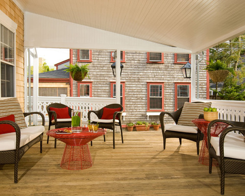
Where to begin when designing your outdoor spaces: “You should think of an outdoor space like a room! It is important to use furniture and fabrics appropriate for outdoor wear and tear but then layer in more comfortable accents like cushions, throw pillows, and even a rug. There are so many great sunbrella fabrics to choose from, allowing you to have a lot of fun with an outdoor space.
“I also like to break up furniture sets, creating a more unique feel, so while the chairs and sofas are from the same collection the tables are a complete departure in both material and color. Look for pieces that complement each other.”
Thanks so much to Rachel Reider for sharing her design secrets and advice with us today. It’s a great time of year to start clearing out our homes and sprucing them up with a bit of boutique hotel chic. Why not start with your bedroom today?

