Gary Leopold had two interests: drives around the Berkshires, in western Massachusetts, and midcentury style. Those subjects intersected in a 1,600-square-foot Cape Cod cottage in Williamstown. The compact home was built in 1949 on a site blessed with views of rolling hills, but if you wanted to see the idyllic landscape from inside the house, you had to hunt for it. There were just a few small windows at the rear of the house and no back door. Leopold enlisted Andrus Burr of Burr & McCallum Architects to open the home to the outdoors and make it atomic-age awesome.
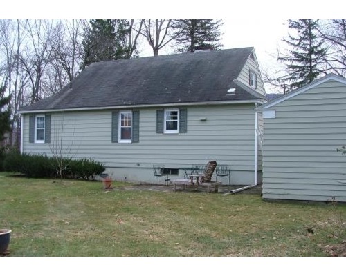
Williamstown 1: Before Photo, original photo on Houzz
Houzz at a Glance
Location: Williamstown, Massachusetts
Who lives here: This is a vacation home for Gary and Kim Leopold.
Size: 1,600 square feet (148 square meters); 3 bedrooms, 2 bathrooms
BEFORE: It was as if the home had turned its back on the view.
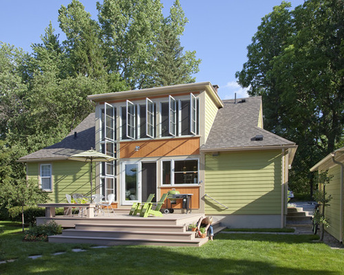
Williamstown 2: Peter Vanderwarker, original photo on Houzz
Photos by Peter Vanderwarker
AFTER: A shed-roof addition opened the house to the outside, making way for a larger master suite upstairs and letting natural light flood the house.
“The house was sweet and had midcentury charm, but it was dark and grim,” Burr says. “We kept it the same in front but blasted open the back. When you see it, it gives you a little frisson of surprise.”
That little frisson becomes a big thrill when you look through the large windows and see the landscape that enamored Leopold.
The front of the house remains much the same. “It’s the kind of house you find all around this area,” Burr says.
The new color palette first reveals itself on the outside, with an avocado-green exterior that hints at the fabulous ’50s colors on the inside. When asked if he had to research shades popular at the time, Burr laughs. “I didn’t have to do research; I lived it, and I remember the colors,” he says.
Classic Shades of Green for the Exterior
The side door is a feature on many Williamstown homes. “Around here we call this the back door,” says Burr, who lives just down the road. “This is the door everyone comes to. The only time you would use the front entry is on a formal occasion.”
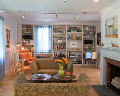
Williamstown 3: Peter Vanderwarker, original photo on Houzz
Leopold probably doesn’t remember the era, but Burr says his client is enamored of that time period. “He purchased most of the furniture and consulted us for some of it,” he says. “Most of the pieces are vintage.
In the powdery-blue living room, Leopold’s collection is on full display. “This is a room that’s used for entertaining,” Burr says. “There was just one arched doorway leading into the kitchen. We added another one just like it on the other side of the fireplace to improve circulation.”
The room includes quirky items, such as a 1950s-era television. “It’s a great-looking piece that is like an art object,” Burr says. “Gary loves those things.”
TV Stands to Prop Up a Vintage Television
The shelves were already in place, and they make a great display place for Leopold’s books and other collections. The track lighting is new. “We avoid putting in can lights,” Burr says. “To me this kind of lighting feels more substantial and solid.”
Leopold’s collection ranges from important pieces of modern photography to vintage toy cars and robots. They add to the period flavor of the home.
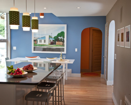
Williamstown 4: Peter Vanderwarker, original photo on Houzz
The dining room opens to the kitchen and is painted sky blue.
In one corner the ceiling has been carved away, letting in light from the floor-to-ceiling window and making the upstairs master bedroom a loft space.
“This made a huge difference in the space,” Burr says. “Before, it was so dark it was oppressive. Now it feels happy and comfortable.”
Williamstown 5: Peter Vanderwarker, original photo on Houzz
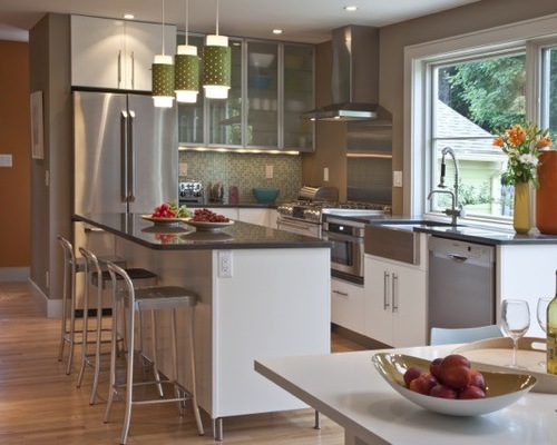
They outfitted the kitchen with Ikea cabinets dressed up with Caesarstone countertops. “We used the cabinets in an interesting and creative way,” Burr says. “They ended up costing $9,000. You can easily have new cabinets that cost $60,000.”
Two bedrooms are downstairs. One is a guest room and is furnished with a classic midcentury bed and modern photographs. “These rooms are almost unchanged,” Burr says. “We just updated the windows, color and furnishings.”
Williamstown 6: Peter Vanderwarker, original photo on Houzz
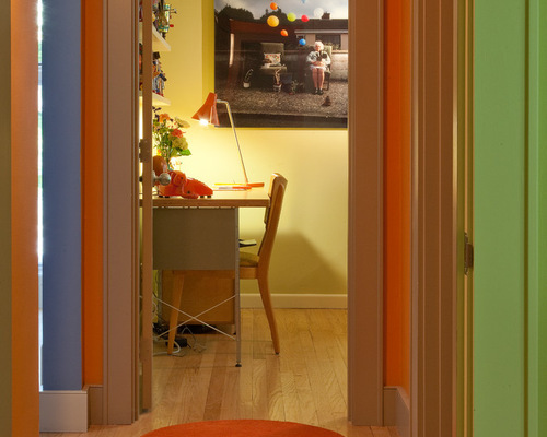
Glimpsed here from the hallway is the other bedroom on the first floor. It’s outfitted as a home office and study.
“The study has a great robot display in it. He had a lot of these pieces but before this had no place to display them,” Burr says.
Williamstown 7: Peter Vanderwarker, original photo on Houzz
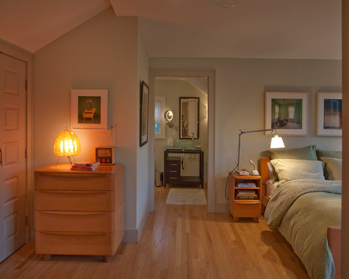
Upstairs the shed-roof addition allowed for a new master suite and bath. “The angles of the ceiling make it interesting,” Burr says. “And there’s so much light, it makes the small room feel larger. I think the best thing about it is that it allows you to wake up to views of the mountains.”
One end of the bedroom, now a loft space, overlooks the dining room and a triangular window.
The finished house straddles the line between midcentury and contemporary. “We wanted to be sympathetic to the original house and honor Gary’s love for that era,” Burr says. “In the end we added excitement to what was a very typical house.”

