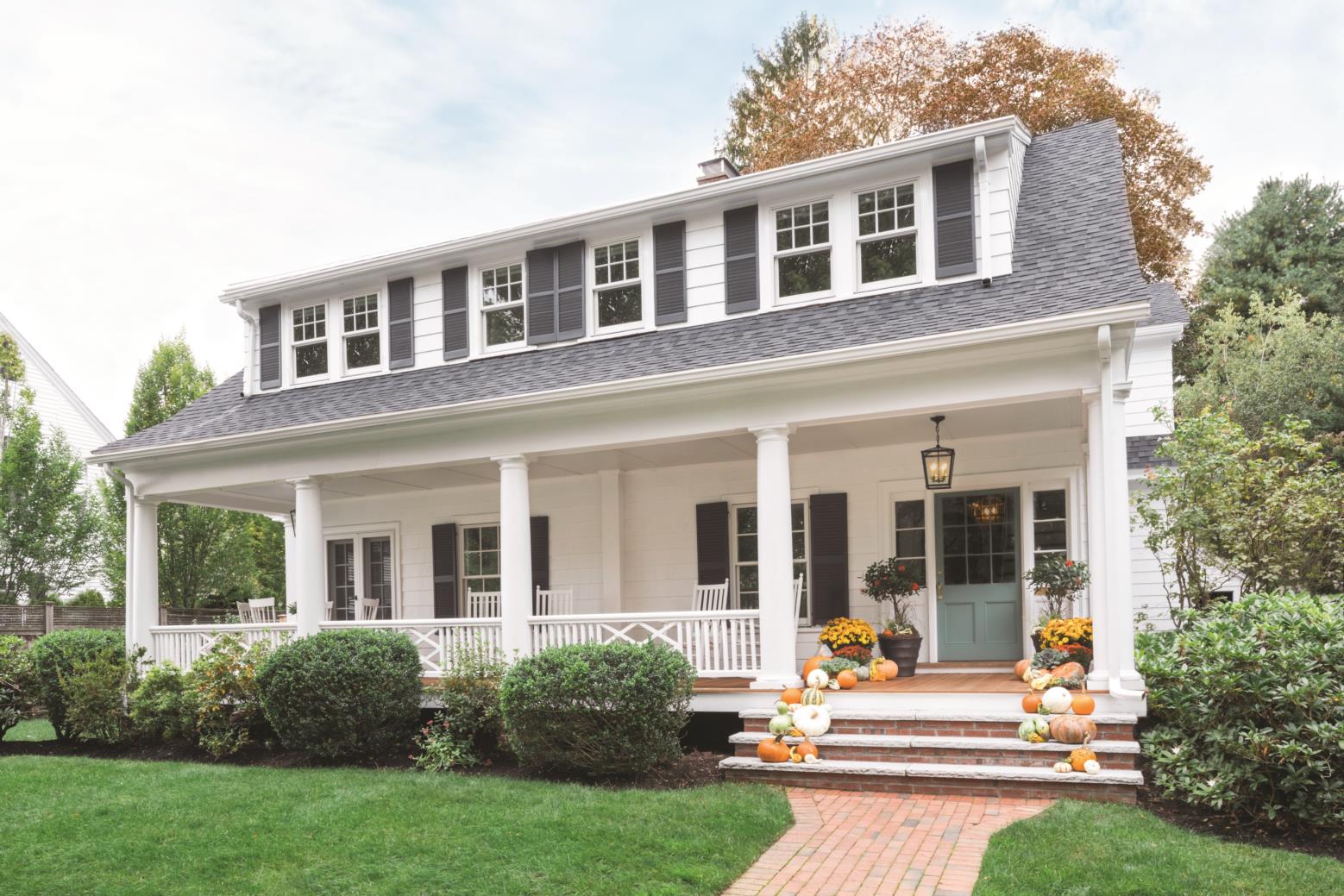
Liza and Peter Kugeler lived in the Dutch Colonial they bought on a quiet street in Winchester with their two sons, Benjamin and William (now 10 and 8, respectively), for a year and a half before they called architect Mathew Cummings to help revamp the spaces. “We wanted to get our sea legs before we made any decisions,” says Liza, an interior designer who studied in Denver and worked in Boston before moving to this house in 2014.
In that year and a half, they realized they wanted to celebrate the charm of the 1915 Dutch Colonial, but also reinvigorate it for the modern lifestyle of their family. “The intention was to bring fresh, modern ideas to the space, while ensuring the comfort and easy living,” says Liza. They didn’t want to change its overall footprint, which at approximately 3,700 square feet feels spacious without being grandiose, but the kitchen was dark and awkwardly set between a formal dining room and a not-quite-right den with a breakfast nook off to the side. Plus, they wanted a mudroom, a pantry, and a master suite upstairs.
According to Cummings, whose Cummings Architects is located in Ipswich, “the overall problem was that the house didn’t connect with the outside space,” which includes a square yard out back. Instead of trying to rework the first-floor rooms where they were, his solution was to move the den to the dining room and extend the kitchen to include the old den near the back of the house, where windows overlook the yard. “I had that thought from the day that I walked into the house and met the family,” says Cummings. “Sometimes it happens on day one; it doesn’t always, but that’s the vision I had that day.”
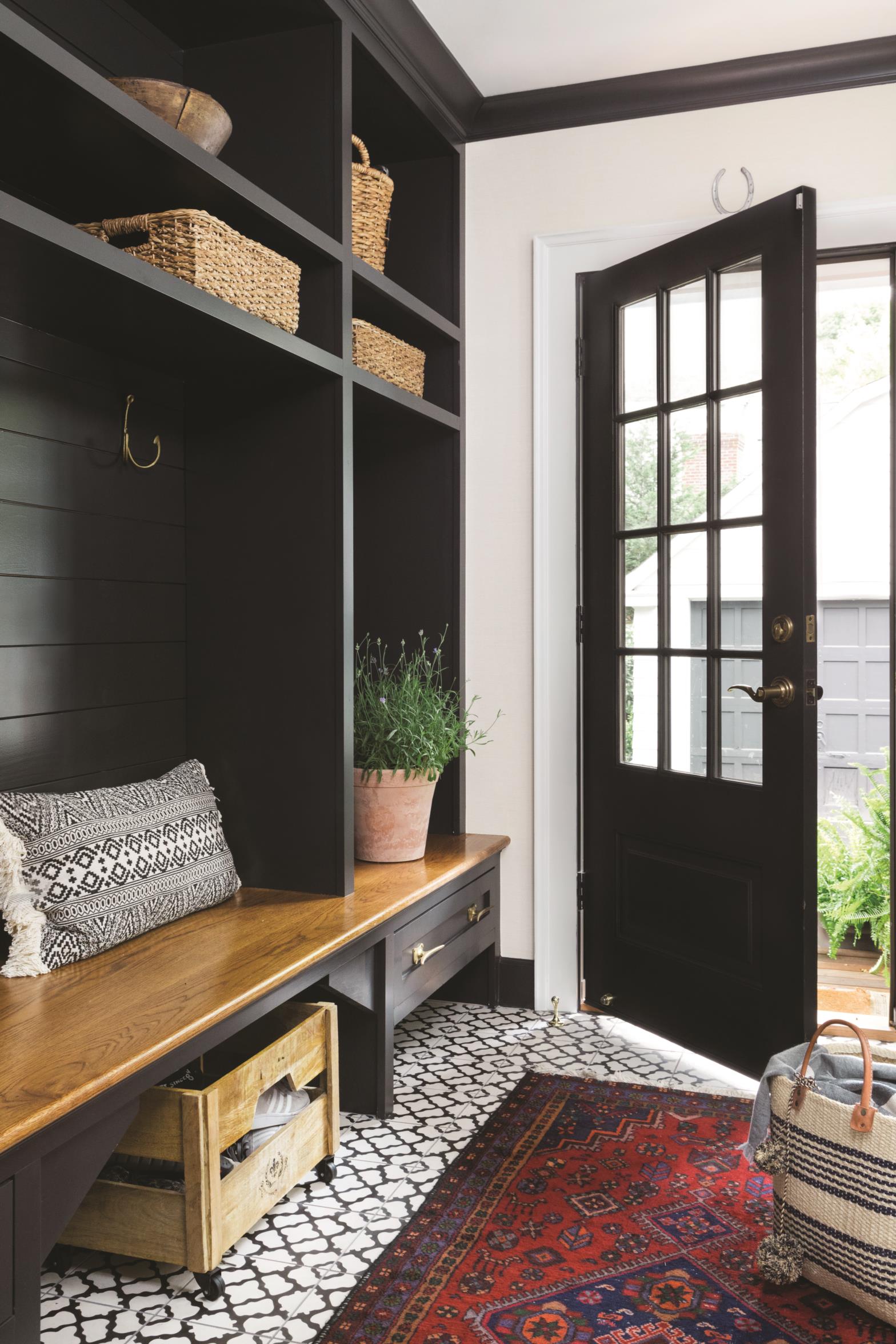
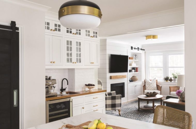
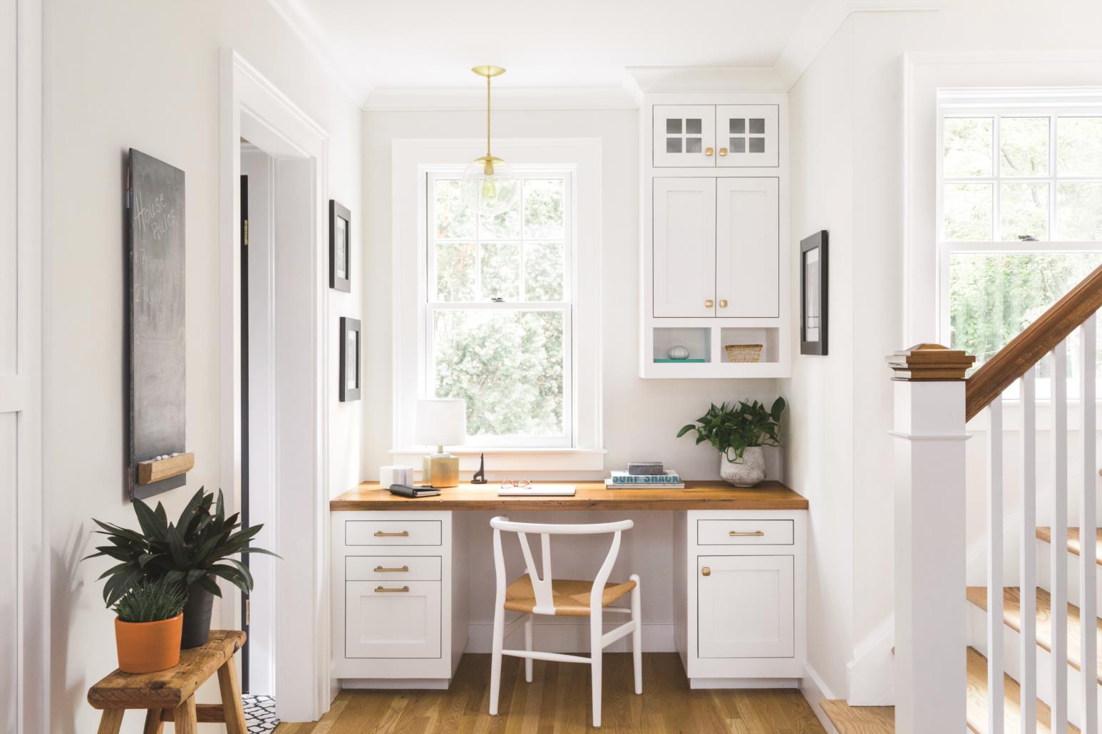
Since the dining table was relocated to one side of the larger, front-facing living room, they had space to carve out a mudroom and replace a small side door from the driveway with a larger entrance at the back corner. This entry point relates better to the detached garage and allows storage for the family and “drop space for the kids,” Liza says, referring to the jackets, boots, and other gear inevitably shed upon entering. A sizable pantry and coffee station are set into the kitchen’s interior wall, and a desk was built into the spot the old side door occupied. Though the powder room was redone with striking glossy black woodwork, its location stayed charmingly under the staircase.
Liza enjoyed the process so much that a few months after the renovation was finished, she founded Realm Interiors in 2017 with friend and neighbor Laura Ogden (who also underwent a home renovation around the same time). “The business was born from an incredible friendship and love of design,” says Liza.
While designing her house, she concentrated on three main themes: a black and white palette, layering textures, and mixing metals.
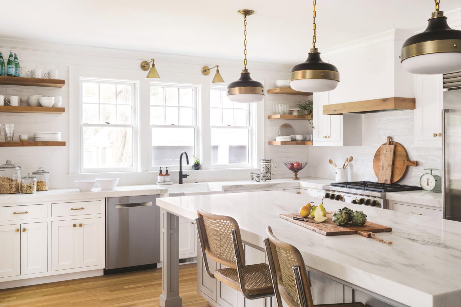
White walls with black accents in the form of doors, faucets, and light fixtures fulfill the first theme and make the rooms feel instantly cohesive. Second, textural details add depth and include white shiplap in the family room, pantry, and hallway and reclaimed wood selected from Longleaf Lumber in Cambridge, which pops up in the open shelving, range hood, coffee station, and desk area. The chalky appearance of the black barn-style pantry door is achieved with milk paint, and the cabinetry, fabricated by Ipswich Cabinetry of Ipswich is white, playing off the gray of the island, which is topped with a hefty 2-inch-thick piece of honed marble.
Of mixing metals, Liza explains how she used “punches of different finishes”—antique brass, stainless steel, matte black in the kitchen alone—to tastefully create a balance. “I find it to be a very appealing look,” she says. “To overdo one specific metal on everything, I would tire of that.”
Shawn Cayer of Windhill Builders of Ipswich worked with Liza and Cummings on all the details. “A lot of features were custom designed,” says Cayer, “which we worked collaboratively on in the field.” He names the reclaimed wood applications as an example, as well as the walk-in master closet with its impressive arrangement of built-ins.

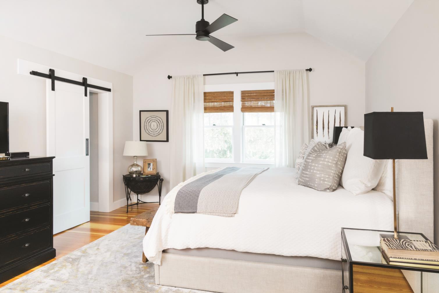
In order to fit the closet and a new bathroom, which features a stunning double vanity made with reclaimed hemlock and spruce, around the master bedroom at the top of the stairs, the space had to be slightly bumped out over the back porch, a massing that Cummings designed to look like it’s always been there. “It’s fresh and new, but it’s still derived from historical context,” says Cummings. “If no one said ‘This is new,’ other than a fresh coat of paint, no one would know that it’s not original to the house.”
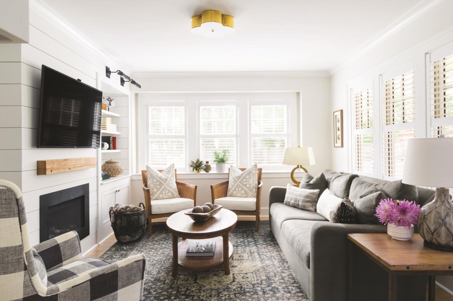
The Kugelers feel historical charm and modern living have been combined seamlessly. “He accommodated our hopes and dreams but kept the beauty of this home true to itself,” says Liza of Cummings, whom she describes as a master of historical architecture.
In turn, Cummings commends the family for being good communicators. “Most people think the architect gives you a design and the drawings, but it’s important that the client and architect communicate well together,” he says. “If you try at it, you can end up with something really, really wonderful, and that’s what happened at this house.”

