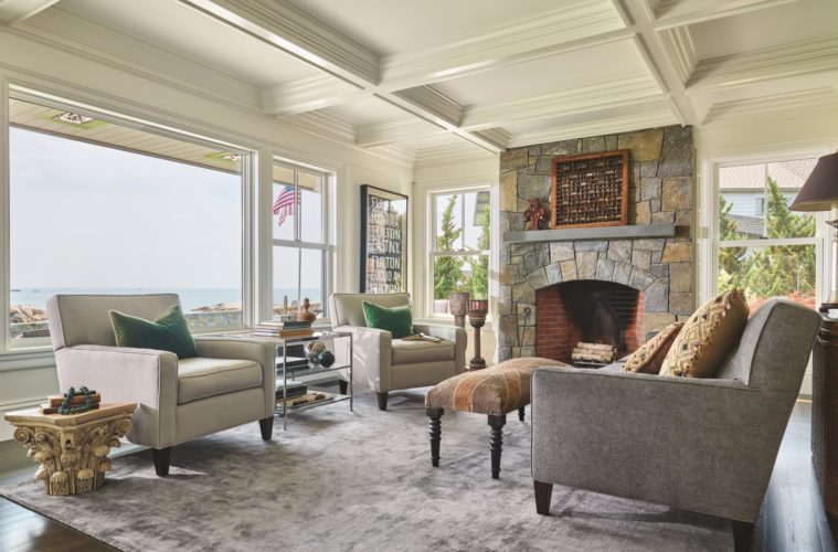
A new shingle-style residence by SV Design channels the spirit of a classic coastal home while addressing the needs of modern day living
Facing the Atlantic Ocean full-on, the North Shore coast was once a lookout spot for fishing fleets and for pirate and enemy ships, both British and French. Today, private residences are privy to the same unparalleled vistas—views that architect Tobin Shulman praises as nothing less than “phenomenal.” Artistically craggy rock masses cluster in the foreground, while islands sprout among the whitecaps farther out.
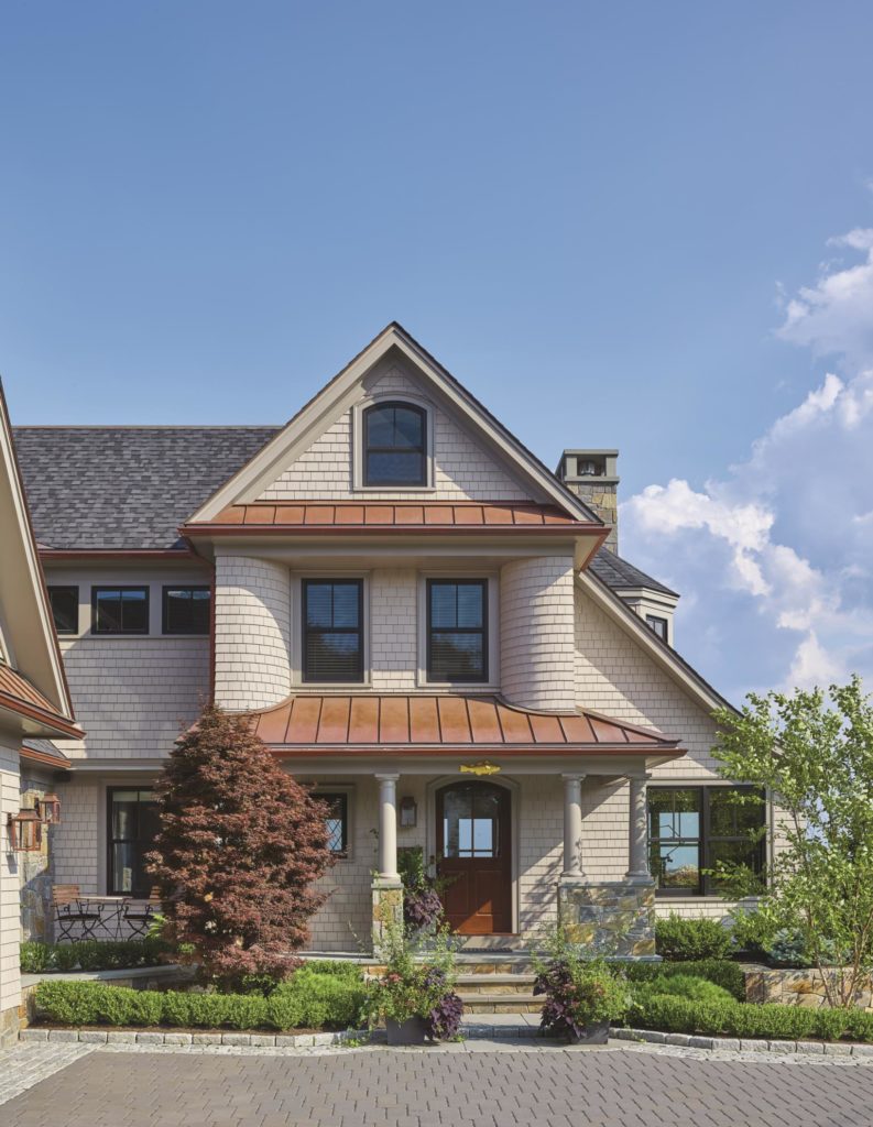
It’s hard to imagine that homeowners here haven’t always capitalized on their enviable vantage point, but lifestyles were different in decades past, as were a homeowner’s priorities, points out Shulman, a principal at SV Design in Beverly. Tapped to execute a replacement for a behind-the-times teardown, the architect says his goal was “to take advantage of everything the site had to offer, but also have it be a functional home for contemporary living.”
In contrast to the original home—a central-entrance Colonial with low ceilings and other obstructions to the views—the new Shingle-style residence with four bedrooms and four and a half baths celebrates its magnificent location. All the living spaces, indoor and out, are oriented toward the ocean side. While there is an attached three-car garage, its well-considered placement allows passersby a glimpse of the ocean, something that the original freestanding garage thwarted. From the home’s front entry, one can gaze all the way through the house to the ocean.
A classic summer architecture
Seen from the rear, the house tells a different story. “We opened up the glassiness on the back, where the views are, whereas the front is slightly more traditional in approach,” observes Shulman. A large picture window is paired with traditional double-hung windows for ventilation, below which an octagonal bluestone patio widens in one corner for a sitting area, and then narrows to accommodate a pair of chaise lounges before ending in a more secluded area for grilling and eating.
In their design for the house, SV Design prioritized an organic flow between inside and outside, a hallmark of contemporary living. Generous patio space, multiple large windows and glass doors, decks, and a “secret garden” provide a strong connection with nature. Shulman says that although it was technically challenging to achieve, it was worth the effort to have a house where anywhere you are, you can step outside and have a view. The homeowners, he says, “love that aspect of the home.”
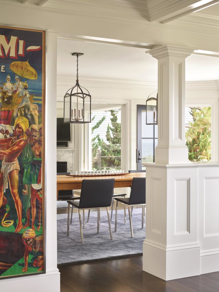
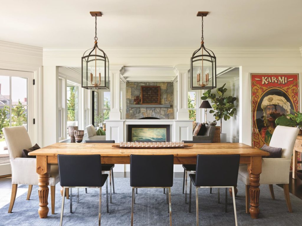
The main living expanse consists of the kitchen, a dining space that seats eight comfortably, and a “snug,” an intimate den-like room. These three areas are open to one another, yet there is delineation where one ends and another begins, like the half-wall divider between the living and dining spaces. “I think people want their homes pretty open,” says Shulman, “but most don’t want to live in a bowling alley. They want subtle ways to indicate this is where you eat, this is where you live, this is where you might watch TV, have a conversation.”
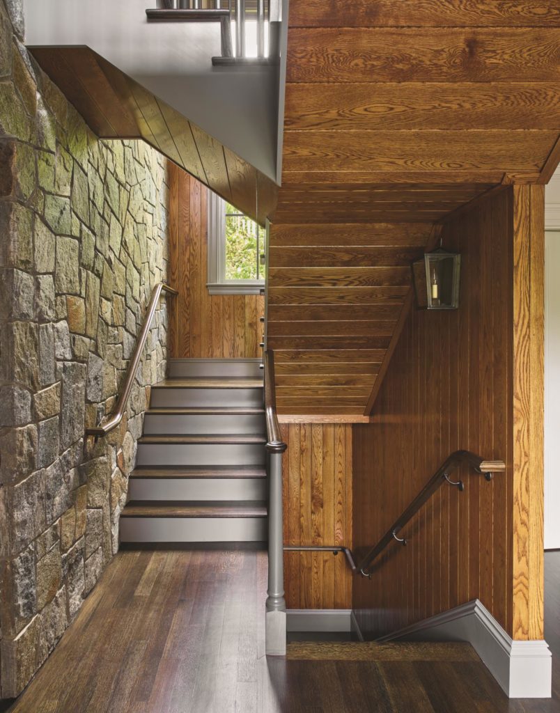
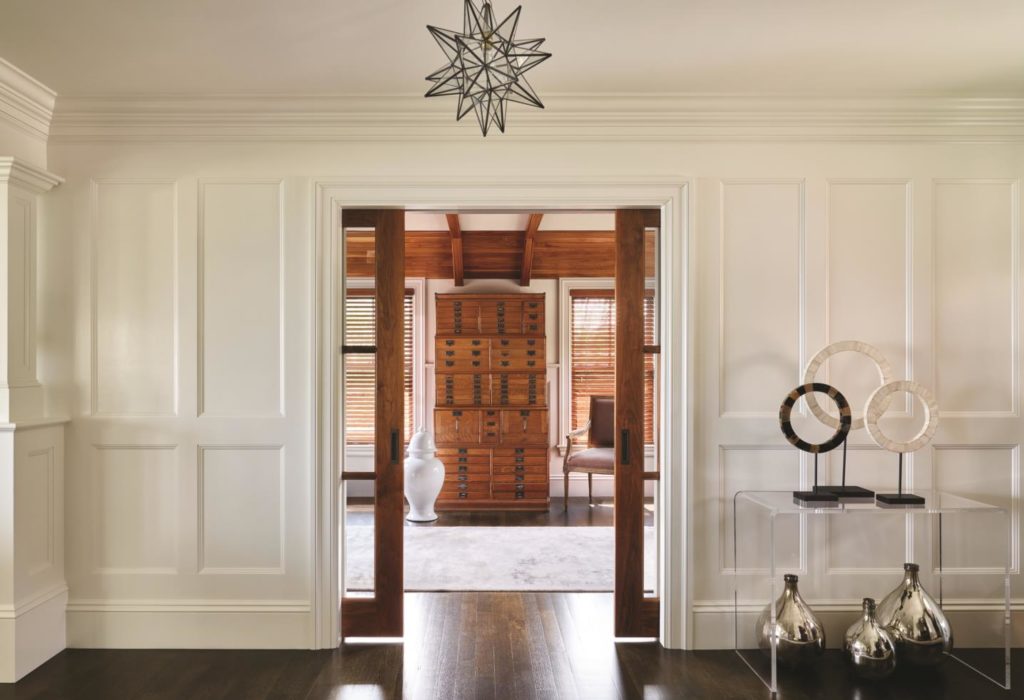
The interiors are clean-lined but not starkly modern. “We know it’s a contemporary house, but we gave it some old-house features that work,” says Shulman. These include natural wood, paneling, and a high level of trim on the crown molding. There are walnut accents in the coat alcove, an arched, paneled portal in the transition space between the foyer and the kitchen, and a coffered living room ceiling. The homeowner led the selection of furnishings and colors. As the owner of an interior design and home accessories business, she tapped into her personal collection of beautiful art and objects to give the home a personal, eclectic feeling.
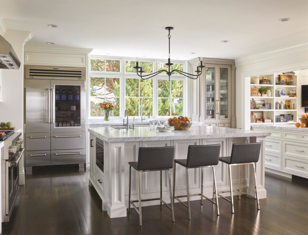
She was adamant about having a “clean, uncluttered kitchen,” says Shulman, but she
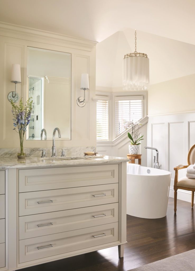
The same can be said about the master bedroom, where the bed sits in a cozy, paneled alcove that is open on one side to a cathedral-ceilinged sitting area. In the master bath, popping up the ceiling over the soaking tub allowed the placement of a light fixture to accentuate the spot. “In the private living spaces, the dial went to slightly more contemporary,” says Shulman. “[The home] is still clean-lined, still classic, but not Star-Wars modern.”
This is a home where the old world and the new coexist in harmony. “There’s a spirit to some of the traditional architecture, especially the classic coastal summer homes, that is still good, and it makes sense to introduce that spirit in a way that works for the way we live now,” says Shulman. “I like to think that some of the solutions we came up with for this house are ones that earlier architects would have come up with had the people lived the way we do today.”

