Creativity is key in turning this peculiar Newburyport house into a luxe retreat
Uniquely sited on a long, narrow lot in the heart of Newburyport’s downtown district, the house belonging to landscape designer Amy Fleischer and her husband is nothing short of inspired. The couple purchased the distressed property somewhat spontaneously, with a total renovation in mind. With help from landscape architect Trent Lloyd, they devoted themselves to transforming the humdrum home and oddball site into a garden oasis.
Fleischer and Lloyd—principals of Lloyd Fleischer Landscape Design—have been collaborating for over 10 years. They share a passion for “design that connects people to their own personal slice of nature,” which means this property fell into the right hands.
Though the 1800s house doesn’t have known historical provenance, it’s thought to have been a small barn or outbuilding belonging to one of the large neighboring homes. “There were no significant architectural features—it was very nondescript,” notes Fleischer, adding that when the contractors started gutting the house, they found some unusual structural elements. Also unusual was its elevation—nearly five feet above grade. That gap between structure and ground proved pivotal when it came to designing the landscape.
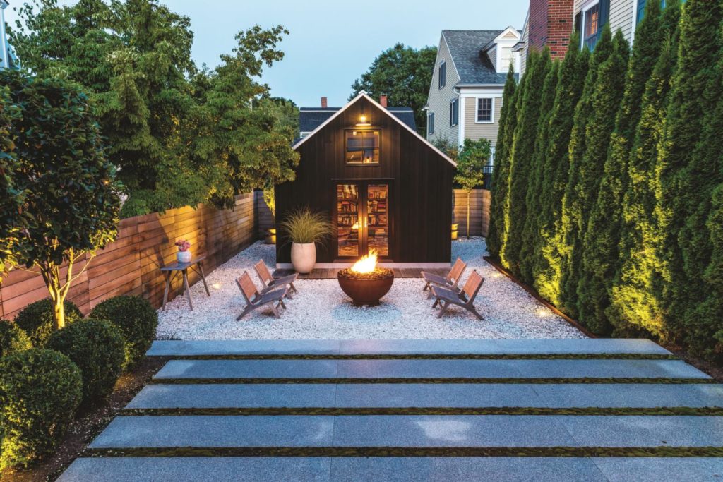
Set 60 feet back from the street, the house occupies a unique site in the densely populated neighborhood. At the back of the house, the challenge was to create privacy in the face of a looming condominium building that flanks one side of the property. Measuring 60 feet deep by 25 feet wide, the backyard is actually larger than the 1,400-square-foot house’s first floor. That created a design opportunity. Much like Frank Lloyd Wright’s use of a compression-and-release strategy, whereby some spaces are intentionally made to feel tight in order to make others feel large, Fleischer capitalized on the dimensions of the indoor and outdoor living areas. The design, she notes, “gives us a feeling of expanse from inside the house.” Views of neighboring trees, a church steeple, and a slice of sky enhance the feeling.
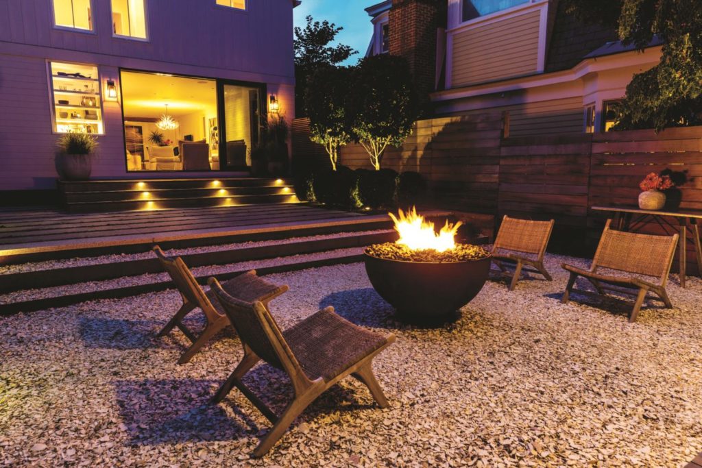
Because the backyard was so deep and the drop in elevation so steep, the transition between the house and the yard was critical. To make a comfortable connection, Fleischer used Ipe decking, six-foot granite slab steps with Bryum moss seams, and crushed clam shell to create a terraced descent from the 12-foot-wide floor-to-ceiling glass door into the landscape. “[Addressing] the change in grade was a strategic calculation,” Lloyd explains. “Terracing down makes the small space feel much bigger. It also adds interest. If Amy had kept it flat, it would have felt static.” The design elements combine for a “treehouse effect,” as Fleischer describes it. She notes, too, that the limited materials palette was meant to echo the modern simplicity of the home’s interiors.
“I didn’t want the feeling of sitting in a hole,” says Fleischer of the grade change’s potential effect. The proportions of the shed, which serves as her husband’s writing studio, were important in this regard; it couldn’t look like a dollhouse. Instead, the appropriately scaled studio anchors the outdoor space and contributes to its intimacy. It was also important to orchestrate the space such that people would feel connected to, rather than distanced from, the house.
Of the design plan, Fleischer says her aim was to use traditional materials in a contemporary style. As with the hardscape materials, she kept the plant selections to a minimum. “I wanted to see green and feel nature’s embrace, so on one side of the yard, we planted 12- to 15-foot mature ‘Smaragd’ arborvitae. This lush green wall completely transformed the space, making it feel private.” That choice was a direct response to the unsightly condominiums.
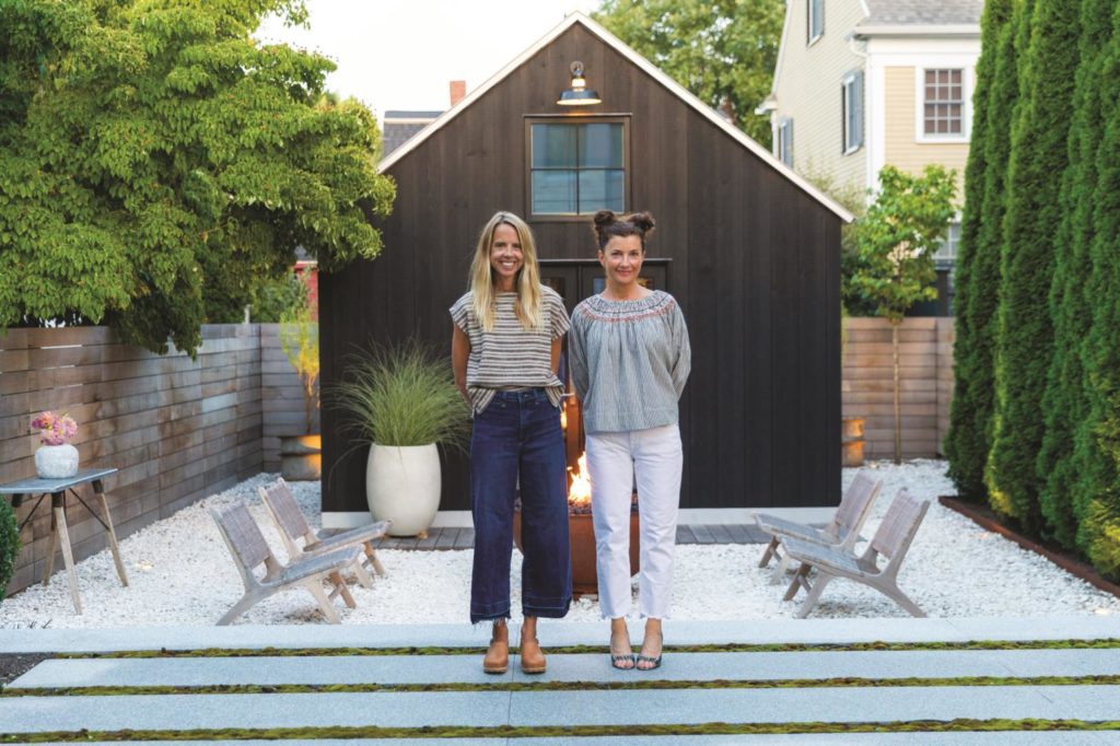
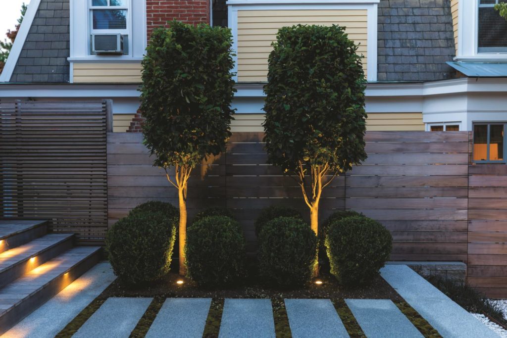
Rather than repeating the arborvitae, which would have created an enclosure, Fleischer welcomed the sight of the neighbor’s dogwood tree and architecturally interesting roofline. To round out the planting, she went with tightly clipped ‘Green Mountain’ boxwood and small Parrotia persica trees. There are also a few potted ornamental grasses to add movement and generally soften things a bit. “The simplicity of the planting allows the space to breathe,” notes Fleischer.
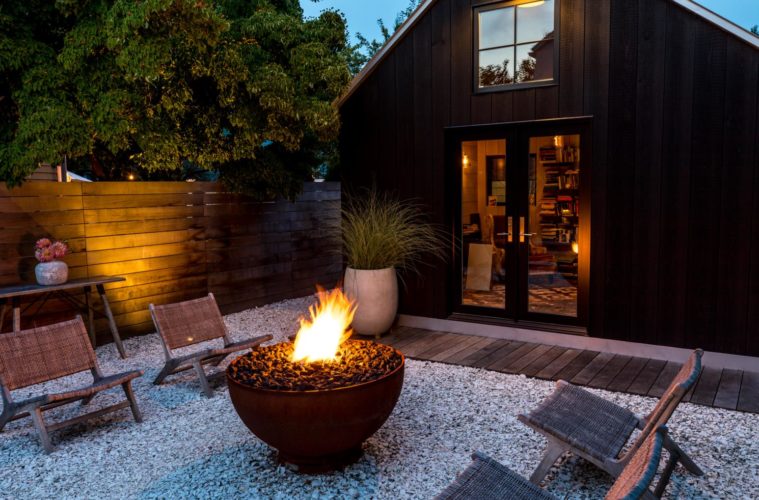
At the center of the gathering space is a custom-fabricated 36-inch Corten steel fire bowl, which the designer and her family use year-round. “We are big believers in adding elements like fire and water, because they really enliven a space and offer a sensory experience,” says Lloyd. “We think about people being able to walk around a fire freely.” Hence the reason moveable furniture is key to their designs. “It helps create a more open space so you don’t feel constrained,” Fleischer adds.
Asked if there were any other notable challenges to the project, Fleischer points to the lot’s orientation—it’s essentially a zero-lot-line property. They had barely three feet of access way to the back. Consequently, they needed to facilitate careful communications with three sets of neighbors. “We had to be smart about the construction management process,” she says. They also planned ahead—two of the fence panels on the back and one on the side were built to be removable.
The end result is a study in well-executed contrasts. As Lloyd puts it: “Amy’s design is simple and bold—white and black, grounded in green.

