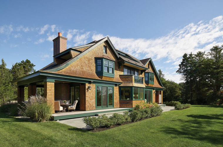
One of the charms of living on the North Shore is the proximity to the ocean. So when a couple hired Lexington–based Morehouse MacDonald and Associates, Inc. to build them a classic Cape Ann Shingle-style home in Gloucester to enjoy with family and friends during the summer months and occasionally off-season, the project began by maximizing the water views.
“Before we tore down the existing house, we needed to do a mockup for the client in terms of how the views would change were we to build the house at a certain angle,” says associate principal Anthony M. Frausto, AIA, LEED AP, the lead architect on the project. “So we put a very large ladder up on the roof of the existing house, and then we climbed up this ladder and took pictures, because that was the proximate level of the new second floor for the new house.” It was a brilliant idea that allowed the couple to envision what they’d see outside the windows of their new home. Suffice it to say, they liked what they saw.
With the newly angled 4,600-square-foot footprint in place, Frausto and his team began to concentrate on the home’s design. Shingle-style residences are one of the firm’s fortes; the style was popularized by notable architecture firms such as McKim Mead & White, who built many of the seaside cottages in Newport and Long Island. “It’s a style that gives you a lot of freedom, but there are some essential ingredients,” says Frausto. On the exterior, “the rooflines are very important, so for this house we created slung twin gables that peak on both sides.”
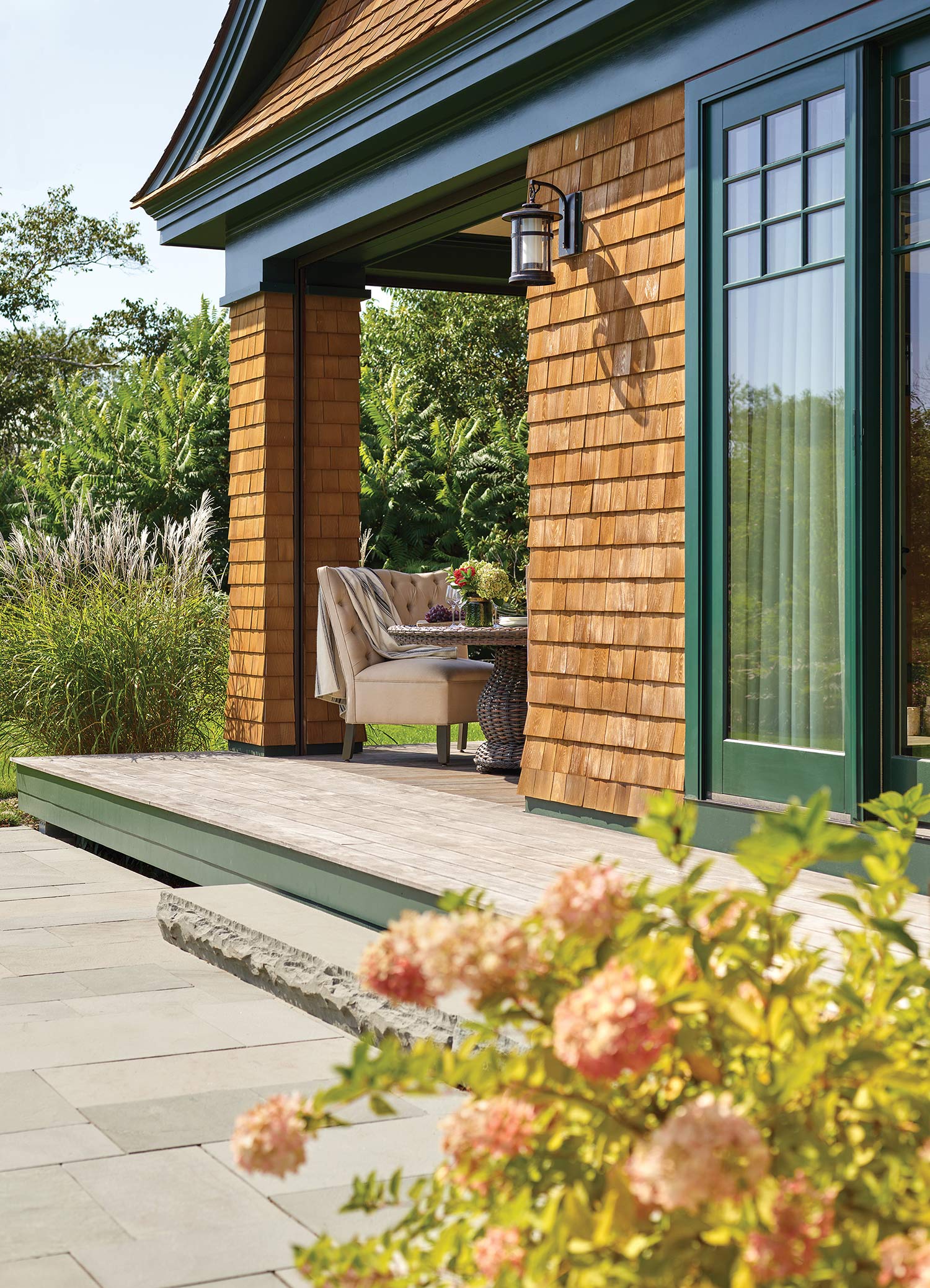
Since Gloucester’s zoning code prevented Frausto’s team from creating a true ridge along the roofline due to height restrictions, they gave the illusion of one by placing the chimney on the side of the home, which hid where the hips rose up and didn’t quite meet. Then they stained the shingles a warm honey-brown and painted the trim hunter green, typical of the Shingle-style homes traditionally found in Newport and on the North Shore. The green trim also wraps around the roof ends to delineate where the roof ends and the first floor begins, thus breaking up the height of the home, another distinct characteristic of the Shingle style, along with an outdoor porch, which gives the couple a place to relax outside and includes roll-down motorized screens to keep out bugs during the warmer months and a wood-burning Harvard brick fireplace for when it gets chilly.
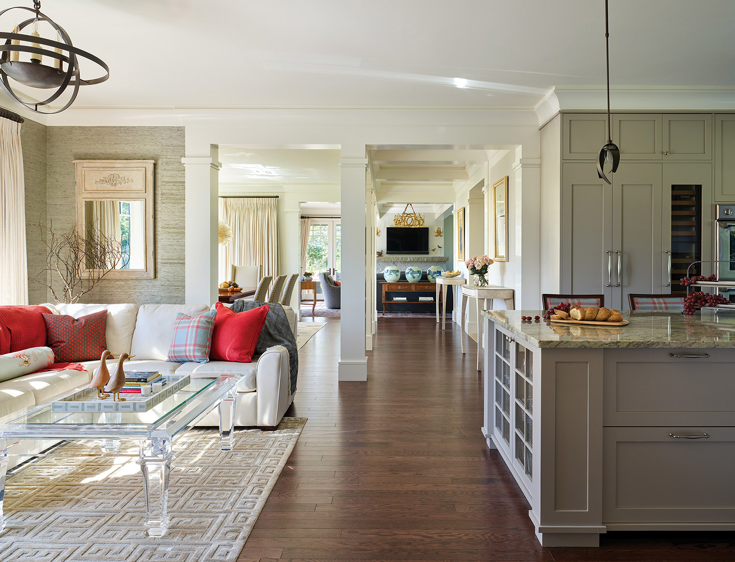
The home’s ample interior space includes a playroom for extended family on the third floor along with an office with a curved eyebrow window that looks out onto the ocean. There are three bedrooms and a den with a porch off it on the second floor and plenty of shared spaces on the first, including a seating area at one end of the kitchen nicknamed “The Starbucks Zone,” where guests can relax with coffee in the morning and family and friends can hang out together anytime, especially when the wife, who loves to cook, is preparing meals.
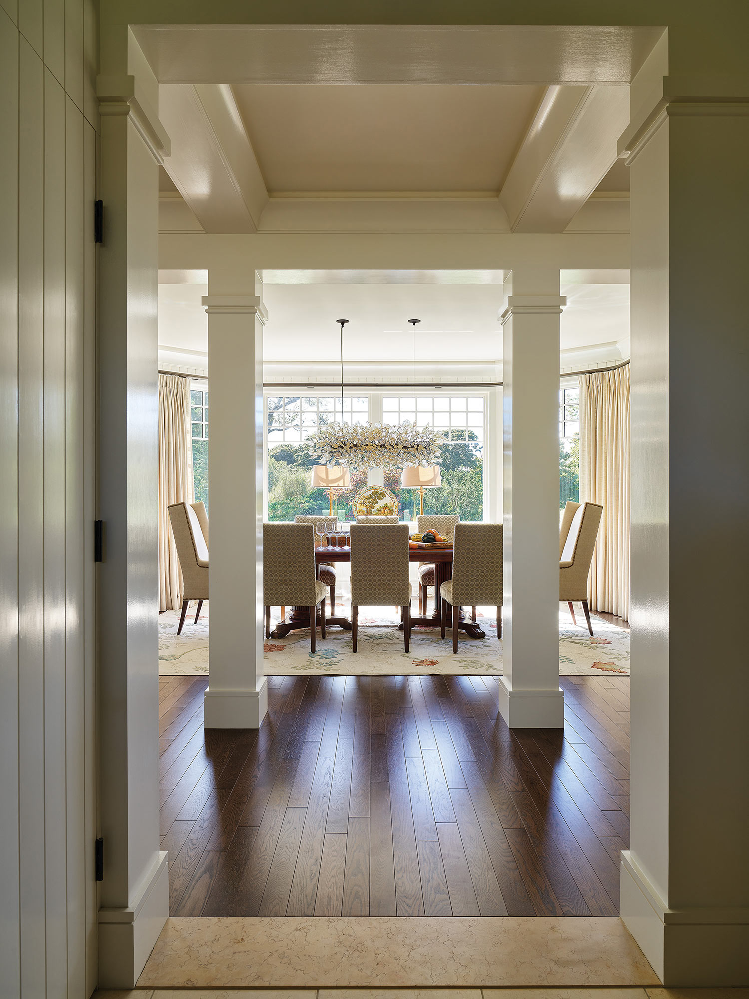
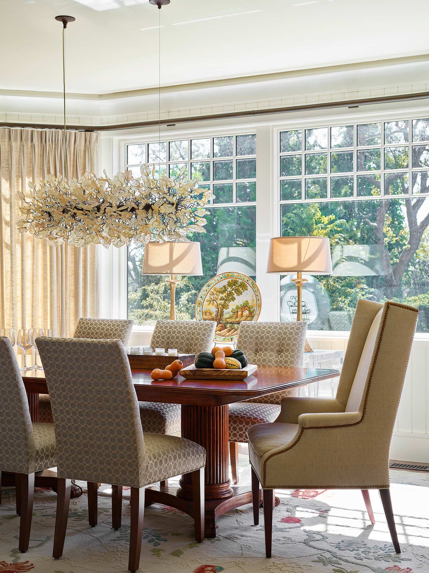
“They wanted a house that was open and flowed, but didn’t necessarily have an open floor plan,” says Frausto. “So the plan has visual continuity but clear delineated edges, like in the dining room, which is framed on one side by interior columns.” An abundance of windows with the mullions pushed up high, typical of Shingle-style homes, allows light to flood in, while dark-stained white oak floors and four gas fireplaces lend a sense of snugness. And while the home’s lines are crisp and clean, it has plenty of historic detail, like lofty ceilings, substantial crown molding, an abundance of shiplap, a tray ceiling in the master bedroom, and even a ballast pattern on the outdoor Juliet balcony railing off the second-floor den.
This clean yet detailed aesthetic was reflected in the owner’s choice of décor. “They wanted this house to be more sophisticated than a typical beach house, so the challenge was finding that sweet spot between being sophisticated and a place that someone can sit anywhere in the house in a wet bathing suit,” says the couple’s longtime designer, Abby Welling Forstall, owner of Rockport-based Embellishments Interior Design and Décor. “The client also wanted a very calming house that had lots of ambiance but also felt cozy and warm, since it was going to be used in the summer as well as holidays and weekends in winter.”
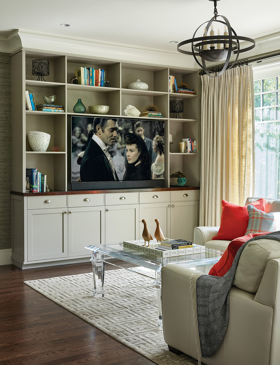
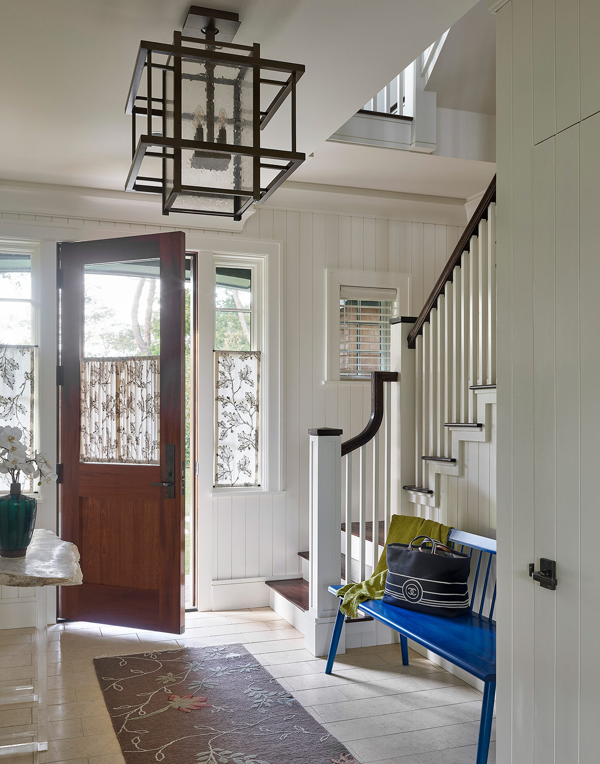
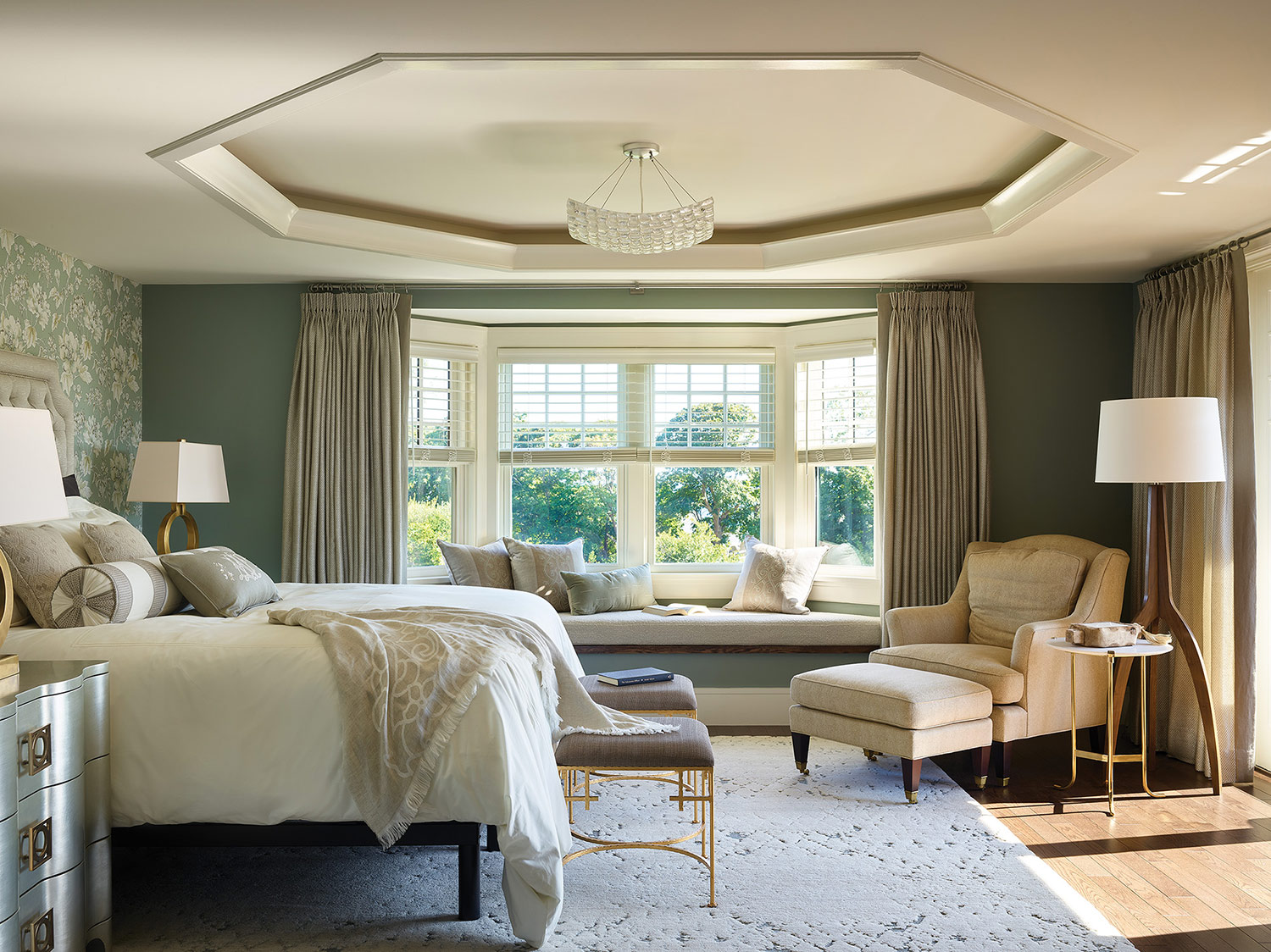
To achieve all this, Forstall used a neutral color palette throughout the home to keep attention on the dramatic ocean views. The entry has off-white shiplap walls with a complementary cream stone floor, perfect for wet boots on a rainy day. A fog-gray finish adorns the kitchen cabinets, while a soft green-gray grass cloth in the adjoining “Starbucks” area adds warmth. An organic touch runs throughout the home in the form of natural materials and animal appointments, like the metal bird sculptures on the stone mantel in the living room, the whale cotton pillows in the second-floor den, and the leopard chairs in the third-floor office, where a little giraffe sits on the desk. “I make sure elements tie across rooms,” says Forstall, who also threaded touches of ocean blue throughout the house via her color choices for upholstery, pillows, rugs, artwork, lighting, and paint colors—pastel blues and greens for the master bedroom and navy blue to add punch to the third-floor playroom.
Draperies proved to be one of Forstall’s biggest design challenges, not only for managing the sun, but also in maintaining views. The dining room with its bay window, for example, required a custom-made rod with four angles to allow stacking on adjacent walls. Delicate, almost sheer, drapes in beige linen were used throughout the first floor. But in a nod to practicality, most drapes in the house have a sturdy leading-edge accent, so any visiting guests can simply grab them and pull them shut without damaging the fabric.
The family’s love of hosting guests led them to think about ways to expand their space in the future. Morehouse MacDonald and Associates, Inc. Architects has already designed a garage with a large room above it that can connect to the main house. The firm also has left enough room in the second front entrance near the driveway to build a staircase (to that garage loft space), for which only one wall would require modification. Additionally, they designed an outdoor area to accommodate a jacuzzi and firepit when the time comes.
But for now, the couple is simply relishing their new home that they call On-A-Cove (because it is), which they had carved into the stone mantel in the second-floor den. “They are beyond thrilled,” says Forstall, who helped come up with the home’s name. “They were so happy with the architect and how smoothly the project ran.”
“We continue to get really great feedback from the client that they love their house,” says Fausto. In fact, he adds, “One of the best things we can hear from a client is that they want to move on to phase two. And this couple is interested in doing that.”

