New England’s residential architecture and design has a rich history and distinct vernacular. In this summer issue, we share with you some of the Institute of Classical Architecture & Art’s New England Chapter’s 2020 Bulfinch Award winners. The ICAA is the leading nonprofit dedicated to advancing the classical tradition in architecture, urbanism, and their allied arts. It does so through education, publication, and advocacy and offers programs that are designed to promote the appreciation and practice of classical and traditional design, including classes, travel, lectures, and conferences. As the vice president of this wonderful chapter, I would like to share with you some of the best traditional work from architects, designers, and landscape designers in New England.
Residential (New Construction) over 5,000 SF
Hendricks Churchill for “Oblong Valley Greek Revival”
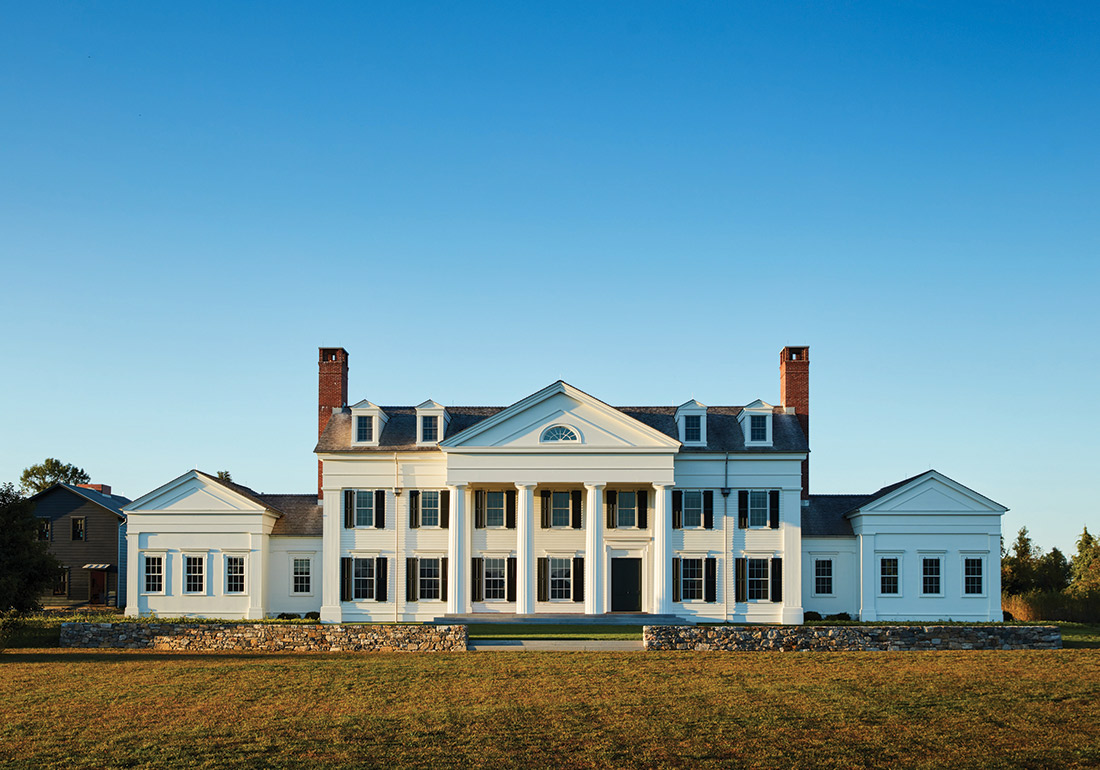
Two years in the making, this regal Greek Revival country house is the work of Connecticut-based Hendricks Churchill. Located in the Hudson Valley, on the upstate New York line, it is the firm’s response to what the clients desired—namely, a house with a sense of history. The goal was to design a classically influenced structure that remained understated in its composition and detailing. “It was important to them that there be a precedent,” explains principal Rafe Churchill. “We went up and down the Hudson Valley looking at historic houses and other structures, including local churches, which helped us resolve a lot of the details on this house.”
The stately front portico is what people respond to immediately. Churchill feels the eight dormers on the third story play a key part in the livability of the house; they belong to the bedrooms, which enjoy the best view from the house. The east and west wings are devoid of the pronounced architectural details that distinguish the main house; they are intended to be pared down relations that support rather than detract from the primary volume. They lack shutters and have flush board siding rather than clapboard, which Churchill says helped to prevent the structure from being overwhelming.
The interiors are more open than would have been found in a historic house of this style. “They wanted to be able to live in the house without it dictating their lifestyle as an old house would,” says Churchill, noting the unembellished millwork. The crown molding, baseboards, and ceiling treatments are simpler and lean more contemporary than the exterior might suggest. This is notably on view in the kitchen. “The goal was to show some restraint and maintain the understated appearance that is hinted at on the outside,” Churchill explains. Rigorous attention to proportion and style resulted in a tailored build that, while referencing its historic forerunners, is more suitable for a modern-day family.
Residential (New Construction) under 5,000 SF
G.P. Schafer Architect for “Summer Cottage in Coastal Maine”
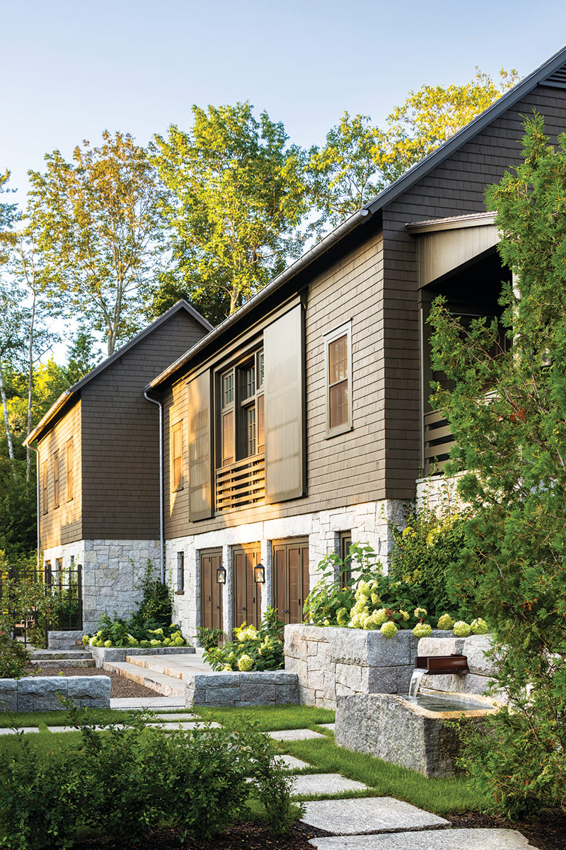
Located in Camden, Maine, this 3,300-square-foot cottage is reminiscent of a bank barn, given the way it tucks into the terraced hillside site. Additional buildings include a 650-square-foot meditation studio and an 800-square-foot garage/bicycle shed. All are organized around a center courtyard, where a granite trough serves as a reflecting pool. The arrangement is meant to recall a small farm compound that might have served the original turn-of-the-century estate. “The property was recently subdivided,” explains Gil Schafer of G.P. Schafer Architect, “and this lower lot that our clients purchased has a sloping topography that rises up from the street. Given there were houses on either side, we thought it important to shelter the experience of their site from the adjacent suburban context.” To create privacy, the architect focused views inward toward the courtyard, thus drawing attention away from the nearby street.
The cottage proper houses the main living spaces, which include a show-stopping entry gallery, a timber-framed great room, a lower-level guest suite, a mudroom, and laundry/storage spaces; the kitchen and master suite are on the upper level. “This split-level design allows the cottage to take optimum advantage of the site and allowed room for garden spaces on each level,” Schafer notes. Though evocative of a New England farm, a Japanese influence is detectable; it is seen in the form of a granite fountain set along the steps leading to the upper lawn terrace, as well as the painted screen on view in the entry vestibule. Choice materials and fine craftsmanship are on display inside and out, making for a rich tapestry of honorable details.
Residential (Restoration, Renovation, or Addition)
Patrick Ahearn Architect for “Nantucket Sound Overlook”
This 1888 Shingle-style waterfront home by Boston architect Horace Frazer is part of Cape Cod’s early development. The house had undergone a number of iterations, so the team began its resurrection by removing all of the add-ons not endemic to the original structure. Its renovation entailed lifting the massive 6,300-square-foot building and lowering it onto a new foundation. “In order to preserve the house and the integrity of the structure, that’s what we needed to do,” says principal architect Patrick Ahearn. Though a Herculean undertaking, it did create an opportunity to add a lower level.
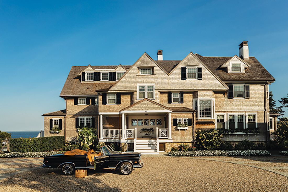
The house did not have a good presence from the road, as there wasn’t a defined front door and many of the details—such as the shutters and window boxes that warm the façade—didn’t exist at the start. The arrival was formalized and enhanced by the addition of a motor court, centered on the portico, and two carriage houses, one of which serves as a pool cabana. Additional changes to the front elevation included new Chippendale railings, window patterns, and chimneys; and the entire structure was reshingled.
On the interior, minor changes were made to the floor plan to open the kitchen to the family room. “We preserved the overall character throughout, including the existing fireplaces and significant millwork, and we introduced higher-end finishes to improve the aesthetic of each space,” Ahearn explains, noting that they reworked the circulation pattern too. Rather than a series of small rooms and pantries, they created a gathering space without changing the volumes. “We saw this as an opportunity to bring back the essence of the grand country house using the bones of the old house,” says Ahearn, adding that careful editing of the original architecture and the introduction of thoughtful new elements resulted in a thoroughly reimagined property.
Interior Design
Lisa Tharp Interior Architecture + Design for “Back Bay Brownstone”
“The main objective was to honor the client’s leanings toward minimalism and contemporary style within the historic envelope of an 1860s Back Bay brownstone,” says designer Lisa Tharp. The goal was to realize a fresh, streamlined take on a classical architectural style, evidenced in the bolection molding panels, among other details.
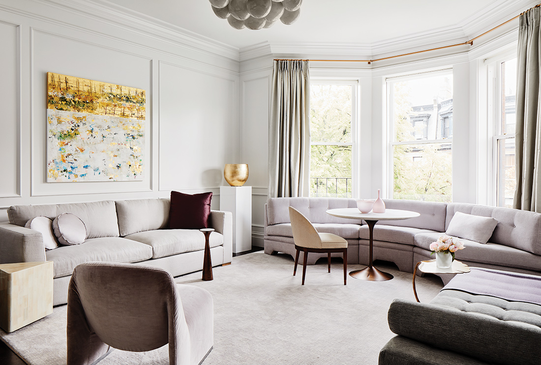
Tharp relied on a mix of furnishings spanning two centuries. Traditional treatments such as silky wool draperies and fluted mahogany caseloads pair with vintage and custom pieces by the firm. She also went with an all-white palette in order to showcase both the furnishings and the architecture. “The white creates almost ethereal backdrop, and a dark floor grounds the space,” the designer explains. “Every piece stands in sculptural relief. It feels like a celebration of clean lines, regardless of the era from which the works emanate.”
Such a spartan milieu called for warmer accents, which Tharp added in the form of artworks and brass and gold accents. “We wanted the eye to travel and find some warm hits in all of the cool,” she notes. Special mentions include the way in which both bay windows were handled. Tharp describes the upholstery in those spaces as “fluid,” and says the soft draperies call attention to the height and proportions of the rooms. The custom banquette is meant to function as both a casual dining space and a lounge area.
The architect expanded the staircase up to connect to the roof deck and added a new head house clad in copper. Tharp punctuated its skylight with an Art Deco style pendant light, stating: “It didn’t need a lot because the architecture is so strong.”
Landscape Architecture
Dan Gordon Landscape Architects for “Pond’s Edge Estate”
After more than a hundred years, this Chestnut Hill property was overgrown and its systems were not sustainable. Enter Dan Gordon Landscape Architects. His firm was tasked with rejuvenating the gardens in the spirit of the neighborhood’s traditional character. (Views of the private gardens were historically enjoyed by all manner of passersby.) “We wanted to create a landscape with private outdoor spaces for the family to enjoy, while allowing views into the gardens to preserve the community tie.”
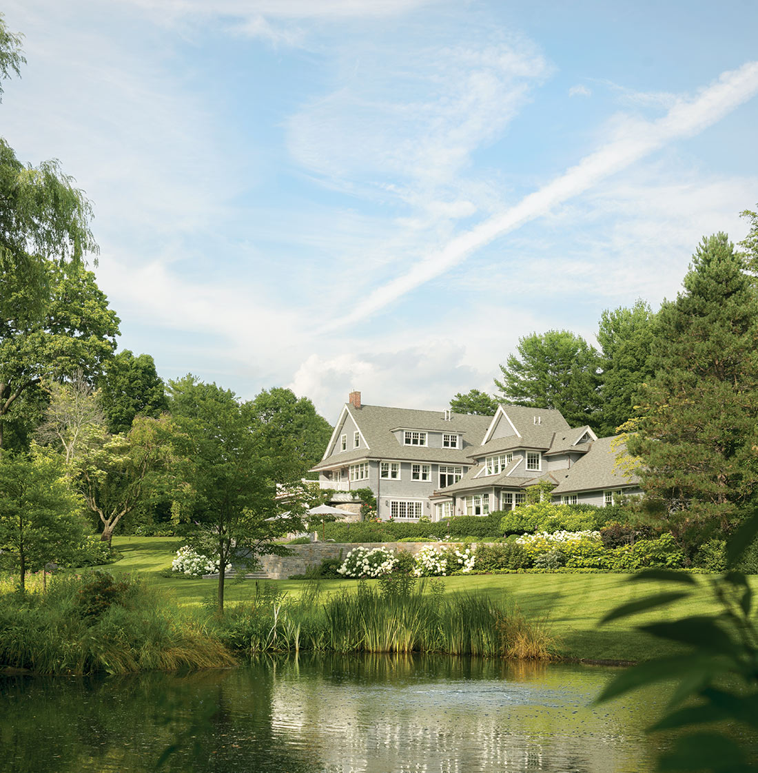
Of course, the house’s presence played into the design program, too. Gordon’s idea was to reconnect the existing early 20th-century architecture to a thriving landscape—portions of which are cultivated, others left more natural. The team preserved mature heritage plantings, and removed what would impede the design. “There were a lot of little gardens that we took out to make the broad gestures more successful,” Gordon explains.
An existing pond was dredged and rescaled to become, in combination with a wetland meadow, the focal point of the garden. Today it is a healthy and sustainable natural ecosystem. Terracing the steep site was key to maximizing the views and creating outdoor living spaces. There are roughly 20 feet between house elevation and the pond. “We had a lot of program to put into that space,” Gordon notes, adding that each of the oval-shaped terraces is like a balcony focused out over the landscape. Architectural stonework is featured around the house, while hand-selected natural stone characterizes the pond.
Asked for closing thoughts on the project, Gordon replies: “Pond’s Edge Estate reflects the aspirations to preserve and enhance New England’s natural and cultural heritage by creating well defined, humanistic, outdoor spaces, while embracing conservation ideals for their function and aesthetic benefits.”
