Interior designer Andra Birkerts is drawn to the unexpected. She uses the element of surprise to energize spaces, generate conversations, and nudge entrenched sensibilities.
When a client approached her about building a summer home in Rockport, Birkerts welcomed the opportunity to immerse herself in the vernacular of the town’s rustic coast. She had worked with the couple once already on their home in Chestnut Hill and was familiar with their style inclinations. She knew that the well-traveled, career-oriented pair—with a love of art, interior design, and architecture—didn’t want a standard New England beach retreat.
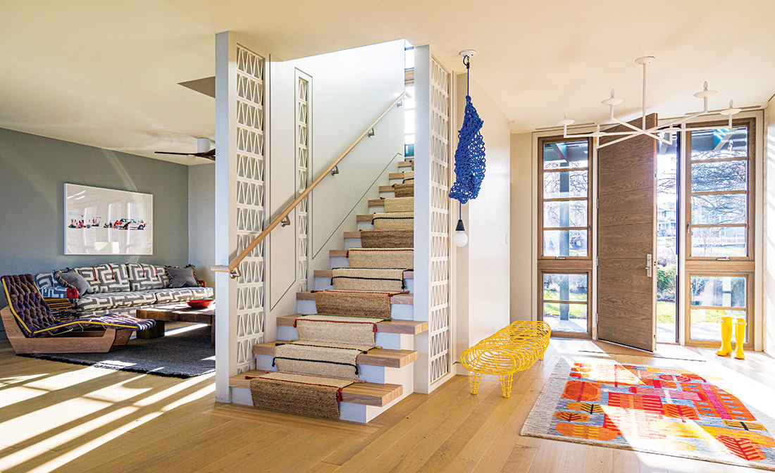
“For them, it needed to be a very cool place, something fun and inspiring and befitting the stunning environment,” explains Birkerts, who founded her full-service interior design firm, Andra Birkerts Design, in 1992. “They understand modern lifestyle and how certain combinations of color, materials, and furniture can really activate a space,” she explains.
Having summered in Rockport for years, the couple decided on an oceanfront lot that was part of an accumulated family compound. With two children in their teen years, they wanted to transform the existing, traditionally styled home into a generational destination.
To rework the structure into their contemporary vision, they tasked Cambridge-based Epstein Joslin Architects (on Birkerts’ suggestion) with the transformation. Known for award-winning cultural destinations (check out the stunning Music Center at Indian Hill in Groton for starters), Epstein Joslin Architects generates residences that are innovative and distinctive. The architects’ task: deliver a rebuilt home within the existing envelope and roofline that connects to the beauty of the surrounding scenery.
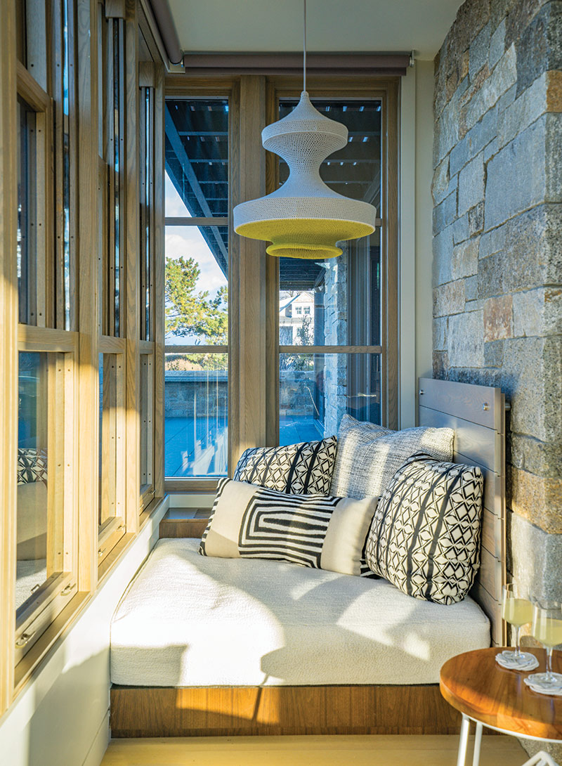
“The architects and I worked very closely during the design stage,” says Birkerts. “The resulting material palette, derived from the setting, is very complex and the construction was quite involved,” she recalls. The surrounding topography was heavily graded to create easy flow into the landscape, and new stone-clad terraces encourage outdoor lingering and entertaining.
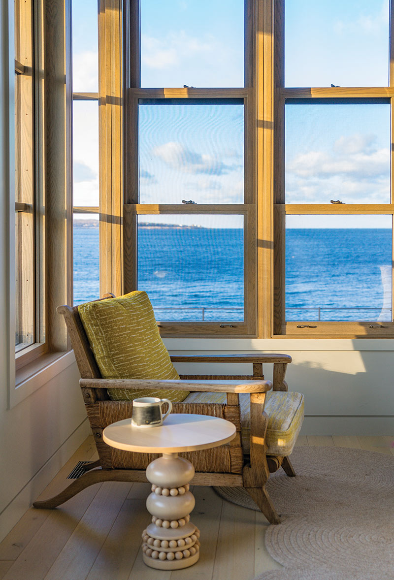
Inside, Birkerts used bold strokes via form, color, and materials to create engaging microenvironments. “The element of surprise is a quality that I really like to bring into my work,” says the designer, “and it’s something that the client responds to as well. We tried to give everything some interest via color or detail; it keeps you on your toes a little bit,” she relates.
At one end of the open-concept first floor, they opted for a full kitchen system by Henrybuilt: “We used them for the Chestnut Hill kitchen,” Birkerts says. “Their work is sleek and interesting—without feeling cold—and well-engineered with beautiful materials. The install looks simple but is actually very high-tech and complex. It took a lot of planning to transform such a large space into a cook-friendly layout that really functions well.”
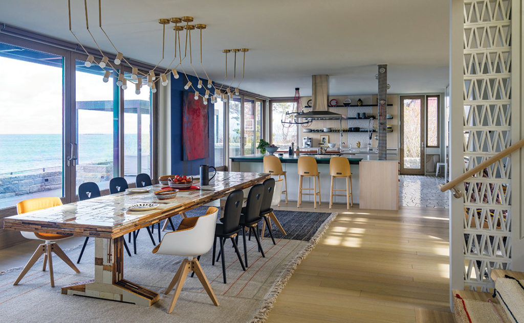
Birkerts, herself an artist with a bachelor’s degree in fine arts and an MFA in painting, admits: “I’m a color person.” Opting for red handles on the kitchen cabinets made the space immediately interesting. “I don’t like to overdo it,” she notes, “but there are certain moments when color is the right way to go. That infusion of red is not a lot, but it does the trick.” The kitchen’s unusual floor treatment of broken marble pieces with dark grout echoes the flagstone patterns outside.
Finding the proper table for the dining area was a challenge. “It’s a big, important space right at the center of the house,” she relates. “I wanted to find a really fantastic piece so that, even with no one seated, it still has a life of its own.” She found her solution in Dutch furniture designer Piet Hein Eek, whose contemporary pieces are no less than individual works of art assembled from scrap wood. Contemporary dining chairs by the Italian workshop Casamania surround the 10-foot-long Canteen table.
Overhead, Birkerts eschewed more traditional chandelier-type lighting options for pendant strings by Grain Design. The fixture takes its inspiration from café lighting and plays with the contrast between interior and exterior environments. “I wanted something festive, like bistro lights at an outdoor party, and they are really beautiful at night,” she explains of the inspiration.
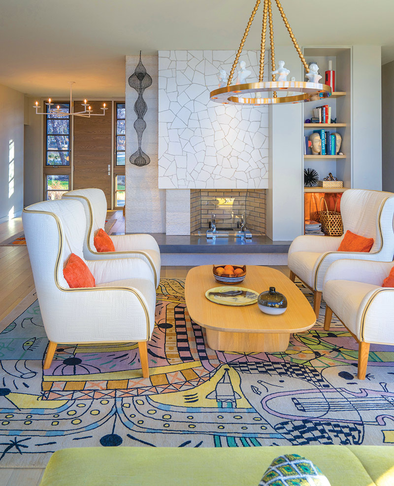
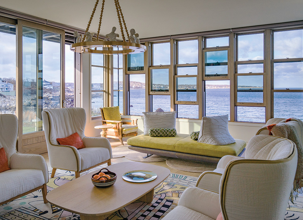
On the first floor’s opposite corner is a formal living room with two walls of glazing and panoramic ocean views. A showpiece rug by Spanish artist Jaime Hayon anchors the sitting area of De Padova wingback armchairs. Overhead, a hanging fixture by Moth Designs, dotted with celebrity figures, echoes the rug’s whimsy. Birkerts included a “Prado” sofa by French company Ligne Roset for additional seating by the windows: “It’s a great piece because it’s low so as not to obstruct views and the pillows move. It’s very sculptural and flexible.”
Throughout the interiors, Birkerts played with established opposites: inside/outside, formal/informal, neutral/colorful. Her firm’s motto is that formal spaces don’t need to be stiff, and informal rooms can be elegant and sophisticated. She also sourced a predominance of European furniture because of its low profiles.
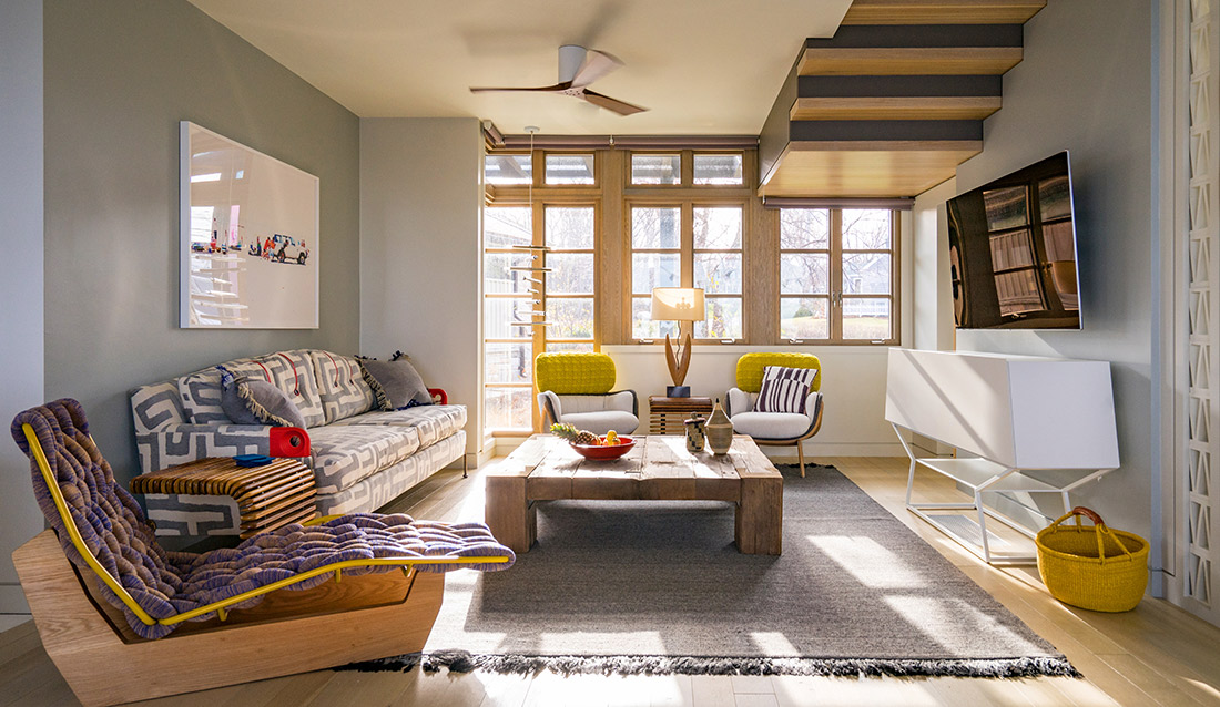
In the first-floor TV room, she created a comfy atmosphere via bespoke furnishings. A wooden chaise by Italian design house Moroso is visually intriguing while a sofa by woodworker Palo Samko incorporates side table functionality into one practical artform. A secondary TV room, geared more for rainy, cooler days, features a wraparound Flexform sofa and a plush red rug. “It’s definitely where you go when you want to be cozy,” Birkerts explains.
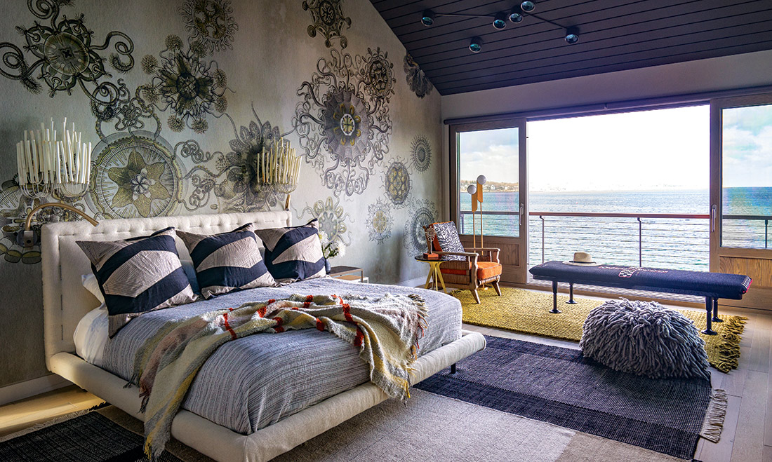
Unpredictable design strokes continue in the master suite, where the client took a chance after falling in love with an abstract Wall & Décor wallpaper. The pattern is suggestive of sea creatures, and sconces by Artifacts hint at sea life as well: “They look a little like candles, but there’s definitely a reference to something you might find underwater, like coral. That’s the way I like to work,” asserts Birkerts. “I don’t generally go for a direct hit; I prefer allusion.”
Very deliberate decision making went into the interior’s development—the designer-homeowner collaboration involved meeting roughly once a week for nearly two years. In the master bathroom, the duo mapped out the exact floor tile grid before installation. They also strategized how to hang pendant lights by WonderGlass haphazardly along the master vanity. Nothing was assumed, and everything was critiqued on two levels: aesthetics and ease of use.
“The clients wanted the home to be feel relaxed but a controlled relaxed,” says Birkerts. “It had to be interesting and beautiful but still approachable.” Ultimately, the finished family retreat is a testament to how beautiful the unexpected can be.
Interior Design: andrabdesign.com | Architect: epsteinjoslin.com | Contractor: thoughtforms-corp.com

