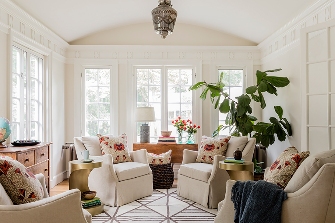
The c. 1909 Colonial, set on the edge of a park north of Boston, was designed by a local architect for his sister. When its new owners purchased it in 2011, it needed work—but with its Victorian detailing and bucolic setting, the couple knew it had great potential. Beneath its dark woods and dated aesthetics, they saw a family-friendly diamond in the rough.
“These clients spent a couple years updating the bigger bones of the house—the heating, the roof—and then started thinking about modernizing inside,” says interior designer Meghan Shadrick, who collaborated with architect David Whitney on the 2018-2019 near-gut remodel. “This is a busy family with two young kids. They wanted their home to feel special but not ornate; they wanted something really relaxed and approachable.”
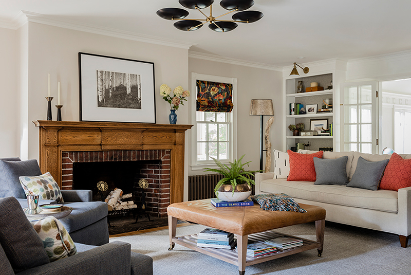
Like a typical Colonial, the living spaces are arranged in a four-square around a central hallway with stair. Upon entry, the dining room leads to the kitchen on one side and a long living room marries two squares along the other. A bonus sunroom extends off the living room towards the park.
To modernize the first-floor layout, the architect added 12 feet to the back of the house. This extra square footage elongated the kitchen, creating enough room for both a generous island and a breakfast nook. It also allowed for a new rear entry with mudroom tucked between the kitchen and the sunroom’s rear-stretching mass.
Shadrick masterminded the space planning as well as the interior finishes and furnishings. “I did some tweaking to help with furniture placement,” she explains. “The living room is long and awkward to furnish. We swapped a set of French doors opposite the fireplace for an interior window, creating more room for furniture along that wall. We also reconstructed the built-ins, which lacked lower cabinets; their shelves were too shallow for proper storage.”
While the dining room paneling had been painted white, every other room had dark wood trim. The owners had accumulated a lot of beautiful furniture over the years, but in similar rich wood tones. “It was too dark all together; we needed to lighten and brighten,” Shadrick contends. “We sprinkled some existing pieces here and there, but overall the first floor represents a fresh approach.”
In establishing the interior’s color palette, Shadrick took her cues from the client’s art and handmade pottery collections. “She was attracted to a lot of greens and blues and some earthy oranges. We definitely kept the design neutral, particularly on the first floor, but with some injection of these brighter tones.”
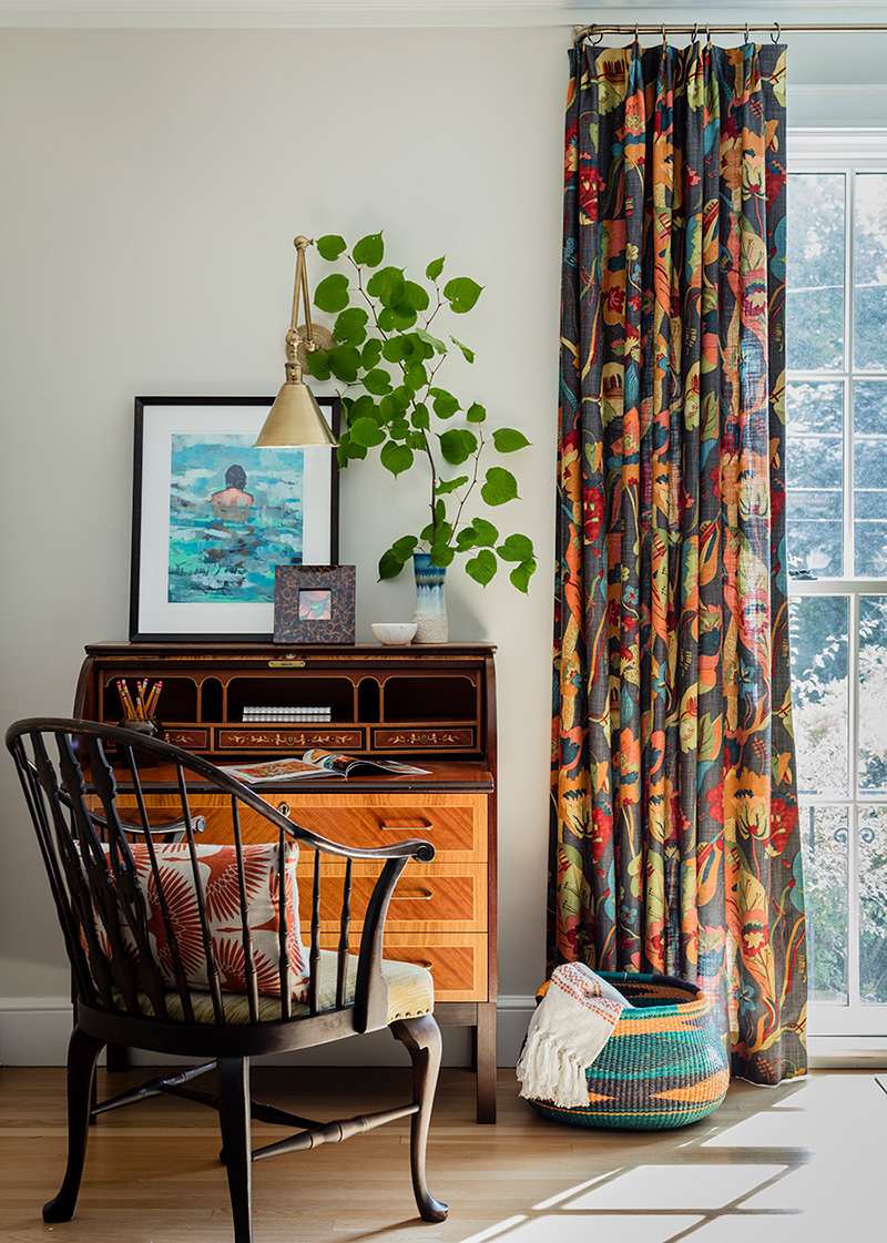
In fact, the client’s boldest choice—a botanical Lee Jofa—launched the living room’s entire design. “She absolutely fell in love with it; it was the first thing she approved,” says Shadrick of the drapery fabric. A central sitting area with swivel chairs is privy to the fireplace on one side and TV on the other. Overhead, a large semi-flush-mount light from Arteriors lends a touch of mod, while a Philip Jeffries wallpaper backing the bookcases adds yet another layer of subtle texture.
Shadrick decided to leave the living room’s fireplace surround of quarter-sawn oak unpainted, although she did enlist a finisher to bring it back to life. “Leaving this oak piece intact is like a loving ode to the home’s past,” she reveals. “I try and blur the line between old and new in my designs whenever possible.”
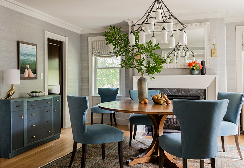
For their dining room, the family didn’t want anything super formal. “The shell is still traditional, but we kept the furnishings very approachable,” says the designer. Crate & Barrel dining chairs, upholstered in blue velvet, encircle a French oak dining table.
The statement “Sara” chandelier by Canopy Designs is based off an antique Egyptian light fixture. “It feels old but at the same time there’s a freshness about it,” Shadrick says. A custom mirror of her own design, installed over the mantel, is a new addition that reads like a historic feature.
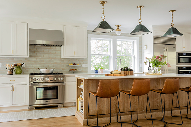
In the newly expanded kitchen, crisp white perimeter cabinets partner with quartzite counters and a backsplash of gray Ann Sacks “Elements” tile. An island of white oak adds warmth to the neutral palette. “I brought in decorative artist Pauline Curtiss to ceruse the oak, which emphasizes the wood’s tactile beauty and lends an aged feel to the space,” says Shadrick. Statement Urban Electric Co. “Gibson” pendants in patinaed copper draw the eye overhead.
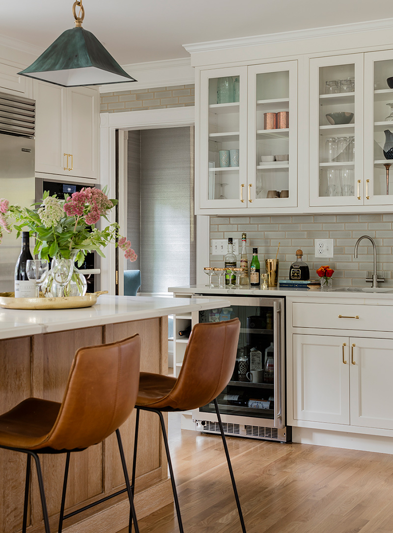
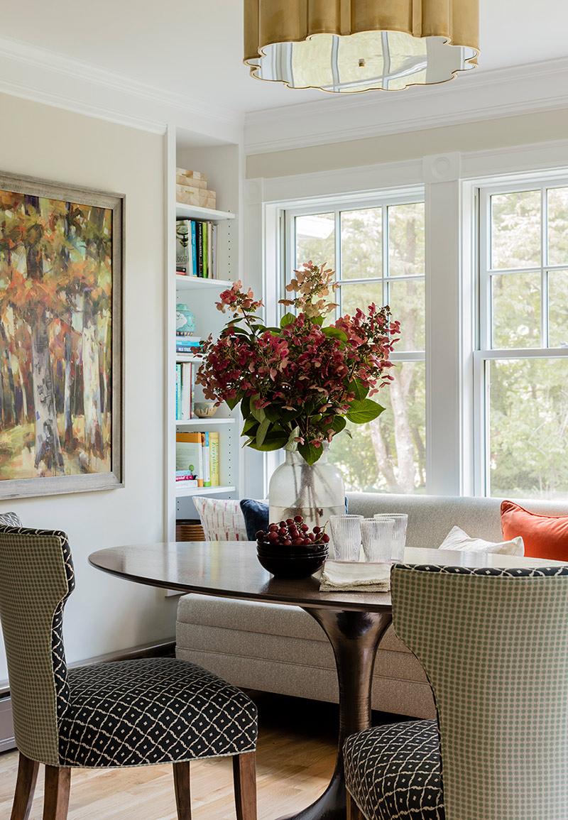
Besides the kitchen’s work triangle, its layout boasts a built-in bar for mixing cocktails and a wall of floor-to-ceiling storage cabinets. For breakfast or morning coffee, Shadrick designed a cozy nook centered on a banquette from Ballard Designs, which she had upholstered in an indoor/outdoor Schumacher fabric. Its Eero Saarinen-inspired tulip table has a hammered metal base from Bungalow 5. But instead of a more traditional marble top, its custom wood top by Maine-based Huston & Company “feels warmer and more approachable,” she points out.
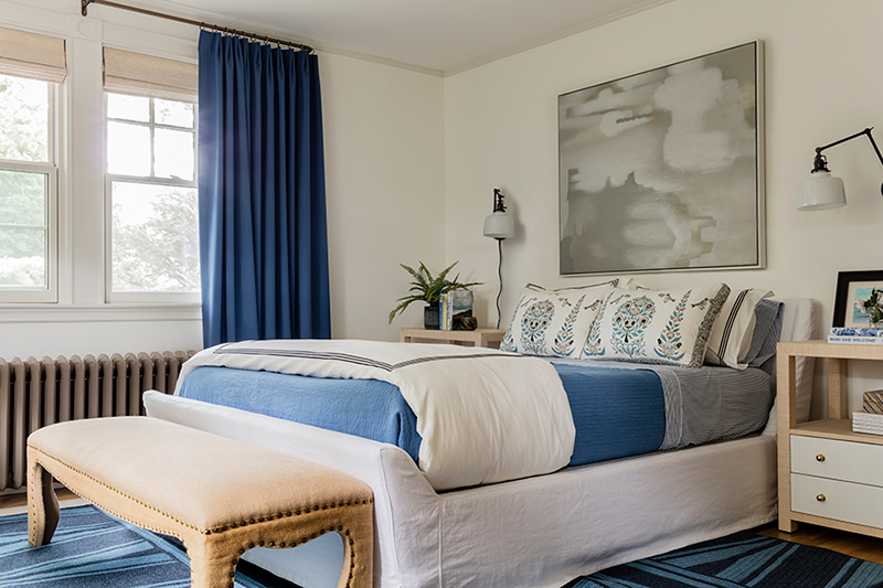
Upstairs, the architect stole space from an extra bedroom to deliver another wish-list item for the homeowners: a proper master suite. To keep the space soft and soothing, Shadrick used similar tones of blue from the first floor but subtracted the bolder accents of red and orange. An upholstered sleigh bed partners with a geometric braided rug by Boston-based Thayer Design Studio. Rejuvenation sconces leave the grass cloth-covered Worlds Away nightstands clutter free.
Updating the home for 21st-century living was the design team’s goal. However, Shadrick did more than just select new cabinets and furniture. She curated an interior that feels like her clients and complements their daily life. “I am the filter,” she explains of her role, “but in the end this is their home. It’s their sanctuary.”

