Three years into living in their nearly 75-year-old Beverly home, Emily Rabinowitz-Buchanan and Nicholas Soodik, educators who relocated from Brooklyn with their two little girls, were ready to make changes. Renovating the kitchen and bathrooms along with adding a bath topped the list, as did evening out the sizes of their daughters’ bedrooms.
Stacey Clarimundo, principal of Found Design Studio, and senior designer Hattie Holland understood that the 3,000-plus-square-foot Cape didn’t need an addition. Rather, the problem was the floor plan. “We reworked the layout for efficiency,” Clarimumdo says. “Reallocating space made the rooms more functional and appropriate in size.”
The approach was in line with the couple’s aesthetic. “They wanted the house to remain humble,” Clarimundo says. “Changes couldn’t seem shiny or new.” Inspiration came from across the pond. “I love English cottage style,” Rabinowitz-Buchanan says. Clarimundo elaborates. “Emily is attracted to low-key but unexpected interiors with color and earthiness,” she says.
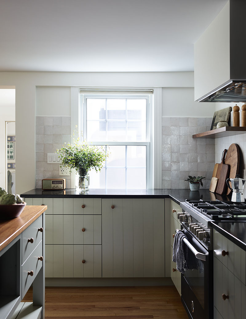
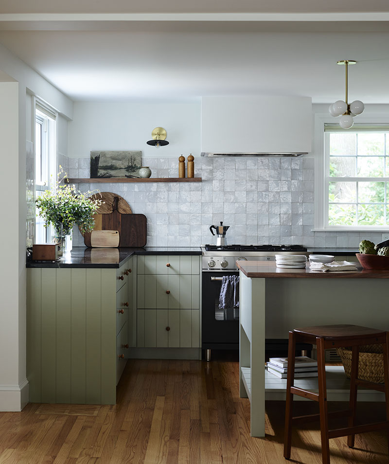
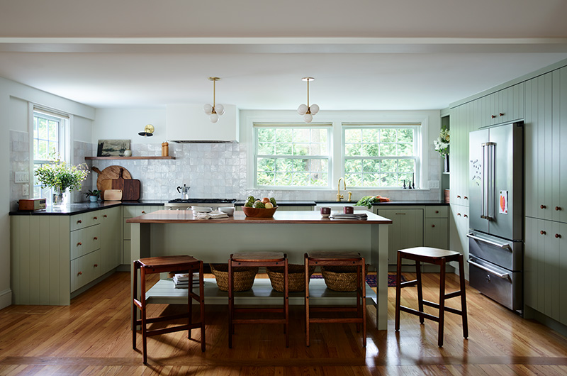
Despite the airy, open concept of the main floor, the kitchen was pushed into a corner and hemmed in by an L-shaped peninsula. Clarimundo demolished the peninsula and absorbed the breakfast nook that was wedged in beside it. Then, she stretched the kitchen along the entire back wall, complete with soapstone counters, and gave the family a walnut-topped center island.
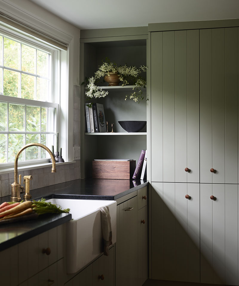
The redesign required closing up a window so that they could relocate the stove. Initially, the couple hesitated. “We were concerned about natural light, but it was the right move,” Soodik admits. Rabinowitz-Buchanan observes that the design is much calmer without the window. She appreciates the floor-to-ceiling pantry cabinets that flank the fridge too. “Before, we kept stuff in a closet outside the kitchen,” she says.
Custom V-groove cabinetry painted Farrow & Ball Blue Gray imbues the country vibe they were going for, as do the textural wood knobs and unlacquered brass pulls. The zellige tile backsplash emphasizes the effect. “These terracotta tiles are handmade; there are chips where the glaze didn’t stick,” Clarimundo says. “Zellige is having a moment, but it’s a material that’s been around for hundreds of years.”
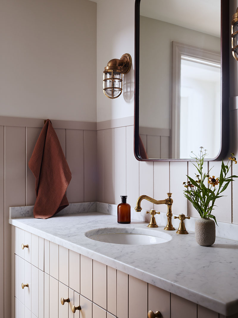
The creative pulled similar styles to the other side of the house. In the girls’ bath, which she cut in size by about one-third, the well-priced, blush-colored ceramic tiles in the shower look handcrafted, and the V-groove vanity echoes the cabinetry in the kitchen. The room is feminine but not saccharine. “The dark teal tile floor, walnut-framed mirror, and chunky sconces tone it down,” Clarimundo says. That the elements are disparate helps conjure the under-the-radar, made-over-time feel.
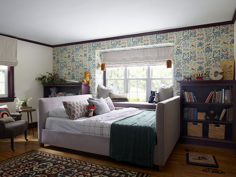
Shrinking the bath enabled the team to enlarge the nine-year-old’s bedroom, where new built-in bookshelves are painted Farrow & Ball Brinjal, a moody aubergine. Like the bath, the room is girlish but sophisticated. “The Belgian linen bed reads purple until pulled away from the millwork; then it reads gray,” the designer says. “They can always repaint later, but the bed can stay with her.” The wall of Arts & Crafts era paper is easy to change too. “Wallpaper has a lot of impact, we don’t need to use a ton,” Clarimundo asserts.
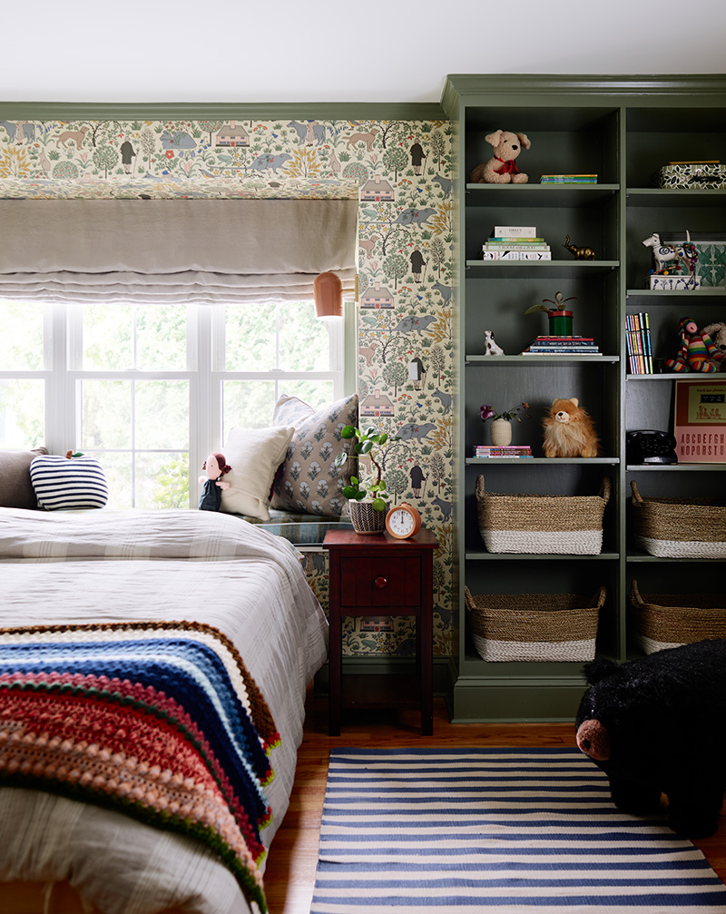
Next door, in the six-year-old’s bedroom, Clarimundo chose another Arts & Crafts era paper by Trustworth Studios. The pattern’s Labrador retrievers speak to the girl’s love of dogs; it also pictures giant rats. “The rats remind me of the Rodents of Unusual Size in The Princess Bride,” Soodik laughs. “It’s one her favorite movies and brings a little Brooklyn to Beverly.”
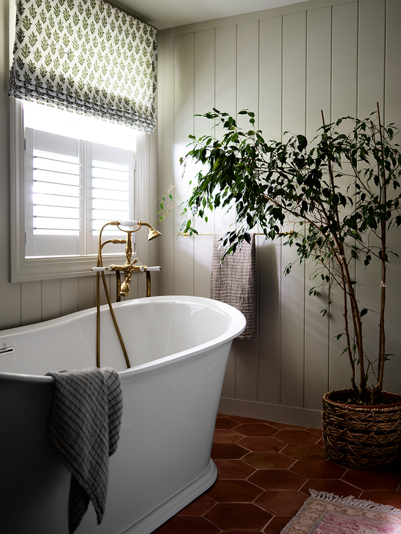
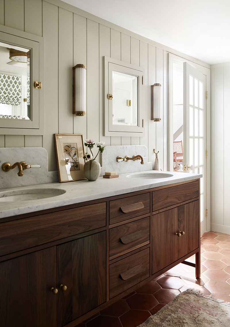
The couple’s bedroom didn’t require much, but their bath got a full makeover. It included cutting its size by one-third in order to create a guest bath. Still, the proportions are generous. Here, shiplap lines the walls while the walnut vanity’s midcentury modern lines counterbalance the curves of the marble backsplash, unlacquered brass faucets, and freestanding tub. Earthy terracotta floor tiles help ground the rich wood and infuse warmth. Clarimundo reiterates the material’s age-old appeal and notes that, historically, terracotta was used outdoors, and as such, is absolutely humble.
The renovation feels authentic. “It looks like they could have done it themselves over time,” the Clarimundo says. “We reshaped the rooms and retained quirks. You can tell people live here; that’s what we wanted.”
Interior designer: Found Design Studio, founddesignstudio.co, Contractor: J&J Frerk Carpenters, 978-922-3036, Cabinetmaker: Curtis Cabinetry, curtiscabinetry.com

