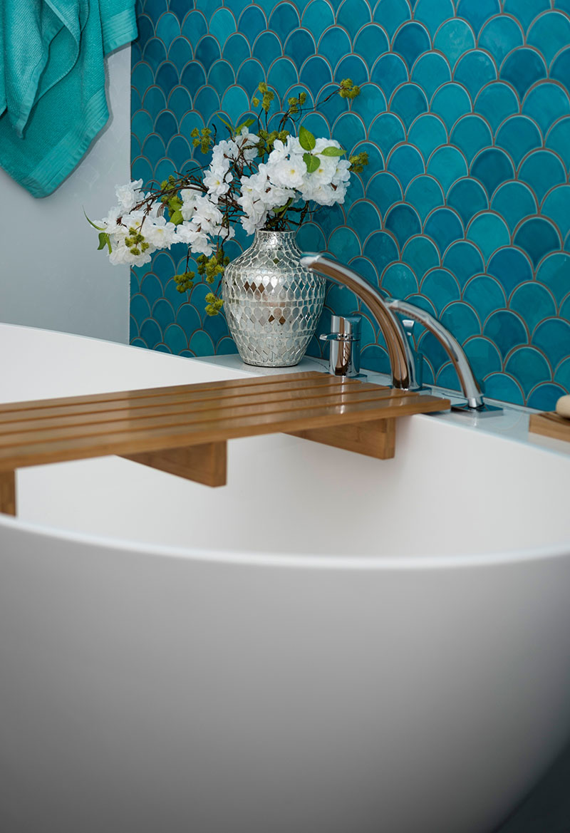
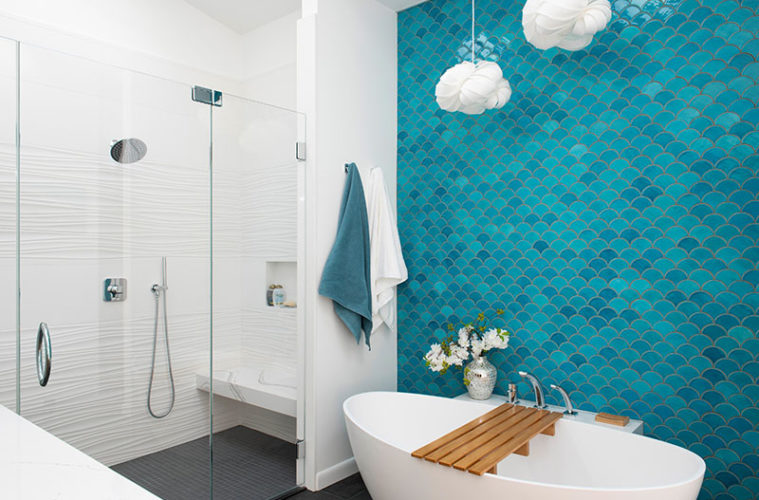
Meredith Burns had her heart set on creating an accent wall covered in turquoise fish scale tile in her soon-to-be remodeled bath. But not just any turquoise fish-scale tile. “She wanted the exact fish-scale tile from her inspiration photo,” Katie Boucher says. Boucher, a designer with Right Angle Kitchens and Design, searched high and low, only to discover the tile wasn’t available in the United States. In her pursuit, she turned up a similar handmade ceramic tile by Mercury Mosaics that both she and her client loved. “They used Mercury Mosaics tile for their kitchen backsplash, so it all came together,” the designer says. “We call it the mermaid bathroom.”

Boucher collaborated closely with Meredith and her husband, Dave Burns, on the primary bath and walk-in closet of their North Reading home. “Meredith has a real eye for design,” she says. “We bounced ideas off each other; sometimes she had the better ones.” For instance, when Boucher advised Meredith that the scale of the pendant light she hoped to hang over the tub was too small, Meredith staggered multiple ones, making a vertical statement.
The couple also chose the gently curved resin soaking tub by Badeloft that sits against the fish scale tile backdrop. While its contemporary silhouette was the initial draw, the pair took the plunge, so to speak, to take advantage of its competitive pricing. “The brand was just entering the U.S. market, so it was great timing for us,” Dave says.

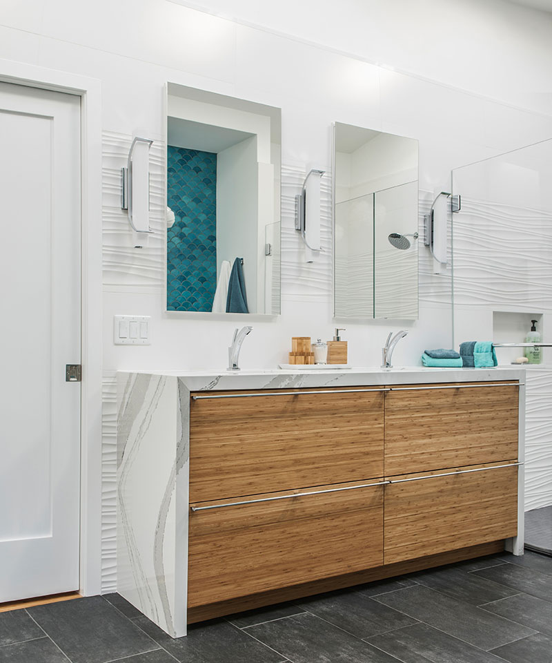
When it came to the filler, the couple preferred a deck-mounted model over a free-standing one. Boucher designed a three-foot-long ledge fabricated from the same Cambria quartz as the shower bench and waterfall countertop of the vanity. The structure goes all the way to the floor, hugging the tub on the way down. “A lot of thought and effort went into ensuring it didn’t look like a giant box,” Boucher says of the ledge, which also provides a perch for a glass of wine or a candle.
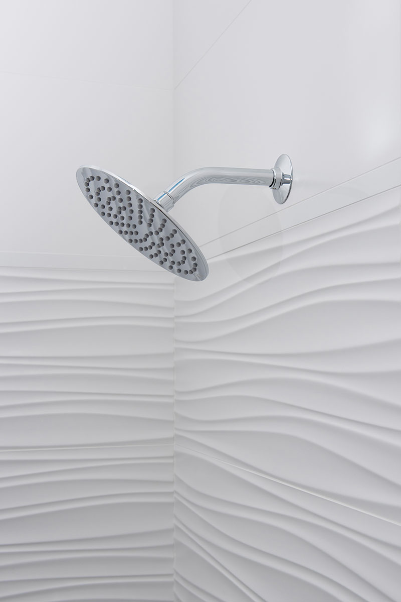
Mindful not to overshadow the turquoise accent wall, Boucher wrapped the double shower in horizontal bands of 12-by-24-inch tiles, alternating Porcelanosa OXO Line tiles with a wavy texture with flat ones. “I love the wavy lines, but you can’t mount plumbing fixtures on them,” she explains. Charcoal-colored porcelain floor tiles ground the light, airy space. “It’s just a simple, neutral base,” Boucher says. “We didn’t dwell on it.”

Not so of the charcoal-colored quartz shower curb, which matches the floor tile exactly for a seamless effect. Since the floor couldn’t be sufficiently pitched for a curbless shower—doing so would have required cutting into the floor joists—Boucher incorporated a one-inch-high curb to hold back the water. “It was another wild goose chase, but we found a fabricator who had a remnant that’s a perfect match!” she says.
Bands of the white tile, both wavy and flat, continue behind the Plain & Fancy double vanity. Beyond the warm, bamboo façade lie highly customized his and hers compartments. Narrow pull-outs on either side of the sinks use space that’s usually wasted. “It was a fun math problem in a Tetris kind of way,” Boucher laughs.
Before introducing Boucher to the project, the Burnses solved some space planning issues relating to their closet. Most significantly, they decided to add dormers to the area’s steeply pitched roof, which allowed them to make the most of the square footage. “It was a haphazard space with rolling racks and wire shelves,” Dave says. “Half of it was unusable because the ceiling was so low.”
Boucher inventoried Meredith and Dave’s belongings to plan for every nook and cranny. “Meredith is very fashionable,” Boucher says. “I really wanted to showcase her beautiful things.” A rolling library ladder allows the homeowners to reach the highest points of the floor-to-ceiling built-ins. Glass-front handbag cabinets, for example, are tucked above two levels of hanging space. And shoe shelves backed with Schumacher Balloons wallpaper reach the room’s full height. Other features include tip-out hampers embedded halfway into the wall, push-latch doors that access hidden suitcase storage, and a sliding, barn-style door fitted with a full-length mirror.
“When we bought the house, there were so many things we liked, and lots we didn’t,” Meredith says. “We now have the house we want.”
Preliminary space planning: Carpenter & MacNeille, carpentermacneille.com
Design: Right Angle Kitchens and Design, rightanglekitchens.com
Contractor: James Construction, 781-389-7818

