Homeowners Dan and Lindsey Bello are no strangers to renovations: They had previously refreshed a circa 1890 home in Reading and know full well the process’s challenges and rewards.
When they purchased another property—also in Reading, close to their children’s schools, with a generous yard plus poolscape—they knew the 1946 garrison Colonial needed a lot of work.
“The interior was dated with a lot of dark wood paneling, wallpaper, and drop ceilings. There was also an awkward boxed-in spiral stair taking up a lot of the footprint and making furniture placement difficult,” recalls Dan of the initial aesthetic. The family moved in and started construction—a full gut down to the studs—in less than a year.
The couple tasked interior designer Liz Marchant Ourston, principal of Liz Marchant Interiors, with overseeing the home’s transformation after a referral from Lindsey’s brother (Ourston worked on his home in Washington, D.C.). Originally from Detroit, Ourston has moved quite a bit, including 10 years spent in Southern California. She handled the North Shore project adeptly from her home base in Austin, Texas, aided by a couple of in-person visits.
“Typical of an older house, the layout was really tight and closed-off,” recalls Ourston. “The Bellos have two young children and wanted the home to function better for their needs. They craved better flow throughout.”
Larger improvements involved a second-story addition (above the existing single-story family room) to form a primary bedroom suite with bathroom and walk-in closet. The builder, Choice Builders of North Reading, also demolished the tight winding stair and replaced it with a more practical straight stair.
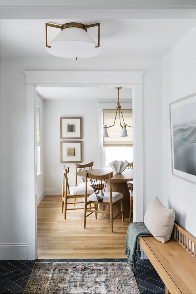
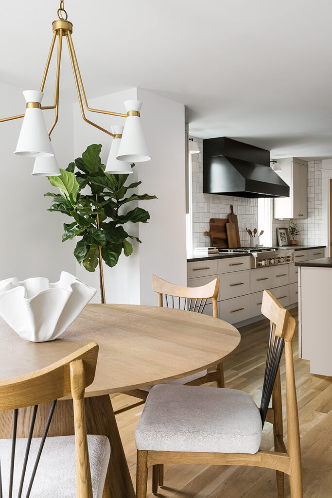
The revamped ground floor now feels much more interconnected, with fewer walls and wider openings. Its layout boasts a dining room and kitchen on one side and lounge and family room on the other. Now, from the kitchen, the clients can see their kids doing homework or watching TV in the family room. Entertaining options range from informal gatherings around the kitchen island, to cocktails in the lounge, to a formal sit-down in the dining room, where artisanal chairs by Four Hands encircle a pedestal table by Worlds Away.
Beyond just layout improvements, Ourston infused the home with a comprehensive style based on the owners’ preferences for clean lines and neutral tones. “The interior is transitional, with modern twists on classic forms,” says the designer.
For the kitchen, Ourston opted for Omega cabinets in a warm grey finish (the Bellos wanted to avoid stark white). Black reverberates through the space on the vent hood, Caesarstone countertops, and Hudson Valley Group pendants. Meanwhile, a backsplash of matte white tiles keeps things feeling bright.
Off to the side of the kitchen is a bonus pantry. “Originally we had cabinets running into that corner,” recalls Lindsey, “but when the house was down to its studs, Liz and the contractor worked together to find room for it.” Ourston adds: “Lindsey wanted a unique pantry door, so we went with reeded glass and warm wood to contrast all of the painted surfaces.”
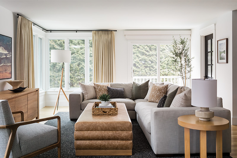
In the home’s other half, a large, comfy sectional wraps around a House of Morrison “Namale” ottoman in the family room. Accent pillows continue the comfort theme but contribute sophisticated patterns. Since this room is frequently trafficked—it’s how the kids come inside from the backyard and pool—the Bellos were happy with practical rug tiles under foot.
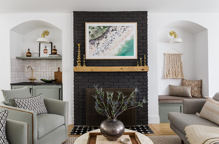
One of the couple’s favorite hangout spots is the lounge, outfitted with a built-in bar. Complete with a sink and beverage fridge, the bar saves on trips to the kitchen and allows for relaxing evenings without TV but with the kids still nearby. Crate & Barrel club chairs, upholstered in a sage green, echo the cabinetry’s “Evergreen Fog” Sherwin-Williams finish.
The Bellos love their focal point gas fireplace. However, demolition revealed that its brick went only as high as the mantel. “We had to search for antique irregular bricks to make it full height,” recalls Dan. “It was challenging, but we finally found a good match.”
Another bonus space courtesy of the renovation is a Harry Potteresque powder room tucked underneath the stair. Sans hardware, its push door is easy to miss at first glance. Inside, olive-green Roca tiles, pendant lights by Hudson Valley Group, and a Rejuvenation mirror make finding this jewel-like bathroom worth the effort.
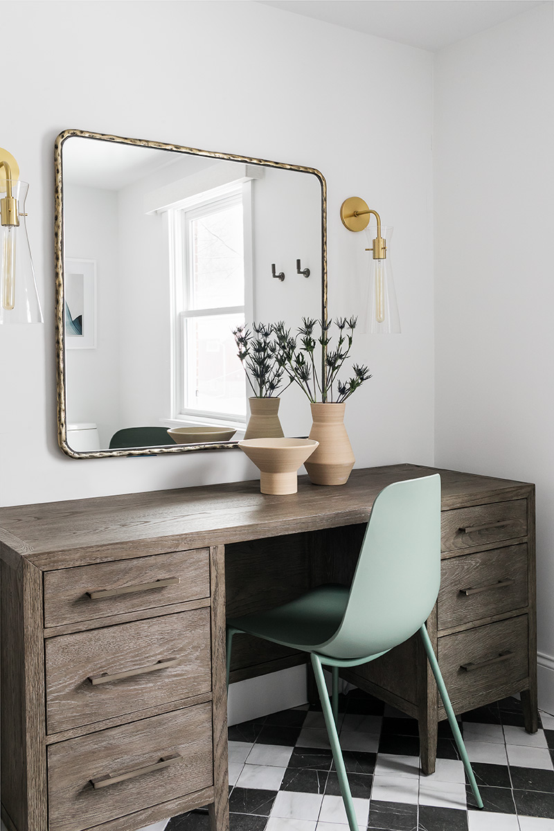
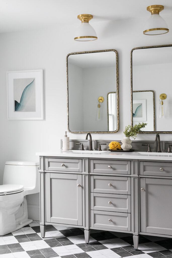
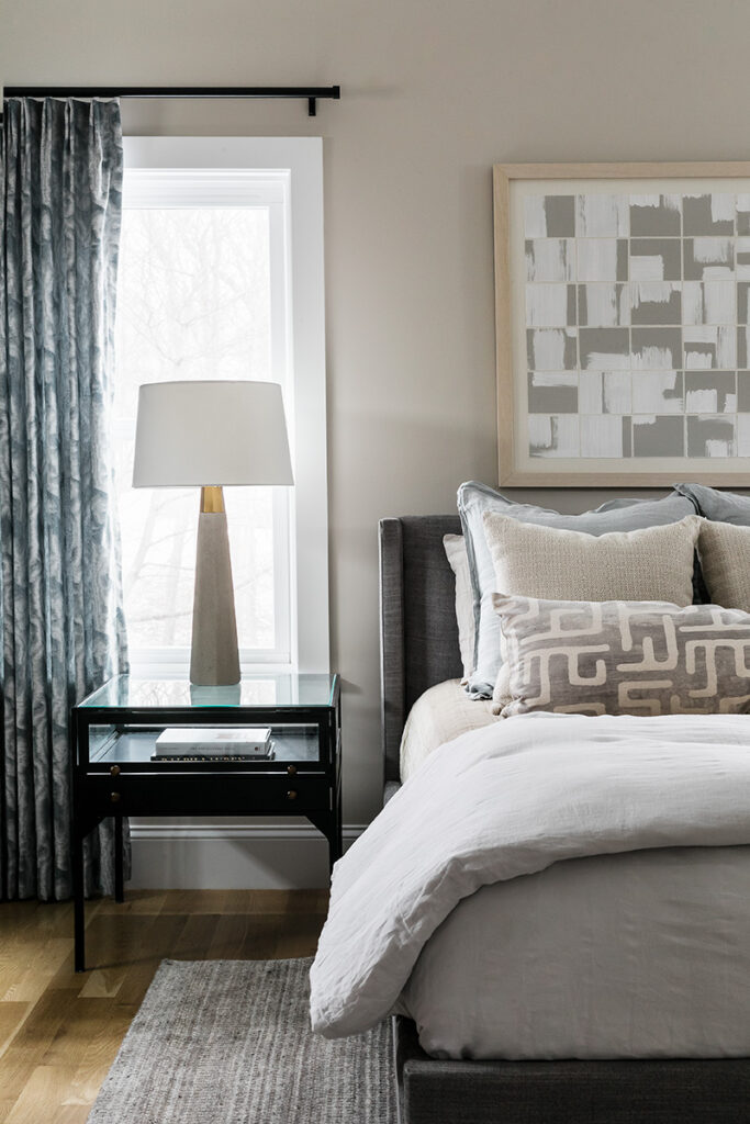
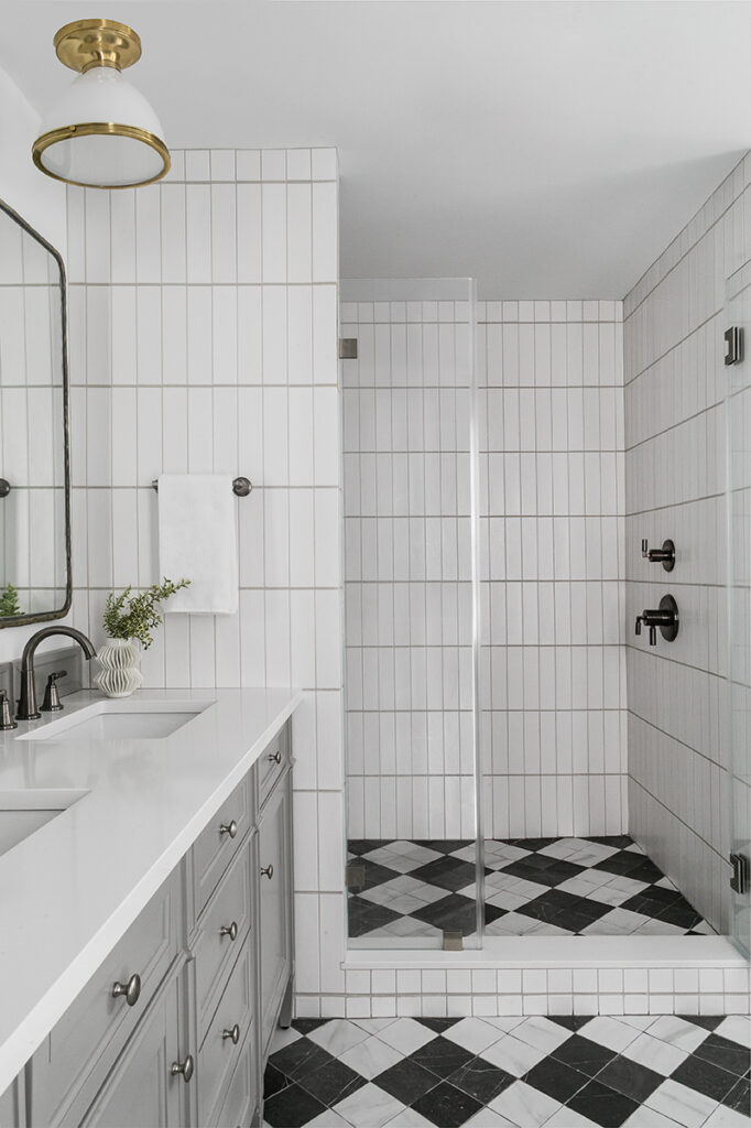
Upstairs, the new primary bathroom has his and hers sinks in a gray vanity plus a makeup station for Lindsey. “The white-and-black checkered floor is a little more traditional than the rest of the home,” notes the designer, “but we countered that with contemporary porcelain wall tile arranged vertically, with thicker horizontal grout lines for added interest.” The couple’s adjoining bedroom is a serene study in taupe, gray, and pale blue.
From start to finish, Ourston impressed the Bellos with not just her design prowess but also her ability to problem-solve spatially, adding storage when possible and even considering electrical outlet placements. No detail went beyond her notice.
From sourcing artwork on Cape Cod, where the family loves to vacation, to choosing a round dining table that reminds Lindsey of meals with her grandfather, Ourston achieved au courant style comprised of meaningful parts.

