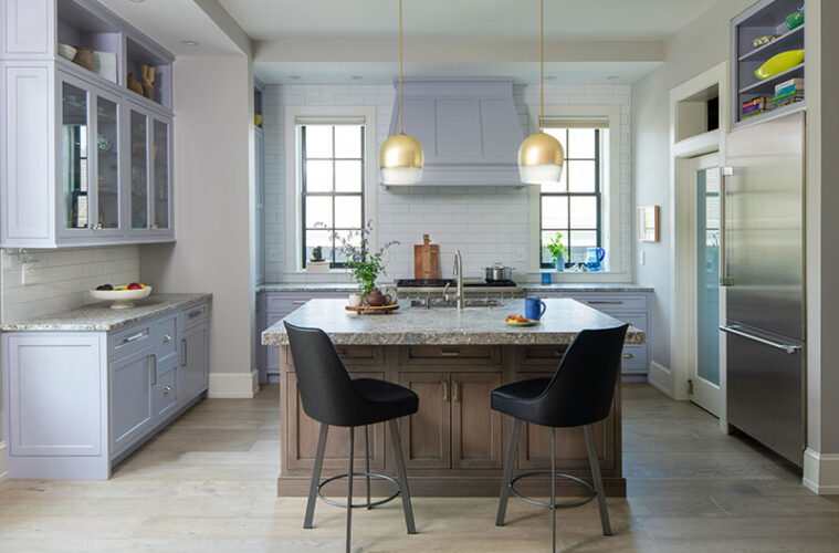
When your client is an artist with a keen eye for color and design, good things happen. Case in point: The ever-so-slightly-lavender-hued cabinetry in the kitchen of this Beverly condominium. “The homeowner didn’t want a cabinet color that would distract from her artwork,” Katie Boucher says. “She wanted it to be complementary.”
Boucher, a designer with Right Angle Kitchens and Design in Woburn, worked with the clients to come up with a lavender-infused shade just this side of gray. The designer explains that when you pick a paint color from a fan deck, the color is based on acrylic paint. The manufacturer then has to tweak the formulation for the enamel paint used on the cabinetry. The result? “It’s almost a whole new color in the end,” Boucher says.
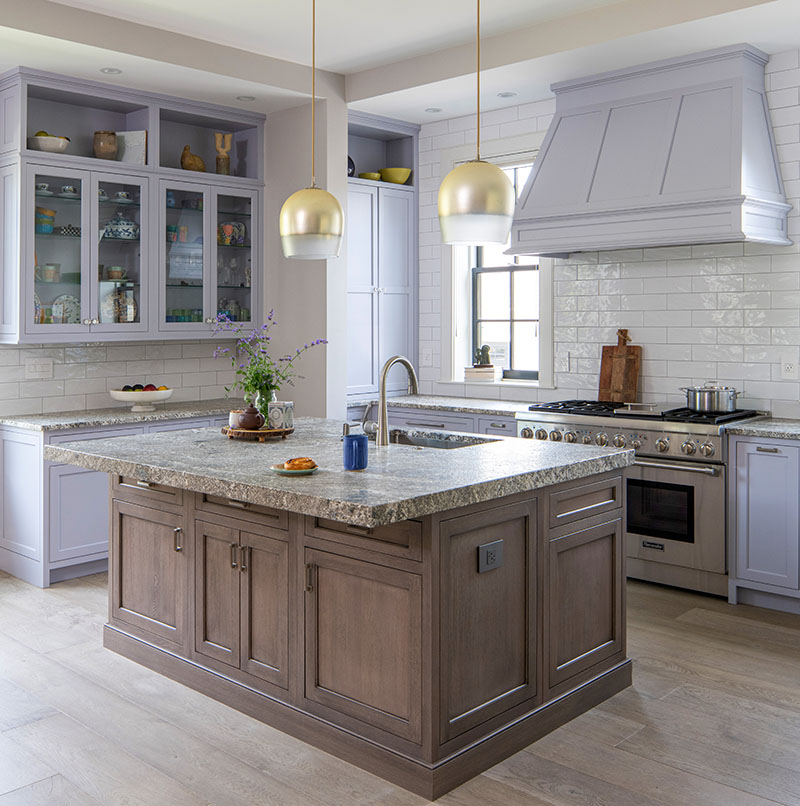
Since the condo, which is one of four newly developed units in a former Congregational church built in 1839, has an open-concept floor plan, the owners asked that Boucher keep tidiness in mind when planning the design. “They wanted the main part of the kitchen to always appear clean and organized, and they also wanted enough counter space to prep, serve, and eat,” the designer says, ticking down the owners’ list of priorities.

To that end, Boucher designed a nearly 10-by-6-foot walk-in pantry complete with sink, beverage fridge, and full-on coffee station. Not only does the functional offshoot contain the mess of everyday living, but it also keeps family members and guests out of the way of the cook, be it in the morning or during cocktail hour.
While the clients’ inspiration images pictured pantries with transparent glass doors, Boucher steered them toward a more forgiving option. A swinging door with frosted glass gives them the best of both worlds—light and a place to hide any mess. “Clear glass would have defeated the purpose of having a separate space,” she says.
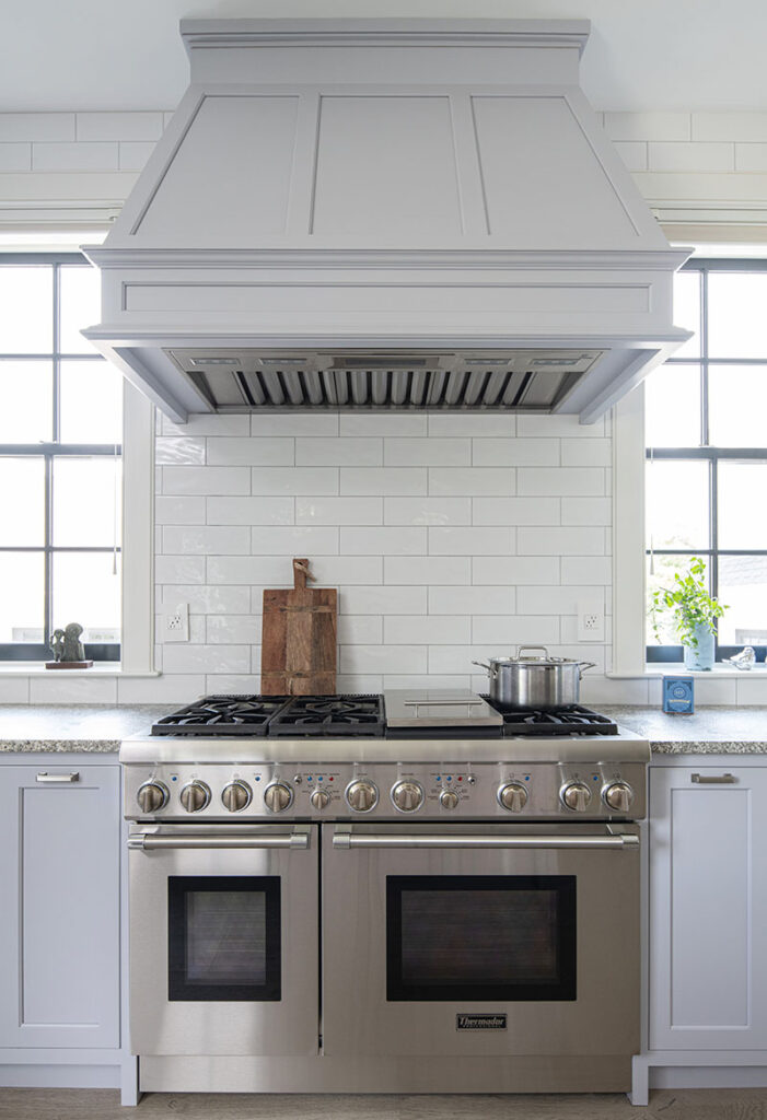
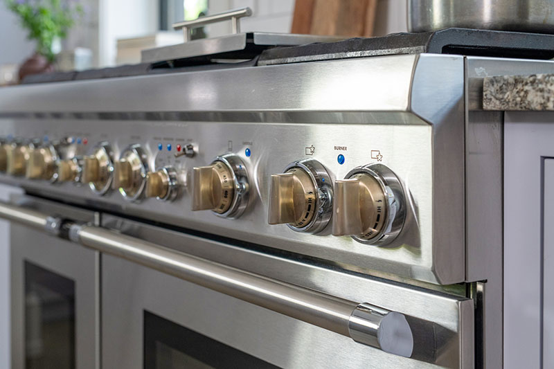
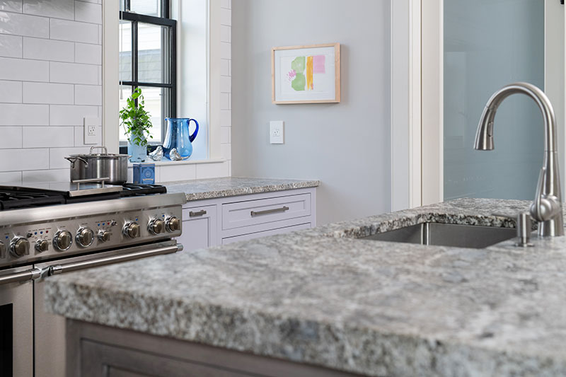
Keeping the cooking space free from interference drove the overall layout, as did the understanding that it would be a primarily one-cook kitchen. With one person executing meals solo, the proximity of the range and sink would be crucial for ease and efficiency. Boucher located the 48-inch Thermador stainless-steel range between two tall windows of the main wall, making it the room’s focal point.
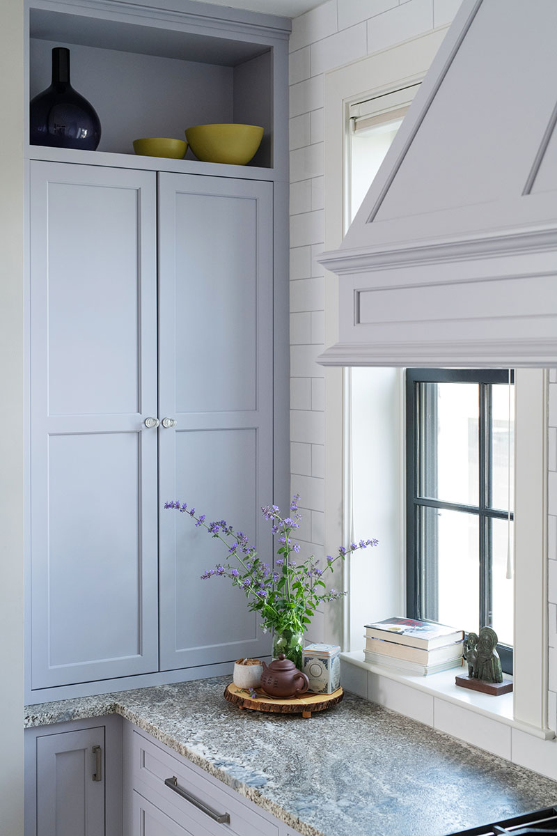
Once she identified the range as the focal point, Boucher worked on making the hood special. “I didn’t want it to be just a boring box just hiding an appliance,” she says. Instead, the designer embellished the hood, which widens at an angle, with detailed moldings and Shaker-style panels that echo the cabinetry door and drawer fronts. When it came to the millwork around the windows, however, Boucher had to scale back. “Trim too close to the range is a fire hazard,” she explains.
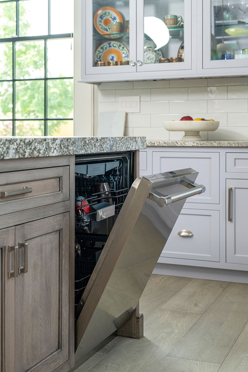
For the backsplash, which runs up that whole back wall, the team chose elongated white subway tile installed with grout in a slight purple undertone. “White grout would have looked washed out,” Boucher says. “I wanted more pattern so we used a tiny bit of contrast.” By the same token, the tile’s undulating surface adds interest. “The tile mimics the organic texture of the leathered granite countertops,” Boucher adds. “I always try to repeat elements—color, texture, finish—so there aren’t any one-offs.”
The six-by-five-foot island, with its contrasting base and chunky leathered granite top, is an anchoring statement in the center of the space. That said, it took a few tries to get there. “Initially, the island was the same color as the cabinets, but as we reviewed the renderings, we decided it looked flat, single-dimensional, and too color-blocked,” Boucher says. “The room also needed more warmth.” Boucher’s response? To encase the base of the island in wood, namely, rift-cut white oak. The linear graining, she points out, plays well with the movement in the earthy granite countertop. Next, they reviewed stain samples, settling on a warm gray finish.
The process was essentially pain free. “Meeting in the showroom is helpful because we have the samples right there,” Boucher says. “And it’s easy to do renderings; the software does it all so efficiently.”
Learn more about the project team
Architect: ART ARchitects
Contractor: Hunter Whitmore, Whitmore Brothers Construction Co.
Landscape architect: Nina Brown, Brown, Richardson + Rowe
Kitchen Design: Right Angle Kitchens and Design
Lighting Design: Lucia Lighting

