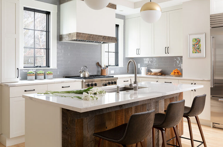
Heidi and Mike Kruckenberg live in a beautiful Victorian in Malden’s West End. However, with history comes a fair bit of dysfunction, particularly in the kitchen. For example, the range sat in front of a boxed-in chimney that protruded deep into the space and lacked a counter on one side. The refrigerator was located in the mudroom, which was so cold in wintertime that you needed a coat just to grab the milk. Although there was a separate pantry, there was no center island, and every counter faced a wall.
It was hardly a kitchen where a family of eight could gather to make meals and happy memories. “I make most of our food, including baking the bread and cookies for their school lunches, and the kids learned to cook during the pandemic, so one might be assembling nachos while another stirs a ramen,” Heidi says. “A lot happens in here at once.”
Erica Palm, a dear friend, former neighbor, and designer, advised the couple to wait until they could afford to do it right rather than try to fix it piecemeal. So, they did, hiring her to rethink the entire thing, including the adjacent mudroom, powder room, laundry room, and dining nook. (Palm worked for Lee Kimball at the time and now works at Newton Kitchens & Design.)
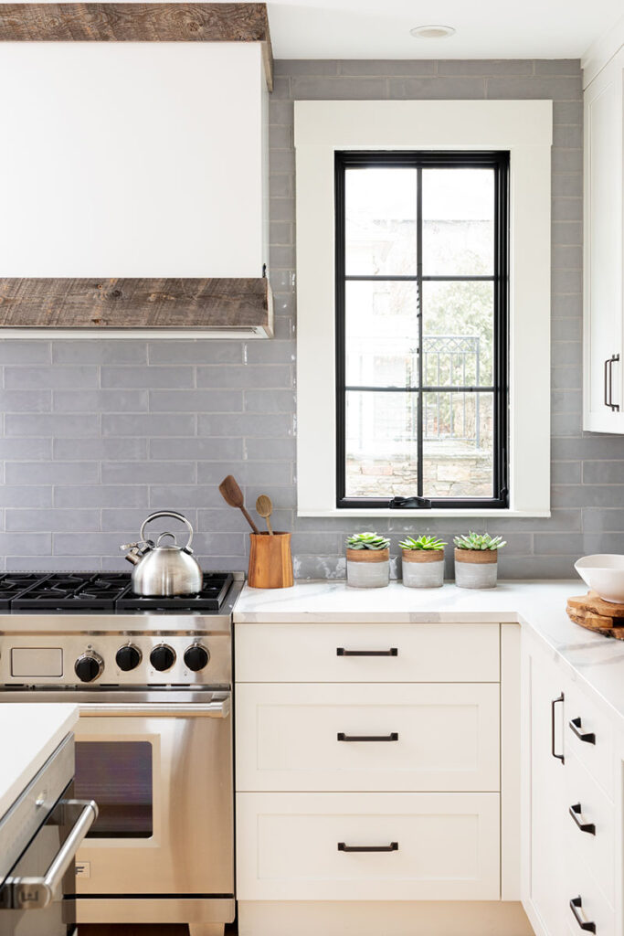
To expand and square up the kitchen’s footprint, Palm demolished the separate pantry and cut back the protruding chimney since removing it would have been cost prohibitive. Palm also did the unthinkable: She closed a window along the back wall. Now, instead of three double-hung windows that contributed to an ill-looking asymmetrical elevation, two casement windows with black frames flank the range. “There was some trepidation on the clients’ part,” Palm admits.
The arrangement is the room’s focal point. Glossy gray subway tile with a handmade texture runs to the ceiling, lending a traditional feel. It also adds a touch of color and sets off the windows’ oversize casings and the crisp white hood enclosure trimmed in reclaimed wood that hovers over the six-burner range. “Boxy hoods aren’t good when there are sightlines from the side, but here you mostly see it from the front,” Palm says.
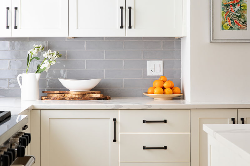
Durable quartz counters top base cabinets with Shaker-style doors on either side of the range. At the left, the double floor-to-ceiling pantry cabinets are outfitted with roll-out shelves. There’s also a narrow spice cabinet that sits on the counter. “That one hides a cast-iron drain pipe that we weren’t able to relocate without renovating the bathroom above it,” Palm says.
To the right of the range, the counter turns onto the adjacent wall to form the L-shaped layout. Two sets of upper cabinets nestle into the space beside the walled-over chimney, where the couple hung a colorful watercolor by their friend and neighbor, Edward Rice. Palm squeezed out storage below with a six-inch-deep base cabinet. On the other side of the pared-down, camouflaged chimney sits the sleek, stainless-steel fridge.
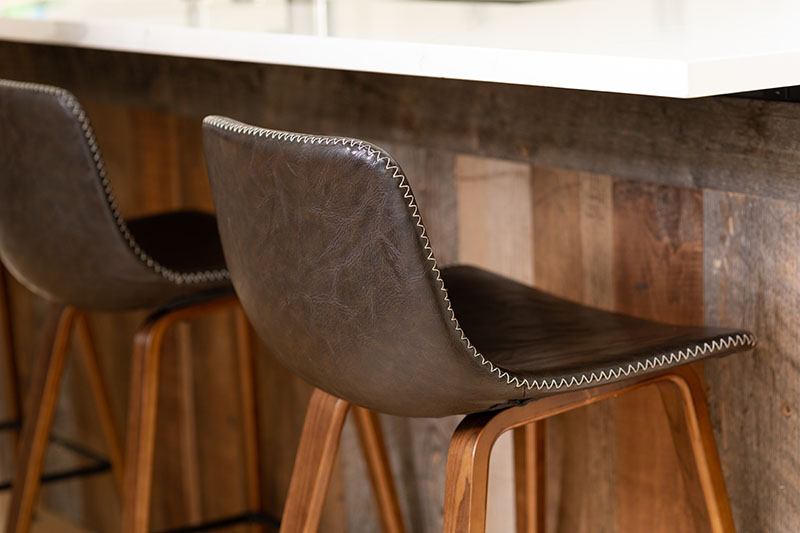
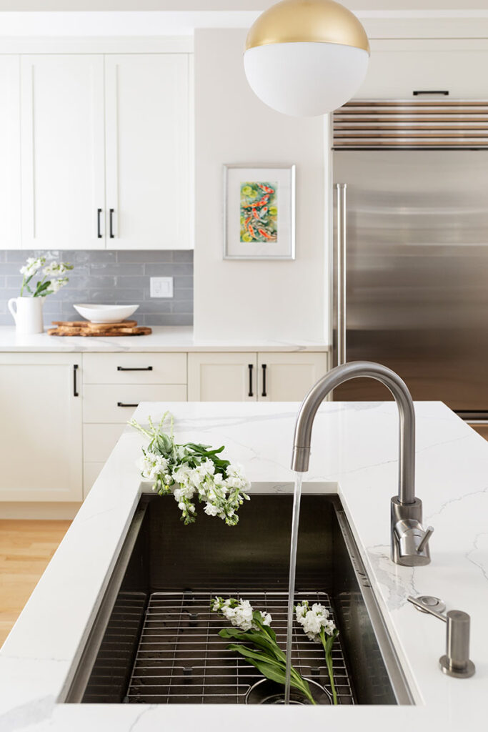
Getting rid of the walk-in pantry allowed for a seven-plus-foot-long island with a generously sized sink that looks out to the rest of the space and those beyond it. The flip side accommodates four stools. Reclaimed wood lining the back of the island infuses character and won’t get damaged if (when) the kids kick it. “The more you bash it, the better it looks,” Palm says. “We wanted the kitchen to look lived in and loved like the rest of the house, not brand new.”
The Kruckenbergs love the look and the new easy lifestyle. They can all be in there facing each other, talking, and working together. “I was worried about losing storage without that walk-in pantry, but it’s more plentiful now,” Heidi says. “We didn’t lose anything; we gained a lot.”

