There were many things that the owners loved about their 19th-century house that’s perched on a hill in the Massachusetts beach town of Manchester-by-the-Sea.
It is within walking distance of the charming downtown district, it has lovely water views, and it was the perfect place to raise their two sons.
But two decades after purchasing the property, with their children in college, they decided that it was time to make some long-overdue changes.
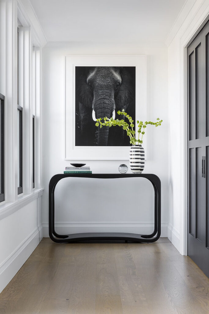
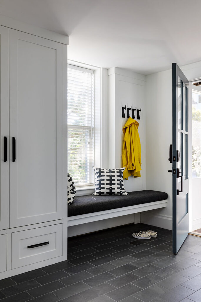
Working with architect Remko Breuker, kitchen designer Karen Swanson of New England Design Works, and interior designers Jayme Kennerknecht and Courtney Lizotte Dana of Kennerknecht Design Group, they embarked upon a renovation that has opened up the home’s possibilities for decades and generations to come.
The new spaces—contemporary clean, crisp, and open—are designed for entertaining, hanging out, and most of all, comfortable living in the 21st century.
“Our goal was to center the life in the house around a larger kitchen with an open floor plan to the main living areas, taking full advantage of the harbor views,” the owners say. “At the same time, we incorporated large pocket doors to be able to separate areas and create privacy within this large living space.
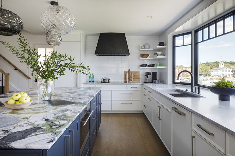
With that plan, it was only natural that the kitchen would become the starting point for the interior design, which exquisitely pairs old and new art and furnishings throughout.
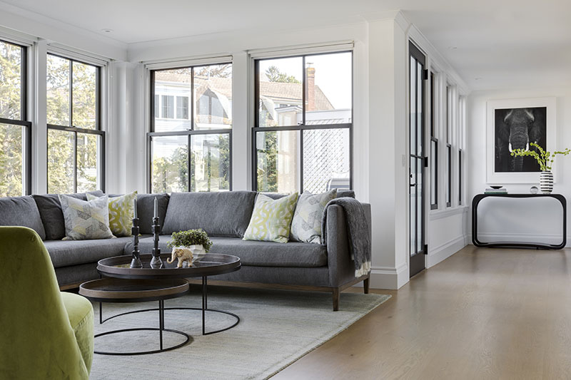
Inspired by the striking charcoal and white veins and apple green flecks of the central island’s quartzite top, Kennerknecht and Dana designed a soft marine color theme around it, grounding the palette in neutrals and adding accents of greens and slate blues to tie all the spaces together.
“It’s a light, bright palette that’s also edgy,” Dana says, adding that “it was refreshing to be able to explore and lean into more vibrant colors.”
Kennerknecht adds that color was used to “find places to repeat and places where to break the rules to create harmony.”
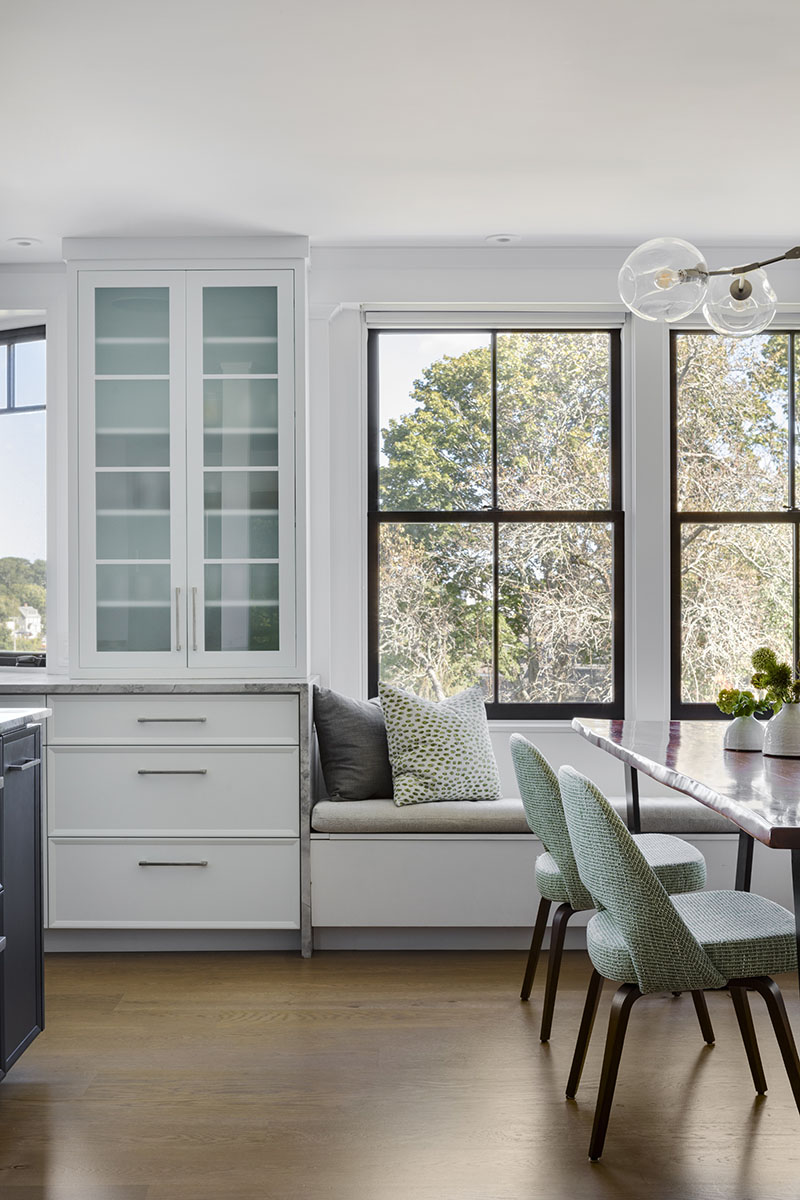
The color show starts in the kitchen, whose slightly blue-white cabinetry is counterbalanced by the deep richness of the island’s ink-blue base.
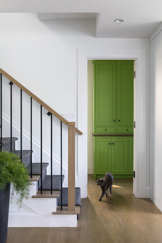
The wooden cabinetry in the adjoining pantry is apple green, a bold choice that the designers felt comfortable with because it’s only partially visible from the main living spaces.
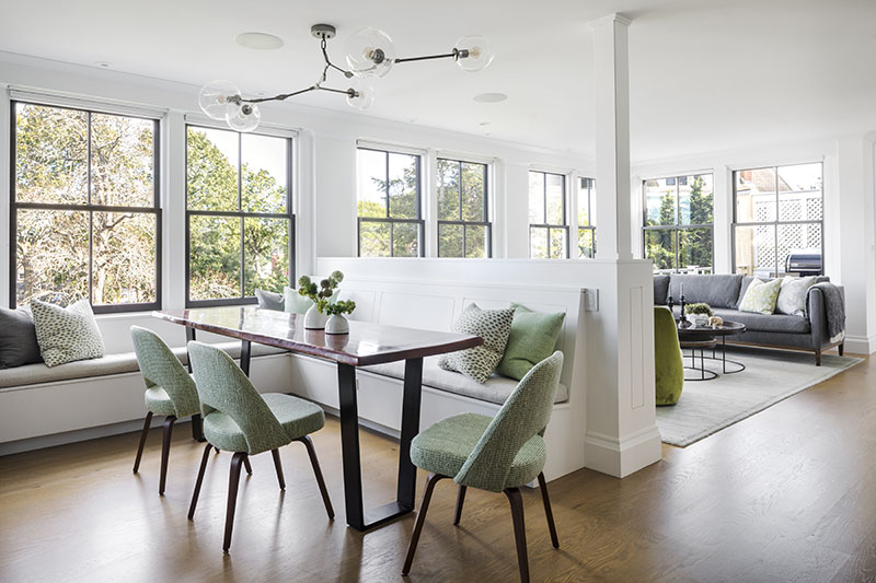
To create a cozy breakfast nook, Dana designed a window seat and banquette whose half-height wall separates the dining and main living areas while still giving them a comfortable feeling of connection.
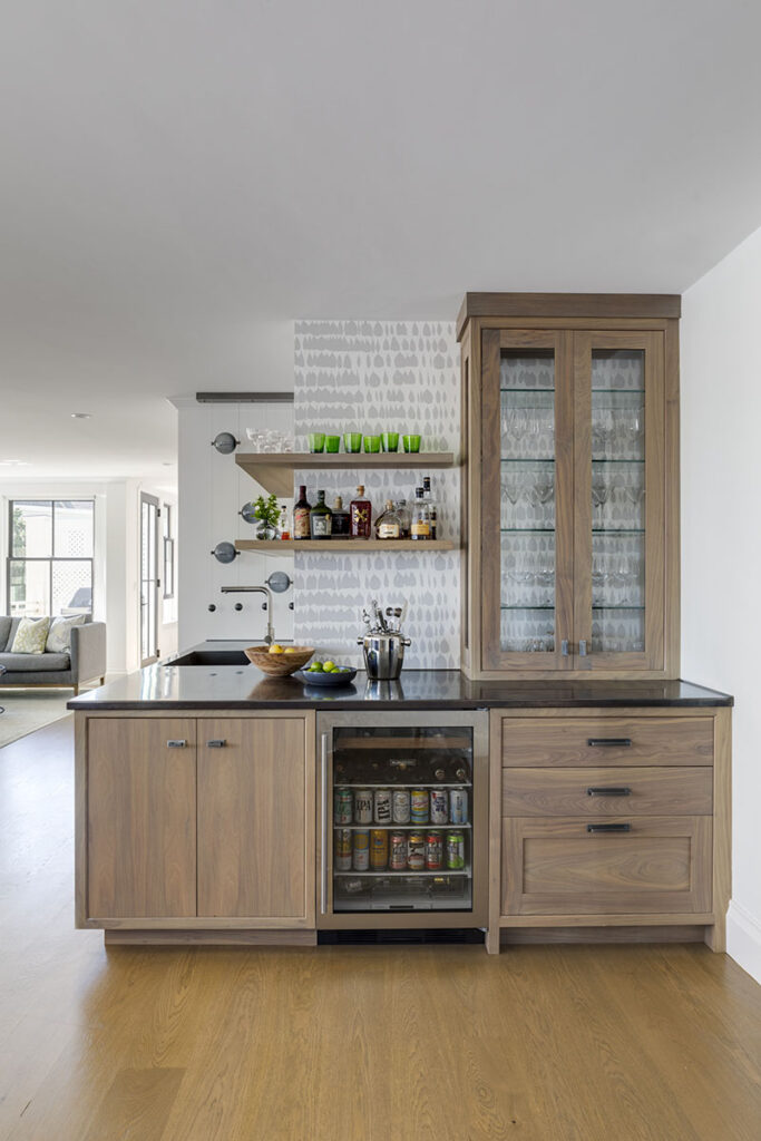
The wet bar, which is in the intermediate space between the living and dining areas and sited diagonally to the kitchen, is more subtle. The heart of family events and entertaining, its walnut cabinetry, open shelves and neutral wallpaper make a muted statement.
Its countertop and sink—made of a single piece of blackened stainless steel—further grounds it.
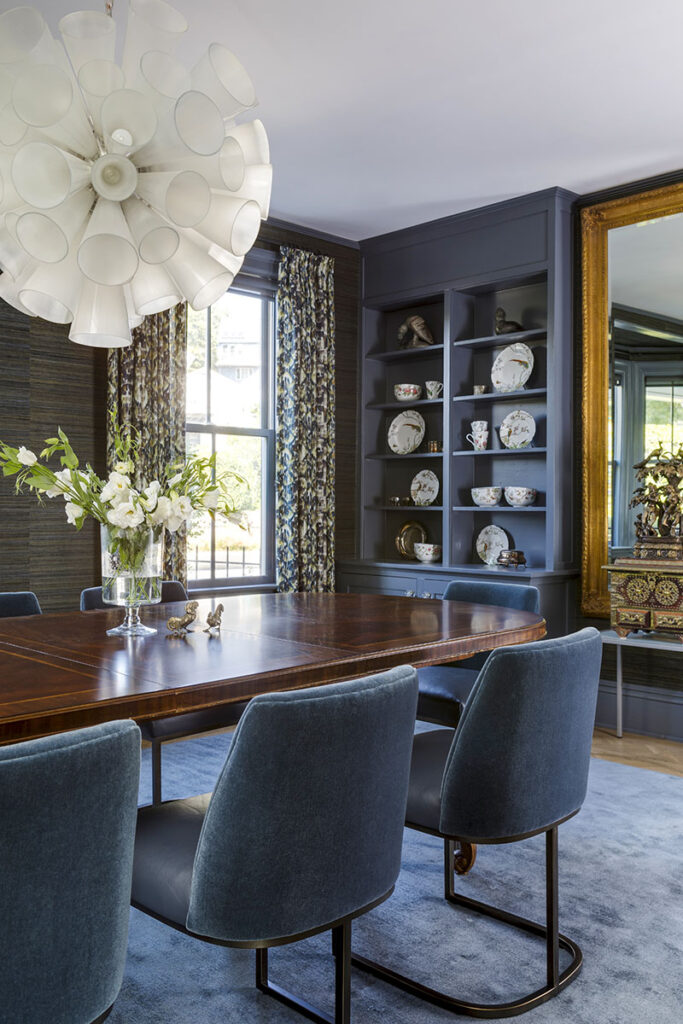
The dining room, which features a bow window, is one of the more formal rooms in the house and is a wonderful illustration of Dana’s and Kennerknecht’s artful pairing of traditional and contemporary elements.
The Queen Anne mahogany dining table, an heirloom, sets the tone for what Dana describes as a “moody” space whose walls are wrapped in multicolored grass cloth. The full-length drapes are in an energetic yet elegant blue and green small-repeat pattern.
“The owners had a dining table they wanted to use, and this helped us organize the space,” Kennerknecht said, adding that the chairs are upholstered in a textured seafoam-green fabric.
The sectional sofa in the main living space, upholstered in a muted grey, follows the lines of the windows. A more relaxed cousin to the banquette, it is accented by club chairs clad in flamboyant chartreuse.
The room’s contemporary chairs, defined by stainless steel frames, are upholstered in tranquil blues: leather on the seats, mohair on the backs. “They speak to each other with a different personality,” Dana says.
Another family favorite, the billiards room, juxtaposes original architectural elements, including two sets of leaded-glass doors and ceiling beams painted the color of cobblestones, with contemporary touches, notably pendant fixtures.
“It’s on the darker side of the house,” Dana says, “and it has a sleek feel for evening entertaining.”
Noting that it was challenging to work existing pieces into the contemporary aesthetic and make everything feel intentional and cohesive, Kennerknecht says that this “exploration of old and new all rings true.”
Learn more about the project team
Architect: ART ARchitects
Contractor: Hunter Whitmore, Whitmore Brothers Construction Co.
Landscape architect: Nina Brown, Brown, Richardson + Rowe
Architect: Remko Breuker
Kitchen design: New England Design Works
Interior design: Kennerknecht Design Group

