Jodi and James Gould purchased a Portsmouth duplex in 2011 because it had a huge yard for their dog. (Their toddler enjoyed it too.) About nine years, another child, and a cat later, with the duplex bursting at the seams and the noisy brood self-conscious about sharing a wall with neighbors, the couple wondered if their lot was actually large enough to build another house on. They asked real estate lawyer Derek Durbin to look up the deed.
Turns out, the property was in fact two lots that had been merged years prior. And—here’s where it got interesting—in response to the tight housing market, Portsmouth was allowing residents to unmerge qualifying double lots until the end of 2021. The serendipitous discovery allowed the Goulds to build a single-family home right in their own backyard. “It was like winning the lottery,” Jodi says.
Rather than design from scratch, Jodi, who is a kitchen and bath designer, found a ready-made house plan that an architect friend slightly modified to better suit their family of four. She and James, who is in sales, share a love for renovation and oversaw the construction. James is the keeper of the spreadsheets, and Jodi is the creative engine; both contribute elbow grease. “My mother, who would have loved to be a carpenter, was the original DIYer before it was a thing,” Jodi shares.
As for the home’s look and feel, it was important that it exude age: This would not be a spiffy McMansion. The inspiration? An old mariner’s house, with walls planked in wood, glints of warm brass, dinged-up salvaged elements, and hand-me downs. “I wanted authenticity, as though the house has history, even though it has none,” Jodi says.
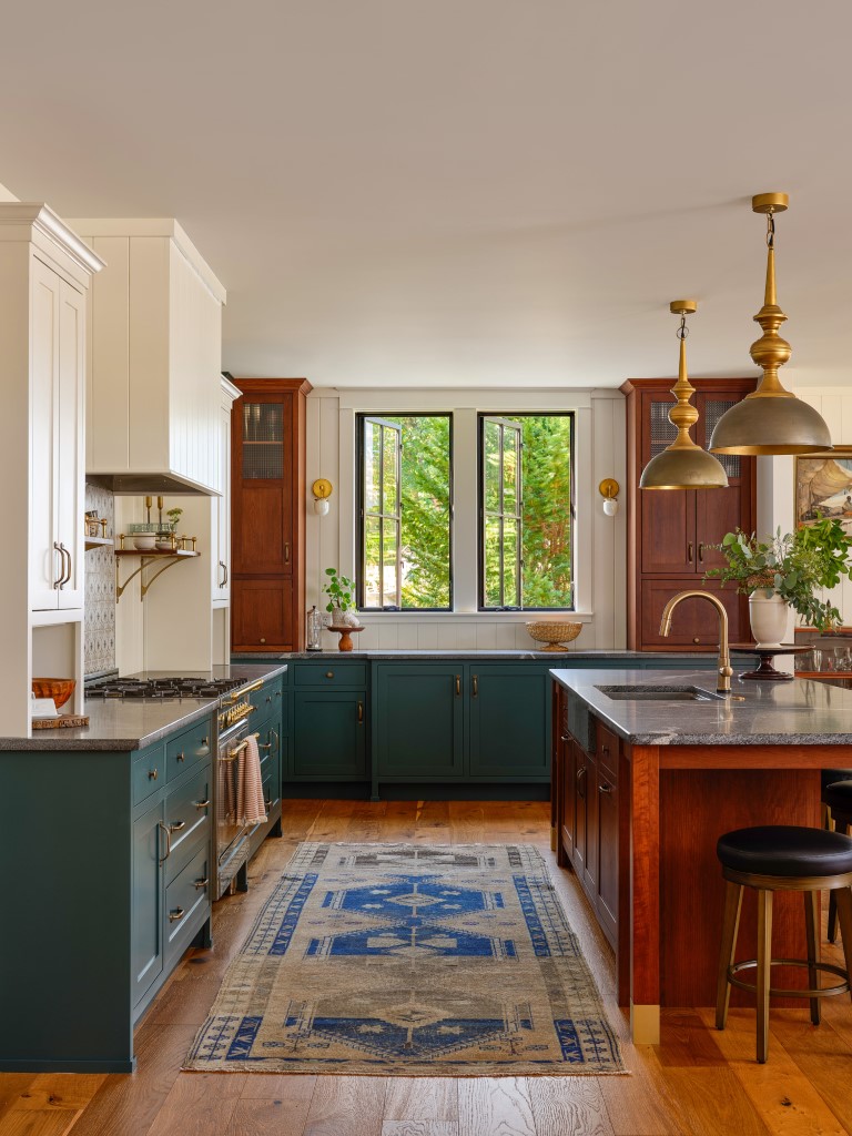
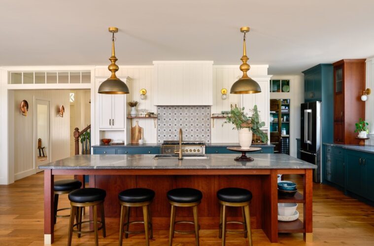
By the same token, Jodi did not want a big, white cookie-cutter kitchen. The materials palette, which includes cherry, granite, and brass, reflects that. “I’m a bit old-fashioned, that’s where the cherry wood came in,” the designer says. Indeed, cherry is hardly in vogue. “My clients don’t use cherry, and I’d never do an all-cherry kitchen with wood uppers and lowers like people were doing in 2003,” Jodi clarifies.
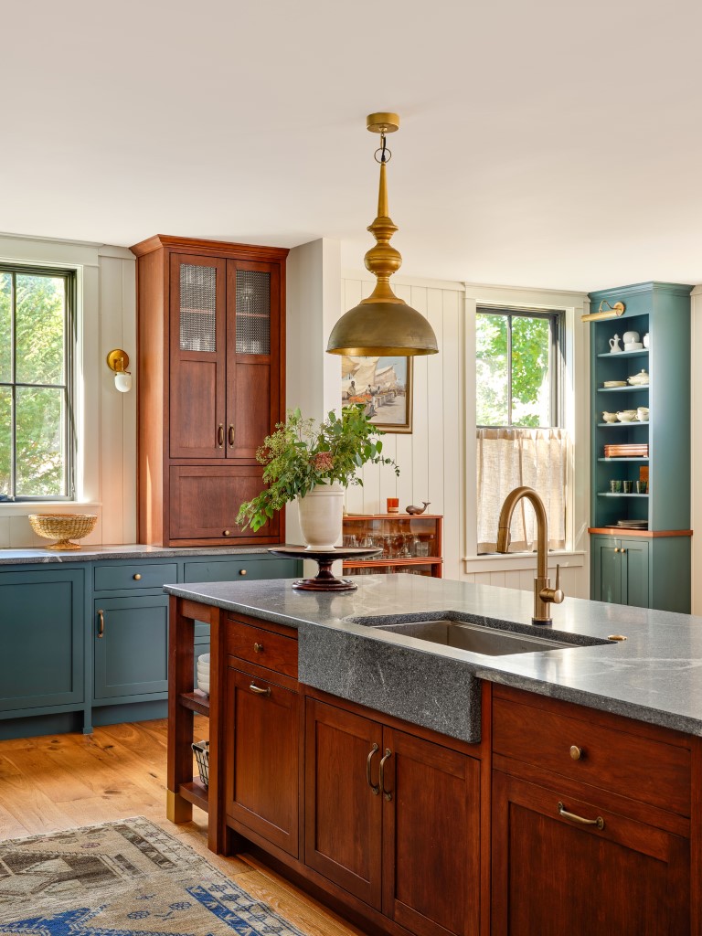
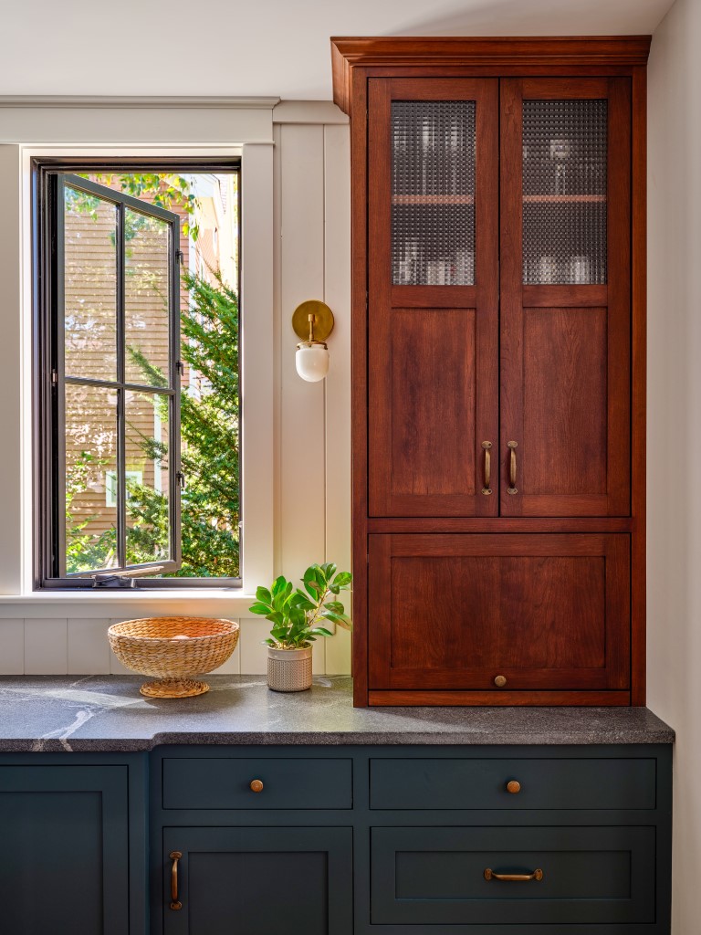
Instead, Jodi used cherry for the island. “I wanted the island to look like a piece of furniture, and cherry lends itself to that,” she says. Cherry tower cabinets flank the windows, bringing the material to the side of the room. Repetition is important in making choices feel deliberate. “Having a material in more than one place, so it relates to something else, gives it a reason to exist,” Jodi explains. Cross-reeded glass on the upper third of the tower cabinet doors ensures the pieces don’t feel top-heavy. “I saw that glass on a bathroom door in a bar in Newport with an old nautical feel, and I knew that’s what I’d use,” Jodi says.
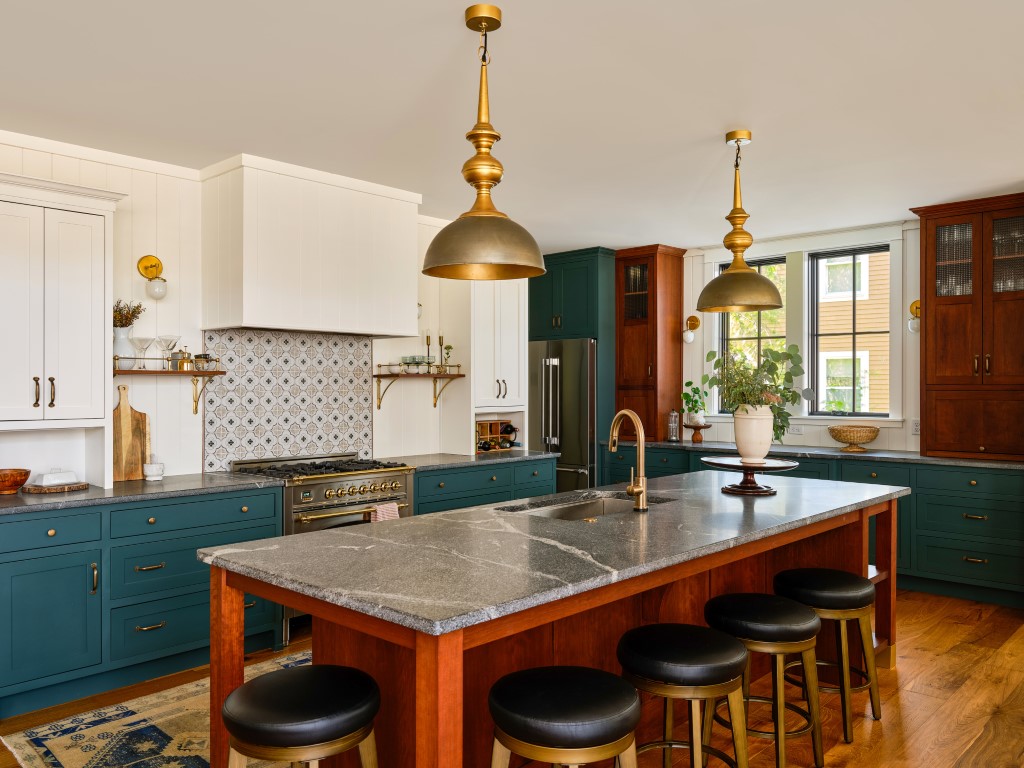
After running through about 30 different blues and greens (“I’m my own worst client!” she jokes), Jodi landed on Sherwin-Williams’ Still Water, a moody aqua with gray tones for the base cabinets. It’s a hue that she refers to as an in-between color, one that makes you wonder if it’s green or blue. She cites the English kitchen company (and Instagram darling) deVOL as an influence. “I love their saturated, nuanced colors and how they mix colors that don’t quite match but somehow do,” she says. “It’s unexpected but authentic; that’s what I’m going for.”
To keep the kitchen airy, the upper portion of the room, which is lined with nickel gap for texture and historic appeal, is painted Benjamin Moore’s Simply White. The designer deems the shade, which runs throughout the home, comfortable and easy to live with. The simple hood is done in the same nickel gap planks. She’ll add a vintage seascape to the front when she finds the right one.
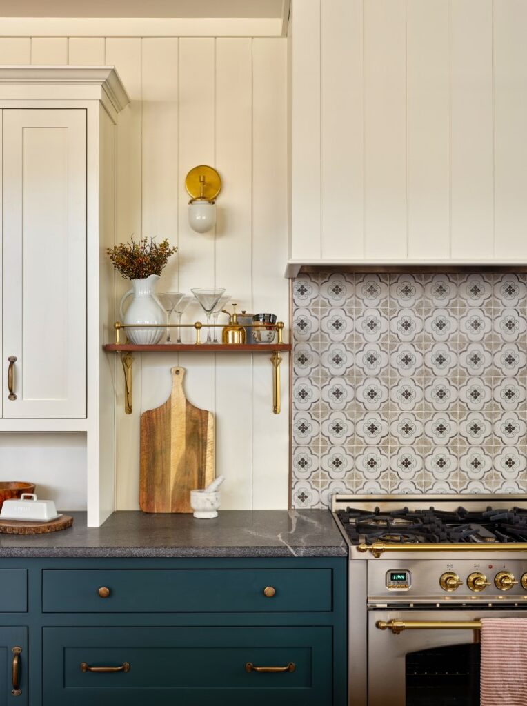
In the meantime, interest comes from the backsplash tile, a low-key Americana-meets-Moroccan mosaic for which she searched far and wide. “Most patterns look new, whereas this feels classic,” Jodi says. “It reminds me of tile used in kitchens of the 1930s and ’40s.” The best part? The whole thing cost less than $70; plus, she installed it herself.
Silver-gray granite counters run around the perimeter and top the center island, serving as a unifying element in a space with three different cabinetry finishes. Jodi opted for granite over soapstone, for its superior durability. “It’s a natural material that looks like one you might find in an older home,” she says. “Would quartz be in an 1800s era mariner’s home? No.”
Aged-brass dome pendants with turned stems add rich interest over the island without overwhelming. The room’s other brass elements follow suit with a similarly weathered feel, except for the Ilve range, which was available only with polished brass accents. No matter. Jodi wasn’t budging; this vintage style range would be hers. “I would have preferred an aged finish, but it wasn’t an option,” she reasons. “Sometimes, you get what you get.”

