Upon returning from living abroad for 20 years Gretchen Parker and her husband, Tim, who hails from England, purchased the rambling bed and breakfast that Gretchen grew up in from her father. Gretchen continued the tradition, serving as a seasonal innkeeper until 2018 when she and Tim sold it, ready to downsize and push back from the sea. The new empty nesters—they have two daughters—didn’t stray far. The following year, the couple closed on a Cape Cod–style home just down the street.
The originally 1,962-square-foot home, built in 1960, sits on a deep lot bounded by conservation land on two sides and graced with mature trees behind it, a rarity for relatively smaller homes in Rockport. “This house was part of a huge development, most of which didn’t get past the planning stages,” William Ruhl, the architect (and neighbor) who helped the Parkers reimagine the home, says. “The view in back looks like Vermont.”
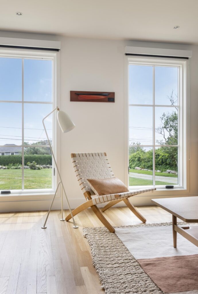
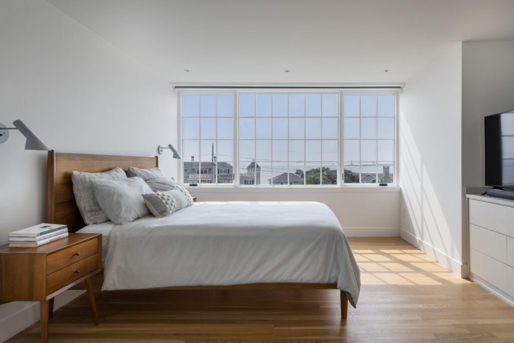
Post-renovation, the view in front—at least from upstairs—looks to the Atlantic Ocean, all the way out to Thacher Island. Gretchen and Tim’s daughter Caitlin, who is a commercial architect in Washington, D.C., found a photo of a similar style home with an exaggerated dormer that the couple passed to Ruhl as inspiration. Using that concept as the starting point, Ruhl replaced the home’s tiny, limiting dormers with oversized, modern dormers clad in copper that opened up the view. In the back, he popped almost the entire length of the roof.
These moves also vastly increased the headroom, adding nearly 550 square feet of usable space upstairs. It went from dark, tight, and claustrophobic to light, airy, and efficiently expansive. “The upstairs had two bedrooms, one bath, and a lot of storage under the eaves,” Gretchen notes. “Will did a phenomenal job of reconfiguring it to give us an office, a primary suite with a walk-in closet, a laundry room, and two guest bedrooms with a Jack and Jill bath.”
Other architectural enhancements further modernized the exterior and let light inside. Double-hung windows became elongated casement windows and the solid front door was swapped out for one with full glass. In addition, Ruhl replaced the shingles on the main portion of the house with hearty, flat shiplap siding with narrow corner boards and updated the roof deck over the garage with mahogany rails and stainless-steel cable. “After living in turn-of-the-century Victorian homes it was time for a change,” Tim says. “This is a new look for a new era.”
To align the interior with the owners’ tastes and lifestyle, facilitate the flow, and coax views and sunlight through the house, Ruhl widened the openings between rooms to eight feet. This allowed them to leave the partition walls in place while achieving their goals. Still, they stripped the place to the studs, freshening it with all new finishes and trims. “We did a simple, Shaker-like flat trim throughout and painted everything Benjamin Moore Chantilly Lace, a nice bright white with a name that makes you think of doilies,” Ruhl says.
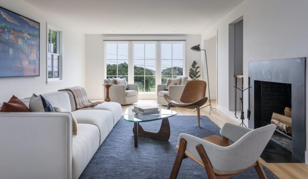
The living room opens off the entry, running along the side of the house from front to back. The couple banished the room’s wainscoting, along with the traditional wood mantel, requesting a minimalist honed-black soapstone surround instead. Caitlin and Gretchen commissioned paintings by local artists Karen Tuzinski and Scott Tubby to hang above the sofa. “The artists coordinated on the cobalt blue sea, sizing, and frames,” Gretchen explains. “When we hung them, we were all surprised to see that the horizons coincide too.”
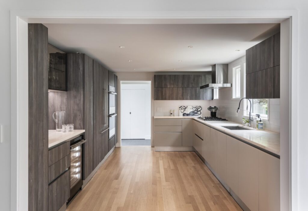
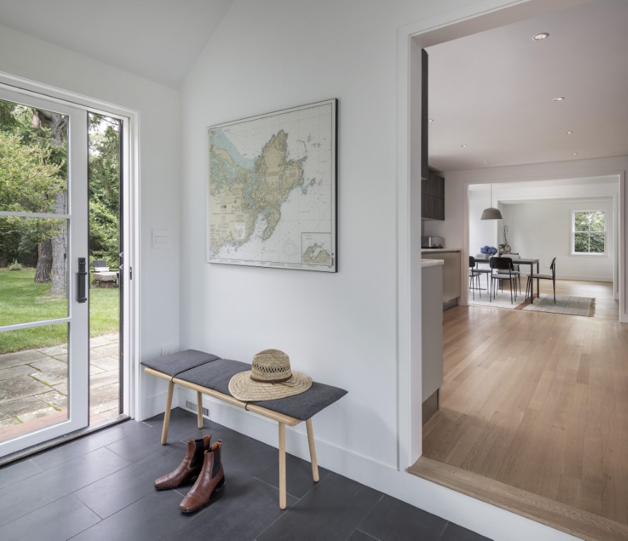
Along the back of the house, the living room is open to the dining area, which is open to the kitchen, which is open to a new mudroom. It’s an ideal setup for entertaining indoors and out. The couple headed to Scavolini for contemporary Italian cabinetry, choosing a rich, dark wood laminate finish which they paired with glossy off-white base cabinets on the sink side. Ruhl enlarged the window over the sink and flanked the hood with windows, all of which capture beautiful afternoon light.
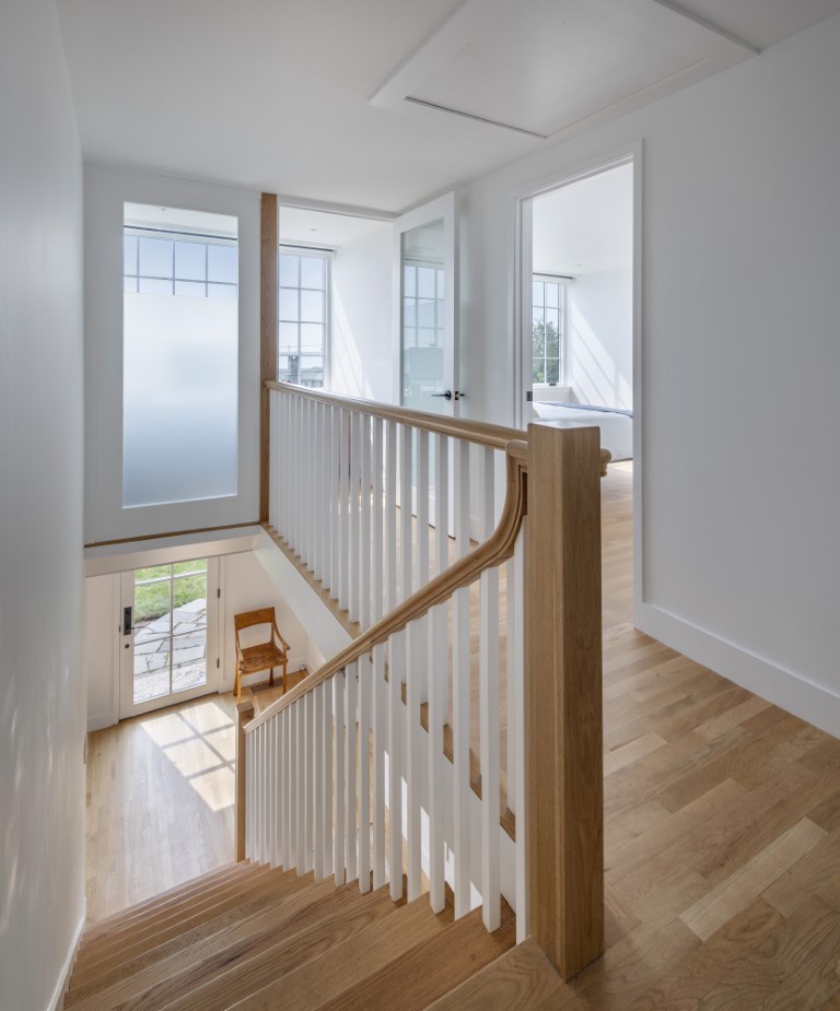
The refashioned stair ascends to the second floor, where Tim’s small office nestles into a front dormer and a frosted glass wall and door let light from the ocean-facing window penetrate the stairwell and hall. The idea to use frosted glass came from the frosted exterior windows of a bank-turned-residence downtown. Caitlin designed the built-in desk to maximize the tiny area and efficiently store all Tim’s stuff.
Having built-in storage to tuck things away helps make this small house feel bigger than it is,” Tim says. “Friends are often surprised when they walk in, saying, ‘I thought this was a little house, but it feels huge inside!’”

