When a new family with four children took up residence in a late-19th-century Colonial Victorian in Winchester, they brought the house to life again in a lovely and lively manner.
As with all moves, there were adjustments that had to be made to make everything better. The house, which was built in 1889, was a lot bigger than the previous place the sextet had called home, and the old furniture just didn’t seem to fit.
They arranged the pieces as best as they could, but “everything looked unfinished and vacant,” says Justine Sterling, whose namesake design firm is based in nearby Stoneham.
After helping the couple select a paint scheme for the exterior, Sterling came up with a multiphase plan for redecorating and repurposing the interiors that was classically chic and elegant, and most important, rough-and-tumble kid-friendly for the youngest occupants, who range in age from 6 to 16.
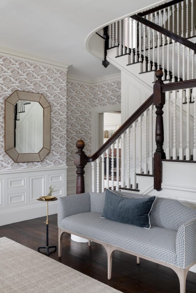
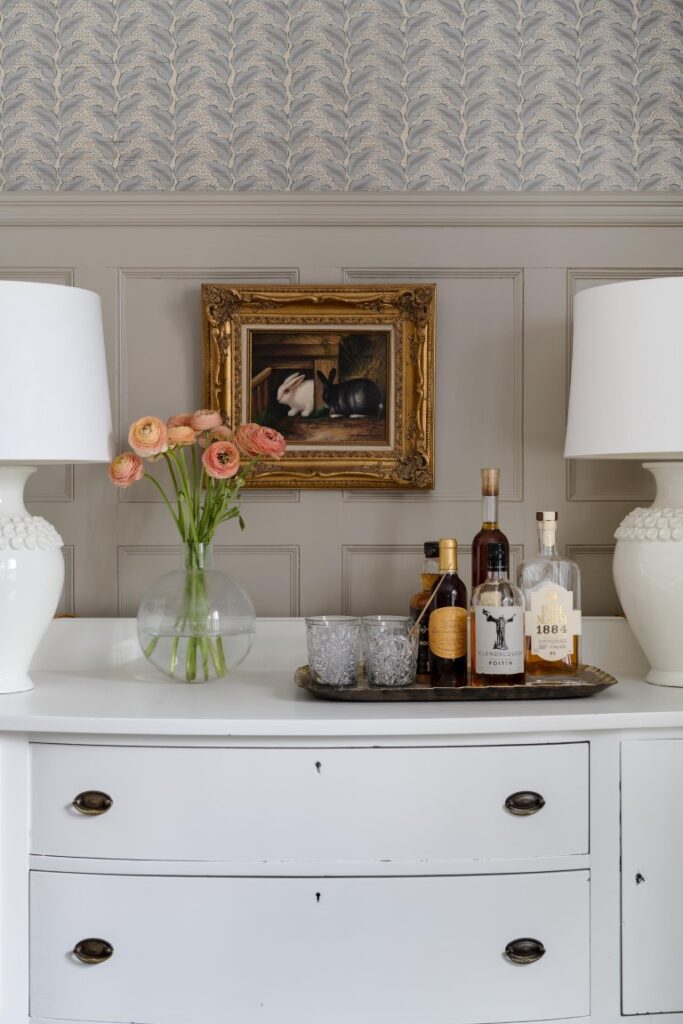
The house was very cooperative: Its original architectural elements, which include wood-panel wainscoting and numerous fireplaces with different styles of mantels, set the tone for the project, whose first recently completed phase encompassed the entry hall and main stair leading to the second level, the formal dining room, the living room, and the primary bedroom suite.
“The wife wanted the rooms to be well appointed,” Sterling says. “It’s all kid-friendly—the finishes are hard-working and hard-wearing.”
Sterling’s classical/traditional design plan, in a color palette of warm white, taupe, mink, and the wife’s favorite, subtle blues, elevates the architectural elements and visually connects the main public rooms, which are grounded in oak flooring that is stained dark. The foyer, which includes a staircase with the original banister, leads to the living room on one side and the formal dining area on the other.
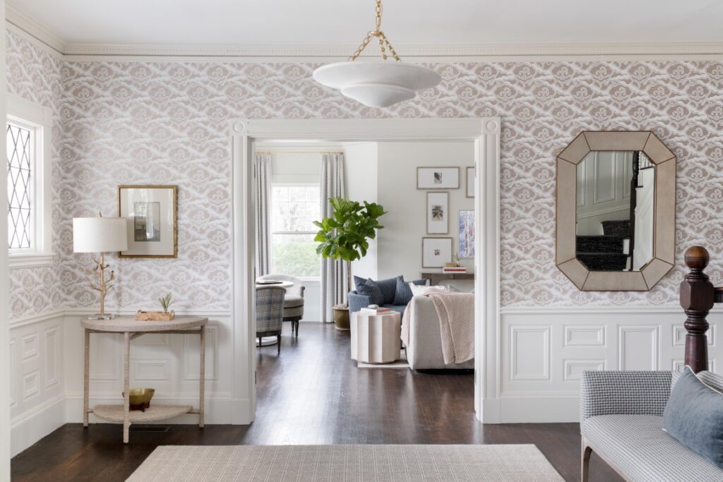
With its doily-like dynamic swirls, Schumacher’s “Cirrus Clouds” sisal grass cloth wallcovering sets the stage for the main rooms, which are tied together by furnishings that are complementary without being cloyingly clonish.
Although the dining room is dominated by a custom table (the family requested one large enough to seat 10 to 12) the space was planned around the fireplace mantel and Serena Dugan Studio jute grass cloth wallcovering “Cassis.” There are two seating areas—the table as well as the window seat under the three-paned bay that features a pair of side tables—that are versatile enough for parties or everyday eating and hanging out.
Sterling, who loves to mix window treatments, installed draperies in the front windows, which also include wooden shutters. The bay, however, which is on the side of the house, is unadorned except for wooden shutters on the bottom panes, a treatment that maximizes natural light.
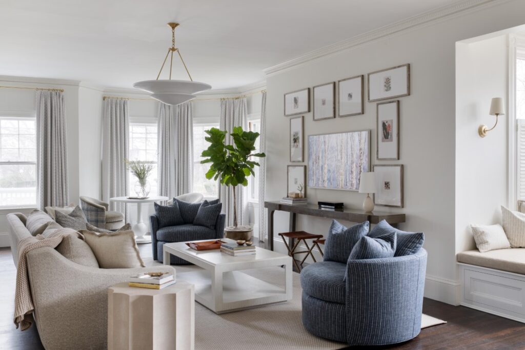
The living room, which bookends the other side of the entry hall, is divided into three zones, creating cozy, coordinating spaces that are multifunctional. The symmetrical central zone revolves around the flat-screen television, which is set in the wall like a work of art and surrounded by small framed artworks.
“It has a screen saver, so it, too, becomes a work of art,” Sterling says. “You don’t even realize it’s a TV when you first see it, which is exactly what the wife wanted.”
The pair of oh-so-comfortable blue-upholstered chairs, each of which Sterling says is large enough to squeeze two children into, face the coffee table, a study in white.
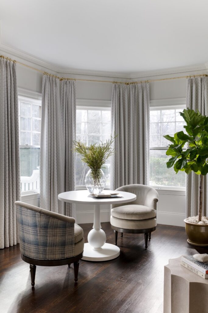
The living room’s front zone is a sitting space. Two matching swivel chairs, their fronts upholstered in kid-friendly taupe velvet and their backs clad in a pale-blue plaid, have seated themselves around a white-wood pedestal table that’s a nod to the chess-piece-like window tables in the dining room.
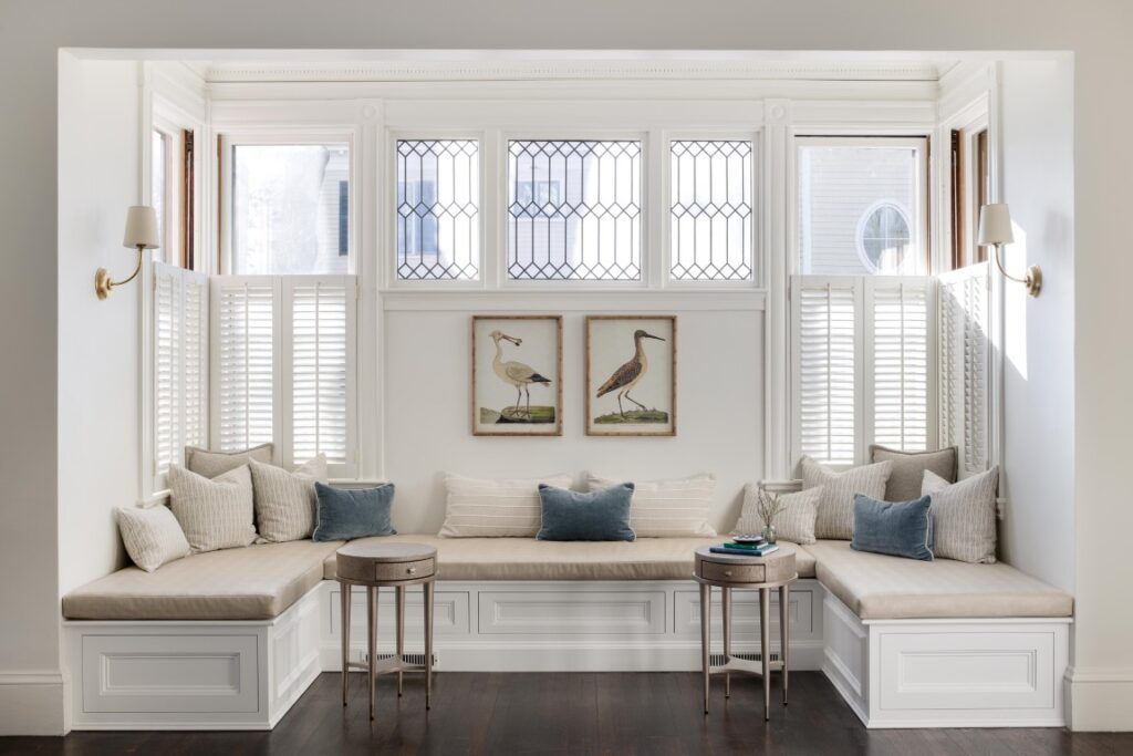
The most versatile zone of the room is the one in the back, where Sterling says adults and kids like to spend free time. The window seat has paneled storage drawers.
“The two tiny drink drop tables are perfect for a cup of coffee or a book,” she says, adding that the window seat is upholstered in kid-proof textured vinyl that can be wiped down quickly.
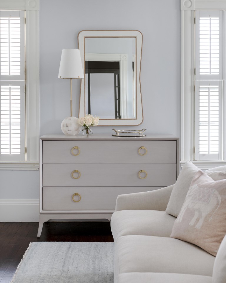
The clean, contemporary aesthetic recommences in the primary suite, where there’s a soft sofa at the foot of the bed and shutters on the windows.
“The wife didn’t want drapes,” Sterling says. “She doesn’t like anything fussy, and she wanted everything to be easy to clean.”
The rooms Sterling designed exist in perfect harmony. “When you walk in the door,” she says, “the eye glides from room to room; everything feels laid back and comfortable.”

