Lauren Patel started dreaming about redoing the kitchen in the early 1900s Victorian that she shares with her husband, Mitul, and their three children, on day one. While much of the Arlington home had retained its character, the kitchen, with its dark-brown cabinets and beige backsplash, had not. Plus, with access via a vestibule along the side of the house or through a swinging door from the dining room, the kitchen felt isolated. “We wanted it to feel more like part of the house and look as though it had always been that way,” Lauren says.
As for that look, Lauren hoped to cultivate an English sensibility with furniture-like cabinetry painted a dusky but not too dark hue and materials, such as natural marble and unlacquered brass, that would only look better with age. “I like a soulful character,” Lauren says. “A white kitchen is classic but doesn’t fit the vibe I wanted.”

To find maximum function in the existing footprint and realize their desired aesthetic, the Patels turned to Lara Shaw. A friend who was working with Shaw on their own kitchen assured the couple, who had not worked with a designer before, that Shaw would support their vision, not override it with her own. “Our chemistry was great; we totally got each other,” Shaw says.
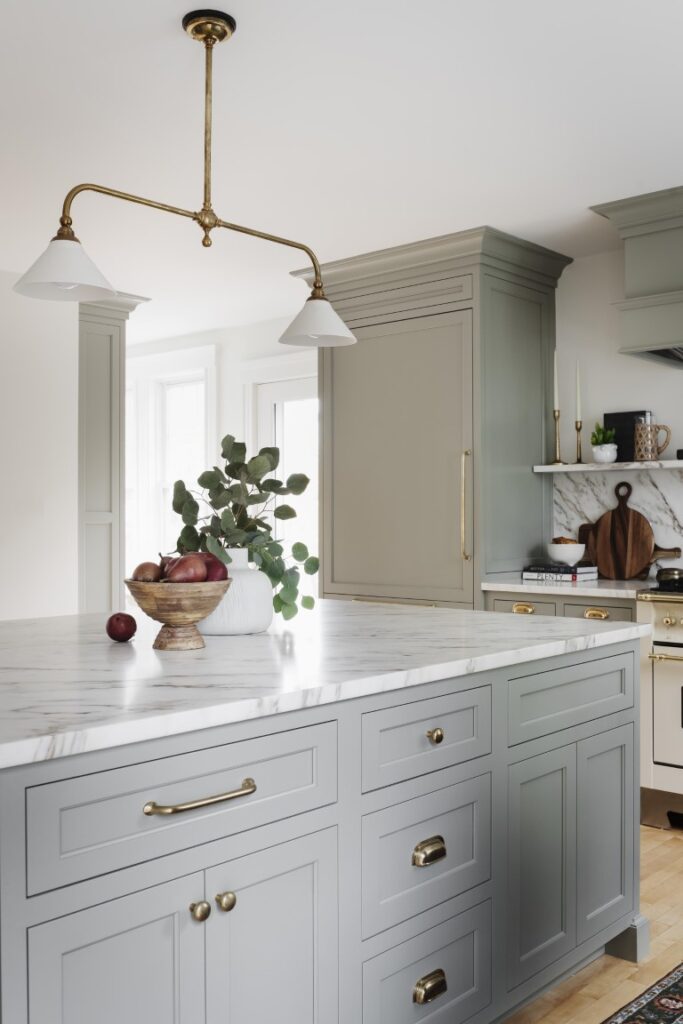
Shaw immediately steered the couple toward custom inset cabinetry. “You can’t get that seamless, furniture-like effect with stock cabinets,” Shaw explains. “They wanted cupboards with a cozy, timeless feel.”
The cabinetry color is Benjamin Moore Oilcloth, a muted, warm green with gray undertones that reads as a neutral. “I initially envisioned a darker color, but our home does better with lighter shades,” Lauren says, recalling how she previously painted a bedroom in a dark color but ended up changing it. “This is a light green but it appears darker sometimes; it changes depending on the time of day.”

In terms of the layout, the L-shaped configuration remained intact, save for a few key tweaks. A tower cabinet that hides the toaster, coffee maker, and such replaced the refrigerator, which was interfering with the back door. The refrigerator, in turn, moved to the adjacent wall where it ends that run of cabinetry. “Swapping out the giant slider with a standard-sized glass door to the deck allowed us to relocate the fridge there and extend the cabinetry,” Shaw says.
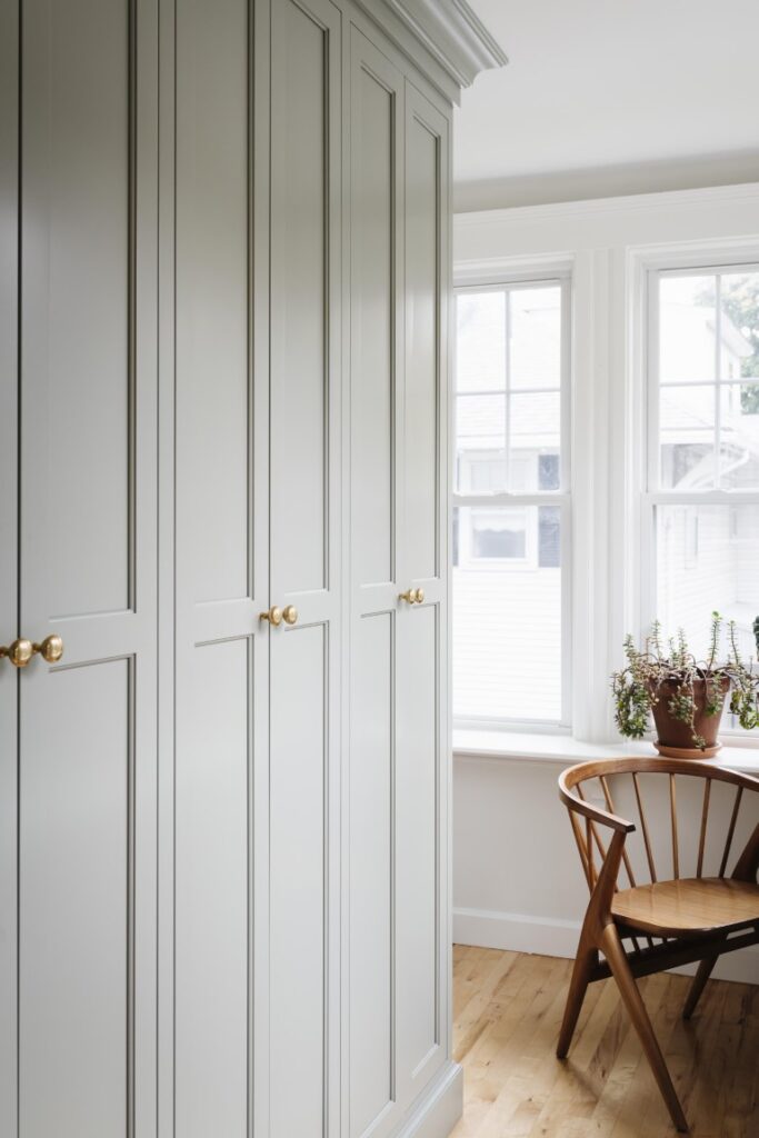
Perhaps the most valuable move happened in the sunny, plant-filled vestibule just beyond the side door. Here, Shaw closed up an interior window into the dining room in order to install floor-to-ceiling pantry cabinets, remedying a major shortcoming. “It stores so much food; it’s life-changing,” Lauren says.
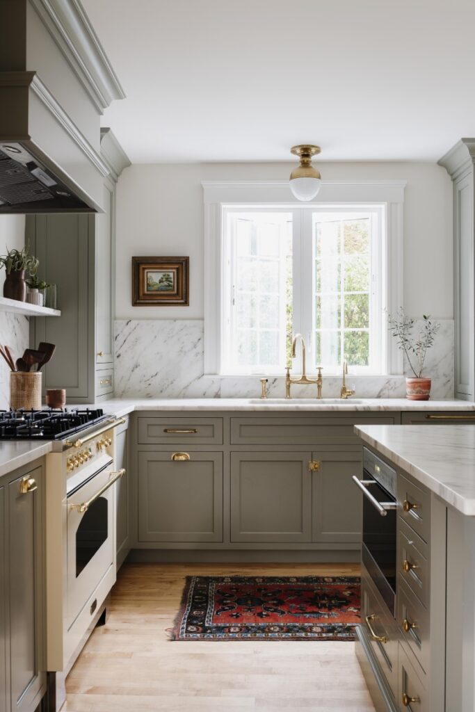
The room’s focal point is the ivory enamel range with brass trim, an item high on Lauren’s wish list. She and Shaw played with numerous color options, including dark green and black, before settling on this combination. “I love this feminine approach,” Lauren says. “Lara describes it as the jewelry of the kitchen. It is definitely that.”

A honed Danby marble backsplash and shelf enhances the vignette. The must-have feature was inspired by the one in influencer Athena Calderone’s former Brooklyn brownstone. That said, while Lauren imagined using a stone with similarly robust veining, Shaw recommended they go quieter. “That stone, with its black, grey, and gold veining, was too loud, too trendy, and triple the price,” Shaw says. “This has some movement, nice depth of color, and fit the budget.”
The stone carries over to the island, which Shaw was able to enlarge once they decided to expand the opening between the dining room and kitchen for a better connection between the spaces. Lauren embraces the idea of the patina that the natural stone will develop over time. The unlacquered brass pendant light from deVOL, a British brand, that helped solidify the kitchen’s overall sensibility, will also show some age, as will the unlacquered brass bridge faucet.
The refurbished kitchen matches the integrity of the Victorian home and suits the family of five who live there. “We’re a down-to-earth young family and not formal in any way, and our kitchen reflects that,” Lauren says. “Lara gave us as much utility as possible while also making it beautiful.”

