Although this 3,700-plus-square-foot clapboard home in South Hamilton had ample living space and a fairly open layout, the kitchen was cramped and felt closed off from the rest of the rooms. “The kitchen was clearly not designed by someone who cooks,” the homeowner observes, lamenting its poor circulation and lack of cooking triangle, in addition to its size. “We always felt like we were on top of each other.”
Plus, stylewise, it was time for a refresh. The family moved into the traditional house eight years ago, and their tastes had since become more modern. “There was beadboard everywhere, and they wanted it gone!” says Kate Daskalakis, whom the couple hired to revitalize the kitchen and the rooms around it.
First, Daskalakis analyzed the kitchen’s potential for expansion. Alas, its position in the middle of the home made enlarging it a no-go. “A hallway runs behind the range wall, which made pushing it back impossible without reconfiguring a large portion of the first floor,” the designer explains. “That wall is structural, which would have greatly increased the cost too.”
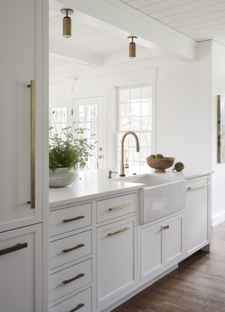
They could, however, alter the opposite wall, the one that separated the kitchen from the living room. The original design featured the kitchen counter with a pass-through window flanked by upper cabinetry above it, along with a height-gobbling header and crown molding. Daskalakis replaced the clunky configuration with a peninsula and streamlined the header. Not only did the redesign open the kitchen to the living room, but it also added counter seating. “I love the stool seating at the peninsula,” the homeowner says. “People can participate from there—out of the actual kitchen.”
The long, narrow island that ran down the center of the kitchen needed rethinking too. While the (beadboard-clad) piece provided storage and prep space, it was more hindrance than help. “You had to travel around this long island to get from the sink to the stove,” the homeowner says.” So, Daskalakis came up with a furniture-like island that is shorter in length and filled with smart storage solutions. For instance, deep drawers outfitted with pegs hold the dishes, just across from the new apron-front sink, making unloading the adjacent dishwasher easy.
The handsome piece, painted in Farrow & Ball Downpipe, a sooty charcoal, and topped with charcoal-colored soapstone-like quartz with a thick, mitered edge, anchors the otherwise all-white kitchen. “The clients really wanted a contemporary, bright white kitchen with white cabinetry, white walls, and white countertops,” Daskalakis says. “The island accentuates that by providing contrast.”
To keep the scheme from feeling flat, Daskalakis added eight-inch-wide shiplap to the ceiling and peninsula front. The rhythmic texture directs the eye upward and provides a nice transition to the coffered ceiling in the living room. The custom inset frame cabinetry and clean-lined, brushed brass pulls feel fresh without straying too far from the home’s traditional architecture.
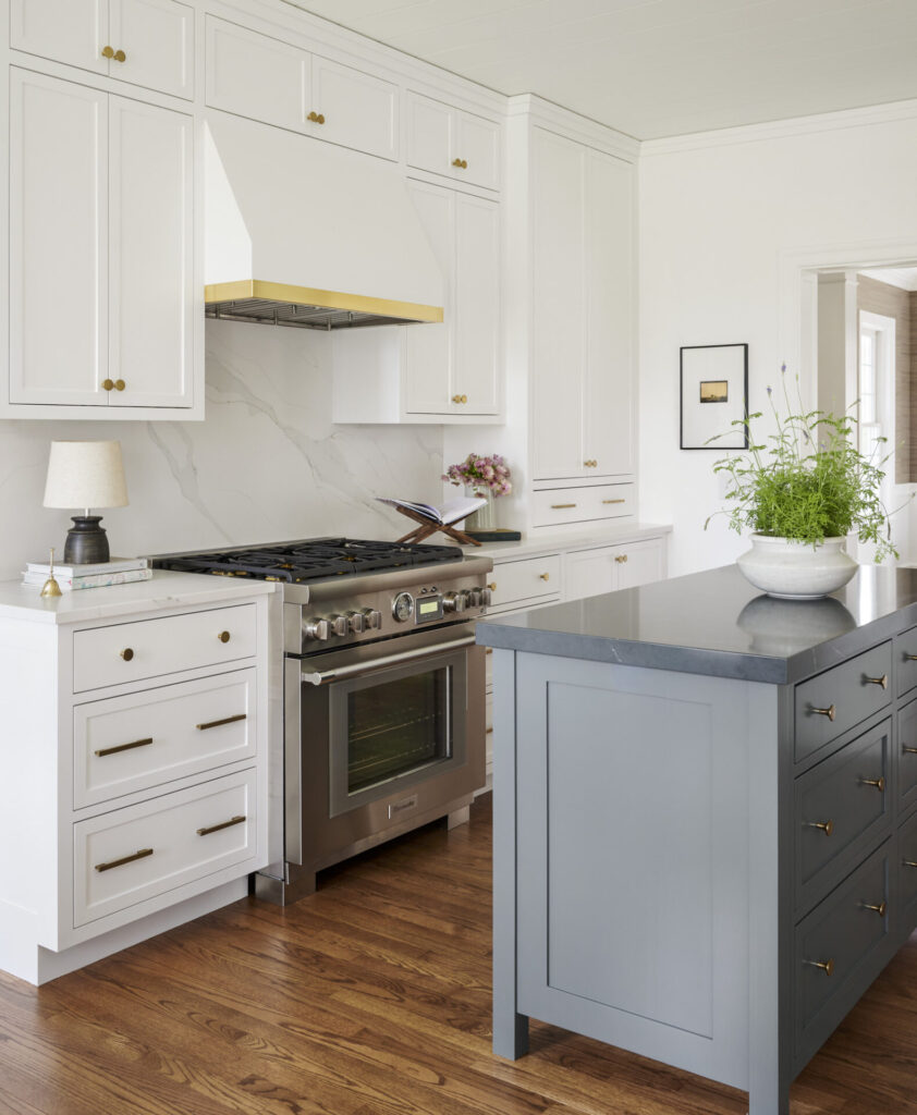
To increase storage on the back wall and create a focal point, the designer swapped the two wall ovens and cooktop for a Thermador range topped by a painted wood hood with simple brass trim. “The double wall ovens took up the whole wall, severely limiting pantry-type cabinetry,” Daskalakis says. Now, there’s a tower cabinet that stretches from the countertop to the ceiling, where the designer remedied another clunky soffit and crown molding situation. “We modernized the lines and took advantage of the high ceilings,” she says.
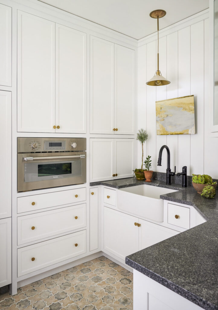
The homeowners loved the look but worried they’d miss that second oven. No problem! Daskalakis incorporated a speed oven into the walk-in pantry, which she and the family now call the scullery, once she completely redesigned it. This sleek auxiliary kitchen is packed with function. The extra oven fits flush in a wall of cabinetry along with a counter-depth paneled fridge that supplements the full-size one in the main kitchen.
The scullery also houses a second dishwasher and farmhouse sink, complete with a dedicated spigot for instant hot, cold, and bubbly water. “We found a system from Zip Water that fits under the sink to replace the giant machine we had before,” the homeowner says. The family also love the rustic, arabesque-shaped floor tile. “It makes me joyful when I walk in,” the homeowner says.
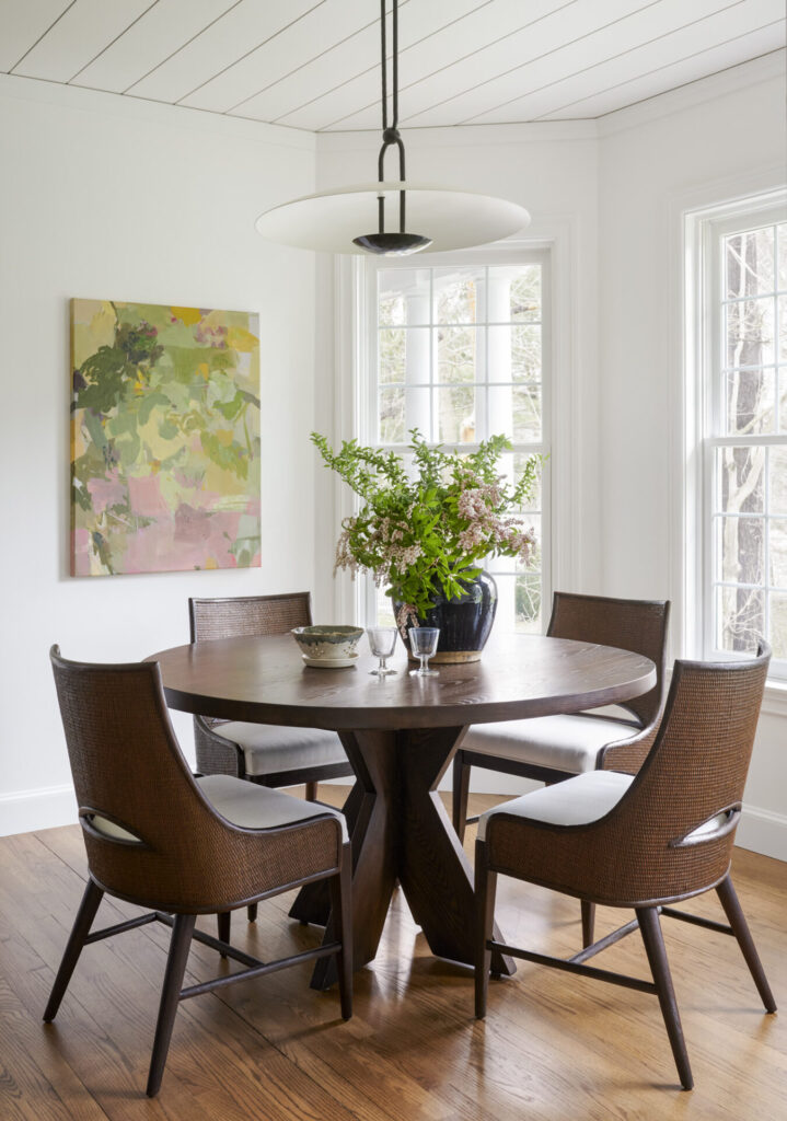
Daskalakis spruced up the adjacent breakfast nook too. Chairs with curved, caned backs that tie to the new counter stools with woven rattan backs now surround the family’s existing pedestal table; a pendant with bronze metalwork and a disc-like dome hangs above it.
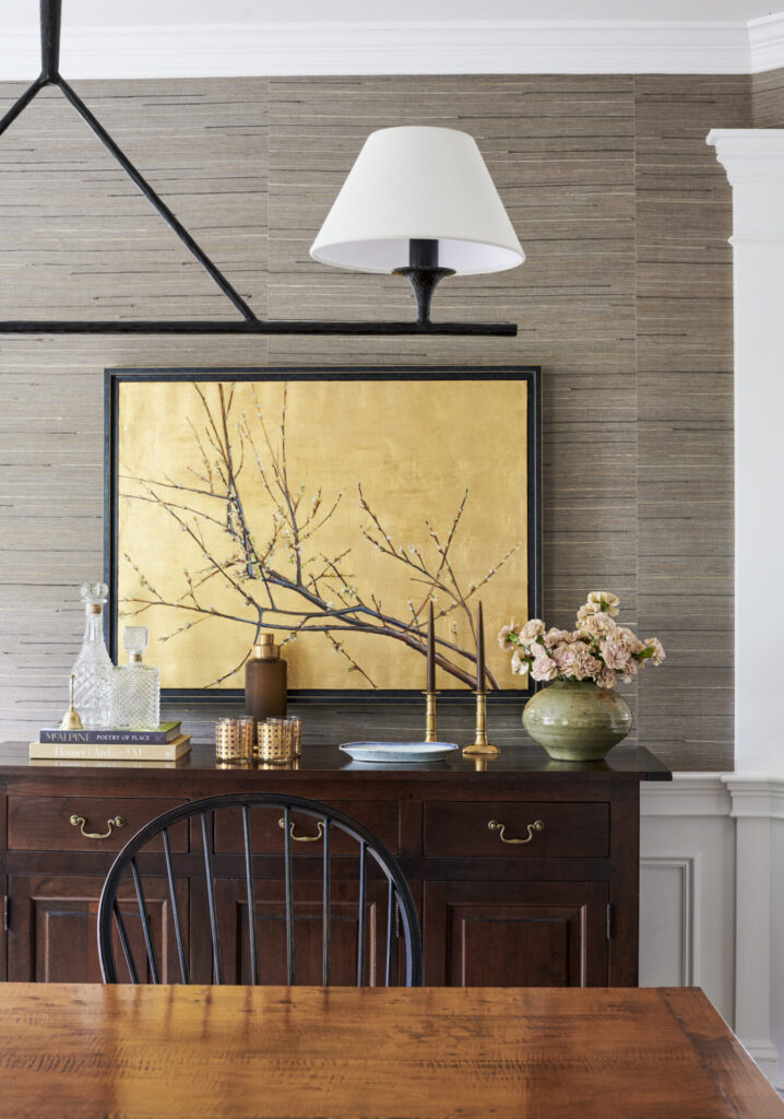
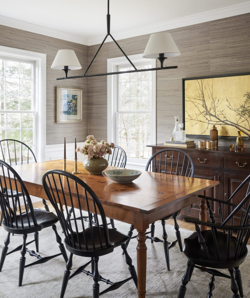
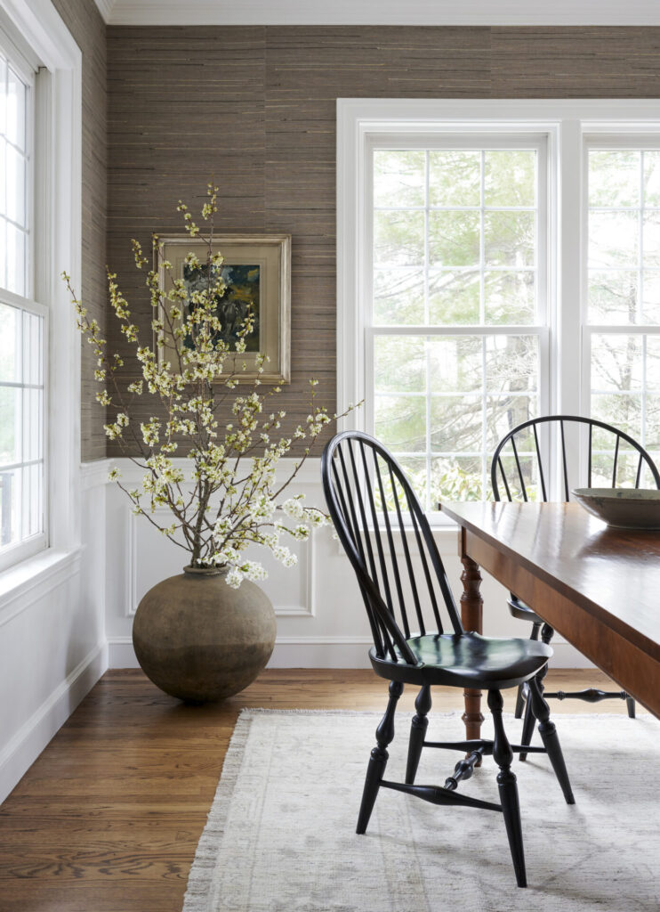
The breakfast room’s Windsor chairs, meanwhile, moved to the formal dining room, where the curved black forms contrast the existing rich wood table. A new linear pendant in aged iron brings a slash of black to the top of the room too. The real drama, however, comes from the Hartmann & Forbes grasscloth wallcovering that Daskalakis wrapped the room in. “The grasscloth really sets off that space and elevates the pieces we weren’t ready to let go,” the homeowner says.
Learn more about the project team
Designer: KSD Designs
Contractor: Portside Fine Carpentry
Cabinetry: HDC Millwork
Painting and wallpaper: JMB Painting Co., 603-892-2590

