Being unafraid of “flipping the plan” led to a beautifully renovated and reimaged space at an 1880s era home in Ipswich, where an elevated farmhouse aesthetic meets incredible function. The homeowners, Michelle and Peter, had moved into the home years before with the intention of renovating but never did.
“They loved design but really needed some help in figuring out what they wanted,” says Essex-based designer, Kristina Crestin of Kristina Crestin Design.
That’s when Michelle and Peter called in the pros. The renovation and design project appeared on season two of the HGTV show, “Farmhouse Fixer,” which features Crestin and farmhouse renovator Jonathan Knight, of New Kids on the Block fame.

The house had great bones but clunky functionality. Too many windows resulted in glare on the TV in the family room; the couples’ dirty barn boots and riding boots lived outside on the porch because there wasn’t space inside the house; their office was small and cramped; a small step-down area in the living room and an unused downstairs shower left big pockets of wasted space.
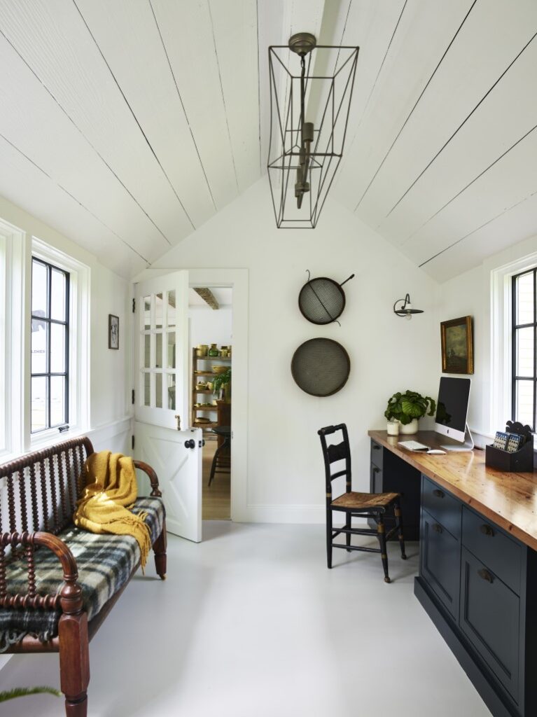
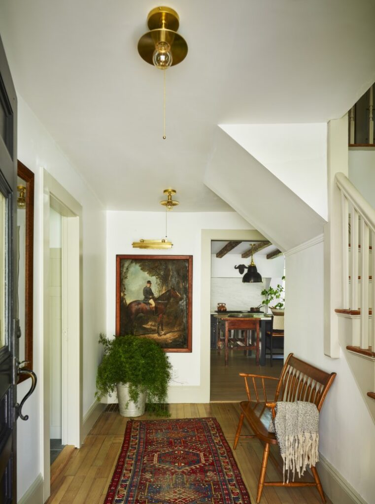
That’s when Crestin and the team got “flipping,” switching the dining room and the family room; turning the office into a superfunctional laundry-mudroom; creating a new office in the former laundry area; reconfiguring the front entryway so that it led directly into the mudroom; and removing the downstairs shower and unused step-down space in the living room to add more room to other areas of the house.
One of the most impressive changes is the European farmhouse-style mudroom. Its location directly off the front entryway allows Michelle and Peter to come straight inside after a day of working with their horses without tramping mud and muck through the house. Because it’s located right at the front of the house, it’s aesthetically beautiful, too.
“It seems like a pretty mudroom moment, but it’s crazy functional,” says Crestin.
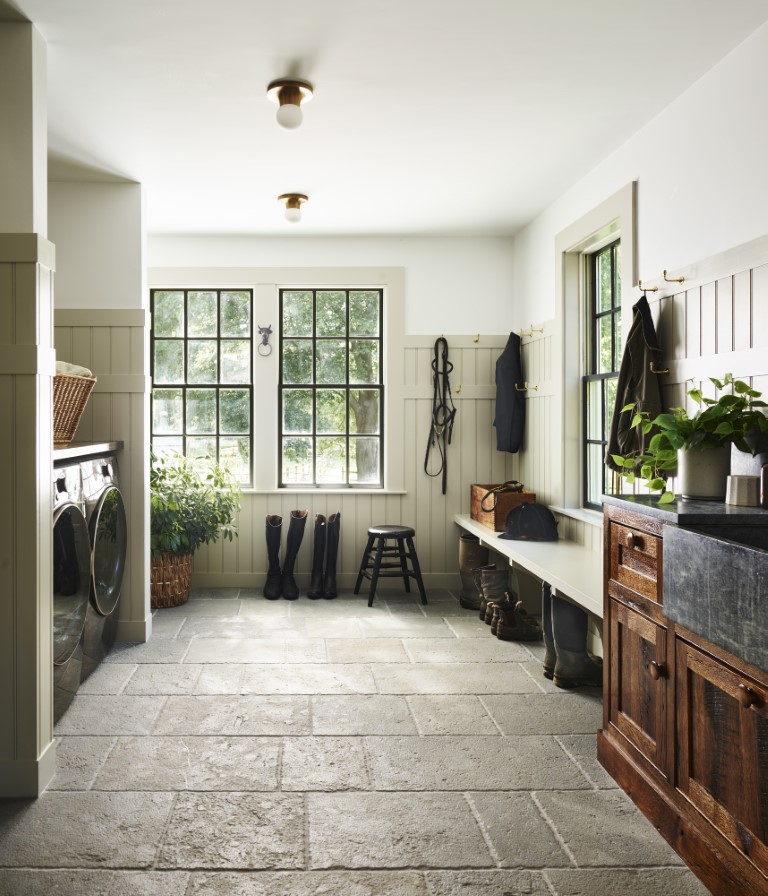
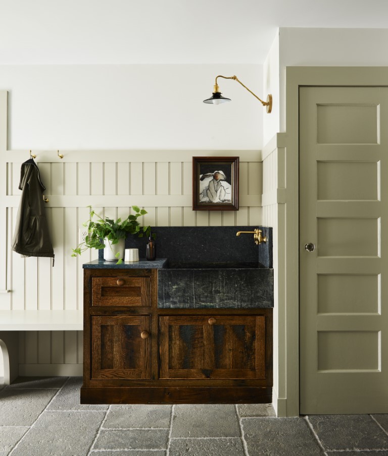
Those pretty, functional details are everywhere you look. Features like the gray, Old-World limestone floors, soapstone counter and sink, and reclaimed oak custom cabinets exude farmhouse charm but are sturdy enough to stand up to heavy use. The adorable, wooden peg “wellie wall” offers practical storage for tall messy boots, while the height of the wainscoting (painted in Revere Pewter by Benjamin Moore) was carefully considered to accommodate hooks.
Even the mudroom sink faucet marries form and function. Plumbing in an exterior wall is impractical, so the side-mount faucet gives an imperfect look that’s fitting for a farmhouse.
“I love that when you work in farmhouses you can somehow build in the haphazard or the unexpected and it doesn’t feel weird,” Crestin said.
Crestin also echoed design details throughout the house. The mudroom’s limestone floors appear again in the dining room. There are reclaimed ceiling boards throughout the house. And the kitchen cabinet color (Midnight Blue by Benjamin Moore) is repeated on the walls and ceilings in the family room, as well as the desk cabinets in the office. Doing so offers a balance that ties the entire house together.
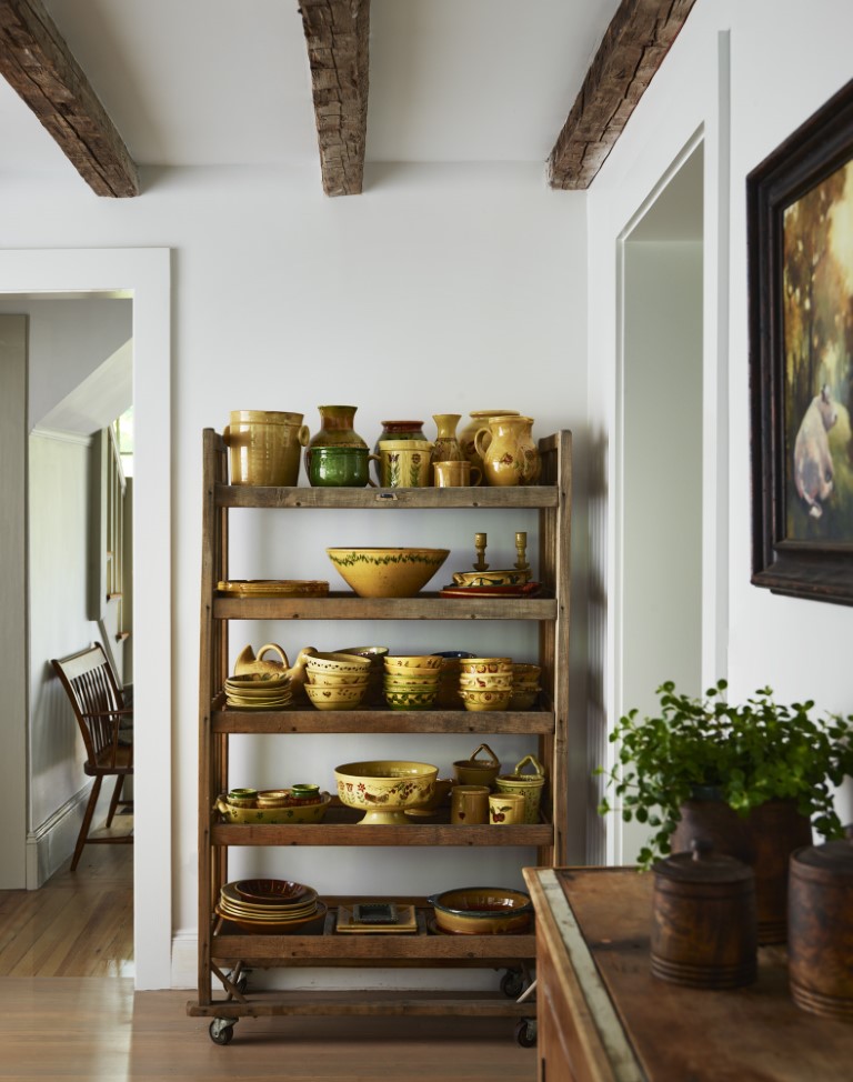
“It’s that subtlety of repetition that I think makes the house feel more thought out,” Crestin said.
Crestin also played with light and dark throughout the house, both in terms of colors and natural light.
“We tried to think thoughtfully about where the light and dark was,” she said.
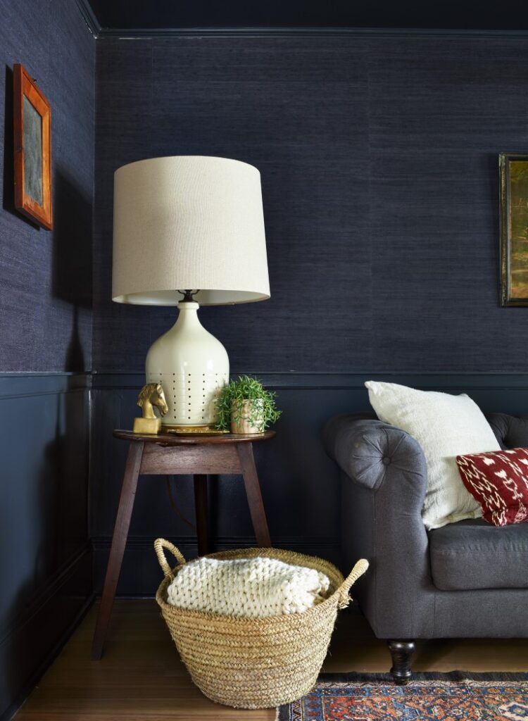
For instance, the family room is dark with hints of color, with the deep blue walls and ceiling getting a boost from burgundy chairs and vintage touches like a wooden side cabinet. Navy grass cloth on the walls gives an extra layer of texture.
“They weren’t afraid to have a moody, more cave-like space,” Crestin said. “The burgundy really helped us in the antique moments to mix in with the new.”
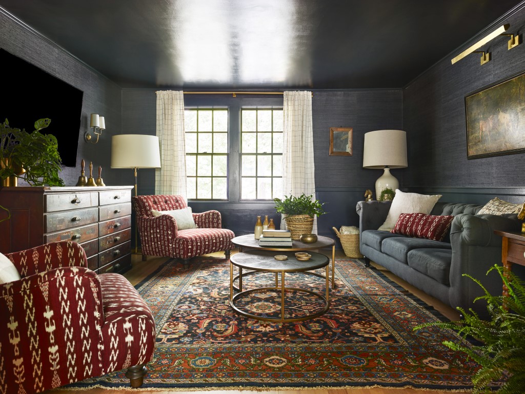
Now, the elegant family room feels like a cozy “blanket,” as Michelle said on the show.
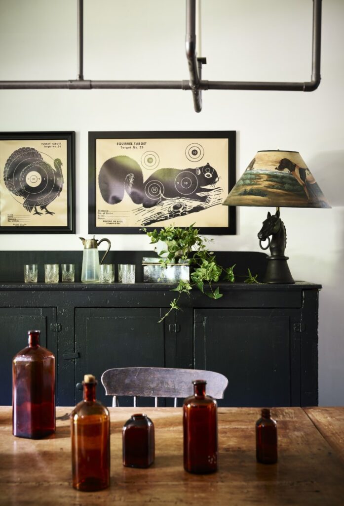
The darkness is concentrated in the middle of the house and dissipates as you move outward, giving the entire home a sense of balance. The dining room and office at the ends of the house are light and bright, with lots of windows and bright-white walls and ceilings (White by Sherwin Williams).
“The family room is really dark, the kitchen has hints of the dark, but like spokes of a wheel, as you fan out everything is light,” Crestin says.
The kitchen also balances light and dark. The white marble counters, backsplash, and farmer’s sink, bright white walls (White by Benjamin Moore), and vaulted ceilings give the space a bright airiness that’s balanced by rich color and darker elements like midnight-blue custom cabinetry and long reclaimed ceiling beams.
Other details give the kitchen a sophisticated, elevated farmhouse feeling, like the brass lights with black shades, a wooden butcher block that anchors the end of the island, and a vintage pottery rack to display Michelle’s collection of French pottery.
The result is a home that looks, feels, and functions exactly how Michelle and Peter wanted it to.
“It looks like a farmhouse,” Michelle said on the show. “It looks like what this should have looked like.”

