Will Ruhl studied architecture at Yale in Rudolph Hall, a concrete and glass building designed by modernist architect Paul Rudolph. “A lot of people hated that building,” Ruhl says, “but I loved it.” So when he got a call to remodel a home designed by Rudolph, he jumped at the opportunity.
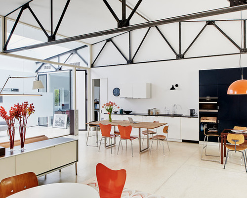
Garage Conversion 1: Tony Luong, original photo on Houzz
Photos by Tony Luong
Houzz at a Glance
Who lives here: A college professor and an education tech company worker and their two young sons
Location: Cambridge, Massachusetts
Size: 3,200 square feet (297 square meters); three bedrooms, two bathrooms
Designer: Will Ruhl and Sandra Jahnes of Ruhl Walker Architects
The house was originally built as a municipal garage for the city of Cambridge, Massachusetts, in the early 20th century. Rudolph converted it into a home in 1959. The house was in “perfect original condition” when Ruhl’s clients bought it, Ruhl says. “The previous owners hadn’t changed a single thing. It had been lived in very lovingly its entire life.”
Rudolph’s 1959 design made use of the former garage’s bays: A large central living area separated the master bedroom, bathroom and guest room on one side of the house from the bedrooms, bathroom and kitchen on the other side.
But Ruhl’s clients wanted to turn the old kitchen into a playroom and study room for their sons and pull the kitchen out into the main space. They also wanted “a big, loft-like living room,” Ruhl says.
The main room, which measures 36 by 36 feet, fit the bill. “They loved that and wanted to keep it the way it was,” Ruhl says. The steel trusses and slab floors were original to the structure. The door to the left of the kitchen cabinets goes to the husband’s office and the boys’ bedrooms and guest bedroom.
The clients kept the original white terrazzo floor. It’s described as “elegant, nearly indestructible and practically carefree,” in Architectural Record’s “Record Houses of 1960.” The flooring has a few cracks and some “minor discoloration,” Ruhl says, but is in great shape after almost 60 years of wear and tear.
Garage Conversion 2: Tony Luong, original photo on Houzz
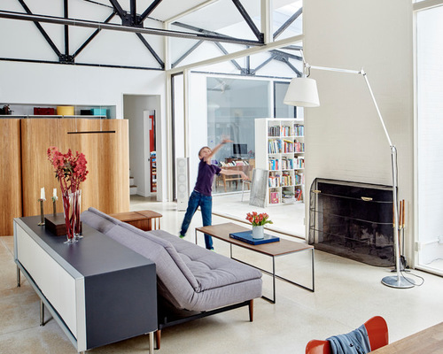
Ruhl’s original design called for a steel and frosted glass screen on the side of the main room opposite the kitchen. “It would mimic the steel trusses above but also give them more privacy,” he says. But the clients opted instead for a bamboo screen, which hides closet doors and creates a private corridor by the master bedroom and bath.
Related: Find More Room Dividers Here
The door on the right at the end of the bamboo screen leads to the wife’s office and a laundry room, and the small staircase goes up to a small loft above the master bedroom that serves as a TV room for the family.
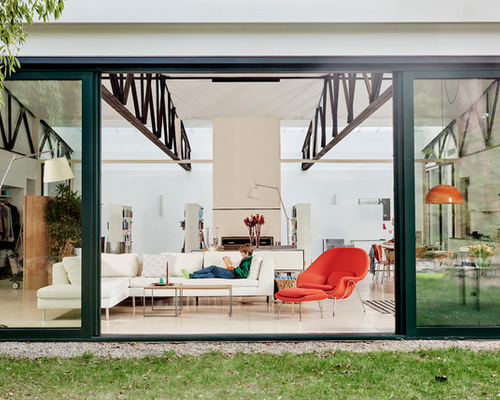
The north-facing wall of glass was Rudolph’s original design. Ruhl replaced the single-pane glass with large, energy-efficient triple-pane sliding doors made in Germany. “In good weather the family wanted to open up that whole wall to the yard so the house is continuous inside and out,” Ruhl says. When both doors slide open, the opening is 12 feet wide.
The renovation included “a lot of expensive surprises,” Ruhl says, including the discovery that there wasn’t a foundation under the wall of glass. “Originally it had been a parking garage, and what little foundation was there was crumbling,” he says. “So we had to dig it all out and build a new, code-compliant foundation below the house and put in steel posts and beams to hold the roof up.”
The former municipal garage was built into a hill and half-buried on the back side. When Rudolph converted it into a home in 1959, he removed part of the roof at the back and created a conservatory to bring in warm, southern light. Because the conservatory was old and cracked, Ruhl turned it into a library to house the couple’s extensive collection of books.
A new roof of honeycomb polycarbonate material (which replaced corrugated fiberglass) allows more light but doesn’t bring in heat in the summer and doesn’t let out the warmth in winter.
Garage Conversion 3: Tony Luong, original photo on Houzz
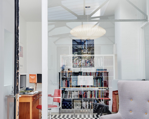
One side of the house contains the master bedroom, bath, laundry room and wife’s study; the other contains the husband’s study, two bedrooms and a bathroom. The two home offices are identical. The glass walls between the offices, shown here, and the library are the original Paul Rudolph glass, as is the glass between the living room and library.
Garage Conversion 4: Tony Luong, original photo on Houzz
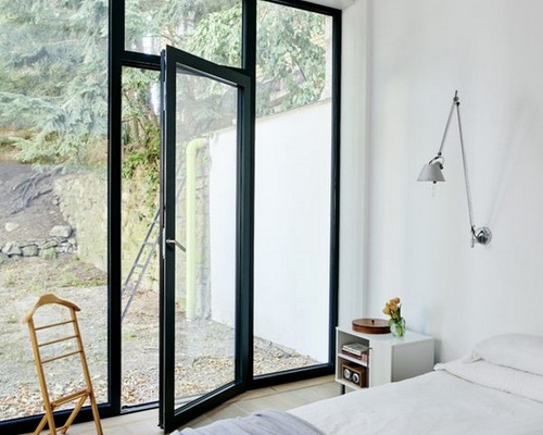
The master bedroom opens onto a small yard in front of the house.
Garage Conversion 5: Tony Luong, original photo on Houzz
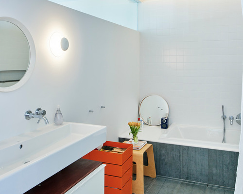
The master bathroom has a high transom window that borrows light from the master bedroom. The original bathroom was a 5-by-8-foot practical space that was standard for late 1950s homes. Ruhl expanded it by stealing space from what used to be a hallway. The sink has two faucets, and there’s a shower next to the tub. Porcelain tile covers the floor and the side of the tub.
The boys’ rooms include the same simple color palette and clean lines as the rest of the house.
Garage Conversion 6: Tony Luong, original photo on Houzz
The furniture throughout the house belonged to the couple. You can see the former conservatory-turned-library on the other side of the fireplace, and the warm light that fills the space from the translucent library roof.
“What Rudolph did with this house was really spectacular,” Ruhl says. “The way he controlled the light and brought in the warm light — our job was to get out of the way. We tried to modernize and make things more comfortable, but we also tried not to impose our own interests on it.”

