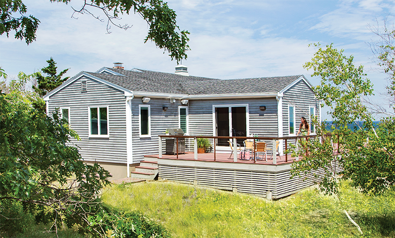
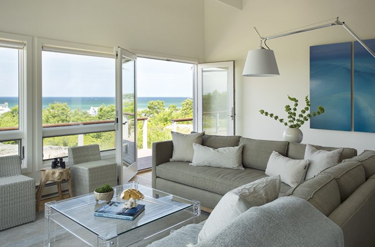
High on a beachside bluff in Gloucester is a snug little bungalow with a lofty primary resident: Mother Nature. Located a stone’s throw from the foamy lip of the Atlantic, the home’s airy elevation yields spectacular views of Castle Hill, Cape Ann, Halibut Point, and open ocean, all of it enwrapped by beautiful Wingaersheek Beach.
When architect Rob MacNeille of the firm Carpenter & MacNeille in Essex first laid eyes on the vacation home, he was most struck by the heart-pounding vistas. The challenge would be to open up the 1960s-style structure—a drab, worn version of its original self—to the world outside without increasing its size.
“I was amazed at what a beautiful location it was and the views it had,” says MacNeille, the firm’s design principal and president. When MacNeille first got involved in the yearlong project, the owners saw it as a simple refurbishing to prepare the modest cottage as a potential summer rental. “It was tired, and needed some fresh new finishes,” MacNeille says. “That was the original goal.”
After several conversations with MacNeille, the family got more excited about the opportunities, and eventually the project morphed into a total makeover. As MacNeille says, “We did the entire gamut.”
Today, the cottage retains its simple 1960s roots, but in a notched-up style that reimagines the era, so often indicative of boxy, ho-hum architecture. Neutral colors, new plaster, and bamboo flooring play up the light, bright beach environment. The openness of the interior is emphasized with thoughtful lighting, including recessed lights and striking pendants over the peninsula in the kitchen.
The kitchen, which flows into the living and dining areas, was a particular challenge, MacNeille says. The poorly lit space—it had no exterior window or door—begged for a special effect. In addition to the lighting, MacNeille and his team installed a lovely glass tile backsplash that reinforces the sparkling ambience.
The light, bright scheme became a conscious goal, one that MacNeille and his colleagues achieved with flair: For a beach bungalow that measures just 1,580 square feet, the effect is expansive and light-filled.
 |
Carpenter & MacNeille, a full-service team, undertook the entire project, including cabinetry and interior design. While there was no expansion of space, which the owners didn’t want or need, MacNeille created the illusion with one significant alteration in the living room: The original flat ceiling has been transformed with cathedral lines, leaving some of the ceiling joists in place. “We left some of them for structural purposes, so they kind of float in the cathedral ceiling,” MacNeille says. No window treatments in the living room and minimal window de?cor in the dining area allow ocean views and light to pour in. Tucked to the side of the one-story cottage are the original three bedrooms, two with a shared bath and a master bedroom and bath located on the south-facing side.
A major exterior project transformed the dwelling and its use: a connection of the existing front and back decks, com-bining them into one structure around the south side of the cottage. The new portion has the most stellar ocean views and also serves to connect to the kitchen and dining area, which spill onto the deck. The new expanded deck is comple- mented with a mahogany cable railing, with horizontal cedar slats to increase the visual effect and conceal the empty space under the deck. “It’s a nice skirt effect,” notes MacNeille. The exterior got another major style boost by replacing the originalsiding—nondescript vertical panelized plywood—with red cedar clapboards. The renovation has led to a new relationship for the family and cottage. “It’s become something that’s close to their heart,” MacNeille says.
The interior concept, so key to a balanced look, was led by Elizabeth Hourihan, an interior designer with Carpenter & MacNeille at the time and now owner of Elizabeth Brosnan Hourihan Interiors in Weston, Connecticut.
Hourihan recalls listening carefully to the family’s wishes and then working together to maintain a consistent interior palette, using color judiciously in the neutral environment. Area carpets over the bamboo flooring add texture and vivid color. Vintage leather chairs from Andrew Spindler Antiques in Essex anchor one of two seating areas in the living room; in the other area, a pair of chairs placed by the masonry fireplace adds a leafy splash of teal blue. Between the kitchen and dining room, strings of chain mail hanging from a metal track create a delightful diaphanous curtain to separate the spaces. Hourihan still has an emotional tie to the project. As she says fondly of the owners, “They ended up doing so much and loving it so much.”
MacNeille revels in the region’s architecture, whether it’s updating a 1960s cot- tage or restoring an early-1900s Peabody and Stearns–designed carriage barn (for which his firm won a prestigious Bulfinch Award, given annually by the New England chapter of the Institute of Classical Architecture & Art). After a childhood spent in a 1718 house in Connecticut, atage 20 he took a summer job painting properties for Historic New England (formerly the Society for the Preservation of New England Antiquities) in Boston. The passion has buoyed the span of his career. “As a kid I was steeped in this stuff,” MacNeille says. “I never looked back.”
While the project had its challenges, the owners and the design team embraced itas a way not to reinvent, but to reimagine, the 1960s. “Obviously, we have a lot more resources today,” notes MacNeille. “We looked at the ’60s with a different eye, trying to keep the aesthetic and excitement of it, but still have a rigorous design.” He couldn’t be more pleased to see the family enjoying the cottage. “It was a shell of its former self—we brought it back.”

