A design-savvy couple makes over a Hamilton home, bringing to life their definitive sense of style.
Land and a quiet, private setting created the perfect combination to move Raymond and Linda Gosselin and their family to Hamilton. The home, on the other hand, needed major changes to meet their family’s needs, as well as the couple’s eclectic design sense. Situated on 2.4 acres, the redesign and expansion gave them plenty of living space and many opportunities to introduce their one-of-a-kind touches.
The 18-month-long project, which at one point required the family to uproot to temporary quarters, was designed with the creative hand of West Newbury architect Laine Jones (lainejonesdesign.com). It was such a successful partnership that Jones has gone on to create and plan other spaces for the family, including their summer place in Plymouth.
Jones characterizes the design challenge here as an “interior that was just too open,” explaining that there wasn’t enough definition to demarcate rooms. “You didn’t know where to stop paint colors or where to place furniture,” he says of the original space.
Jones ended up nearly doubling the size to 4,000 square feet. Besides adding rooms to the main house, he created a three-car garage with a room for the kids to hang out in and a stair tower to Ray’s home office and exercise room. While the space remains open and filled with light, the rooms on the first floor are seamlessly linked and imaginatively defined with architectural details that work on all levels, from the floors to the ceilings, walls, and moldings.
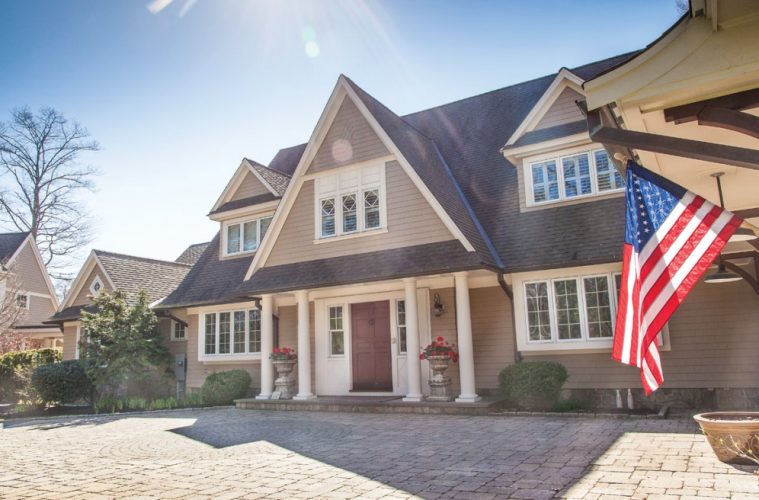
In designing the exterior of the house and additions, he added shingled flairs and woven corners along with stone to assure that, from a distance, the home presented as being quietly and solidly planted into the landscape.
In summarizing Ray and Linda’s short list of wants and needs, Jones says, “They wanted a sophisticated, functional, and whimsical space with a lot of visual interest.”
Of their Beverly home (designed without Laine’s help), Linda says, “We made the mistake of having very large rooms. Not that it was cold, but it wasn’t warm. We looked at a lot of homes before buying this one. We love the warmth of turn-of-the-century architecture and wanted this to have the same character that comes with an older home, but also wanted a lot of functionality.”

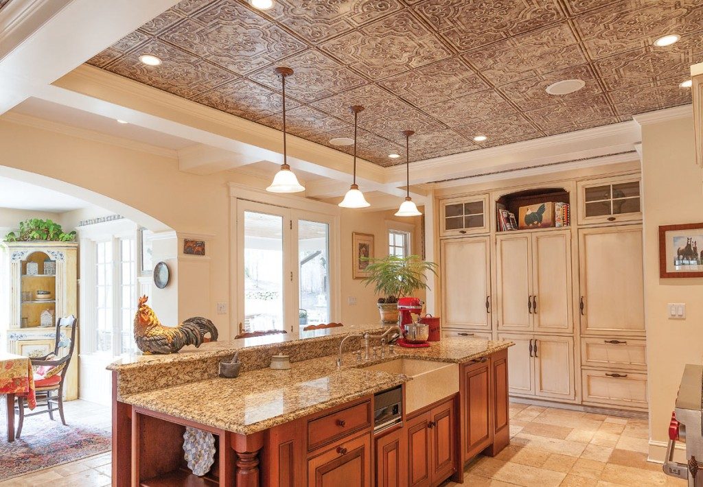
The European country-style kitchen, with its granite countertops and ceiling of powder-coated tin.
Before taking on the project, though, they defined their turf regarding design decisions. “When we purchased this home, we agreed Ray would have the final say on the outside design, and I would have it on the inside,” she says.
In the redesign, they kept the second-floor layout much the same, except they added an additional bedroom, playroom, and storage space to accommodate the three children and, at the time, four dogs.
The downstairs was completely rebuilt and redesigned. A 30-foot hall acts like the spine and main public and private rooms come off of it—from the mudroom and laundry on one end to the new master suite on the other. The kitchen, breakfast room, and dining room are situated on the mudroom end, with the family room and living room more in the center of the space and the master suite at the very end.
“At one point during construction, you could walk in the front door here and walk from the front of the house to the back with nothing stopping you,” says Ray.
The couple is quick to point out how design details were chosen with reference to notes taken on for-sale homes that they had visited during antique shopping jaunts. They often took pictures of things they liked and purchased things they loved figuring they’d eventually find a place for them. A good example is the original Merrimack Cooperative Bank’s quarter oak sawn doors (weighing in at 300 pounds per door) now in his home office. “They still have the bars on the windows and the slot for deposits,” he adds.
In planning the main-floor layout, the couple opted for building out the master suite at the opposite end of the house of the children’s second-floor bedrooms and playroom to ensure privacy and quiet. Cathedral ceilings open the interior space, bringing in light and views, while columns, arches, low walls, and a mix of stone and wood flooring make the space open yet defined—and certainly visually interesting. The wood flooring is a mix of antique chestnut and wide pine; the stone is a mix of slate and limestone.
The back end of the living room was opened up with an arched window, bringing in light and height. The fireplace was re-bricked, and a new hearth, custom-built cherry mantel, and sideboard infused the room with a new dramatic energy.
The kitchen is a sophisticated country style with a European flair. They wanted the room to be big but warm. The cabinetry is painted and glazed to make it look older, the hardware is a twist of wrought iron, and the countertops are granite. The ceiling is powder-coated tin, newly stamped. The powder coat is a highlighted finish to give it more depth.
Wherever there is stone flooring—the kitchen, mudroom, laundry room, and foyer—they installed radiant heat.
Linda, who spends a lot of time with her horses and therefore in barns, wanted to have a reminder of her favorite pastime and passion here. Laine’s design solution came with the creation of rolling barn doors that recall those typically found in a stall. Recreated with reclaimed wood and purposefully distressed, they serve as the entry to the first-floor family room.

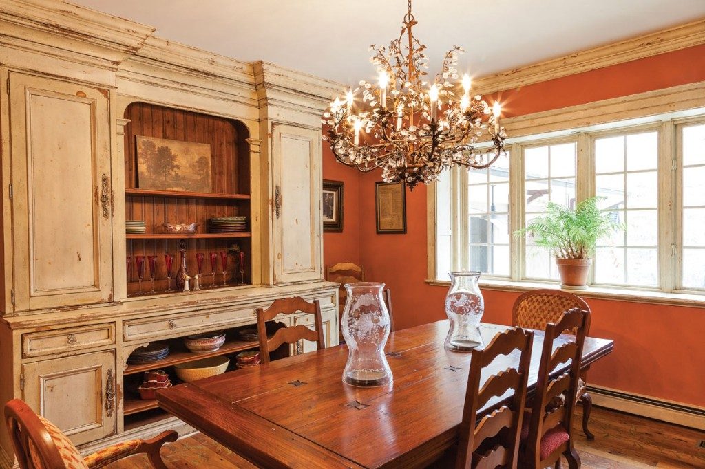
The dining room features a reproduction of a Parisian hutch;
Other reclaimed design details the couple found include their front door and threshold, which is more than 100 years old and is a remnant of the Ayer estate. Ironically, the estate was minutes from the Gosselins’ home, and the doors ended up at Northeast Architectural in South Hampton, NH, one of their favorite places to shop.
“When we were building [the house], the owner of Northeast Architectural told us about a home near here that was being torn down and asked us if there might be anything we might want,” says Linda. “[The door] had to be stripped eight times to get the milk paint off!” she adds.
On another shopping trip to Northeast, they happened across three antique stained-glass windows and bought them. During the planning stages for the wet bar off the breakfast room, the archway seemed the perfect spot for the trio.
One of the unusual design aspects in the dining groom is the reproduction of a Parisian hutch that sits against the back wall. The homeowners had it built out to extend to the ceiling and then had the design theme move around the room via moldings and baseboards that were faux painted. A handpainted vine on the wood floor contributes to the organic feeling of the room.
The couple’s list of “must haves” for their new master suite included separate dressing rooms and bathrooms—including an outdoor shower for Ray. As Jones explains, Linda wanted her bathroom and dressing area to have a soft palette and feel, whereas Ray’s priorities were a large indoor shower with a door to the outside, leading to an outside shower, which he uses eight months out of the year. For closets, he wanted a huge one complete with an island, and she wanted a walk-in closet half the size of his. Wood on her cabinetry would be kept light with a painted glaze, and his would be cherry. Overall, the suite would be built out with a variety of storage options, from shelves to cubbies to closets. A cathedral ceiling, fireplace, and doors to a patio add to the sense of privacy, luxury, and space in their bedroom suite.
Another room the couple added was the screened porch, which is complete with a fireplace and a built-in sound system. “It’s a great place to spend time. I love to go there and listen to music and read the paper,” says Ray. “And it’s great in the fall with a fire going.”

