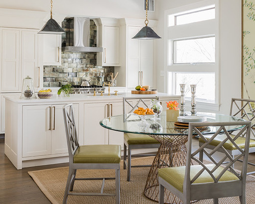
Interior designer Phoebe Lovejoy Russell’s kitchen/dining room was not working for her family at all. One of the first things you see when you walk into her condo, the kitchen had an oddly placed freestanding closet, and a 4-foot-long island divided the space in an awkward way. Striving to keep it open, light, and not too kitchen-y, she created a look that’s bright and crisp with fresh chinoiserie style, taking inspiration from two hand-painted silk wallpaper panels.
Cambridge Kitchen 1: Michael J. Lee Photography, original photo on Houzz
Kitchen at a Glance
Who lives here: Phoebe Lovejoy Russell; her husband, Peter Russell; and their 9-month-old son
Location: Cambridge, Massachusetts
Size: About 450 square feet (42 square meters)
Russell wanted to keep the appliances and cabinets sleek and clean-lined; she tucked the refrigerator, dishwasher, and pantry behind matching cabinetry. “The cabinets fade away because they are crisp, clean, and white,” she says.
An awkward 9-foot-high freestanding closet once divided the kitchen from the dining room; the ceilings are 11 feet, 3 inches high, so it just floated oddly and clunked up the space. Russell’s intervention united the rooms into one pleasing space that now has an eat-in kitchen that also serves as a formal dining area.
The new island is 8 feet long and includes a dishwasher and microwave drawer on one side, and storage for linens, small appliances, mixing bowls, platters, and more on the other. It’s also become a handy spot for stashing baby stuff, she says.
Photos by Michael J. Lee Photography
Cambridge Kitchen 2: Michael J. Lee Photography, original photo on Houzz
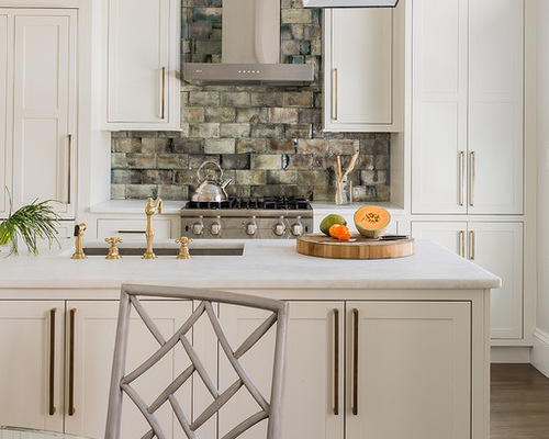
Different patinas contrast the crisp white Shaker cabinets. The pendant lights add deep gray and brass hues, the rubbed antique brass hardware dresses up the cabinets, and antiqued mirror tiles cover the backsplash, complementing the pendant lights and stainless steel finishes on the stove and vent hood.
Tip: If you’re going to splurge on something like Ann Sacks antiqued mirror tiles, pick a spot where a little will go along way. These tiles make a huge impact, yet the Russells did not have to invest in boxes and boxes of them.
The countertops are white Rhino marble with a leathered finish. Russell says that this particular marble is harder than Carrara or Calacatta, and the leather finish is a little bumpier than a honed finish, adding a beautiful texture.
Pendant lights: Gibson, Urban Electric Company, cabinet pulls: Rocky Mountain Hardware; faucets: Newport Brass; antiqued mirror tile: Ann Sacks
Cambridge Kitchen 3: Michael J. Lee Photography, original photo on Houzz
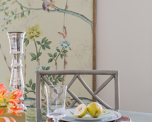
Hand-painted de Gournay silk wallpaper panels inspired the chinoiserie look of their ornate frames and the geometric fretwork on the dining chairs. “The wallpaper panels needed to be loud and stand out, and everything else is simply their supporting cast,” Russell says.
The chairs’ light gray picks up on the touches of gray in the tiles and pendants.
Vinyl cushions on the chair will stand up to all sorts of spills as their son grows up. Once he becomes a little climber, Russell plans to replace the glass tabletop with cerused oak.
Cambridge Kitchen 4: Michael J. Lee Photography, original photo on Houzz
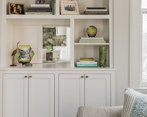
Cambridge Kitchen 5: Michael J. Lee Photography, original photo on Houzz
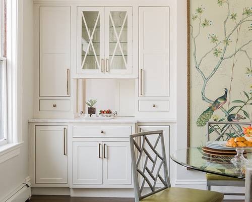
A new built-in bar coordinates with the kitchen cabinetry across the room. It also has a Prohibition-style secret: The center panels slide open to offer a peek through to the living room built-ins.
Related: Get Your Own Built-In Bar Cabinet
While the Russells had planned on sliding food through here, they found what they enjoy most is leaving the panels open most of the time to enjoy the view between the rooms.
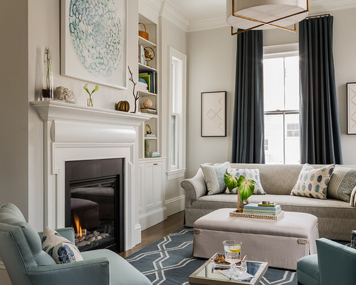
Cambridge Kitchen 6: Michael J. Lee Photography, original photo on Houzz
It wouldn’t have been fair to share only a tiny peek of this lovely living room, would it? Here’s a nice shot of the urbane, comfortable room.
Related: More Living Room Furniture Layouts to Try

