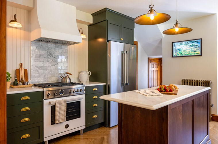
Having grown up in Texas and Oklahoma, respectively, Jenni and T.J. Fanning were used to homes with expansive interiors. That said, historical New England houses really appeal to them. When they moved out of Boston for more space for their young family, they chose a shingled, side-entrance Colonial in Melrose built in the early-to-mid 1900s. “We enjoy the charm and flow of a house with walls,” Jenni says.
The kitchen, however, was a bit too charming, so to speak. The bulky, painted wood cabinets, Formica countertops, vinyl flooring, and floral wallpaper hadn’t been touched in decades. (The old-timey ironing board cupboard was endearing but didn’t make the cut.) The layout was also less than ideal, with the range stuck on a wall by itself and the fridge shoved in the walk-in pantry next to it.
When the Fannings moved in, they relocated the fridge to solve another problem. “Without anything on either side of the stove, we were afraid that the kids would reach up and try to grab things while we were cooking,” T.J. explains. “Putting the fridge next to the stove provided a barrier on one side of it and freed up the pantry.”
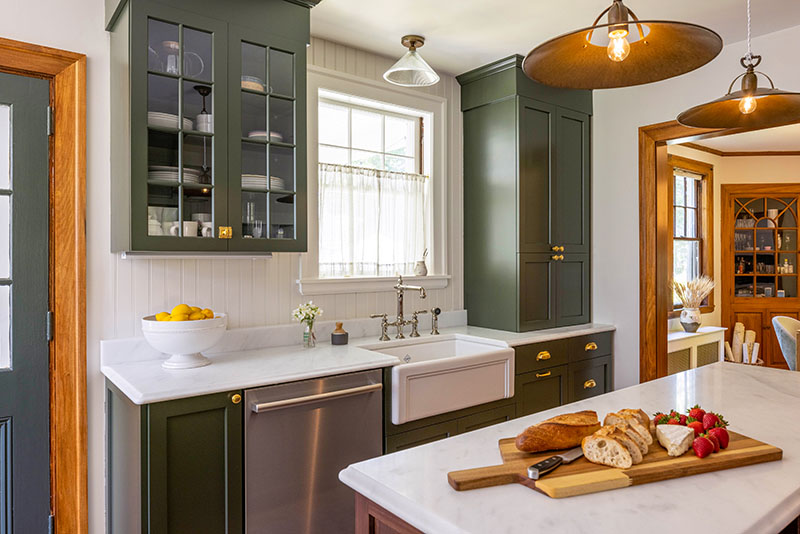
Two months later, the couple engaged Jenni Jacobs of McGuire + Company Kitchen & Bath to completely reimagine the space. “They wanted to make the kitchen inviting and functional for today’s family in a way that preserved the historic details and feel of the old house,” Jacobs says. The homeowners did not want the kitchen to look like a room built in 2022.
To capture square footage, the team removed the coat closet and walk-in pantry opposite the sink. That approximately nine-foot stretch, which matches the length of the sink wall across from it, is now efficient and cohesive. It’s also a focal point, thanks to the white enamel Bertazzoni range that Jacobs notes brings “vintage appeal” to the kitchen.
Countertops with drawers below flank the range and a gently sloping white plaster hood that the couple designed with Fresh Start Contracting hovers above. Plaster soffits hide pipes that the team discovered during demolition. “Working around the guts of a house, especially an older one, affects design, but we had enough ceiling height to incorporate a seamless solution,” Jacobs says.
As for the backsplash, Jacobs says it elicited more conversation than other aspects of the project. The team settled on Carrara marble subway tile behind the range, with wood paneling on either side of it. “Painted beadboard suits the age of the home and is a calm backdrop against all the lines of the tile,” the designer says.
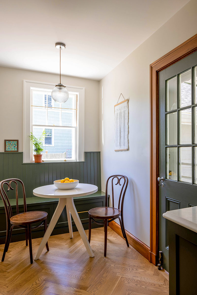
When picking a paint color for the cabinets, the couple wanted a dark green with warm undertones and a natural feel to complement the original gumwood millwork that runs throughout the house. They landed on Sherwin-Williams Ripe Olive. “It brings in some drama and aligns with the home’s historical character,” Jacobs says. She also pulled the color onto the beadboard in the breakfast nook to help bounce the eye around the room.
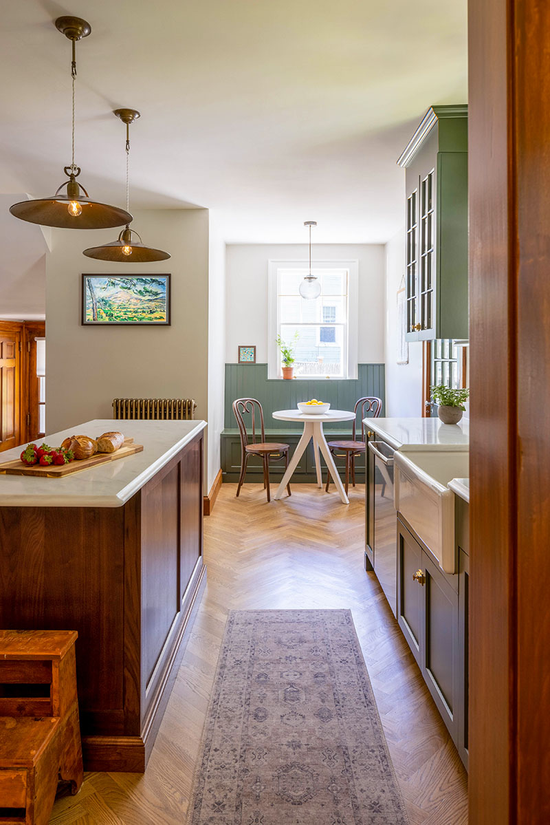
The marble-topped walnut island adds another layer of interest, not to mention valuable work-surface area. While the original layout could not accommodate a center island, the new configuration sans closet and pantry allowed for one. The approximately 58-by-24-inch base, which is graced with another 12 inches of cantilevered countertop, is centered on the newly widened opening to the dining room. “It’s a workstation more than a place to eat, but someone can perch at one end to help prep or keep the cook company,” Jacobs says.
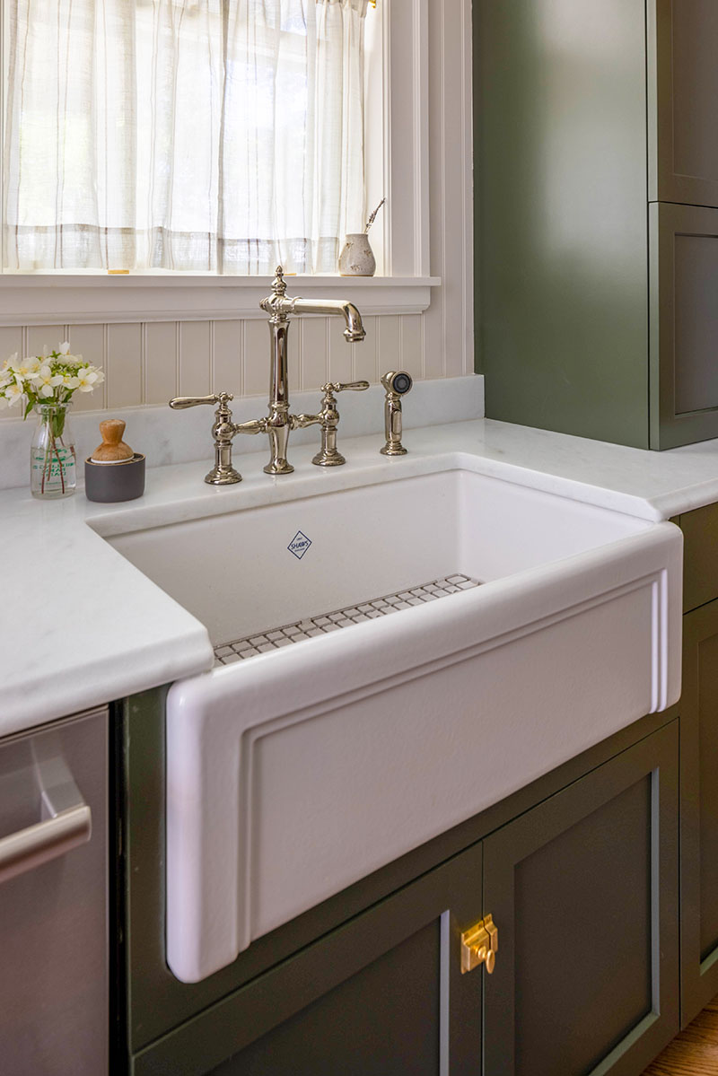
The sink wall setup is similar to that of the previous plan, save for the insertion of a much-needed modern appliance—a dishwasher. A Shaw fireclay apron-front sink, with an inset panel detail and a polished nickel bridge faucet with Old-World style, sits under the window overlooking the backyard. The marble counter, which sports a period-appropriate ogee edge, bends up a couple of inches, while painted beadboard makes its way to the ceiling. A glass-front upper cabinet holds everyday dishware and a deep tower cabinet stores food.
Finally, Jacobs outfitted the breakfast nook with a built-in bench with storage drawers beneath it. Adults eat in the dining room, but the nook enables the couple to easily feed their preschoolers. The vignette also encapsulates the design. “In my mind, the kitchen has a 1930s-Colonial-meets-Parisian-café vibe,” Jacobs says.
Learn more about the project team
Architect: ART ARchitects
Contractor: Hunter Whitmore, Whitmore Brothers Construction Co.
Landscape architect: Nina Brown, Brown, Richardson + Rowe
Kitchen design: McGuire + Company Kitchen & Bath
Contractor: Fresh Start Contracting

