In April 2021, the night before Terese and Dennis Barous were scheduled to fly back to Boston from Florida, their Ipswich home burned to the ground. “We had lived in the house since we got married over 50 years ago,” Terese says. “Luckily, we were not there because it was a horrific fire.”
On the recommendation of a neighbor, the couple contracted Windward Shaw, a Newburyport-based construction company that had built several homes on Great Neck, to build a new home on their property. The firm tapped Kate Daskalakis of Newburyport-based KSD Designs, to meet with the couple about the interior.
Daskalakis showed up to the presentation with a swatch of a large-scale plaid wallpaper that she felt captures a modern take on a traditional aesthetic, a look she thought might resonate with the couple. Terese was wearing a plaid shirt. “We both like a moody New England vibe that mixes modern with vintage pieces,” the designer says. The Barouses brought Daskalakis on board, along with the plaid wallpaper, which ended up in the powder room.
The couple also love modern farmhouse style. Daskalakis specified eight-inch-wide nickel gap boards for the walls and ceilings in select locations throughout the home to dress things up. It’s all painted in Farrow & Ball’s Wimborne White, a just-off-white that reads bright, thanks to copious natural light, but still feels warm.
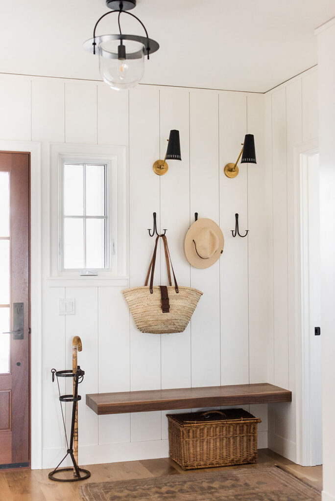
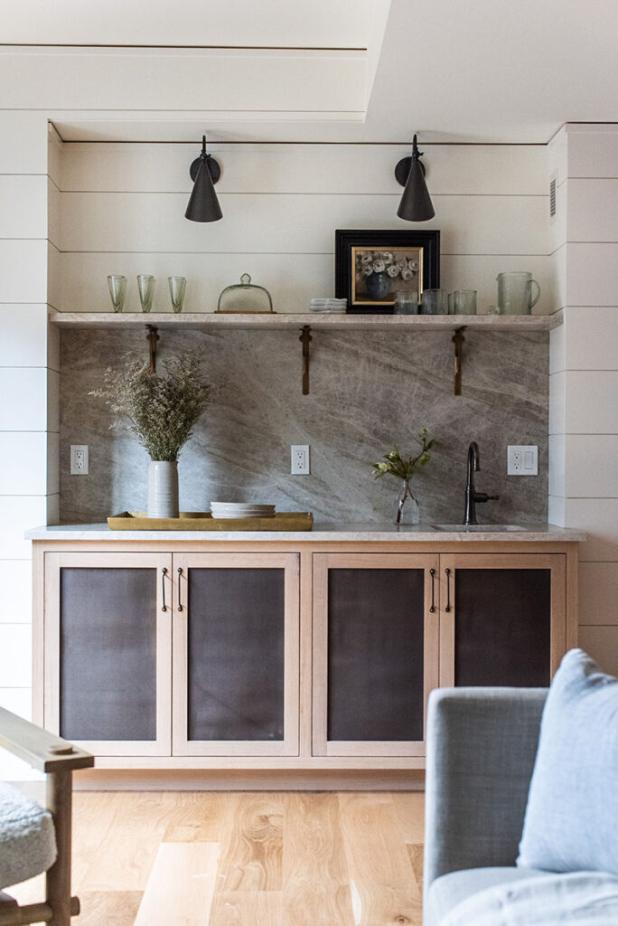
The treatment happens right up front in the entry-mudroom where Daskalakis also introduces other design devices she employs in the house, including mixing various metals and wood tones. For instance, a rich walnut bench hovers above white oak floors, and the built-ins’ quarter-sawn white-oak doors have a whitewash finish and black metal mesh screens (a material repeated on the lower-level bar).
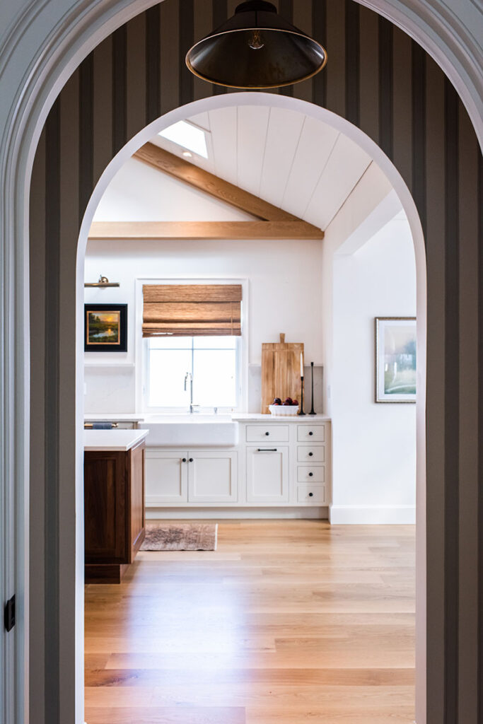
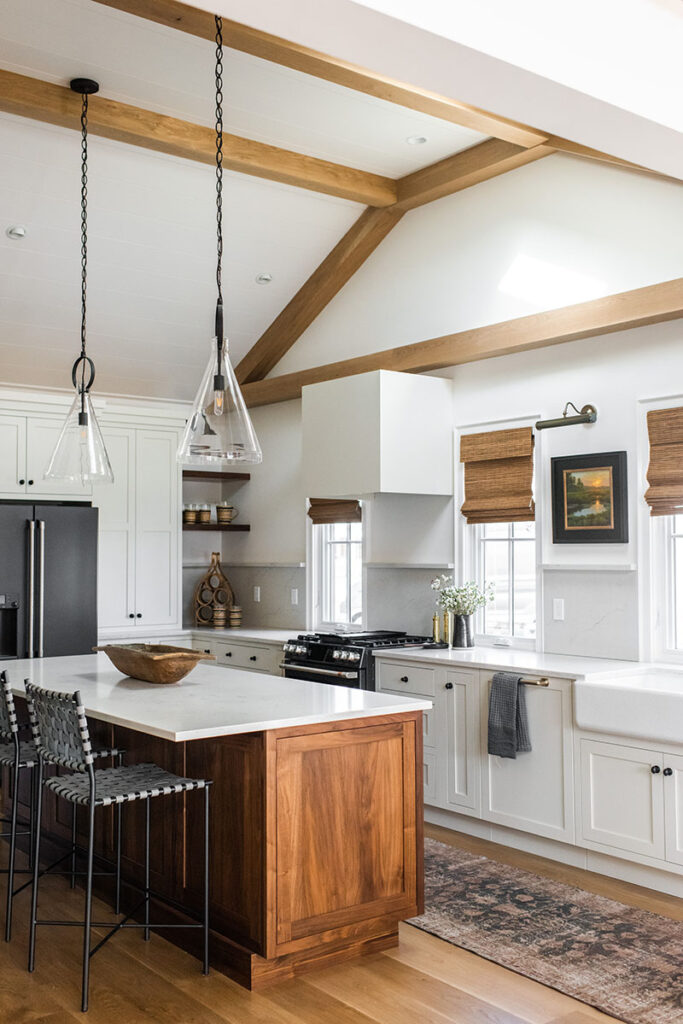
A few steps forward, the kitchen opens up in sunny delight. Three windows come down to the counter, and skylights are cut into the vaulted ceiling. Daskalakis covered the ceiling in nickel gap, then detailed it with natural wood beams. Not only do the wood members accentuate the shape of the building and bring the volume down to a more intimate scale, but they also serve as guidelines for the range hood. “Without a stopping point, the hood would have seemed lost, floating on the large expanse of wall,” the designer says.
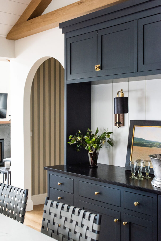
Not that the hood is meant to make a statement: It’s actually just a simple white box. (Black appliances, textural woven shades, and local artwork keep the elevation from being banal.) The true design moment happens on the opposite wall beyond the walnut island: a sideboard painted Farrow & Ball’s Railings, an ashy blue-black. A honed black-granite countertop adds impact, and a landscape painting and Lostine sconce infuse warmth.
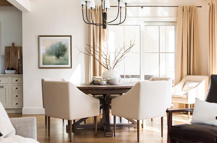
The black metal chandelier with brass accents feels grand yet airy over the dark, reclaimed-wood dining table that sits at the joint between the kitchen and living room in the open concept layout. “The table is small enough to allow circulation to covered porch and deck through the sliders, but expands for entertaining,” Daskalakis notes.
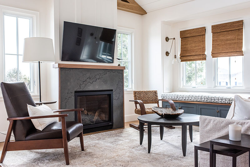
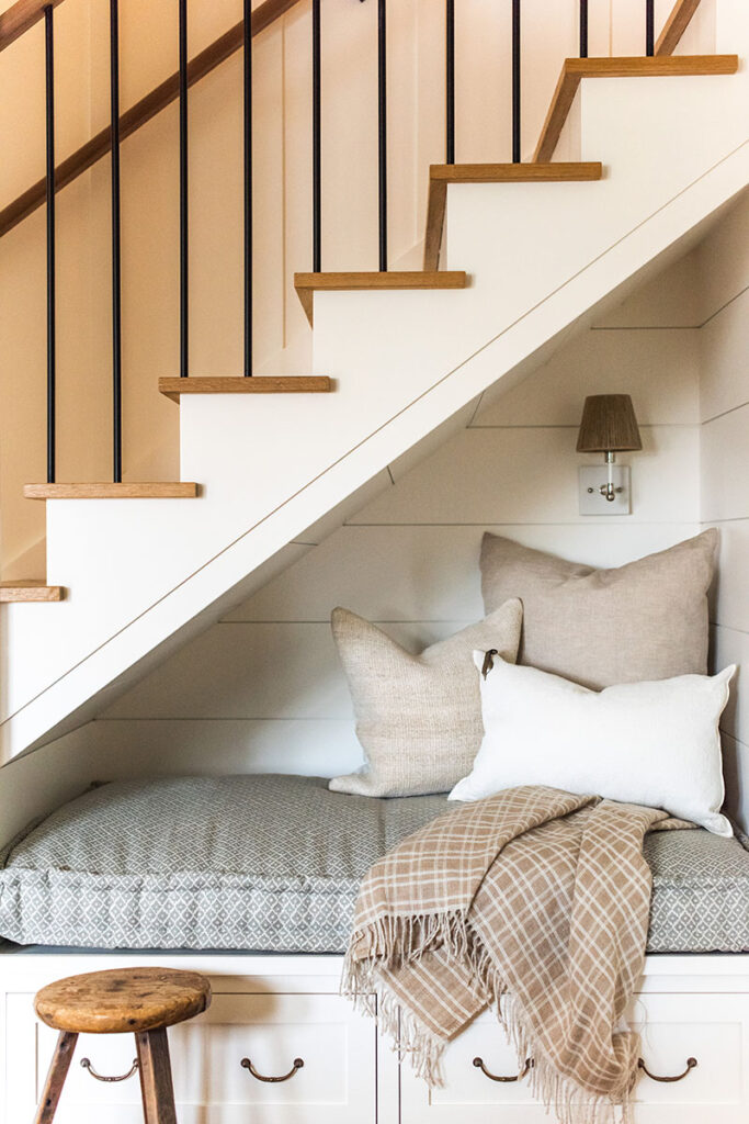
The fireplace is the focal point in the not-very-large living room, thanks to board and batten paneling that runs up the chimney and concrete surround trimmed in walnut. “Terese wanted a mantel to hang Christmas stockings on,” Daskalakis says. “I I kept it shallow so as not to protrude deep into the small room.” A built-in storage bench is tucked into the bump-out to augment seating. Similarly, a built-in bench tucked under the stairs turns dead space into a cozy nook downstairs.
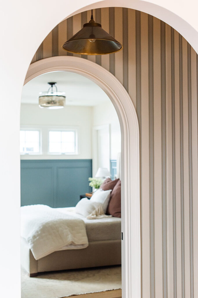
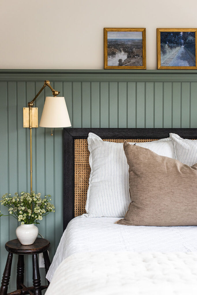
Next to the sideboard, a double-arched vestibule lined in striped wallpaper provides separation from the primary bedroom, where wainscotting painted in Farrow & Ball’s De Nimes injects the palette with a lighter, dusky blue. Daskalakis stuck to neutrals in the bathroom—though the pearlescent zellige-tile backsplash lends a feminine touch. A walk-in shower with pull bars in sophisticated finishes will let the couple age in place without compromising style.
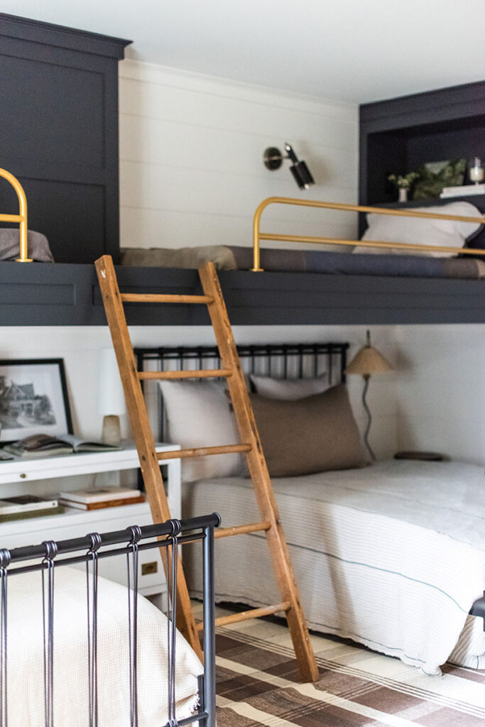
“Accessibility was very important to us,” Terese says. Their bedroom is on the main level, there are no steps to the front door, and there’s an elevator to the lower level where there’s a lounge-y family room, bedrooms for the couple’s kids and grandkids, and access to the backyard. “This beautiful new house is perfect for us as we age,” Terese says. “A silver lining to a tragedy!”
Learn more about the project team
Architect: ART ARchitects
Contractor: Hunter Whitmore, Whitmore Brothers Construction Co.
Landscape architect: Nina Brown, Brown, Richardson + Rowe
Architecture: Brian A. Libby
Builder: Windward Shaw
Interior architecture and design: KSD Designs
Kitchen cabinetry: B&G Cabinet

