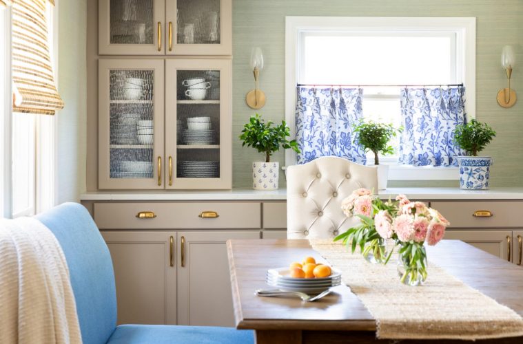
When homeowners Barrett and Eric Lord purchased their first home as a married couple in Marblehead, just minutes from the beach, they knew it was more than a starter home. The house had great bones and a stellar location. Its proximity to the ocean was a key selling point for the young couple, who share an affinity for water. Eric grew up sailing with his family in nearby Salem, and Barrett spent years as a youth swimmer.
The Lords knew from the beginning the small galley kitchen with green Formica countertops would need immediate attention if this were to be the long-term residence they hoped it would be.
Wendy Ditcham of Wendy Ditcham Interiors was their first and only call. A close family friend, who had previously designed Barrett’s parents’ home, Ditcham attended Barrett and Eric’s wedding in June 2017, the same month the couple moved in.
The Lords searched for two years for their home, and while many prospective buyers overlooked the property because they couldn’t see past the kitchen, Barrett says, “That’s what I really loved, because I knew I wanted to do my own kitchen.”
Aside from needing more space, Barrett desired a sophisticated but approachable design plan. “I wanted a look that was coastal, that fit in with where we live, but not kitschy or nautical overload,” she says.
Ditcham wasted no time identifying the major issue and worked directly with builder Adam Dixey of Precision Remodeling & Construction to redesign the space. Establishing function and flow between the narrow kitchen and closed-off dining room was priority one. “It wasn’t just about the aesthetics,” says Ditcham. “The minute I came in, I knew the wall had to come down. Even though Barrett couldn’t look at those green countertops one more day, it was more about how tight the kitchen was—it wasn’t functional.”
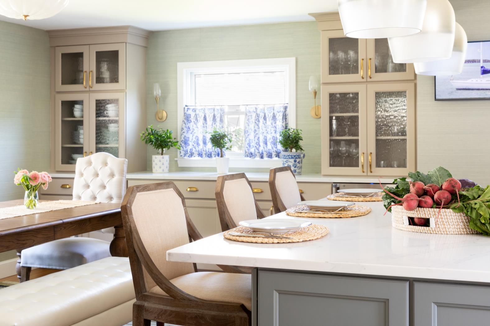
As it was, the kitchen allowed no opportunity to entertain in a way that connected food preparation with guest interaction. Breaking down the wall between the kitchen and dining room resolved this division and resulted in ample space for an inviting kitchen island where family and friends can gather.
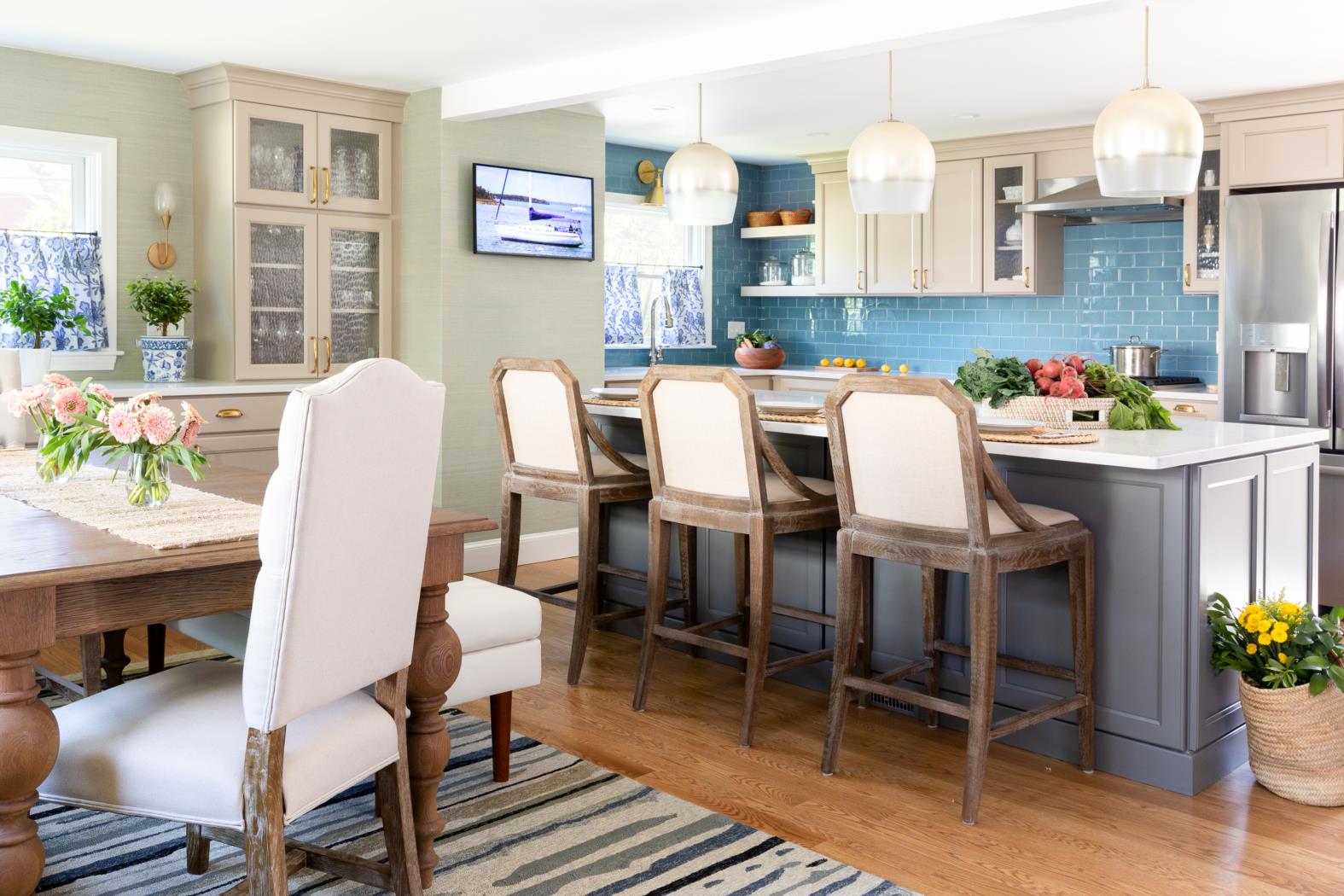
The open floor plan brought about other improvements as well. The decision to move the original kitchen window, which looked out to a very nearby neighbor, allowed more room for cabinetry, improved appliance placement, and brought welcome privacy. Additionally, the shift gave Ditcham the opportunity to match the new window to one existing in the dining area. Together, the pair now deliver a symmetric and cohesive look from the interior and exterior alike.
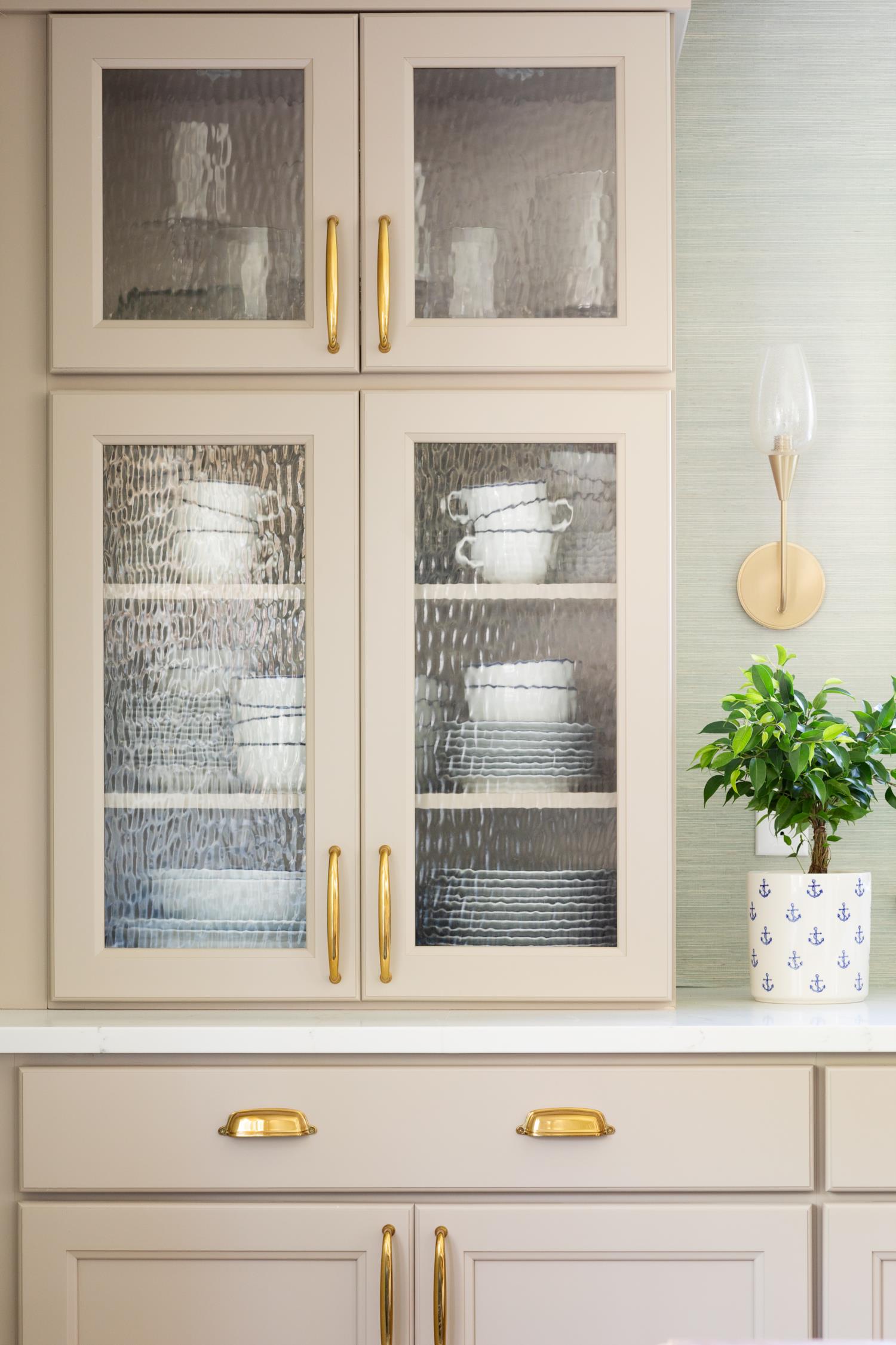
Multipurpose built-in cabinets added on the dining side now act as prime storage while also serving as a buffet and bar area. Details like seeded glass cabinet doors offer a subtle nod to coastal waters.
Thoughtful touches like this can be found throughout. “We had to reference the coastal lifestyle without being theme-y,” says Ditcham. “The colors we used and the texture of the grasscloth all helped give that coastal feeling.” The use of brass cabinet pulls also lends a nautical vibe.
The Thibaut grasscloth wallpaper is Ditcham’s favorite feature in the new space. “Grasscloth gives you that instant warmth and finished feeling. It changes the whole atmosphere of the room.”
Further continuity was achieved during construction when varying floor types, originally set at various heights, were leveled and unified with a seamless installation of white oak planks stained with driftwood-inspired weathered oak.
The only break in the hardwood comes at the kitchen entry, where Ditcham introduced playful cement tile. “I saw this as an opportunity for a fun feature.” Instead of a rug, the ceramic tile inlay replicates a runner and acts as an ideal place for sandy feet or muddy boots to enter the home. “I wanted it to feel more like an entry way than just walking into the kitchen, explains Ditcham. “It distinguishes it from the kitchen and brings color to that side of the room.”
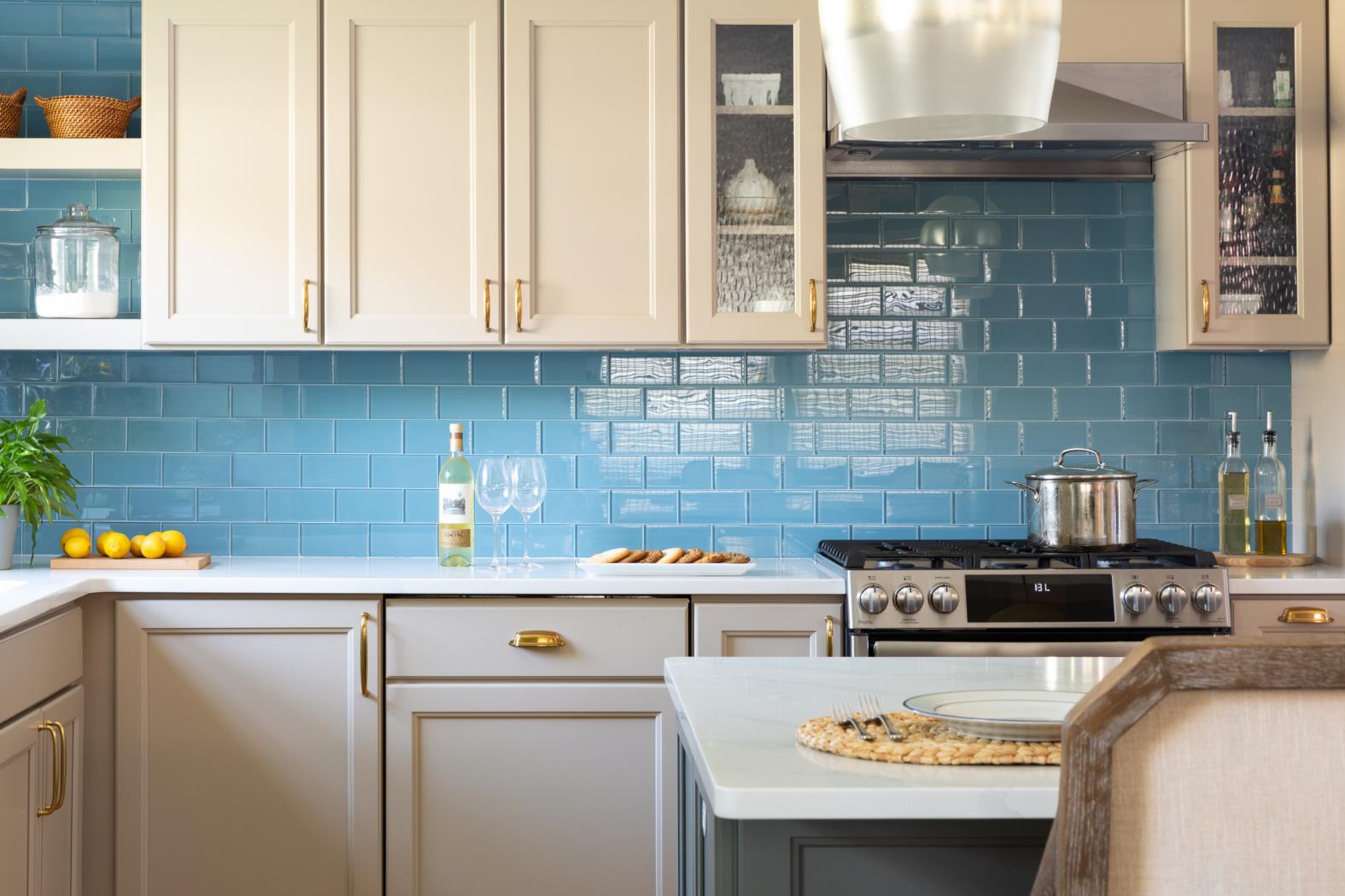
More color is found in the soothing sand and sea hues of the cabinetry. The beige tone of Benjamin Moore Pebble on the cabinets and the blue tone of Benjamin Moore Willow on the island impart character and warmth where Barrett wanted something other than classic white.
Just as Barrett had hoped, her new kitchen is as “perfect, pulled together, lived in, and comfortable” as her parents’ beautiful home. “Wendy was good about making it feel mature, but not so mature that a young couple wouldn’t live here.”
This year, Barrett and Eric Lord look forward to showcasing their newly designed space for Christmas get-togethers, football games, and many more entertaining endeavors.
Interior Designer: Wendy Ditcham Interiors, 978-621-3735, wendyditchaminteriors.com
General Contractor: Precision Remodeling & Construction LLC, 781-631-7555, precisionremodelingmhd.com
APPLIANCES: GE Profile, geappliances.com
WINE REFRIGERATOR: Marvel, agamarvel.com
COUNTERTOP: Alleanza Quartz: Waterfall, Top Line Granite Design, toplinegranitedesign.com
BACKSPLASH TILE: Loft Blue Gray Polished Glass, TileBar, tilebar.com
SINK AND FAUCET: Kohler, us.kohler.com
CABINETS: Wellborn Cabinet, Inc., PrideCraft Fine Cabinetry & Millwork, pridecraftinc.com
CABINET HARDWARE: Restoration Hardware, restorationhardware.com
GRASSCLOTH WALLPAPER: Windward Sisal – Blue, Thibaut, thibautdesign.com
CAFÉ CURTAIN FABRIC: Palmetto, Sister Parish Design, sisterparishdesign.com
FLOOR TILE: Mexican Moroccan Collection-Moorish, Cement Tile Shop, cementtileshop.com
Above SINK LIGHT: Hudson Valley Lighting, hudsonvalleylighting.com
SCONCES: Hudson Valley Lighting, hudsonvalleylighting.com
ISLAND PENDANTS: Mitchell Gold + Bob Williams, mgbwhome.com
DINING TABLE LIGHT: Circa Lighting, circalighting.com

