When a retired couple bought their 1847 house in Boston nearly 10 years ago, they asked architect Lynn Hopkins to make updates throughout much of the house. However, the kitchen, previously remodeled in the 1970s, was in relatively good shape, so the couple opted to live with it as is until a later date. Last year, they decided that the time had come to finally tackle the kitchen and again called on Hopkins for the task. With new countertops, cabinets and some clever touches, the renovated kitchen better reflects the historic character of the house.
Boston 1: Before Photo, original photo on Houzz
Kitchen at a Glance
Who lives here: A retired couple
Location: Boston
Size: About 250 square feet (23.2 square meters)
Designer: Lynn Hopkins Architects
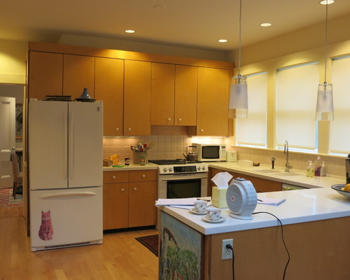
BEFORE: The U-shape configuration of the existing kitchen was functional, and the windows and skylights provided abundant light. But Hopkins says the cabinets were poorly constructed and the knobs looked too small. “The only things added to the kitchen since its last remodel were new pendant lights over the counter and a new gas range.”
Related: See More Kitchen Lighting Options on Houzz
Boston 2: Lynn Hopkins Architects, original photo on Houzz
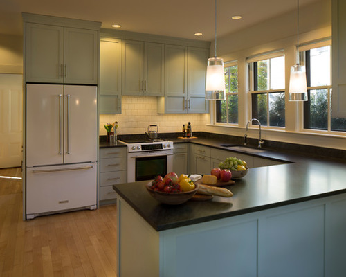
AFTER: New Shaker-style cabinets work with the home’s historic character. The cabinets were selected in a robin’s-egg blue. The new cabinets go all the way up to the ceiling, unlike the previous cabinets, which left a gap at the top. The gas range moved a few feet to the left. “The old range location made it very difficult to access it from both sides,” Hopkins says. “It’s also much more visually appealing now that it’s centered on the wall.”
Boston 3: Before Photo, original photo on Houzz
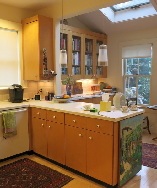
BEFORE: The previous kitchen featured a utilitarian white Corian countertop and a white dishwasher. In the breakfast area on the far side of the counter, the cabinets above the built-in sideboard had four glass doors.
Boston 4: Lynn Hopkins Architects, original photo on Houzz
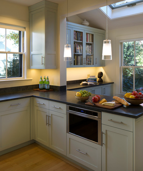
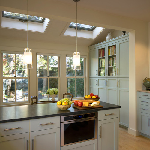
AFTER: The countertops are now a honed Jet Mist granite, a black stone with subtle swirls of gray. The dishwasher stayed in the same spot but is now covered by a panel allowing it to blend seamlessly into the cabinetry. A microwave installed beneath the counter created more prep space. In the breakfast area, the new cabinets and the built-in sideboard are in the same shade of blue as the rest of the kitchen. The cabinets now feature only two glass doors. “We decided to take away two of the glass cabinet doors on one side of the breakfast area and add two to the cabinets on the other side for symmetry,” Hopkins says.
Related: Browse Thousands of Kitchen Cabinets
Boston 5: Before Photo, original photo on Houzz
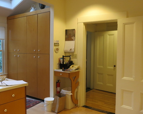
BEFORE: To the left of the door in the previous kitchen, what Hopkins describes as a “built-in standing desk” stored a telephone and office supplies on top and a garbage can and fire extinguisher underneath. “The standing desk looked cluttered and unappealing,” Hopkins says.
Explore More Home Office Ideas on Houzz
Boston 6: Lynn Hopkins Architects, original photo on Houzz
AFTER: Hopkins added a built-in cabinet to replace the standing desk. The new cabinet features more drawers to provide extra covered storage. “The fire extinguisher is now located in the bottom cabinet,” Hopkins says. “It’s still easy to access, but the look is much cleaner.”
General contractor: North River Builders

