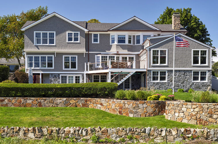
Before the renovation, the property’s best feature was its location: perched on the cusp of a quiet neighborhood beach in Beverly. When its new owners, a family with three children, purchased it in 2014, they gained a backyard of lawn shifting to sand and a backdrop of water views to enjoy for years to come.
However, the home itself did not equal the beauty of its surroundings. Originally a ranch, it evolved over time with a series of additions. While growing in square footage, it ultimately suffered from a variety of layout quirks and a distinct lack of curb appeal.
After living it in for a couple of years, the owners approached Tobin Shulman, principal of SV Design, a full-service architecture and interior design firm with offices in Beverly and Chatham, about a kitchen remodel. Upon closer inspection, the architect envisioned a whole-house renovation that promised better light, more cohesive style, and improved functionality—plus a new kitchen. The owners were sold on this transformative potential.
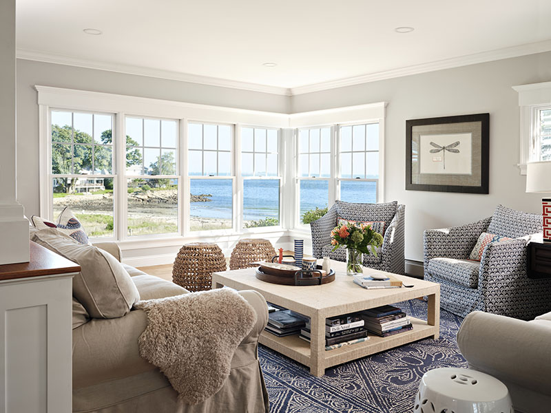
“This house has fantastic views—the landscape just rolls down the hill to the ocean,” says Shulman of the surrounding topography. “The project presented with lots of opportunities to clean up the architecture, add some charm, and achieve a cohesive style.”
The exterior, in Shulman’s eyes, read as plain, flat, and boxy, with an undistinguished style landing somewhere between Colonial and large Cape. “All of those additions generated some oddities, including a fake chimney with stone veneer on the façade as well as two entry doors, with no distinction as to which was primary,” he recalls.
“It was really uninteresting,” agrees the homeowner of the presentation, “and having two entries was strange and inefficient. It needed some sprucing.”
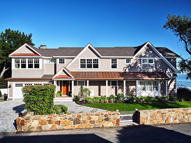
In collaboration with Kernwood Building & Remodeling, SV Design upgraded the home in two phases while the family stayed in residence. Outside, Shulman eliminated a needless entrance and chimney and flattened out an awkward octagonal bump-out above the garage. The facelift continued with a new miniature gable accentuating the front entry, diamond shingling, standing-seam copper roofing, and an elongated front porch.
Inside, one of SV Design’s most impactful changes involved swapping a central switchback stair for a more streamlined straight version, freeing up valuable interior space. “The original stair with landing was grand and pretty, and I was hesitant about the change at first,” admits the homeowner, “but gaining more room for the kitchen was worth it.
“The original kitchen was dated, with dark wood cabinets, dark green counters, and heavy drapes,” continues the owner. “It was also narrow; you could barely walk behind the island stools. We had this big house with a long, skinny kitchen. It just didn’t work,” she says.
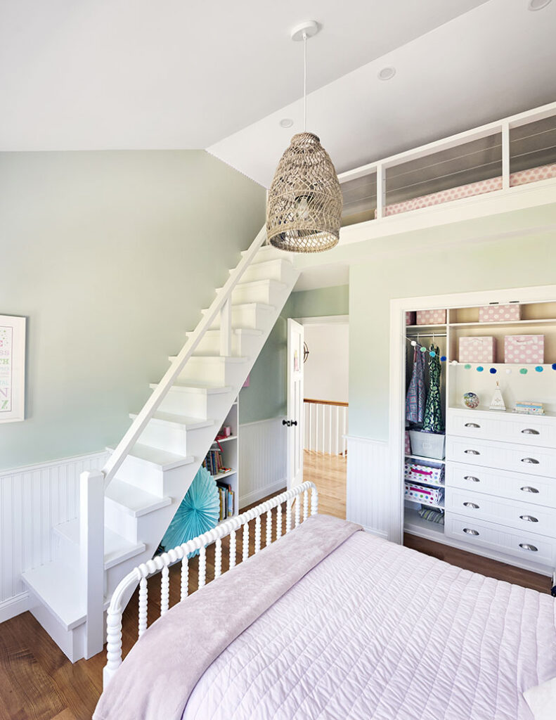
Taking advantage of the stair alteration, Shulman pushed the kitchen cabinetry back two and a half feet, solving the circulation issue behind the island. “It also cleaned up how the second floor works and allowed more space for the children’s bedrooms,” he notes.
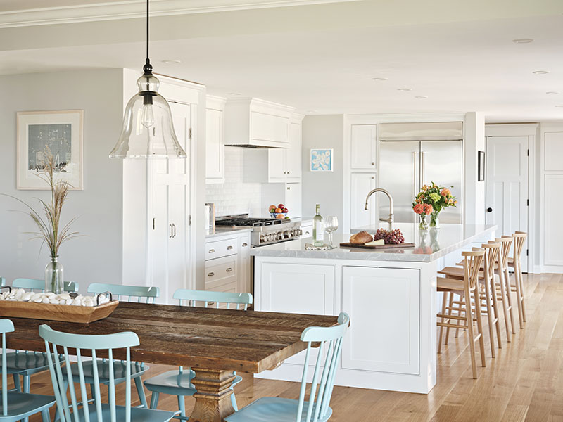
Clean and classic, the new kitchen boasts Shaker-style cabinets and a backsplash of textured subway tile, with wood stools from Anthropologie for a dose of warmth. “We wanted an all-white kitchen, but my husband didn’t want the maintenance of an all-white countertop,” explains the client. “Instead, we inversed the norm and chose a soft grey quartz with white veins.”
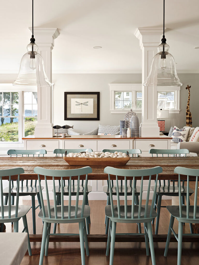
The owner’s preference for simplicity continues in the dining area, where two classic glass cloche pendants hang over an Arhaus dining table, punctuated at either end by vintage chairs. Turquoise dining chairs from Serena & Lily add a fun dash of color. A half wall with paneled columns differentiates the dining and living areas without blocking sightlines.
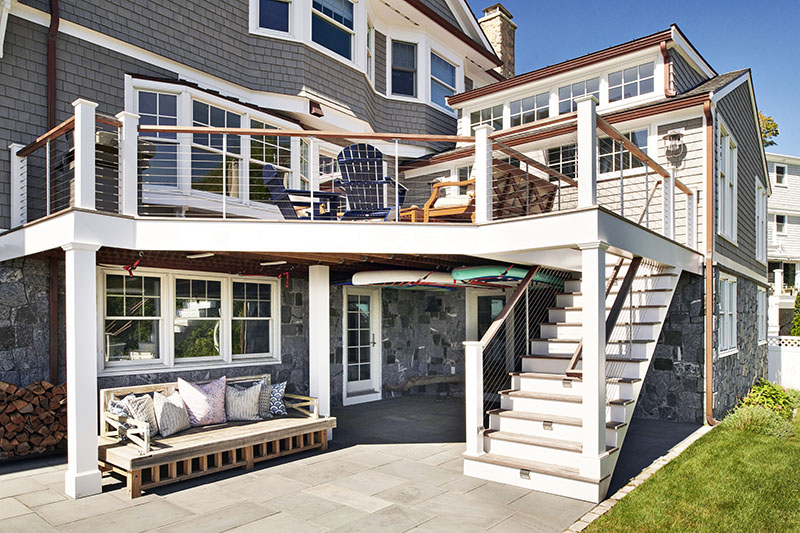
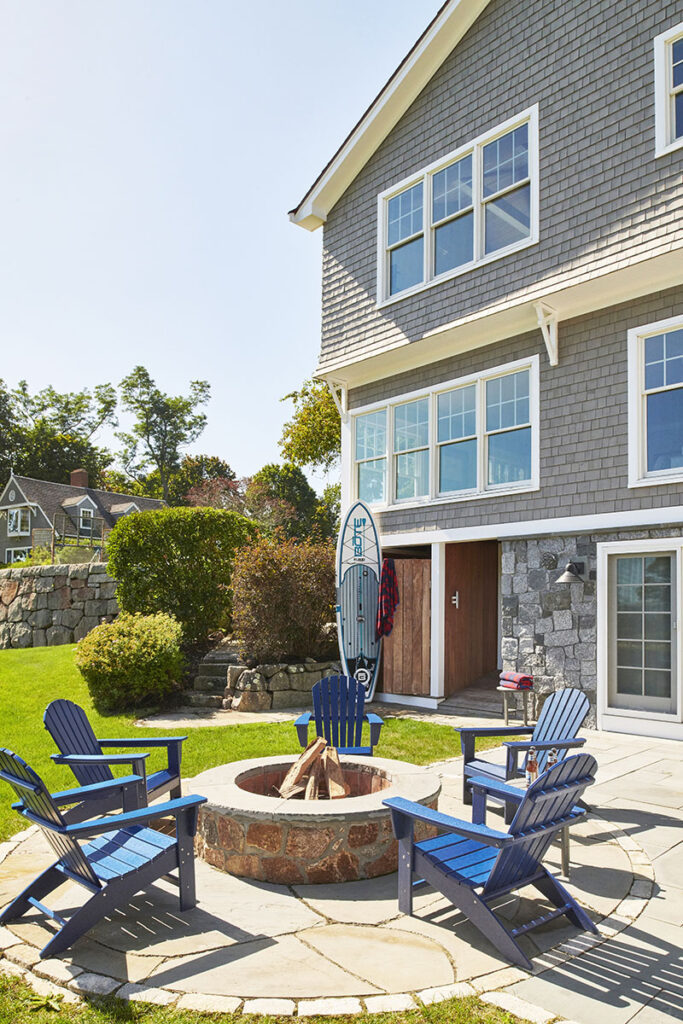
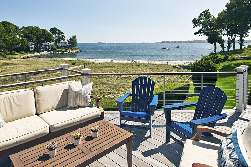
Stretching perpendicularly off the home’s rear axis is an existing family room addition, which Shulman improved with a pop-up shed dormer for extra light. Other tweaks on the house’s water side include a shingle flare and a stone base to break up the massing of the three levels. The kitchen opens to a back deck, and the finished basement opens to a lower patio.
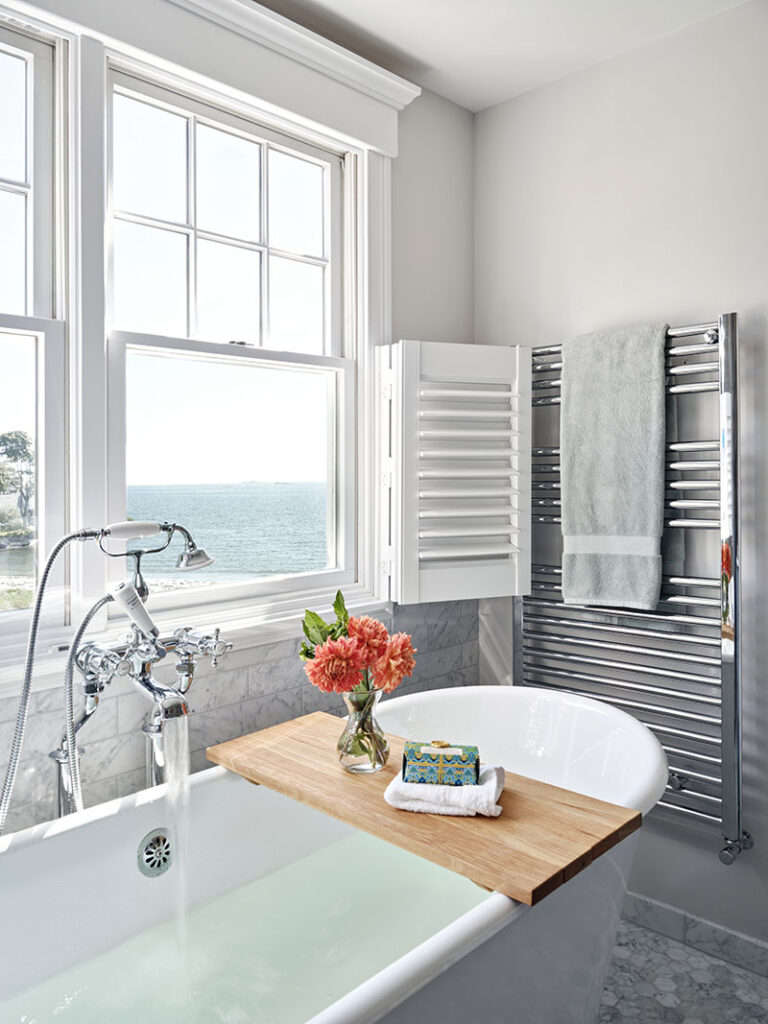
Shulman’s adept use of existing space continued in the primary bedroom suite. “The bedroom was large but had very little storage, and the bathroom was dated,” says the architect. “We shifted the suite’s entrance, shrank the bedroom a bit, and in return delivered an expansive his-and-hers walk-in closet, spalike primary bath with soaking tub, and a convenient laundry room.”
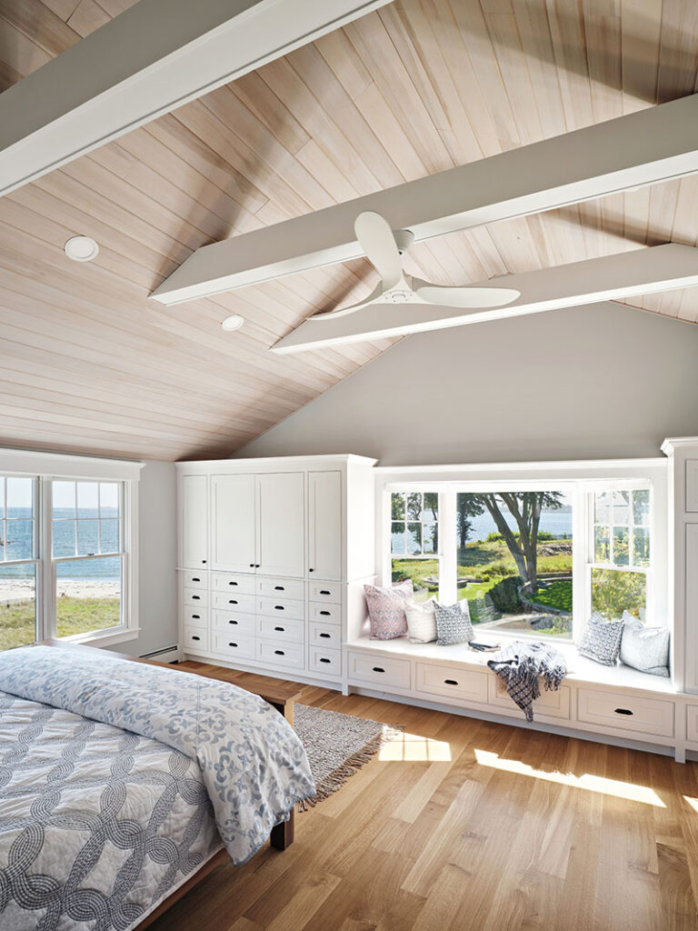
Overhead, whitewashed wood draws the eye to the bedroom’s cathedral ceiling. Custom built-ins provide additional storage and one of the owner’s favorite features: a cozy window seat.
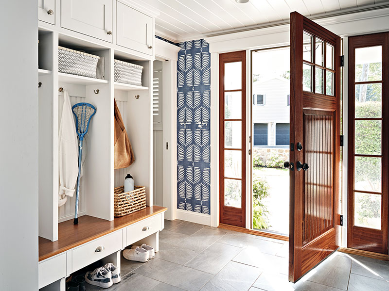
Now, when guests arrive at this beachside beauty, a mahogany door with side lights leads into a tiled mudroom with handy storage cubbies. The kitchen hosts informal meals and homework; the dining room seats 10 for dinner parties and holidays; and the deck beckons with a horizon of sparkling ocean beyond.
Shulman fulfilled his promises without expanding the home’s envelope—and his clients couldn’t be happier. Their quirky diamond-in-the-rough is now a charming family-friendly cottage by the sea.
Architect: SV Design
Builder: Kernwood Building & Remodeling
Tile: The Tile Source
Bathroom Vanities + Fixtures: Salem Plumbing Supply & Designer Bath
Custom Cabinetry + Built-ins: Village Woodworking Shop

