A Family centric colonial in Andover gets made over and gains a little cool, a lot of color, and some serious glam
Designer Paul Daher can see potential in any space, and no detail is outsider her purview. Lackluster décor, dated material choices, underutilized spaces—she’s able to see past an interior’s limitations in the now and envision its more fulfilled, more sensuous, sumptuous future.
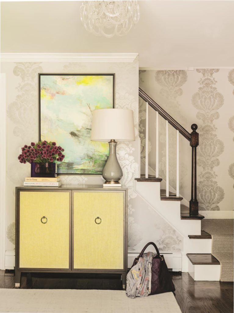
True to form, when the sister of a past client inquired about renovating her family home in Andover, Daher rose to the challenge. “It was your typical center-entrance Colonial,” explains the designer, who leads a nine-person team at Boston-based Daher Interior Design. “When you entered, there was a front-to-back living room to the right and a kitchen and dining room to the left.” A previous three-story addition on the back had added living space; however, the issues of poor flow and closed-off rooms remained.
“They had been living there for a
The kitchen was standard for a 1980s Colonial: upper and lower cabinets running along two walls in an L-shape. At the end of the long, narrow space
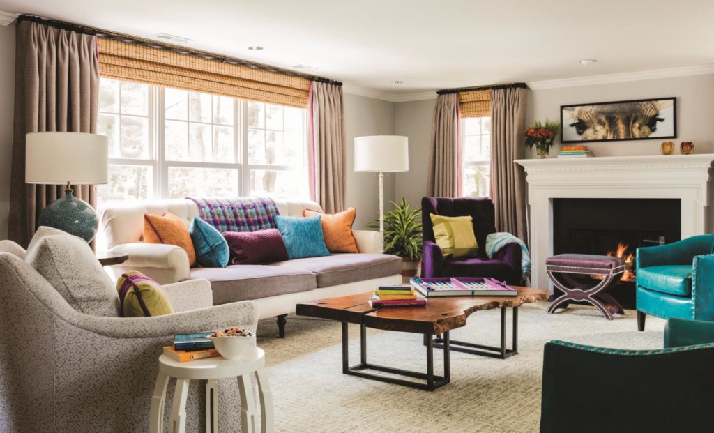
To reconfigure the kitchen triangle, Daher and Mark Bunker of Bunker Building stole two feet from the adjoining dining room. They also swapped the French door for a window, now part of the backsplash wall. “That was the most difficult part of the renovation,” explains Daher, “working with a structural engineer to take out the wall between the dining room and kitchen and put cabinetry there instead. Now there’s a structural beam above that wall of cabinets and fridge; we wrapped it in cabinet material and added pin lights underneath.”
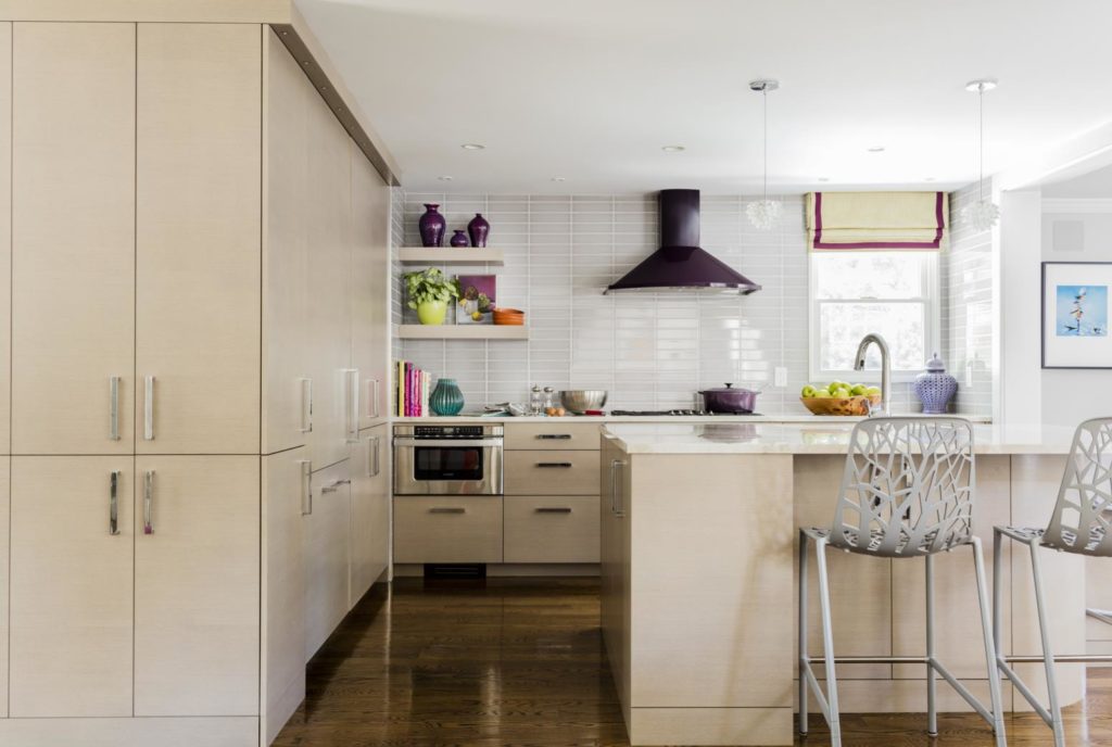
The finished kitchen is a study in contemporary glam. Its stained rift-cut white oak cabinets, quartzite countertops, and crackled backsplash tiles (“They’re gray with a hint of lavender,” says Daher) form a cooperative sea of bright neutrals. Since the client loves
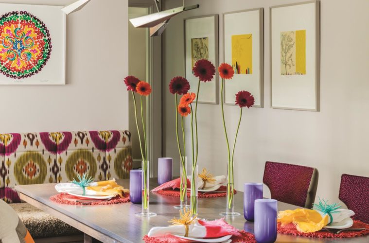
Daher’s color pops continue in the new dining area, where fuchsia, lime green, orange, and purple feature in the floating banquette’s ikat fabric. Custom built by Beaulieu Cabinetry of New Hampshire (who also crafted the kitchen cabinets), the banquette features easy-push drawers for storage beneath. A whimsical art print of swirling candy and custom dining chairs—with aubergine-painted legs and fuchsia seat linings—continue the color play. “The bright accents work because the room’s envelope is quiet,” she explains.
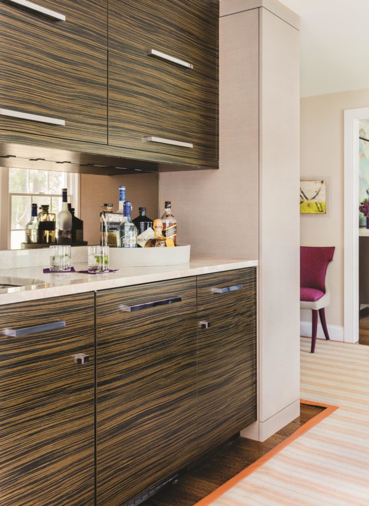
In the old dining room, nestled on the other side of the kitchen’s long cabinet run, is a chic built-in bar. Its Macassar ebony cabinets and bronze mirror backsplash veer toward an art deco look, while its strategic position allows for easy access while entertaining.
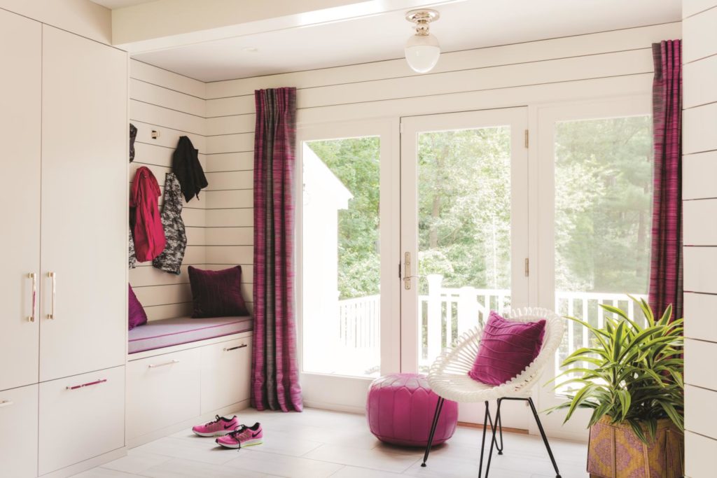
Daher rounded out the first
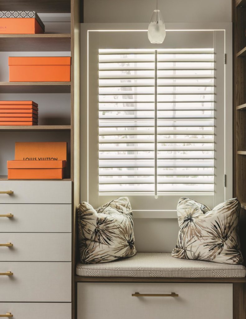
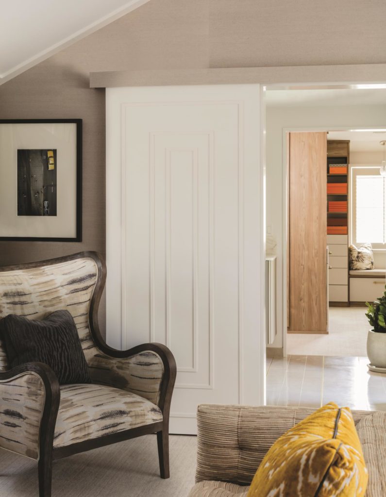
Upstairs, the designer focused on reorganizing the master suite, which suffered from an awkward arrangement of bedroom and bath separated by walk-in closets. “The spaces were small and cut up,” explain Daher, who swapped the bathroom and closet positions and rebuilt both spaces from scratch.
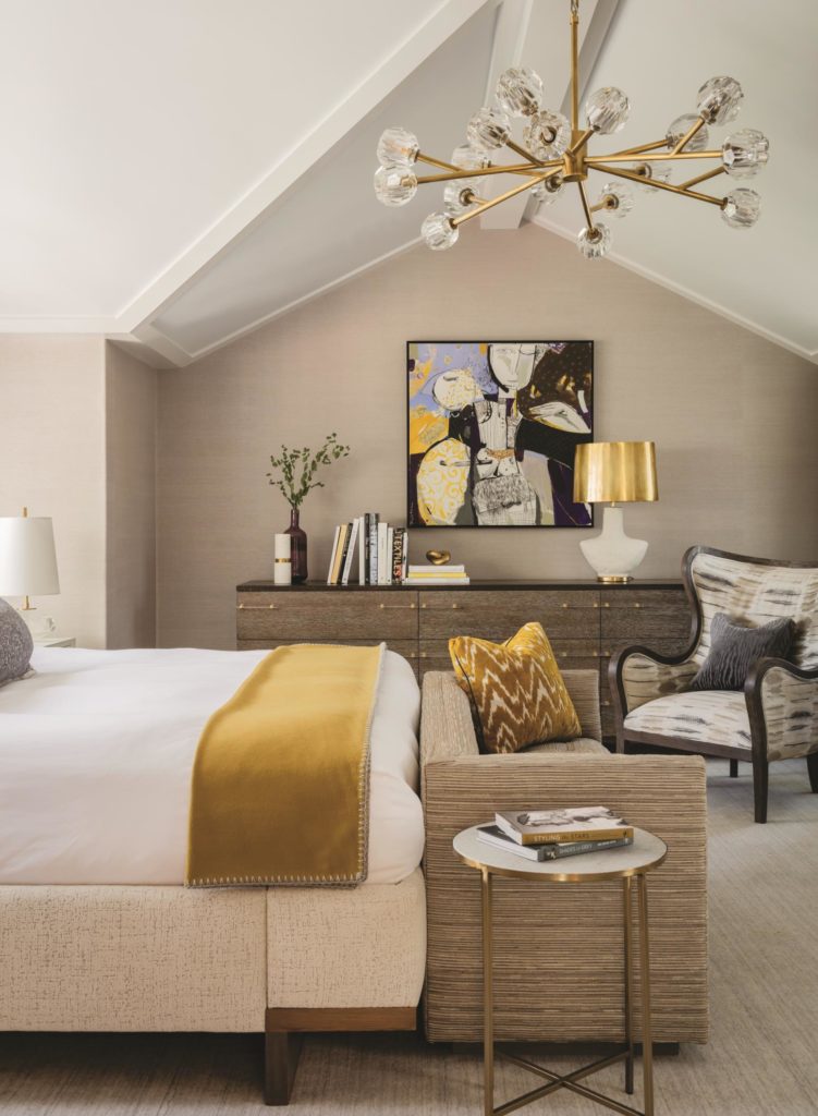
The bedroom stayed as is, although Daher reworked its details. She placed the bed in front of the windows and lined the cathedral ceiling with trim to draw the eye upward. “We kept the envelope of the room calm. What amps up the suite are the gold accents in the chandelier, the pillow, the throw; there’s even brass detailing every couple of feet in the tiled bathroom floor,” she notes. “If you remove the gold, the suite is very tranquil, but we had to have a little charisma in there.”
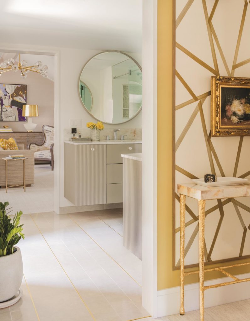
From candy prints to orange leather to golden lampshades, this makeover has it all: color, texture, dazzle, sheen, and shine. Collaborating with such an open-minded client was, for Daher, the best part. “It was a lot of fun,” she relates. “It was a blast.”

