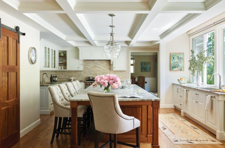
For the owners of a 1990s Colonial in Andover, remodeling their kitchen and other elements of their ground floor was a project of letting in the light.
The professional couple and their three children found their 360-square-foot kitchen too shallow and too dark. Their goal was to open it up on the inside and also to create a strong connection to the outdoors by adding large windows overlooking the patio and swimming pool. “They wanted to get better visibility of the pool and bring more light into the kitchen,” says Steve Prittie, vice president of project development for Howell Custom Building Group. “They wanted that to feel that it was almost an indoor-outdoor space.”
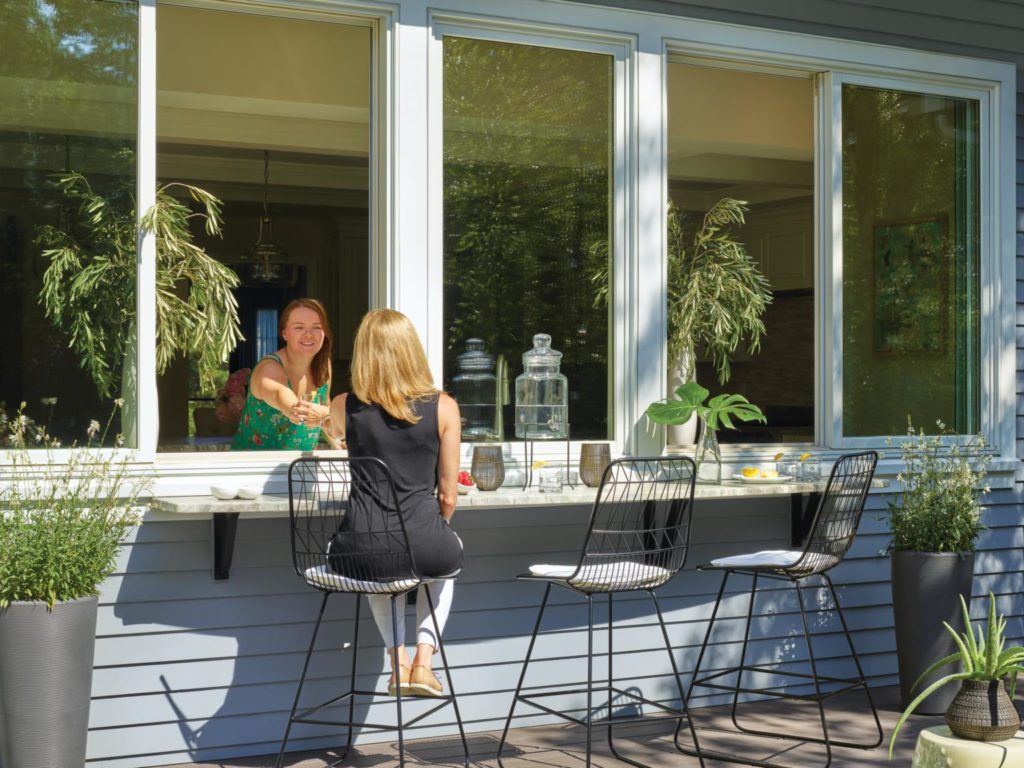
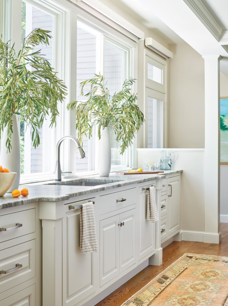
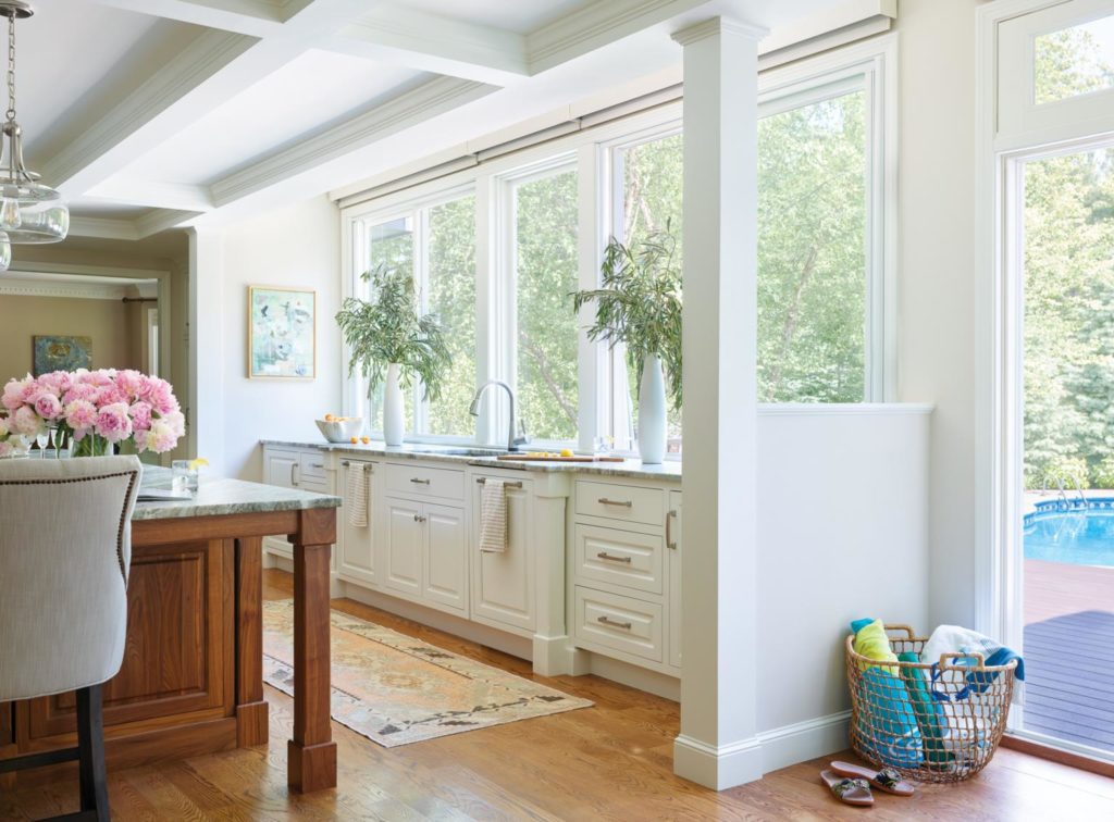
Prittie and the project team expanded the kitchen’s footprint to 460 square feet, in part by bumping it out 4.5 feet at the back. They pushed the sink and some cabinetry out into the new space, and in a unique and important piece of the project, they lifted the ceiling of the bump-out by about a foot, which allowed them to stretch the windows over the sink up above the kitchen’s main ceiling level. This gives those entering the room the impression that the windows go all the way up to the ceiling, a striking effect that suggests openness.
“With traditional window headers, it’s kind of like pulling the brim of your hat down over your eyes, and it’s blocking your view,” says Prittie. “The homeowners really wanted to get as much of the sky and the sun as they could.”
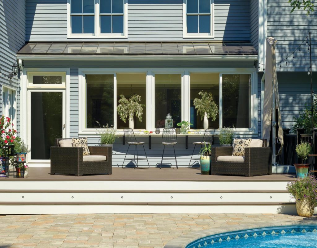
Two of the five tall, south-facing window panels over the sink slide open and incorporate retractable screens. A curved granite countertop with stools that is on the deck outside the bank of windows acts as a connecter between the kitchen and the deck; someone standing at the sink can easily talk with and pass things to those sitting outdoors.
“A lot of the time we spent with them was for the design and layout to make the kitchen function better for them,” says Holly Gagne, principal designer for Holly Gagne Interior Design and the interior designer consultant on the project. “They wanted it to be comfy and really fit, in addition to not having a lot of visual interruptions between the kitchen and the outside.”
The project also reimagined the outdoor space, modifying the back deck to incorporate wide steps leading down to the pool and reworking the patio area to create an appealing seating and grilling space.
Inside, another welcoming seating area can be found around the kitchen’s large island, where the family likes to congregate in the morning before the kids head out for school. “They wanted as big an island as they could get,” says Prittie. “It is quite a dramatic island space—it’s expansive and the views are terrific.”
The spacious quartzite countertop on the island is matched by the other counters, and the striated “Fantasy Brown” pattern from Marble & Granite, Inc., in Norwood contrasts nicely with the white lacquer finish on the cabinetry, the white walls and coffered ceiling, and the black walnut of the island’s base.
“Their palette was warm and neutral,” says Gagne. “They wanted the big windows and the deck and pool area to be what you focus on when you’re in the space, so all the finishes that are in the kitchen are meant to support that and to provide texture.”
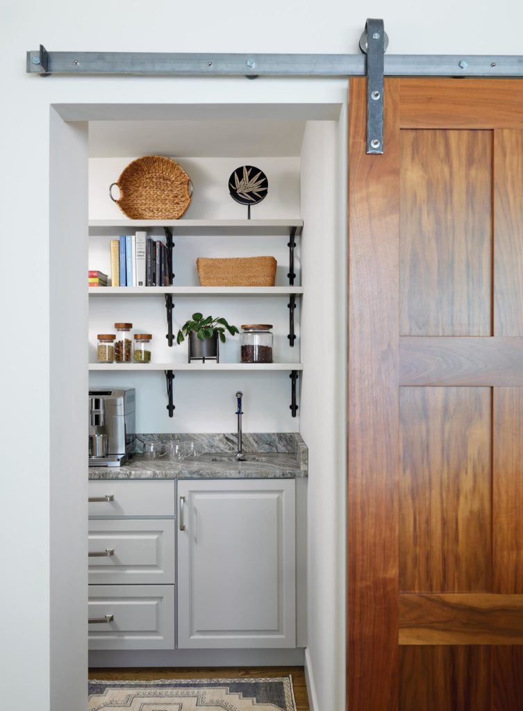
That same dark wood also shows up on the sliding door that closes off the walk-in pantry with its own bar sink situated opposite the back door. The space to build that pantry was taken from the front office, which was originally a larger room than was needed. Next to the pantry is the doorway to the family room, which the project widened, along with the doorway to the dining room.
Another change was the relocation of a powder room, which used to be next to the kitchen and is now off of the main entry hallway, opposite the basement stairs. The homeowner’s desire to move the powder room was, in fact, the impetus that kicked off the new design. With the powder room relocated, plus the additional 50 square feet taken from the front office and the extra room created by the bump-out, the vision of an expanded, light-filled kitchen came into focus.
Prittie enjoyed working with the homeowners, who had a clear vision and helped the team bring their ideas to life. “It was really a nice collaboration, which doesn’t happen all the time,” he says. “They got what they really wanted.” And he got the satisfaction of a job well done.

