A young couple with three daughters loved almost everything about their 1904 Tudor home in Manchester-by-the-Sea. The problem was the kitchen and adjoining family room. “Neither space had been touched in many, many years, and both were dilapidated, dark and a tad depressing,” notes the wife.
In addition to little natural light, despite three windows and a French door, the kitchen had poor artificial light. It lacked storage, had almost no flow, and was saddled with too much cheerless, brown wood, including dark parquet flooring, two beautiful but somber chestnut barn doors separating the living room from the kitchen, and a massive, curved wooden bar installed to define the space between the kitchen and family room. Other shortcomings included mismatched, poorly made stock cabinetry and outdated appliances, such as the clunky, commercial range with several non-working burners.

Enter Anna Orfanides, owner and principal designer of Anna O Designs, whom the couple hired to renovate the space. “In our initial design meeting, our energies were in sync and I was able to home in on their vision for the space,” says Orfanides. “They are originally from Europe and having lived there myself, I understood what they were looking to achieve, which was a modern but eclectic look.”
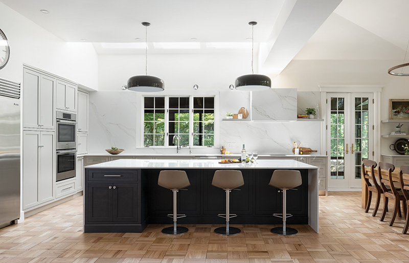
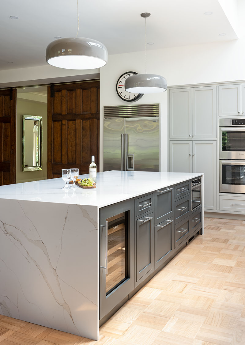
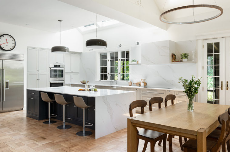
With the couple’s dream space in mind, Orfanides opened up the kitchen’s footprint by saying good-bye to the massive wooden bar, which the couple happily sold to a restaurant. Then, the designer added an island but repositioned it to face the windows and French door to enhance flow between the kitchen and adjacent dining area. To inject a dose of minimalism and avoid counter clutter, Orfanides ensured the island had plenty of space for built-in appliances, including a microwave drawer, Sub-Zero cooler drawers and a Sub-Zero wine fridge.

The island also had ample storage for plates, glassware, and less frequently used items, such as platters, to reduce the number of wall cupboards for a cleaner, more streamlined look. A rich charcoal blue colored paint (Farrow & Ball Railings) grounded the island’s base, which Orfanides topped with a quartz that looked like marble but is much more durable. To give the island a modern pop, Orfanides suggested a thin cut for the quartz top (3/4” thick versus the standard 1-1/4” thick) and added a waterfall edge. She then used the same quartz stone for the kitchen counters, hood, and backsplash for a cohesive look.
One of the designer’s most dramatic changes to the kitchen was installing three large skylights above the windows by the sink. “They were a game-changer that just brought in so much natural light,” says Orfanides, who was overjoyed when the contractor said he could add them. Additional light came from bumping up the number of recessed ceiling lights and using LED bulbs. Four sconces high above the sink added even more radiance, along with two sleek pendants over the island and a mod, walnut-rimmed glass light fixture over the nearby dining table.

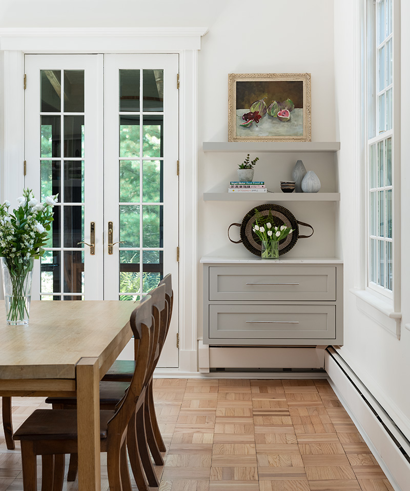
As for the dark parquet floors, they were sanded and stained a soft honey brown. Farrow & Ball Wimborne White paint gave the walls a warm, white glow, while pale gray Farrow & Ball Purbeck Stone paint set off the custom-built Shaker-style cabinetry with a modern inside bevel. Orfanides used the same gray paint on the two drawers and floating shelves above a serving station (to the right of the French doors near the dining table), as well as on the walls and built-in bookshelves in the adjoining family room to tie the spaces together.
Polished chrome fixtures complemented the stainless-steel appliances, including the original Sub-zero refrigerator, new Bosch double-hung ovens, a dishwasher, and induction cooktop. The fixtures also harmonized with the gray cabinets and silvery veining in the quartz stone used throughout the kitchen.
“The project was transformative for the couple,” says Orfanides. “They love the kitchen’s efficiency, including the amount of storage, the quality of the appliances and cabinets. They love the way people can sit comfortably in the space and that there is so much room around the island, particularly when they’re cooking and entertaining. As the wife told me, ‘The space is peaceful, ample, and functional.’ It also aligns beautifully with the rest of their home.”

