Faced with a 100-plus-year-old Colonial house suffering from a disjointed floor plan and outdated amenities, architect Steven Baczek approached the remodel as an opportunity to mix and match design styles. In the kitchen, as elsewhere, he wanted to stay true to the formal era in which the 3,000-square-foot home was built but also accommodate the homeowners’ desire for more relaxed elements. “We had to find the sweet spot between being historically correct and sensitive and meeting today’s needs,” notes the architect, who considered every detail equally—from the cabinets, windows, and walls to the faucet, fixtures, and hardware.
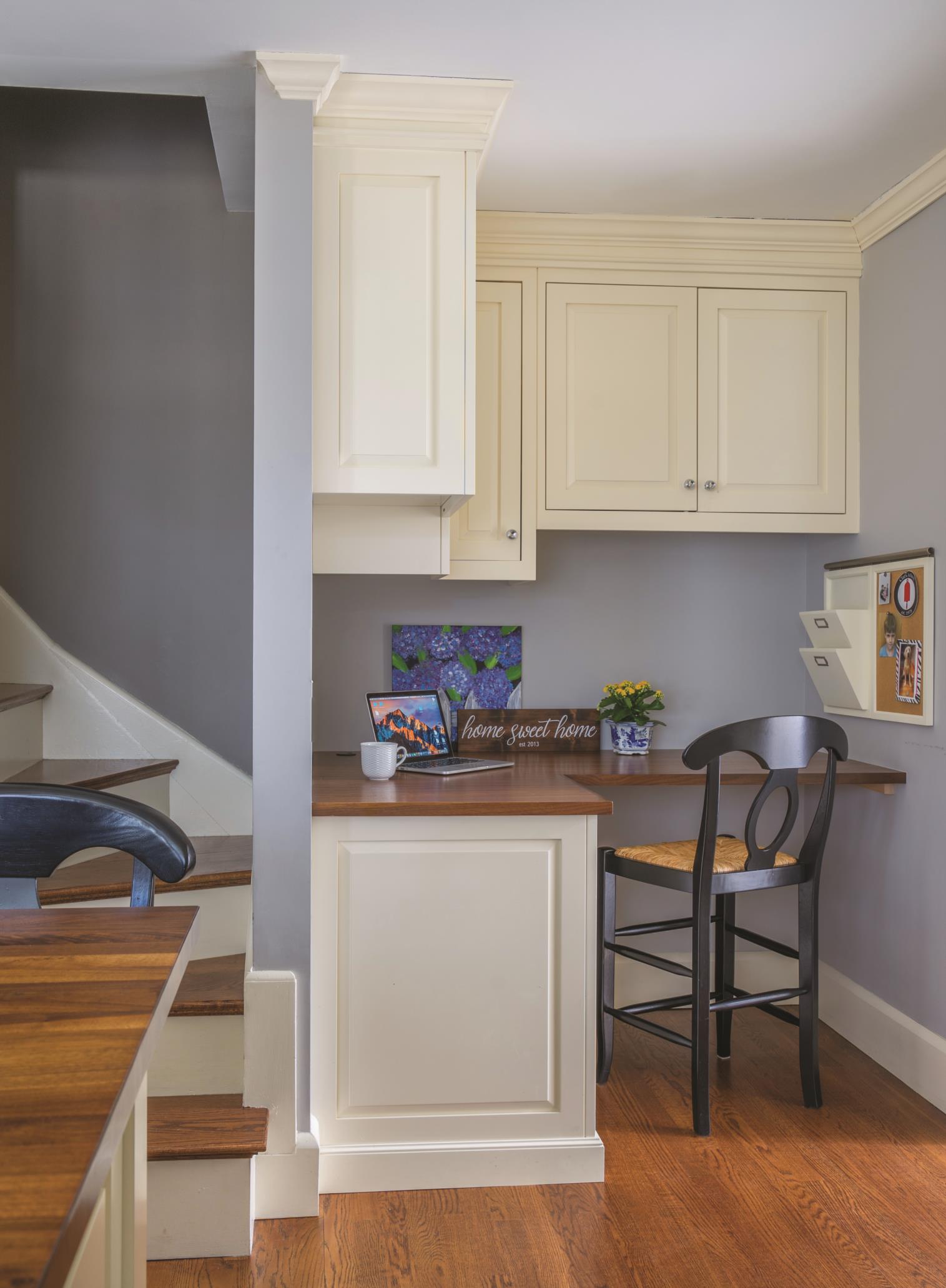
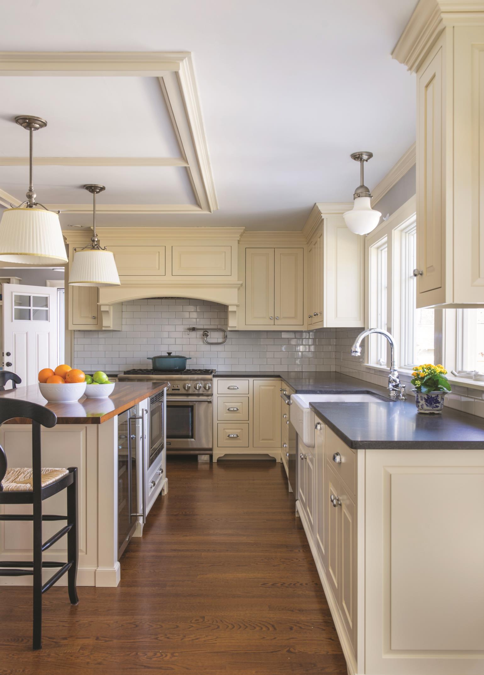
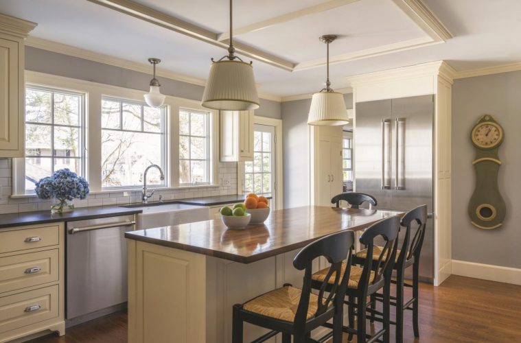
 Of course, restrictions applied—primarily in the form of square footage. Baczek’s program had to accommodate a mudroom, a bathroom, and a small office alcove to the left of the stove. He also needed to address the dining room, which lacked a strong tie to the kitchen. By reconfiguring the layout, Baczek turned the terminal kitchen (it is a corner room unto itself) into a multi-use space. His idea was to create “a room within a room.” The dark chocolate maple-topped island serves that end. Because people are meant to spend leisurely time socializing in the kitchen—as opposed to perching, as is the habit in more transitory, open-concept kitchens, where there are typically other seating options in a dining room and family room—the seating needed to be comfortable. The wicker and mahogany barstool chairs support long stretches of sitting and are a nod to the colonial era.
To demarcate the island, Baczek added molding to the ceiling directly above, creating a coffered effect; it both frames the lighting and makes the island a distinct space. (Because it is an old house there wasn’t the option of going up into the ceiling to build coffers.) This “negative design element,” as Baczek refers to it, furthers his goal to clearly delineate the seating area. “It’s like a nook inside the kitchen without being in the corner,” he says, noting that the hung lampshades on the pendant fixtures add a formal living room or parlor-like touch. In contrast, the pineapple-style polished chrome light over the sink is a more contemporary element that simultaneously contrast with and complement the island lighting.
In order to penetrate the room with natural light, Baczek removed a small three-foot window—typical of the Colonial style to make way for a six-foot expanse of glass. A subway tile backsplash—a design element Baczek sees as a vintage look—also helped to brighten the space. By using a slightly darker grout rather than true white, he achieved the desired effect, which was to have it read like “a series of pieces” versus a tight-joint monolith. The treatment also adds the feeling of age. A white ceramic farmhouse sink, another trending design element, evokes the Old-Country aesthetic Baczek was after.
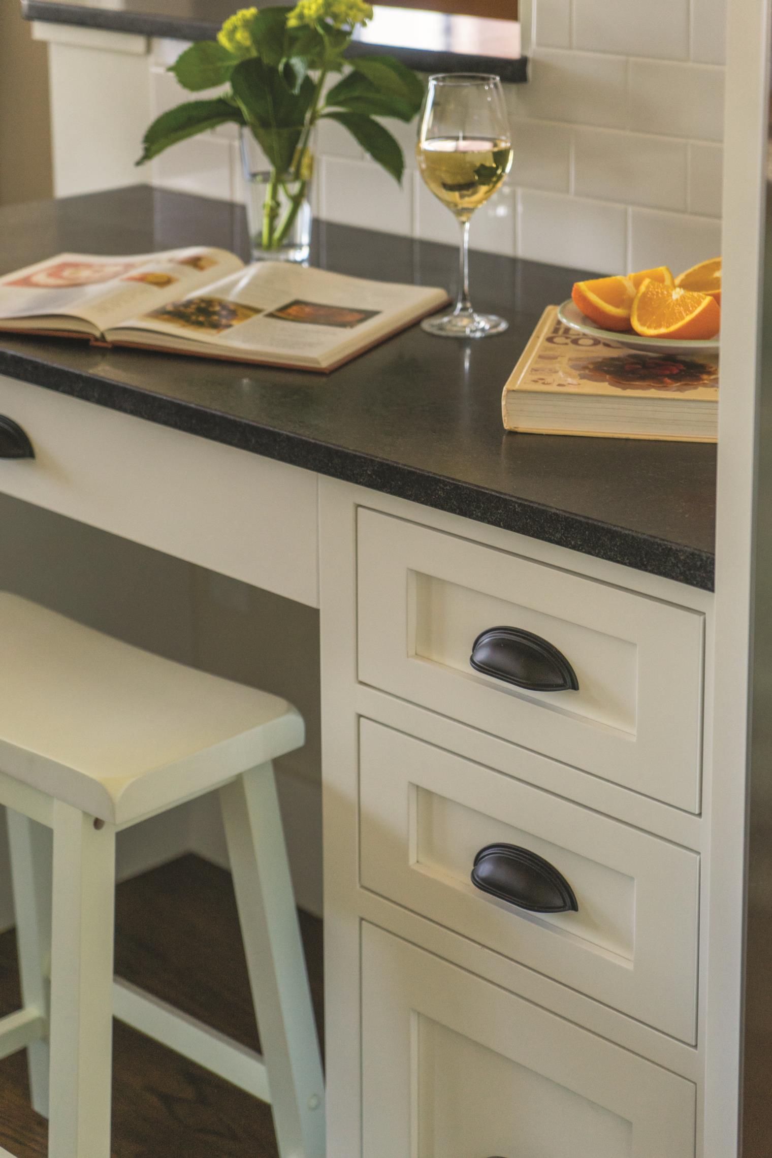
For the cabinetry, Baczek removed one of the pantry doors to use as a model. (The original pantry was located beneath the central hall stair between the kitchen on the left and the dining room on the right.) The cabinetmaker matched its dimensions and specifications, resulting in period-inspired maple cabinets with polished chrome clamshell pulls that are perfectly suitable for a modern-day kitchen in a centuries-old house.
“When you go in that house now, the feel is of a new kitchen that looks like the original kitchen,” says Baczek. “Even though it has modern appliances and amenities, it still feels like you’ve walked into your grandmother’s kitchen.”
Architect: Steven Baczek Architect, 781-354-5839, stevenbaczekarchitect.com

