Starting remodeling work in April on a summer home that clients want ready by June 1 means there’s no hemming and hawing during the design process. “I just had to say, ‘Trust me!’” says interior designer Heather Alton.
There was another challenge: Mounds of snow stood in the way of construction on this well-used family beach house, and people had to do a lot of shoveling to gain access to the front door. Their efforts paid off. The result is a freshened-up home that’s beautiful, relaxing and ready for summer.
My Houzz: Creativity Flows in a New Hampshire Cottage
Kitchen at a Glance
Who lives here: This is the summer home of a family with college-aged children.
Location: Seabrook Beach, New Hampshire
Size: 290 square feet (26.9 square meters)
Designer: Heather Alton of New England Design Elements
The remodel began with the kitchen, but once that started to take shape, design fever spread. The new kitchen had revealed how dated and tired the rest of the house looked. The project grew to incorporate the dining room, staircase, hallways, three bathrooms and lower level. One blessing of the snow was that the neighborhood of summer homes was uninhabited. “We took over the street with our trucks. Thank goodness no neighbors were around,” Alton says.
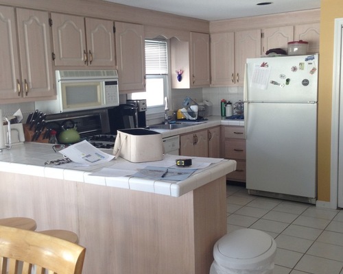
Before Photo, original photo on Houzz
BEFORE: Most of the home, including the kitchen, hadn’t been touched since at least the 1980s. “This is a family that has a lot of people in the house all the time — their children, their children’s friends, other family members and friends,” Alton says. The kitchen needed to be a gathering space that would seat a lot of people, and this U-shaped peninsula layout wasn’t working.
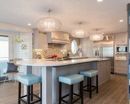
New England Design Elements, original photo on Houzz
AFTER: A large island that seats six and incorporates a lot of workspace was the solution. Alton made it the centerpiece of the room.
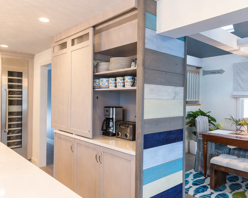
This wall of cabinetry replaced an existing wall between the dining room and the kitchen. It opened the kitchen more and conceals a structural post.
New England Design Elements, original photo on Houzz
The top doors slide open for easy access to coffee making and bagel toasting in the morning. To the left you can see another important item on the homeowners’ wish list: a tall wine refrigerator.
The colorful accent wall adds a casual beachy feel and looks like reclaimed boat boards. In truth, they are new boards that Alton’s partner painted different colors outside the home with graffiti spray paint. “The accent wall keeps things from looking too formal and adds an architectural feature,” she says.
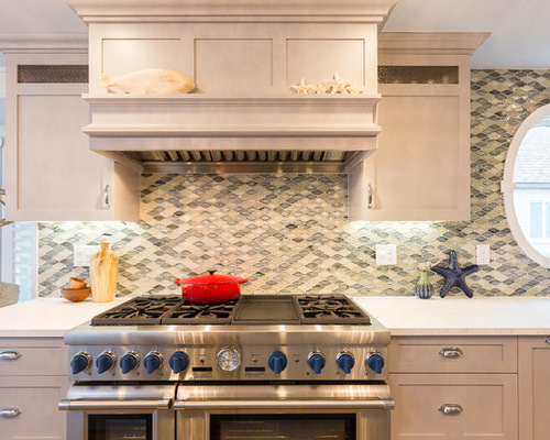
This oval window is new. “There was an ugly window on this wall that was dictating where we would have to place the range,” Alton says. “It’s a good investment to just get rid of something like that. Don’t work a whole new kitchen around one silly window.” The new window adds architectural interest and is in a much more convenient spot.
New England Design Elements, original photo on Houzz
With the window change, the designer was able to grant her client’s wish for a range hood. “With low ceilings like this, I told her she’d have to go ceiling-mounted and simple — no grand arches in the range hood,” the designer says. The new hood is well-scaled for the height of the room and the size of the serious Thermador range. Find a Local Designer Like Alton
For the backsplash, Alton matched the gray-blue tones of the Atlantic Ocean with watery glass tiles. “We didn’t want those bright blue Caribbean colors, and we didn’t want the backsplash to compete with the accent wall,” she says.
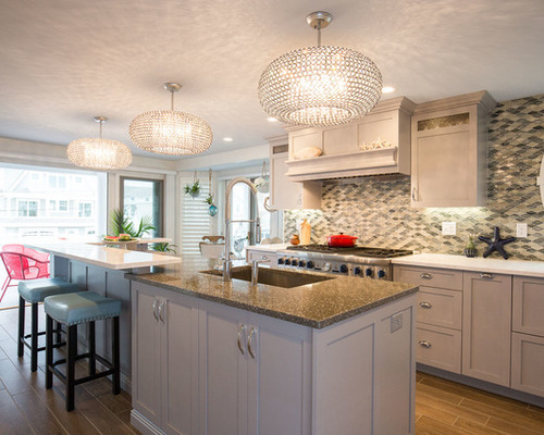
The hardworking island is social on two sides and all business on the work side. A sink, additional storage, dishwasher and custom trash bins are hidden inside. The garbage cabinet contains extra-large trash and recycle bins, a compost area, and a pullout for trash bags.
When a beach house is filled with people, you can wind up taking the trash out several times a day with just a normal bin. “I wanted to take a photo of the custom trash/recycling bins, but they were already filled with trash, and I just couldn’t bring myself to do it,” Alton says with a laugh. “Now I wish I had it to show you.”
New England Design Elements, original photo on Houzz
While Alton originally had picked out hemp light fixtures for the casual room, her client was longing for some glitz. “These light fixtures were her love button. You have to help your client fit in their love-button item,” Alton says. So she cut these fixtures to give them the right height under the low ceilings. Then she refinished the oil-rubbed bronze fixtures in silver to make the crystals inside pop. Classic cabinetry tones down the look to keep the overall feeling in the kitchen more casual.
Alton replaced the original tile floors with a porcelain tile that looks like wood, rather than using real wood, because of all the sand the beach house takes on. She replaced the wall-to-wall carpeting throughout the first floor with the same tile.
She brought in the glimmer her client loved via a new dining room chandelier. “The shapes that fall from it look like water, so it works,” she says.
Before Photo, original photo on Houzz
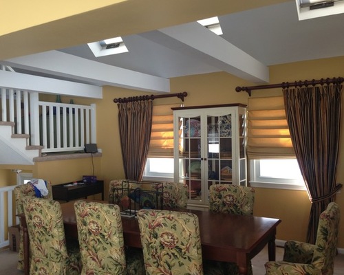
BEFORE: The original dining room looked heavy and dark.
New England Design Elements, original photo on Houzz
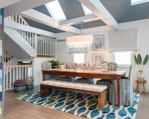
AFTER: Alton was able to repurpose the client’s existing large dining table and had new slipcovers made for the chairs. The playful fish rug was originally intended for the bar area on the lower level, but it was a perfect fit up here. New Roman shades in a subtle medallion pattern also help lighten the mood. As a final touch, Alton filled jars with sand and tea lights and hung them from the wall with rope.
Because her clients trusted her, the shortened design process allowed the crew to finish the project on schedule, just in time for summer.

