Nancy Hanson, co-owner of Heartwood Kitchens, enjoys getting to design a kitchen in a large, straightforward space. It’s a bonus if she is given free rein to configure the windows and doors. Wall space, after all, is the hard currency of kitchen design.
Both of these opportunities came together in a project that involved building a new home on a tear-down’s footprint. The sellers of the property had torn down the house to rebuild, and had even gotten blueprints drawn up for the project. But when they decided to sell the land instead, the buyers were given the brand-new set of architectural drawings as part of their purchase.
Blueprints for a Blank Canvas
The new homeowners, Sue and Phil Carr, were happy to go ahead with the seller’s drawings with a few modifications, and quickly brought in Hanson and her colleague, designer Sherry Croft, to take on the job of conjuring the perfect kitchen.
The main living area of the house had been laid out as a long, open rectangle, with the area against the back wall designated as the kitchen. The only guideline the homeowners presented to Hanson and Croft was to limit the amount of the windows on the side of the home facing the neighbor’s house.
“From a layout standpoint, we were given a lot of liberties,” says Hanson. “I didn’t have any structural walls to deal with, or any posts or beams. We were able to lay out a nice big kitchen without any obstacles at all except the windows.”
The tremendous leeway for design and the open, unrestricted space combined to generate an enticing invitation to creativity. “It was a like a blank canvas for me,” says Hanson. “The space was so big, and I could do anything.”
Windows and an Island
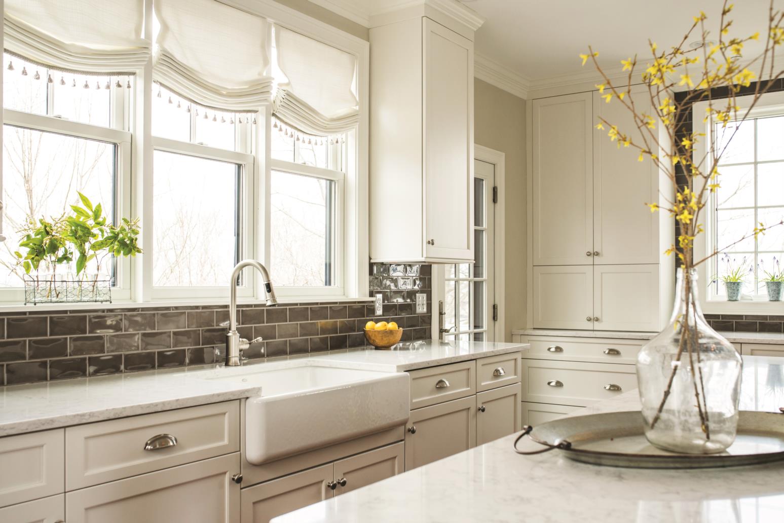
The main modifications Hanson made to the kitchen space were changing the size and location of the windows and switching out the door that leads out to the back deck. “It was fun to work with because we were given some flexibility in terms of where windows would go,” says Hanson. “We able to work the windows into the plan, as opposed to having to work our plan around the windows.”
They decided to make the windows in the back somewhat oversized to take advantage of the sunlight in that direction. The larger windows took space away from the upper cabinetry, but with nine-foot ceilings, the cabinets’ height could make up for what they lacked in width.
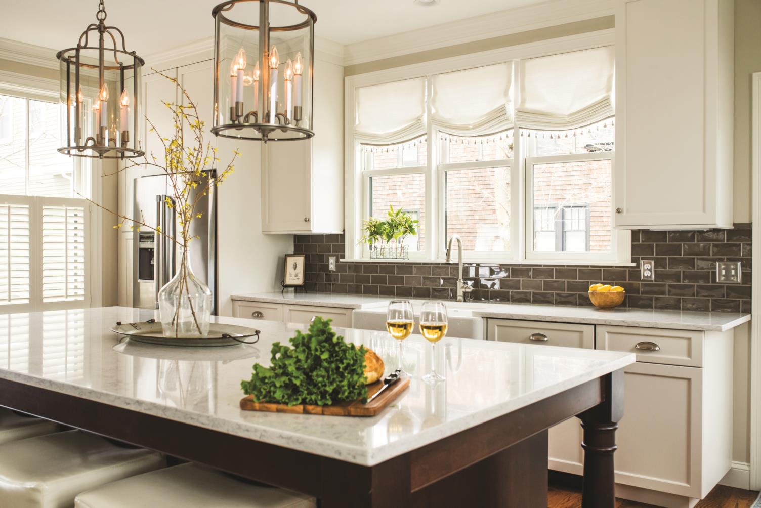
The three windows above the sink look down on a massive dark-cherry kitchen island topped with white-gray quartz. With three grown children and a grandchild in the family, the homeowners wanted to make sure the kitchen was an enticing gathering space. The 5-foot-by-10-foot island can seat eight and provides a spacious centering element to the kitchen’s wide-open space.
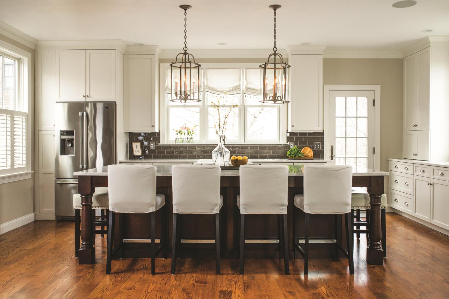
“The island was the starting point, and then we centered the sink and the window on that island, then we worked our way out to fill in the things we needed, like the spot for the refrigerator and the pantry,” says Hanson. “It’s very balanced and sort of symmetrical.”
Open yet Intimate
The plans that the seller provided included a double door in the back wall of the kitchen, but Hanson and her clients found that such doors would take up too much space. They opted instead for a single door, which sits to the right of a set of three windows above the sink, mirroring the refrigerator to create that sense of symmetry.
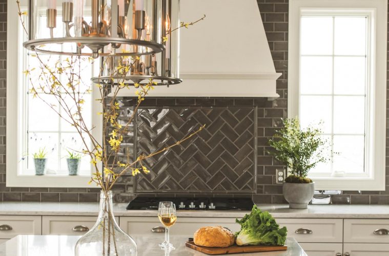
The wall to the right of the door has a counter that is home to the cooktop, which is topped by a prominent white hood that serves as a focal point for the room. The large white hood is flanked by narrow windows and surrounded with gray tiles in a herringbone pattern. Beyond the cooktop is a double oven, which marks the end of the workaday kitchen. A bar area just beyond serves as a transitional element from the kitchen space to the living room space.
“Sometimes when you have a lot of space, it can work against you,” Hanson says in noting how she decided to set this subtle boundary. “You have to make sure it doesn’t get to be so large that it becomes cumbersome.”
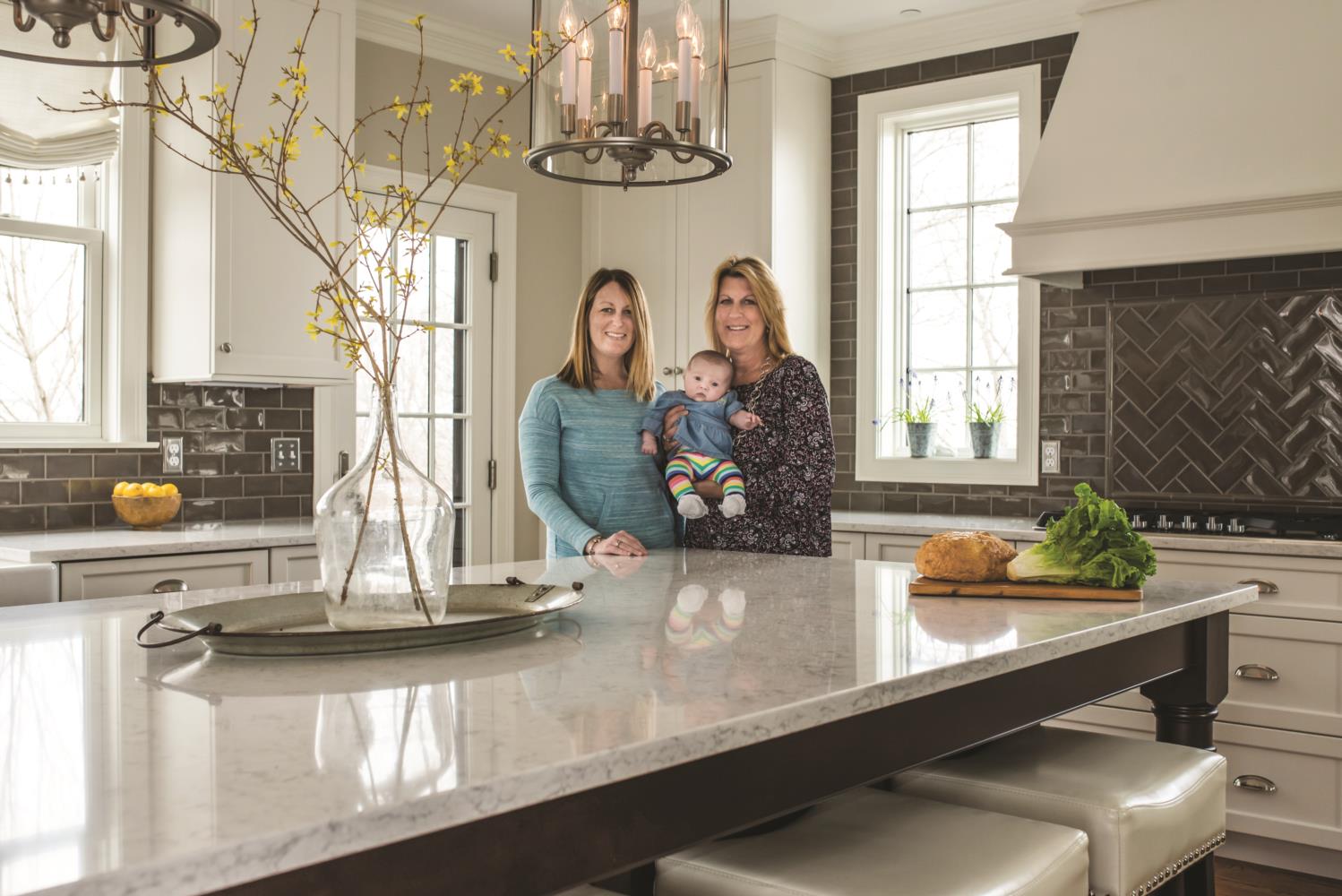
With a high ceiling edged by continuous crown molding, large windows all around, full-height cabinets, and a huge island overhung by striking lantern-style light fixtures, the kitchen is an imposing presence in the home.
But the layout of the appliances, in-flooding of natural light, and balance of the design work together to create an unexpected sense of lightness and grace. The result is a wide-open space that feels comfortable and intimate—a kitchen perfect for modern life.

