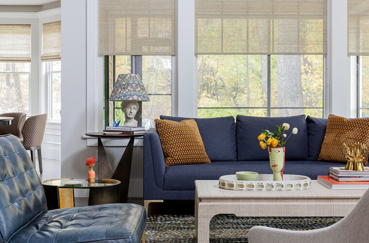
Downsizing from the Lexington home in which they raised their family to a townhouse in Winning Farm, a 55-plus community in Winchester, Ana Donohue’s clients were all about embracing change. The couple loved their garrison Colonial with modern farmhouse décor, but they understood that the light-filled interiors and smaller-scale of their new home called for a more streamlined look. Although they had never worked with an interior designer before, the wife reached out to Donohue after reading an article that detailed her collaborative process.
The project was a great match for the designer, who likes to mix traditional and contemporary elements. “Traditional pieces reflect their time in Lexington and the contemporary ones reflect where they are now, making a mix perfect for this time in their lives,” Donohue explains. “When my clients walk into their homes in five or 10 years, I want them to feel that it’s still current. You need a mix of styles to achieve that.”
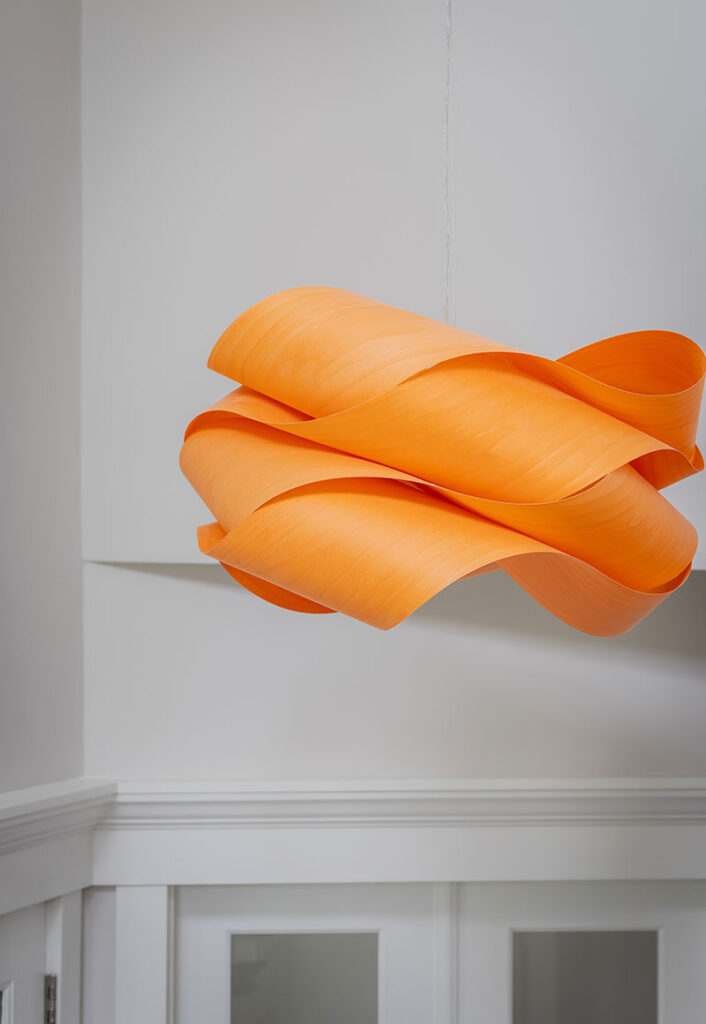
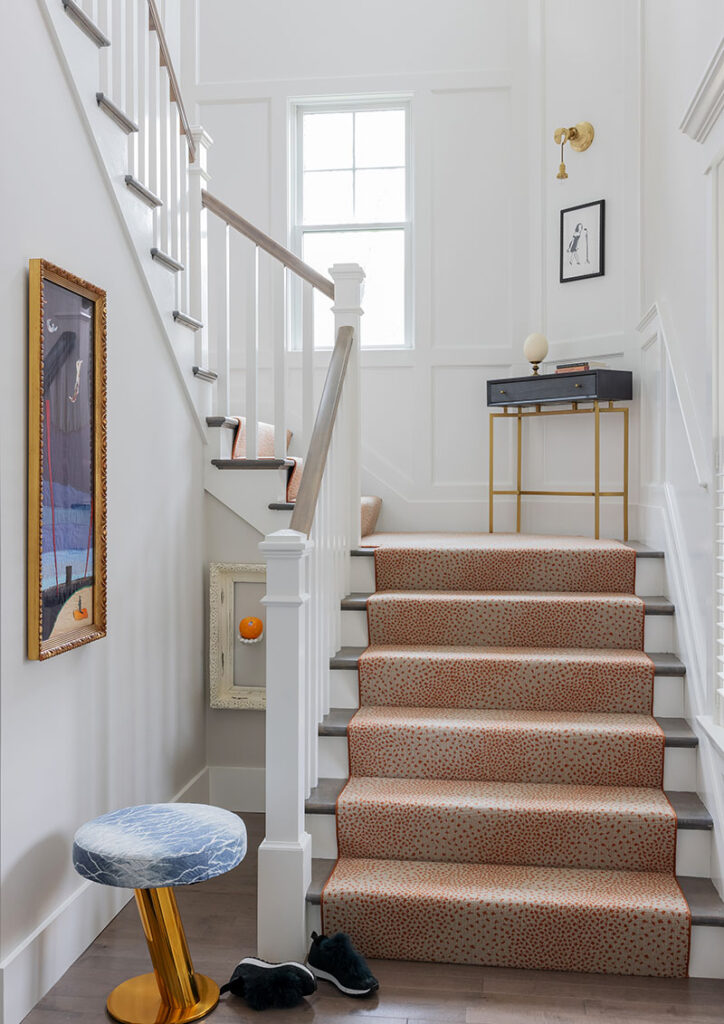
An LZF pendant light that the homeowner spotted in a magazine—a loosely knotted swirl of wood veneer stained orange—kicked off the design by introducing personality and color right in the foyer. An off-white Stark runner with rusty dots reminiscent of an animal print draws orange up the stair. Playing off the couple’s artwork, Donohue upholstered a stool in a blue ombre fabric and put a slim blue console with a leggy brass base on the landing. “The landing is often overlooked,” the designer says. “It doesn’t have to stay empty. Don’t be afraid to add something of interest in unexpected places.”
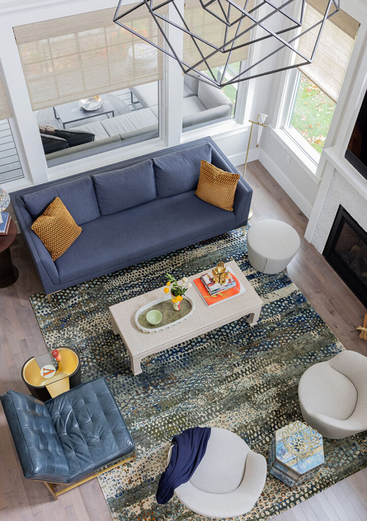
Given the home’s open-concept layout, Donohue carried the denim-blue hues into the living space, starting with the sofa. “The sofa fabric is soft, warm, and inviting,” the designer says. “As the main room, it needs to be incredibly comfortable.” With that in mind, Donohue paid careful attention to the scale and silhouette of the B&B Italia swivel chairs, too. “They look small, but they’re sized to fit bodies: You can sit in them for hours,” she says.
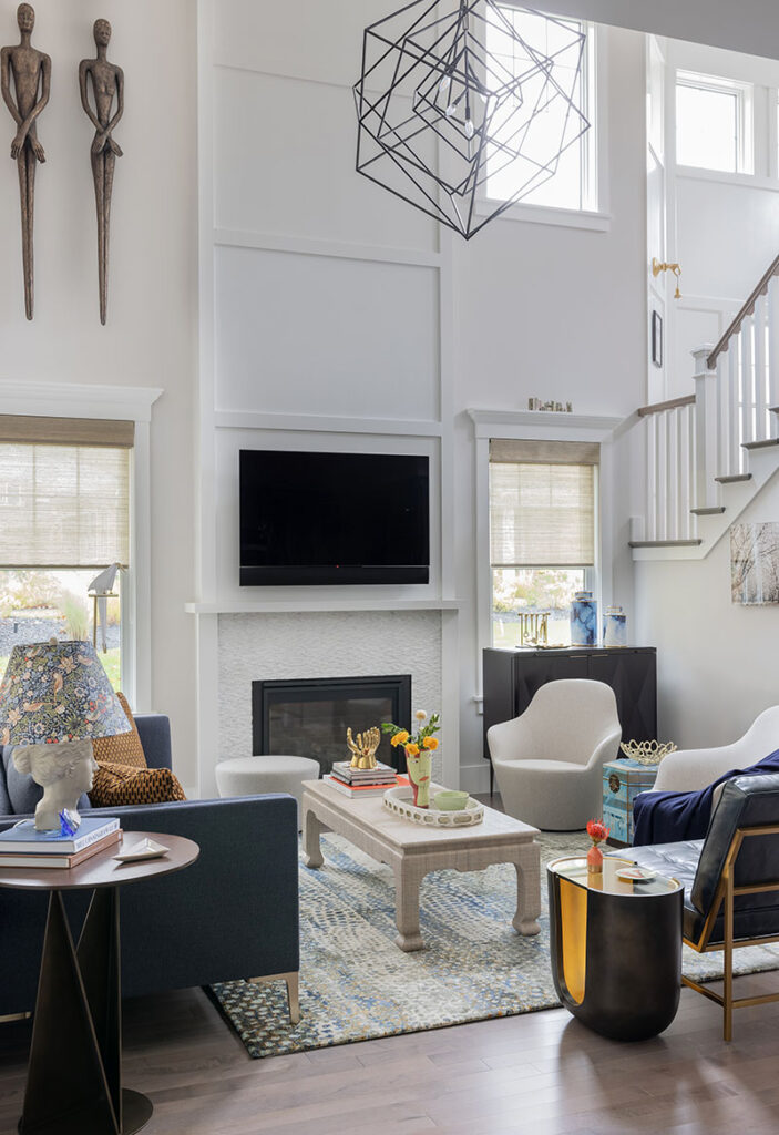
A textural white-tile surround and wood panels that run up the chimney, neatly framing the television, turn the fireplace into a focal point without dominating the room. As in the entry, Donohue went with pattern on the floor, this time in a snakeskin-like design. “Patterned rugs are forgiving, and the blend of cream, gold, and green feels very warm,” she says.
An airy aged-iron chandelier designed by Kelly Wearstler fills the top of the double-height space. The fixture, which is so big that the builders had to remove the doors of the screened porch to get it into the house, is as much a cubist sculpture as a light source. “It’s visually appealing from every angle, including the stairs and the loft,” Donohue says. “You’re not looking down on a bulb.”
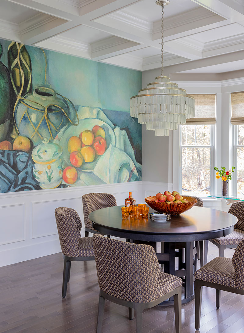
A show-stopping wallpaper mural of Paul Cezanne’s Still Life with Apples envelopes the dining room, pulling the consistent color palette deeper into the home. That guests think it is hand-painted delights the owner, as does the Currey & Company recycled glass chandelier. “The frame has a silver-leaf finish, and the glass has texture, but there’s no color to detract from the mural and chairs,” Donohue says. “Plus, it’s elegant, while still suitable for breakfast.”
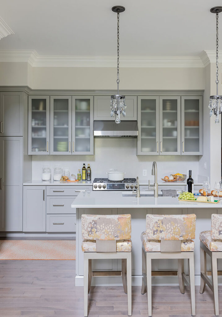
Crystal pendants dangle like earrings over the kitchen island, sparkling against gray cabinetry and leading the eye down to stools with graceful lines and gray and peach upholstery. The dotted orange rug makes another appearance here, punching up the space while tying it back to the entry.
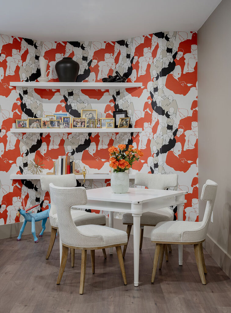
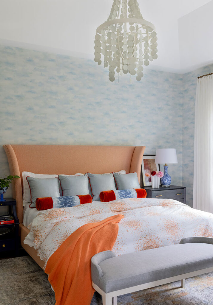
The feminine feel floats back to the primary bedroom, where wallpaper with a misty-blue watercolor wash wraps the room, and a gentle, cross-hatched carpet covers the floor. The star is the curvaceous, marmalade-colored upholstered bed that is topped with a Matouk duvet printed with a sprinkling of artist Lulu DK’s painterly dots. Above, the chandelier’s paillettes, which remind the homeowner of snowflakes, drift down dreamily.
Donohue also jazzed up the basement. A wall installation of ceramic jacks by Kaiser Suidan from Jules Place leads to an entertaining oasis complete with a bar, a pool table, and a lounge anchored by a zebra-print sofa. Marimekko wallpaper that immediately reminded Donohue of the clients, stretches along the outer wall.
“The house feels warm and has a bit of whimsy, with a surprise around every corner,” the homeowner says. “I couldn’t have done this without her.”
Learn more about the project team
Architect: ART ARchitects
Contractor: Hunter Whitmore, Whitmore Brothers Construction Co.
Landscape architect: Nina Brown, Brown, Richardson + Rowe
Interior designer: Ana Donohue Interiors
Contractor: E. Cox Construction

