When interior designer Kristine Irving took on this project, there wasn’t even a house yet — just a busy family that knew exactly what it was looking for. “The clients spent a long time searching for just the right home to renovate,” Irving says. “For them, finding a home that would allow them to build a fully custom interior, designed for their lives, was their main priority. It was also important to them not to purchase something that had already been improved and to end up redoing recent work. That was a tall order!”
Boston Townhouse 1: Nat Rea, original photo on Houzz
Photos by Nat Rea
Houzz at a Glance
Who lives here: A family of five
Location: South End neighborhood of Boston
Size: 3,400 square feet (316 square meters); four bedrooms, 4½ bathrooms
Designer: Kristine Irving of Koo de Kir
The family ultimately chose a multiunit dwelling deeply in need of work. “From hot-pink walls, filthy purple shag carpet and run-down finishes throughout — they definitely had a vision and a plan when they purchased,” Irving says. This plan included not only ripping out and replacing the dated finishes, but also completely transforming the space from a multiunit to a single-family home.
“My role in this project was to creative-direct the entire process with the architect and the builders,” Irving says. “The architect, Embarc Studio, was responsible for the envelope of the building and brought tons of experience working in this type of residence to the table. Same with the builders, Kennedy Design Build — they specialize in this multiunit-to-single-family conversion. Our game plan as a team was to assess the clients’ needs, design a home and to work together to make it happen.”
The end result is a fully customized space (right down to the driveway for those Boston winters) with four levels, a rooftop deck and multiple access points to the outdoors.
Drapery: Designer Draperies of Boston; custom millwork throughout: Kidder Blaisdell Woodworks Corp.; decorative plaster ceiling detailing in parlor, kitchen and master suite: David Autio
Boston Townhouse 2: Nat Rea, original photo on Houzz
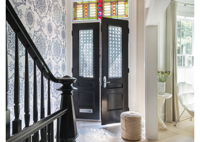
At the street level, double doors and custom transom windows lead to a formal front parlor. “The windows came about for me when I was traveling in Venice during the early stages of the design for this project,” Irving says. “I was at a bar, and there was this amazing window of all round circles of glass. I snapped a picture and texted it to my clients and said, ‘We have to do this,’ and they agreed! We hired a stained-glass artist to make the windows for us.”
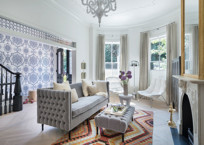
The wallpaper is a vintage Florence Broadhurst pattern, brought out of “retirement” and fabricated in a custom color. The custom chevron floor is white oak with a custom wash.
Custom reissue of Florence Broadhurst wallpaper: Weego Home; custom sofa and ottoman: designed by Koo de Kir and made by Furniture Concepts
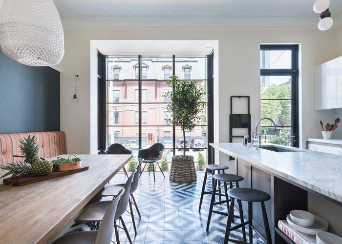
“The clients are big into cooking and really into design,” Irving says. And what with the kitchen’s expansive island and statement tile floor, that certainly shows. The list of musts for the kitchen included a great space for entertaining; lots of light; enough room for the whole family to eat and hang out together; and, last but not least, a kitchen that didn’t look like every other kitchen. Mission accomplished.
Paccha by Popham Design floor tile: Ann Sacks; stone throughout: Matt Luther, MKL Stone
Boston Townhouse 3: Nat Rea, original photo on Houzz
A long banquette easily seats the whole family, whether for meals or just hanging out, and a new structural opening washes the space with natural light.
“The structural steel bump-out at the back elevation was a huge project,” Irving says. “Not only from a permitting, structural and logistical point of view, but also from the interior design point of view. Blending the modern steel with a softer aesthetic on the interior was a great challenge.… The entire team worked tirelessly to make that transition work.”
Structural opening: Architectural Openings
Boston Townhouse 4: Nat Rea, original photo on Houzz
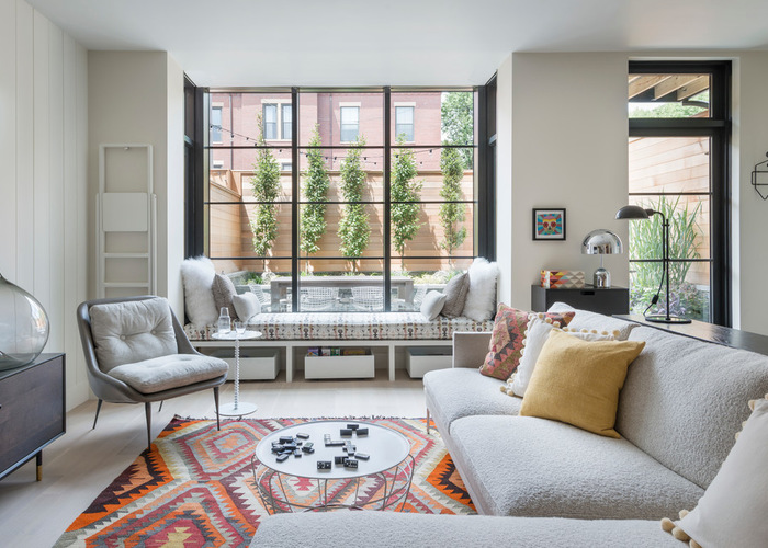
The garden level hosts a comfy family room with a window seat looking out to the patio. “The lady of the house is ‘vertically challenged,’ so we did cool step stools in the family room and the kitchen,” Irving says.
Paint: White Heron in Satin Impervo (paneled wall) and Soft Chamois (plaster walls), Benjamin Moore; cabinet: BDDW
On the other side of the family room is a built-in storage wall with wet bar. A scattering of hex floor tiles by the back entrance provides some protection for this high-traffic zone, which leads to the patio and parking area beyond.
Upstairs, a curtain wall opens from the second-floor master suite onto a Juliet balcony. The youngest child’s nursery is also on this level, but it isn’t shown.
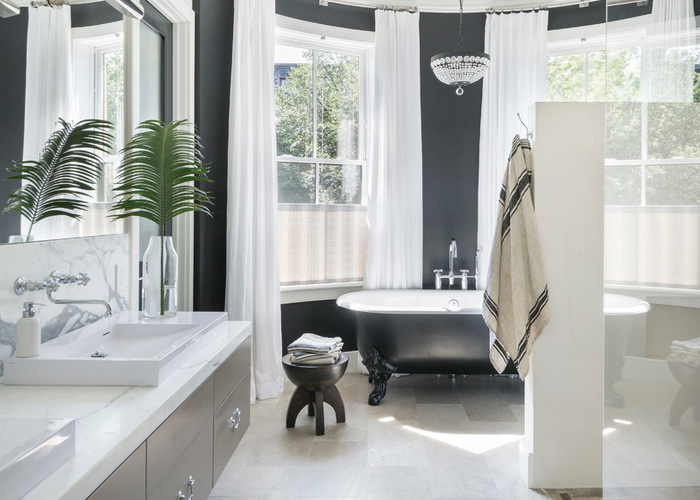
Boston Townhouse 5: Nat Rea, original photo on Houzz
The master bath feels like a luxuriously serene getaway, complete with walk-in shower, claw-foot tub and crystal chandelier.
Circe claw-foot tub: Kallista; custom tub finish: Porcelain Patch & Glaze Corp.
How to Get a Clawfoot Tub of Your Own
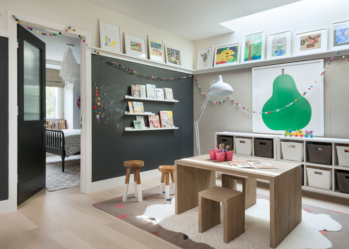
Boston Townhouse 6: Nat Rea, original photo on Houzz
The third floor is the kids’ realm, with bedrooms for the two older children, two full baths and the creative playspace shown here. “The kids in this family are all artistic, and it was important to their parents that they have a space to create and display their artwork,” Irving says. “We designed a gallery of sorts and framed up a bunch of their masterpieces — the idea being that they can easily swap out new pieces anytime using the same frames.”
One wall is covered in chalkboard paint for impromptu sketches. Bins on shelves keep supplies neat, and a skylight overhead bathes the room in natural light.
Table and stools: Restoration Hardware Kids; pear artwork: Enzo Mari; pear art framing: A Street Framers
Right-Sized Kids Desks in Every Color and Material
In the daughter’s room, bold wallpaper, an oversize butterfly print and a hanging chair set a playful tone. “We did the kids’ rooms creatively but on a fairly small budget,” Irving says. “Knowing how quickly kids grow and change, we didn’t want them to be boxed into a space that would feel dated for them.”
In the son’s room, a custom world map mural dominates one wall, while a comfy bunk bed provides room to sleep and host a friend overnight.

