As homeowner dreams go, this one may be the holy grail of households with small children: Lisa and Marc Aronson, parents of three school-age boys, wanted a home as durable as it was beautiful, with a knock-your-socks-off interior that was easy to clean and exuded a breezy tone. When the couple decided to forge ahead with a renovation of their Colonial-style house in Boxford, they turned to Jenn Sanborn, ASID, the award-winning interior designer and principal of Sacris Design in Amesbury.
Sanborn’s conclusion: The project was not just achievable for the family’s dated 1990s home; it was rife with potential. So the trio ran with the challenge, turning the first floor of the house into a family-friendly space that is as fresh and beautiful as the home’s pastoral setting in a quiet neighborhood.
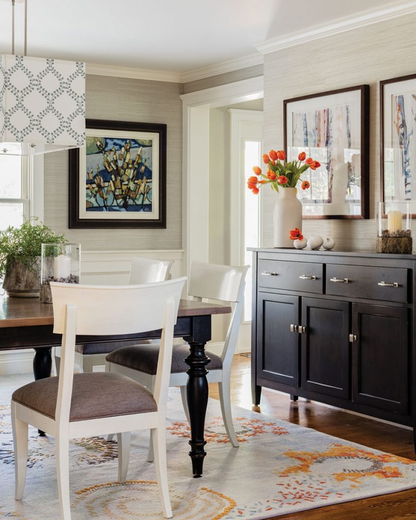
“It was quite formal, crying out for a refresh and a bit of modernization,” Sanborn says. The dining room, for example, was wrapped in shiny damask wallpaper, with a big mahogany breakfront and a brass chandelier over the formal table.
The designer’s philosophy was a match for the Aronsons’ goal. “I’m definitely a traditionalist. I aim for a fresh approach,” Sanborn says. “I want my design to stand the test of time and be rooted in appropriate form and balance, true classical ways of thinking about spaces.” The couple had already worked with Sanborn on the house, most recently on a renovation of the master bath. “Her style is traditional with a twist,” Lisa Aronson says. “We wanted an update without being over the top, and a better connection to the outdoors. She did an amazing job.”
Before the renovation, the 2,400-square-foot two-story home was a classic builder’s center-hall Colonial, with swirled ceilings, narrow colonial casing, and a kitchen divided by an oak peninsula. A small window was centered above the sink, and a glass slider by the kitchen table led to the deck. Today, the first floor’s main rooms are clean-lined, bright, and beautiful, with an open, inclusive spirit that suits the young family.
Sanborn concentrated on the connection between the new kitchen and adjoining dining and family rooms. Sanborn, who is as proficient at drawing plans as she is at creating sublime interiors, recommended widening the cased opening between what was a dining room and the kitchen. “They wanted to be able to use the dining room in an everyday situation,” Sanborn says, and make it a welcoming space for the boys.
Working closely with the Aronsons, she moved on to the big interior design elements: cabinetry, millwork, wall coverings, and floors. “I think of all surfaces of a space, not just which paint colors are on the wall,” Sanborn says. She wrapped the kitchen and dining room in silver-gray grasscloth and stained the oak floors in a walnut finish. The dated swirled ceiling was replaced with painted wood paneling, as Sanborn says, “raising the architecture a notch.”Dated oak cabinets were replaced with painted inset cabinetry.
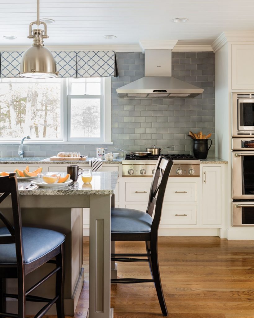
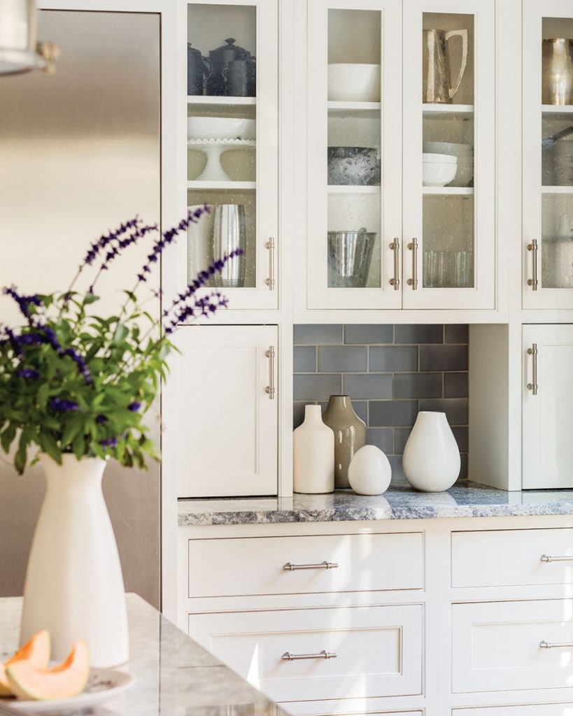
A breakfast table and U-shaped peninsula were replaced with a large granite-topped island, which faces a new expansive window crowned with a custom-made valance. The Azul Anan granite on the island top and counters coordinates with the backsplash of blue-gray subway tile, establishing the project’s elegant color scheme with pops of orange, warm gray, and navy.
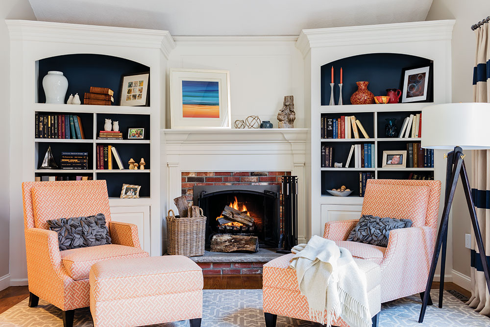
Sanborn’s sense of color and texture is evident throughout the rooms. The family room, for instance, gets a dynamic touch from custom-made heavy linen drapes with horizontal stripes; the fabric didn’t come striped, so Sanborn’s drapery workroom painstakingly combined the linens. Upholstered sofas are anchored by a custom-made orange leather ottoman.
For anyone who loves to cook and bake—as the Aronsons do—the transformed kitchen is the project’s shining star. “It was a matter of reorienting the kitchen and bringing in views to the outside,” Sanborn says.
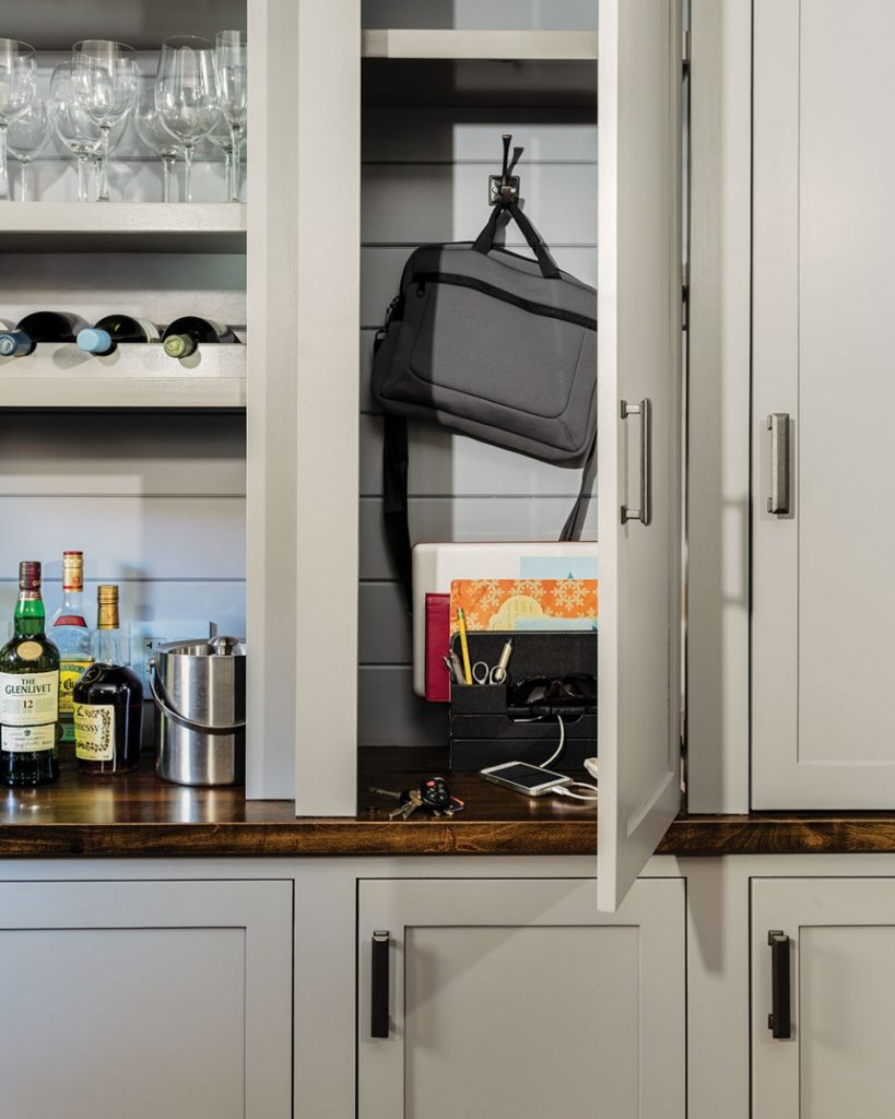
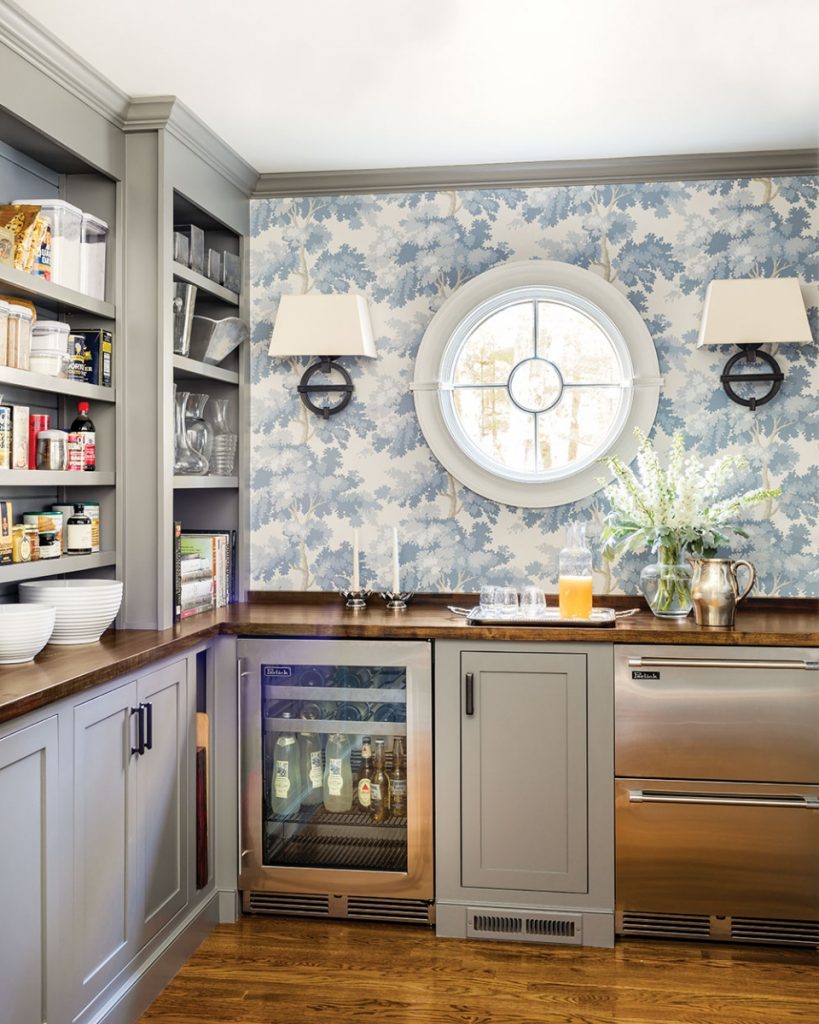
The pantry, originally an office, is a special place full of functionality and design. The shelved space was built on-site by the project carpenter Scott Fortin of South Hampton, New Hampshire. Sanborn replaced two windows with one round window. This and other details—a glass-fronted pocket door, sconces, a dark-stained counter, and Swedish wallpaper in a tree print—bring the pantry to new design heights. The sconces, precisely mounted so the cross bars align with the window’s mullions, perfectly demonstrate Sanborn’s skills. “The pantry is one of the home’s real jewel boxes,” Sanborn says. “You can create special spaces if you’re careful about design details.”
Today the Aronsons have found a home that is as easy to navigate and keep clean as it is to prepare for company. “We knew she was a space maker before we hired her,” Lisa Aronson says. “Now we see she’s a mastermind.”?
Sacris Design
20 Glenwood St., Amesbury, 978-388-5948
sacrisdesign.com

